

above> rendering of new brand / might have liked to see a more dynamic, less mechanical solution.
an iconic identity that had a nice long run. if American was a women, she was a dame.
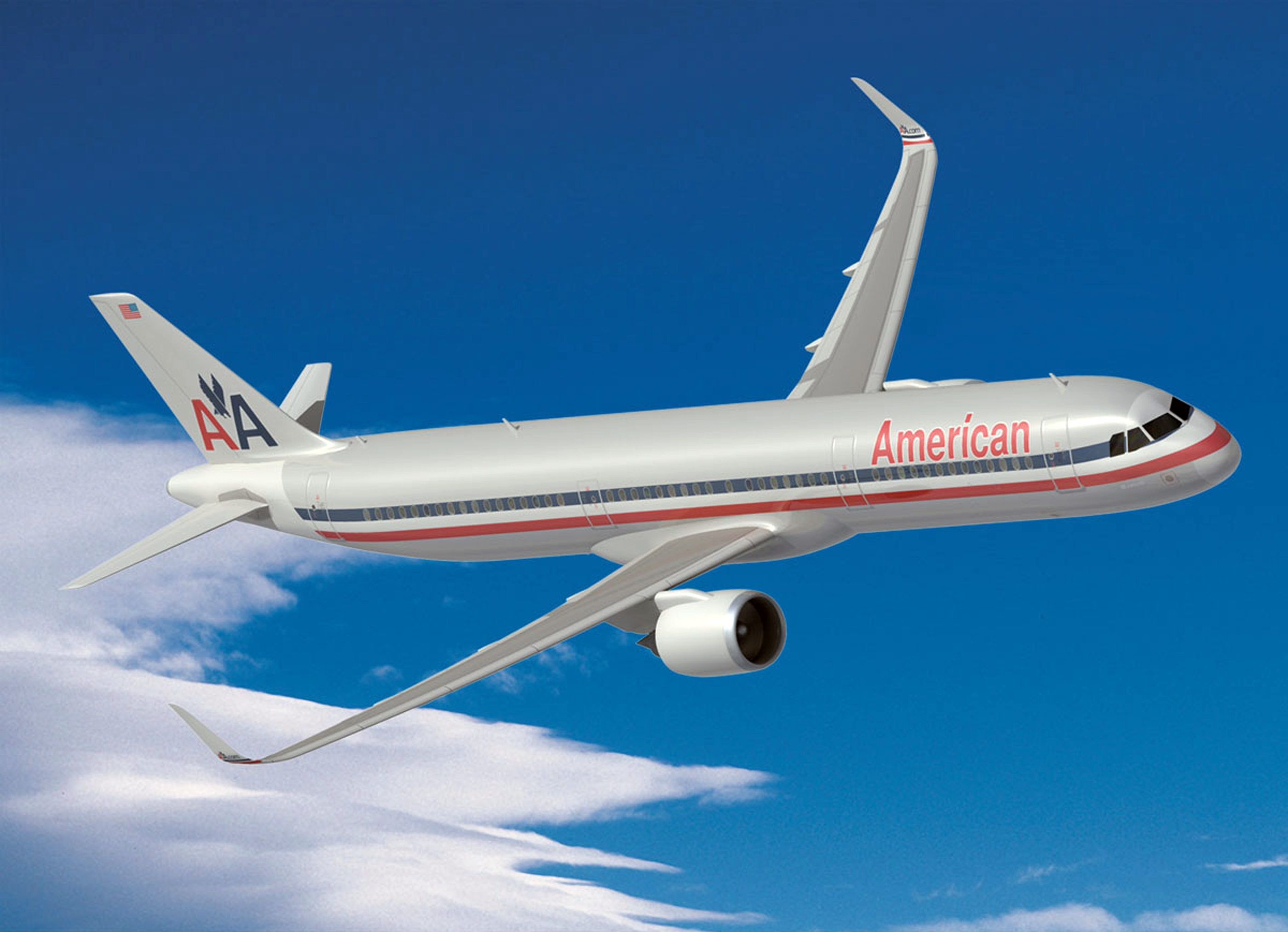
When American Airlines debuted its new brand identity on 17 January I was on a AA 767-300 red eye to Maison&Objet in Paris. I think that same plane on the return leg was one of the last to leave Charles De Gaulle Sunday afternoon as snow was falling. The plane was old with no smoking stickers in the galley. The week before I was in a very new United Airbus 320-200. The 16-hour roundtrips produced measurable differences. As for the news of the redesign, designers of my generation are very aware of the AA brand, its longevity and legendary designer, Massimo Vignelli. The rebranding will become a branding benchmark in graphic design history.
It so happens, 40 years later, in 2007, the well-viewed movie ‘Helvetica’ debuted, an entertaining history of the typeface interspersed with candid interviews with leading graphic and type designers, which consequently revisits the AA brand’s as a brand built around Helvetica. The movie also reveals a rift between modernists and postmodernists, with the latter expressing and explaining their criticisms of the famous typeface. A refrain by many of the designers in the movie — they wouldn’t know how to change or improve the Helvetica design. It’s fair to say, the design, the design elements, contributed to the longevity of American’s brand. It’s also fair to say time, i.e., technology, worked against it.
With some brands the passing of time works in your favor. For example if your business is dark ale or fine chocolate, where tradition and recipes go unchanged for generations, as time passes these industries become more revered. But not in the aerospace business. Boeing’s Dreamliner woes highlight the demands technology and processes aircraft design undergoes. Considering all the changes the airplane is going through I’m a bit surprised at the degree of vitriol directed at the redesign, when we consider the upcoming new planes. I don’t have issue with disappointment over aspects of the new messaging. I do have with an opinion that the long-standing identity, admittedly a classic icon, didn’t need tweaking. A new logo and paint job is more than a cosmetic makeover.
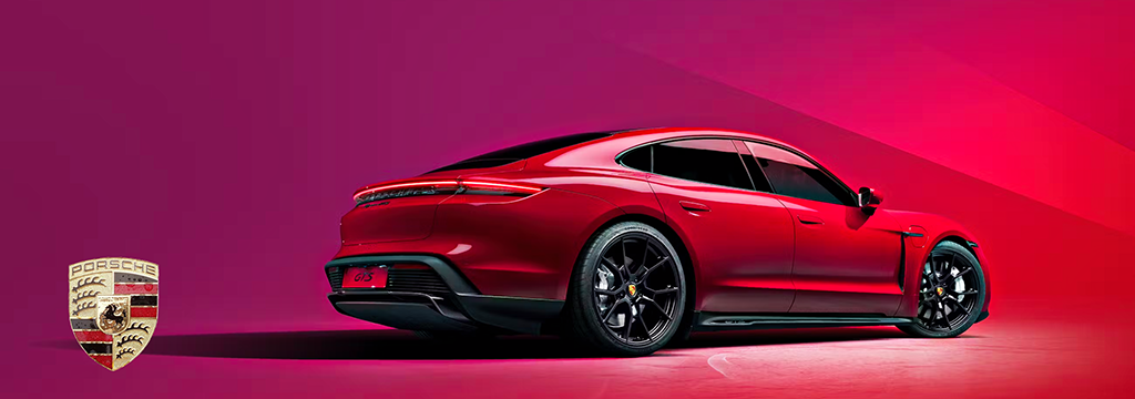
It’s a question that American and their brand consultant Futurebrand pondered for over two years as American was ordering 550 new planes, many with composite bodies that can’t have polished mirror-like finishes. During this time design elements and the name itself were scrutinized. We’re told the creative brief sought the proper blend of USA pride with a focus on flight, worldwide, technology, entertainment and progress. We’re told the abstracted symbol of the American flag will only appear on the tail of the aircraft. The new icon, formally an eagle loses the talons appears both to be a symbol of a bird and wings, the reminder of flight. We’re told American polled their employees and their customers and the message was the old identity felt tired. I believe all of that transpired. Whatever. My recent two-weekend experience wanted me flying at 35,000 feet in a new Panamera and not a 1967 Jaguar 420G — the mid-80s 767 felt older. The brand too either reassures or shakens the experience.
One more thought and it’s about presentation, not just the logotype and symbol but also the ‘packaging’ of the brands. By packaging in this case I mean how the logo is presented over a period of time. Let’s look at American founded 1934 and Coca-Cola in 1886.
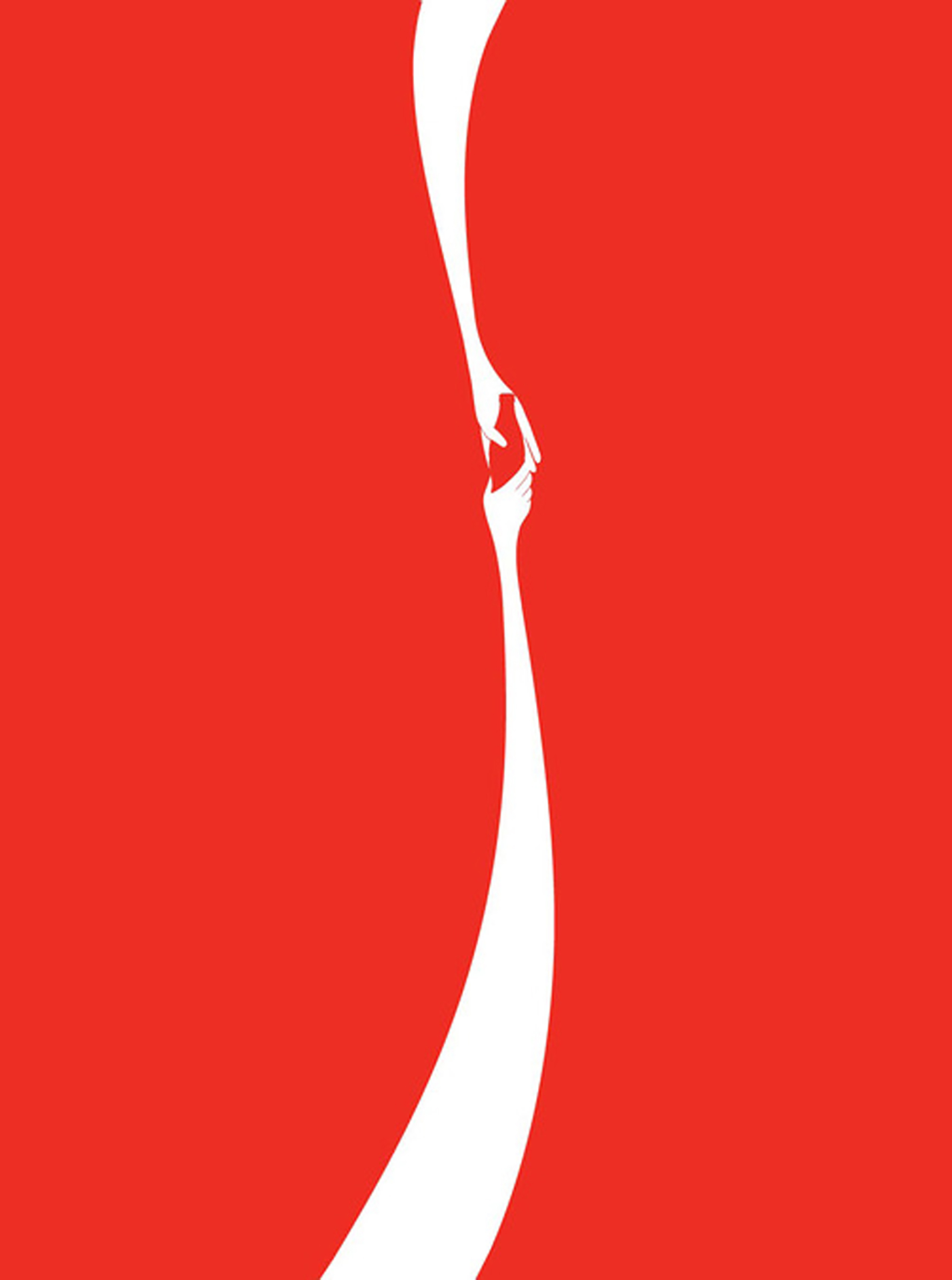
Coca-Cola is a brand where time can work on their side. Coca-Cola introduced the powerful ‘stripe’ in the 60s which coincides with American’s previous brand debut. During this time, while the core Coca-Cola logotype underwent very mild tweaks the presentation of the logo varied greatly while retaining the stripe with its classic product. Noticeable change in the packaging while slight refinement with the logotype was enough to keep Coke fresh.

American’s packaging of the airplane on the other hand lasted a surprising long time with little discernable change, a tribute to the original design surely. But now comes the rub when considering the new planes, the new interiors. There are some out there who would be more than happy with the seats in business and first-class being Cassina LC2’s and LC4’s.
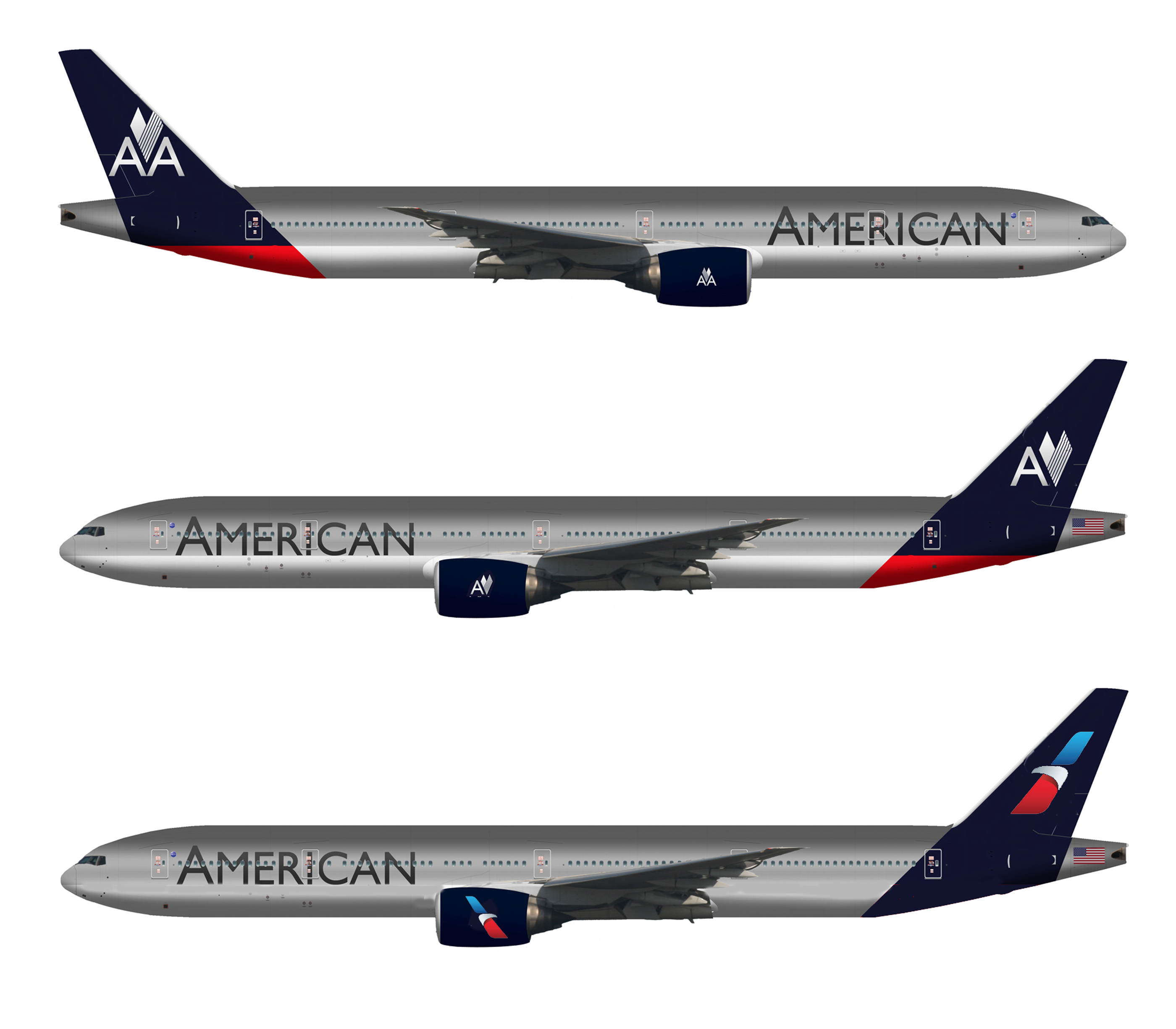
In order to write an opinion I needed to process a bit, the 1967 iteration fixed in my mind for so long. I searched and found the above concept designed by Anthony Harding. Harding created a thoughtful series in May 2012 when he heard American was buying more new planes. The comments on his post were interesting especially to see a pilot give his opinion. Harding’s layout is the top example and I did a quick cut-and-paste on 2nd and 3rd. Anthony, hope you don’t mind. This exercise examined losing the AA and putting a larger symbol on the tail. Massimo’s iconic eagle still makes an appropriate flight and USA statement and is more proprietary than the new abstract symbol though the new one works for me too. This study and the new identity does move it closer to what’s already in the marketplace. The messaging and vision statement play an important role.
The old logotype could lose the outlines. Maybe something close to Helvetica worth a look. But wait, we’re feeding a dead horse. The new identity is public, the old one laid to rest and I don’t think it will come back like Coca-Cola Classic. This dialog is a way of personal closure for me, for an identity that had a nice long run. If American was a women, she was a dame. And it’s ok to revisit those things that may not seem broken.
[ american airlines ] [ starbucks packaging ] [ massimo vignelli ] [ anthony harding ]
