• CALENDAR
    • Add Your Event
  • architecture
    • art & literature
    • awards
    • buildings
    • sustainable
    • prefabricated
    • public space
    • residences
    • urban planning
  • design
    • art & literature
    • awards
    • collectables
    • concept
    • fashion
    • sustainable
    • home
    • lifestyle
    • safety & special needs
    • transportation
    • workplace
  • editor’s pick
    • featured
    • gift ideas.
    • interviews
    • opinion
  • events
    • auctions
    • competitions
    • conference & Exhibitions
    • fairs
  • news
    • latest news
    • elsewhere
    • lifestyle
    • people
    • producer
    • retailer
DesignApplauseDesignApplauseyour daily design dose
  • CALENDAR
    • Add Your Event
  • architecture
    • art & literature
    • awards
    • buildings
    • sustainable
    • prefabricated
    • public space
    • residences
    • urban planning
  • design
    • art & literature
    • awards
    • collectables
    • concept
    • fashion
    • sustainable
    • home
    • lifestyle
    • safety & special needs
    • transportation
    • workplace
  • editor’s pick
    • featured
    • gift ideas.
    • interviews
    • opinion
  • events
    • auctions
    • competitions
    • conference & Exhibitions
    • fairs
  • news
    • latest news
    • elsewhere
    • lifestyle
    • people
    • producer
    • retailer

branding

Home Tag branding
coca-cola debuts inaugural – true – global packaging.

coca-cola debuts inaugural – true – global packaging.

Apr 19, 2016

the new packaging for the entire coca-cola trademark will feature the brand’s signature red disc. the graphic visually unifies coke, diet coke, coke zero and coca-cola life. the new design will hit shelves in mexico the first week of may and then roll out globally throughout 2016 and 2017. packaging changes won’t come to the u.s. until at least next year.

coca-cola’s one brand strategy

a remarkable revelation by global icon after all these years, the changes, announced at an event on 18 april 2016, in mexico, represent an historic shift for the company. “the unification of the brands through design marks the first time in our 130-year history that the iconic coca-cola visual identity has been shared across products in such a prominent way,” said james sommerville, coca-cola’s vp-global design, in a statement.

coca-cola16-new-package1

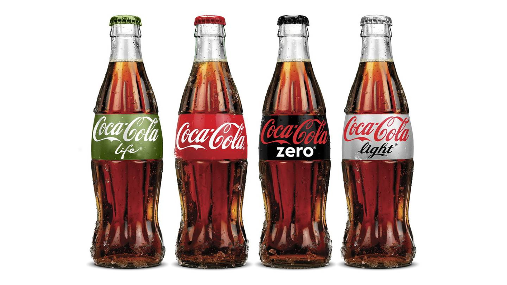
“packaging is our most visible and valuable asset,” said marcos de quinto, chief marketing officer at coca-cola, in a statement. “the coca-cola red disc has become a signature element of the brand, synonymous with great taste, uplift and refreshment. by applying it to our packaging in such a bold way, we are taking the next step towards full adoption of the ‘one brand’ strategy, uniting the coca-cola family under one visual identity and making it even easier for consumers to choose their coca-cola with or without calories, with or without caffeine.”

coca-cola16-new-package3

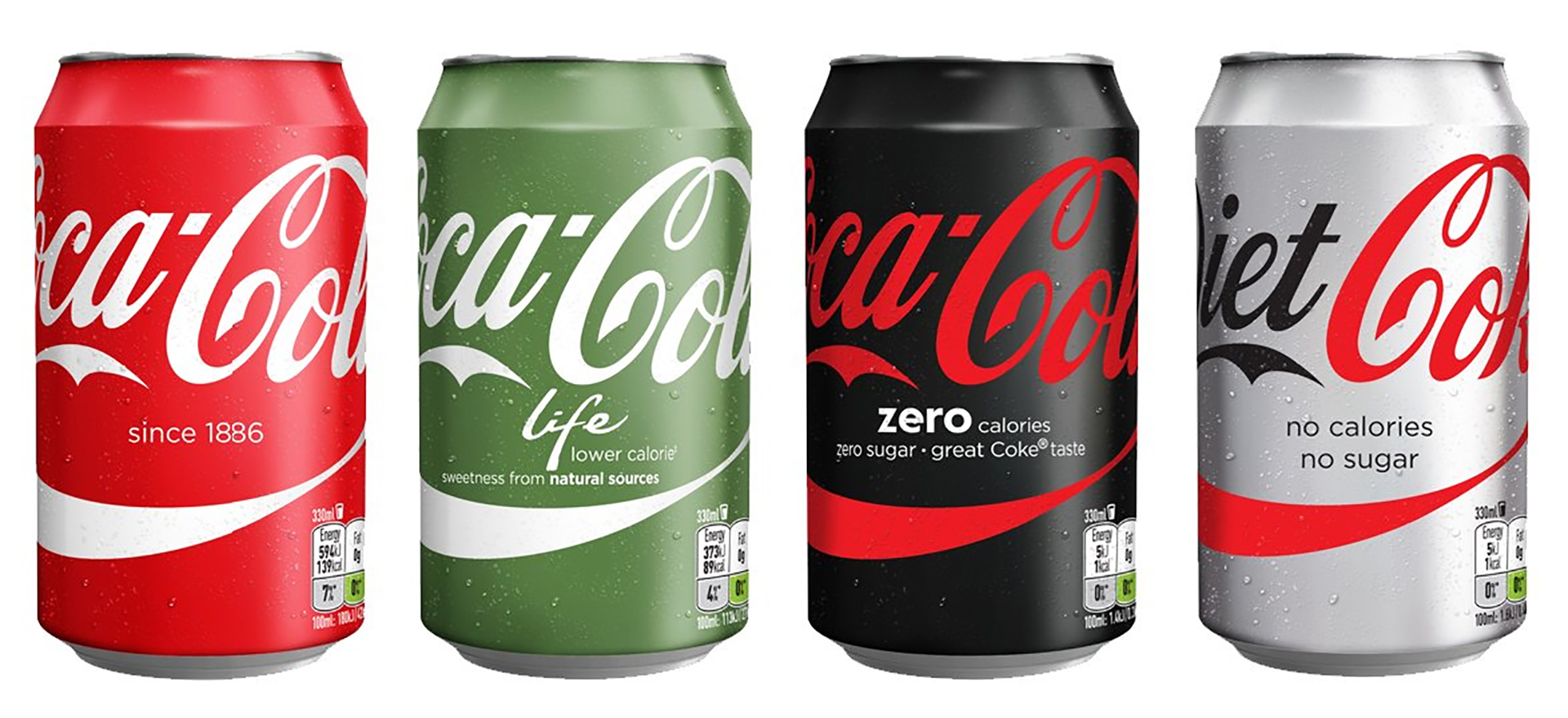
two packaging designs

introduced a year ago (march 2015) –- participating markets will launch one of two packaging design approaches. the first, “monocolor” (pictured above), features single-colored packaging for each brand and a horizontal typography that visually connects packs when lined up side by side on the shelf or in a cooler. this design will be launched in 11 markets in the northwest europe and nordics region including: finland, iceland, great britain, ireland, france, denmark, norway, sweden, belgium, the netherlands and luxembourg.

the “split” design (pictured below), which will launch in spain, sports a horizontally divided look, with coke red appearing above the horizontal ribbon on every pack, and the variant’s signature color appearing below.

coca-cola16-new-package2

coca-cola16-new-package5

what’s the history of the coca-cola red disc?

it was first introduced in the 1930s on hand-painted coca-cola advertising. over the years, it became synonymous with great taste, uplift and refreshment. in 1947, the creative director at d’arcy advertising, archie lee, purified and systemized the red disc used then for retail signage to signify that real coca-cola was sold there. the disc, therefore, became the inspiration for our approach to the “taste the feeling” campaign signature that we introduced in january, and now these new packaging designs also communicate that coca-cola, any coca-cola is the real thing.

what’s gonna happen to the coke stripe ?

the stripe gave design a good hook to draw upon. a favorite below by chinese designer jonathan mak is his [ sharing a coke ]

coca-cola16-hands1

[ thinking behind the design ] [ one brand strategy ] messing with good design fraught with mixed emotion.

dow plucks apple and drops at&t.

dow plucks apple and drops at&t.

Mar 7, 2015

dow plucks apple and drops at&t. index bets on brand, innovation and future. via chicago tribune [RK]

Branding the new american airlines and us airways.

Nov 13, 2013

american-usair1

Ammerican Airlines. US Airways. The odd couple at first glance this is not. Here’s a safe bet: Red. White. And. Blue.

american-usair-usair1the first plane was painted in the new us airways livery in 2004

The American aircraft fleet overall needs a facelift and they are at the beginning of their fleet renewal vs. US which is nearly done. [ details ]

american-usair-american1new american prototype was painted january 2013

[ overheard ]
15 feb 2013
US Airways CEO Doug Parker was non-committal when asked about American Airline’s new livery at an employee meeting Thursday regarding the merger, a transcript shows.

“I just don’t know. I think that’s the kind of thing you want to go spend some time on, talk about what’s the right branding for the combined airline,” Parker told employees Thursday.
The new American Airlines brand, unveiled just weeks before the merger, has drawn a lot of derision. So far, Parker and AMR Corp. chief executive Tom Horton have suggested in public that the new livery would stay with the new merged airline.

Horton was pretty firm on Thursday with my colleague Andrea Ahles in Fort Worth. Here’s what he said about keeping the livery:

[Horton] It looks like something you would design if you were going to put American and US Airways together. But it is a new look. We are rolling it out very quickly. In fact, we have 60 new airplanes coming this year that will be delivered with the new livery. … And I think it’s a great presentation of the new American going forward.

But with US Airways employees Thursday, a securities filing shows Parker isn’t so sure. Here’s what he told employees:

[John McDonald] Doug, lots of questions about that tail and that design right behind you.

[Parker] That is the American Airlines livery and that’s the US Airways livery. I got a lot of questions on this today and I don’t have a great answer, mainly because this is the kind of – kind of a detail we just don’t have answers to yet. I’m not suggesting by any means that we won’t be able to [inaudible]. I just don’t know. I think that’s the kind of thing you want to go spend some time on, talk about what’s the right branding for the combined airline. I haven’t seen the work they’ve done to come up with the branding they have, but I know they spent a lot of time on it and they’re proud of it, so I don’t want to prejudge one way or another. I just want to – that’s a detail that still needs to be worked out and one that we’ll work out together.

20 february 2013
US Airways’ latest employee update on its merger plans is out, and the company has some interesting things to say about maintaining its hubs and whether or not it will keep American Airlines’ new livery.

American and US Airways announced their merger last week, and plan to close on the deal in the third quarter. The new American livery has been a source of much derision, and people have wondered whether the merged airline will keep the tail design.

US Airways CEO Doug Parker will lead the merged airline, and it seems like the US Airways team could be open to a change. American adopted its new branding and livery while the carrier was in Chapter 11 bankruptcy protection.

Here’s the company’s response from a Q & A in the employee update:
Q> What will happen to the American Airlines and US Airways branding and livery?
A> American Airlines is one of the most iconic brands in the world, and we are excited to operate under that globally recognized brand name. More specific branding and livery decisions will be made in due course as we move forward in the integration-planning process

The company also reiterated its promises not to do major cutbacks – a crucial issue for both travelers and employees.

Q> Will you be downsizing any hubs, reservation centers or facilities?
A> This is a merger premised on growth . Our synergies are derived primarily from the revenue benefits of American Airlines’ and US Airways’ complementary networks . Importantly, we expect to maintain all hubs and service to all our current destinations

amerian-usair-aamasimo1designed by massimo vignelli in 1967 | the eagle added a bit later

The design community will pay close attention to how the American brand will morph, if at all. American’s previous brand lasted 46 years.

americanair-uniform1 see more at the kiwi club

A visit to jc penny housewares.

Jun 16, 2013

jcpenny-graves1

I have been watching with interest and dismay the saga of Ron Johnson’s arrival at and departure from J.C. Penney’s. The whole enterprise seemed dubious: turning Penney’s into another Target, if that was the goal, seemed misguided. But I was curious to see where it would end up. At Target, Johnson hired Michael Graves and other designers and he was the creator of the Apple stores—which I never thought would succeed.

jcpenny-graves3

Johnson is gone now but some of the product lines he ordered up for the housewares departments at Penney’s have arrived in the stores. There is stuff from Graves, Jonathan Adler, Conran’s, Martha Stewart, Bodum, Cuisinart, Pantone, Joseph Joseph and others. I wasn’t sure what would happen to these goods after Johnson’s firing,. There was an elaborate advertisement in Architectural Digest magazine’s June issue, the goods were online and I decided to check into my local Penney’s the other day.

jcpenny-conran1conran

The pieces are arranged in a series of mini shops. I was amazed how extensive the variety and display. I don’t know whether the things will sell or be reordered but there were highlights: colorful Bodum mixers, Graves vases and frames that are better than any in the earlier Target collections, and Conran’s furniture that recalls Ikea. The Martha Stewart shop is mostly paper goods.

jcpenny-display1joseph joseph
jcpenny-bodum1

jcpenny-graves4

My favorite: the celedon vase at Graves. [ jc penny shop ]

<a href="about phil patton

a new graphic identity for the whitney.

a new graphic identity for the whitney.

May 28, 2013

Spectacular design..(my opinion) offers amazing variations always connecting to the main DNA the “W”

whitney4

The responsive W: as a spatial construction. Inspired by Ad Reinhardt’s ‘typology of lines’

whitney3

whitney5

[ experimental jetset ] [ whitney identity ] [ details ]

American airlines: 1967 > 2013.

American airlines: 1967 > 2013.

Jan 24, 2013

above> rendering of new brand / might have liked to see a more dynamic, less mechanical solution.

an iconic identity that had a nice long run. if American was a women, she was a dame.

When American Airlines debuted its new brand identity on 17 January I was on a AA 767-300 red eye to Maison&Objet in Paris. I think that same plane on the return leg was one of the last to leave Charles De Gaulle Sunday afternoon as snow was falling. The plane was old with no smoking stickers in the galley. The week before I was in a very new United Airbus 320-200. The 16-hour roundtrips produced measurable differences. As for the news of the redesign, designers of my generation are very aware of the AA brand, its longevity and legendary designer, Massimo Vignelli. The rebranding will become a branding benchmark in graphic design history.


It so happens, 40 years later, in 2007, the well-viewed movie ‘Helvetica’ debuted, an entertaining history of the typeface interspersed with candid interviews with leading graphic and type designers, which consequently revisits the AA brand’s as a brand built around Helvetica. The movie also reveals a rift between modernists and postmodernists, with the latter expressing and explaining their criticisms of the famous typeface. A refrain by many of the designers in the movie — they wouldn’t know how to change or improve the Helvetica design. It’s fair to say, the design, the design elements, contributed to the longevity of American’s brand. It’s also fair to say time, i.e., technology, worked against it.

With some brands the passing of time works in your favor. For example if your business is dark ale or fine chocolate, where tradition and recipes go unchanged for generations, as time passes these industries become more revered. But not in the aerospace business. Boeing’s Dreamliner woes highlight the demands technology and processes aircraft design undergoes. Considering all the changes the airplane is going through I’m a bit surprised at the degree of vitriol directed at the redesign, when we consider the upcoming new planes. I don’t have issue with disappointment over aspects of the new messaging. I do have with an opinion that the long-standing identity, admittedly a classic icon, didn’t need tweaking. A new logo and paint job is more than a cosmetic makeover.

It’s a question that American and their brand consultant Futurebrand pondered for over two years as American was ordering 550 new planes, many with composite bodies that can’t have polished mirror-like finishes. During this time design elements and the name itself were scrutinized. We’re told the creative brief sought the proper blend of USA pride with a focus on flight, worldwide, technology, entertainment and progress. We’re told the abstracted symbol of the American flag will only appear on the tail of the aircraft. The new icon, formally an eagle loses the talons appears both to be a symbol of a bird and wings, the reminder of flight. We’re told American polled their employees and their customers and the message was the old identity felt tired. I believe all of that transpired. Whatever. My recent two-weekend experience wanted me flying at 35,000 feet in a new Panamera and not a 1967 Jaguar 420G — the mid-80s 767 felt older. The brand too either reassures or shakens the experience.

One more thought and it’s about presentation, not just the logotype and symbol but also the ‘packaging’ of the brands. By packaging in this case I mean how the logo is presented over a period of time. Let’s look at American founded 1934 and Coca-Cola in 1886.


Coca-Cola is a brand where time can work on their side. Coca-Cola introduced the powerful ‘stripe’ in the 60s which coincides with American’s previous brand debut. During this time, while the core Coca-Cola logotype underwent very mild tweaks the presentation of the logo varied greatly while retaining the stripe with its classic product. Noticeable change in the packaging while slight refinement with the logotype was enough to keep Coke fresh.


American’s packaging of the airplane on the other hand lasted a surprising long time with little discernable change, a tribute to the original design surely. But now comes the rub when considering the new planes, the new interiors. There are some out there who would be more than happy with the seats in business and first-class being Cassina LC2’s and LC4’s.


In order to write an opinion I needed to process a bit, the 1967 iteration fixed in my mind for so long. I searched and found the above concept designed by Anthony Harding. Harding created a thoughtful series in May 2012 when he heard American was buying more new planes. The comments on his post were interesting especially to see a pilot give his opinion. Harding’s layout is the top example and I did a quick cut-and-paste on 2nd and 3rd. Anthony, hope you don’t mind. This exercise examined losing the AA and putting a larger symbol on the tail. Massimo’s iconic eagle still makes an appropriate flight and USA statement and is more proprietary than the new abstract symbol though the new one works for me too. This study and the new identity does move it closer to what’s already in the marketplace. The messaging and vision statement play an important role.

The old logotype could lose the outlines. Maybe something close to Helvetica worth a look. But wait, we’re feeding a dead horse. The new identity is public, the old one laid to rest and I don’t think it will come back like Coca-Cola Classic. This dialog is a way of personal closure for me, for an identity that had a nice long run. If American was a women, she was a dame. And it’s ok to revisit those things that may not seem broken.

[ american airlines ] [ starbucks packaging ] [ massimo vignelli ] [ anthony harding ]

Herman miller collection.

Nov 9, 2012

click > enlarge

Herman Miller launched in 2012 a new online presence for the Herman Miller Collection. The Herman Miller Collection draws on George Nelson’s vision of “a permanent collection designed to meet fully the requirements for modern living.” This comprehensive portfolio offers a breadth and depth of products to furnish complete environments in a myriad of settings, both residential and contract, elegant and casual, across a range of prices.


george nelson and “_____”

Explore the [ Herman Miller Collection ]

IBM #2 global brand right behind apple.

May 22, 2012

IBM is now #2 global brand, right behind Apple and jumping Google. However… via ad age [RK]

Limited-edition bubba watson pink drivers announced.

Apr 11, 2012

click > enlarge

Ping, an American brand of high-quality golf equipment, is taking advantage of the publicity Bubba Watson received by winning the Masters while using a pink driver by producing them for the public. Ping announced it will sell 5,000 limited-edition, all pink G-20 drivers. The drive will be available at pro shops starting June 1 and cost $430 usd. Ping, which sponsors the Masters champ, said it would donate 5 percent of sales of its pink driver to the “Bubba Long in Pink. Driven by Ping” campaign.


The left-hander starting using the pink drivers to create exposure for himself and cancer research and prevention. Ping donated $10,000 to help start the “Bubba & Friends Drive to a Million” initiative and has given the charity $300 every time Watson hits a drive more than 300 yards with his pink driver. He averages 313.1 yards per drive, tops on the Tour.

Written in cursive on the crown of his G20 driver are the words, “Made Exclusively for Bubba.” The loft is 8.5 degrees, the 44.50-inch shaft is a pink True Temper Grafalloy Bi-Matrix. Grips are PING 703 Gold. He takes 10 wraps of tape under his right hand, 12 wraps under his left. [ ping ]

Revolution collection. Brand new International home & houswares show 2012.

Mar 10, 2012

click > enlarge

This morning attendees are going to be greeted by a newly branded show via the welcome banner at 2012 International Home & Housewares Show in Chicago. Who’s attending? 60,000 professional attendees | 2,000 exhibitors – from over 35 countries | 15,000 U.S. buyers | 6,000 international buyers from 100 countries on 6 continents: North America, South America, Europe, Asia, Australia and Africa.


What could be a suitable trade fair theme, this glassware is the Revolution Collection by Chicago Designer Felicia Ferrone. The Revolution Collection is handcrafted in the Czech Republic by master glassblowers, and formed from a pure extrusion of hand-blown borosilicate glass. This material provides a high degree of thermal resistance for a range of hot and cold applications, and is oven, microwave, freezer, and dishwasher safe. When in use, the contents of these pieces appear to float, seeming to defy gravity and visually suspend their contents, be it water, wine, champagne, gelato, or soup. The Revolution Collection is distinctive in its thoughtful form, and innovative in its application of materials and skillful manufacturing. These attributes are fundamental to the design philosophy and approach of fferrone design, along with responsible sourcing of materials and production.


Revolution was inducted into the permanent design collection of the Art Institute of Chicago in 2009 and awarded a prestigious GOOD DESIGN Award in 2004. Designed in 2001, the Revolution wine and water glass was previously licensed to the Italian manufacturer Covo. Revolution is up for a Global Innovation Awards. Winners will be announced Saturday evening, 10 March. Revolution will be presenting with Wabnitz Editions. Booth S3075

DesignApplause is attending and will be reporting during and wrapping up after this year’s event. Follow show @DesignApplause facebook.com/DesignApplause @HousewaresShow #IHHS12 [ IHHS 2012 ] [ fferonne design ]

  • 1
  • 2
  • …
  • 4
  • 5

Contact Us

We're currently offline. Send us an email and we'll get back to you, asap.

Send Message
DesignApplause

your daily design dose

Follow Us


about us
contact/help
privacy policy

ADVERTISEMENT

LATEST NEWS

  • lissoni new york introduces lissoni architecture.
  • ford switches gears re most dramatic auto business model switch in your lifetime.
  • expo chicago 2023 discovers artists that embrace architecture and design.
  • a man for all reasons brit architect/designer david chipperfield wins 2023 pritzker architecture prize.
  • the beginning is the most important part of the work. hello 2023.

All content ©2007 > 2022 DesignApplause