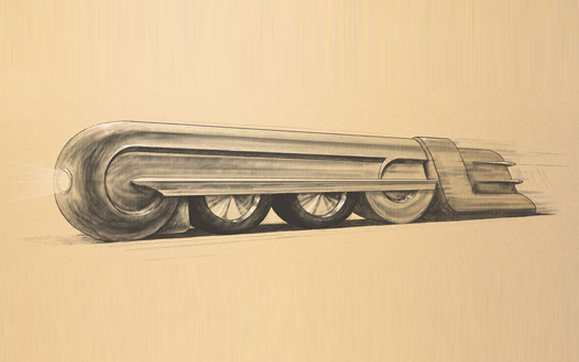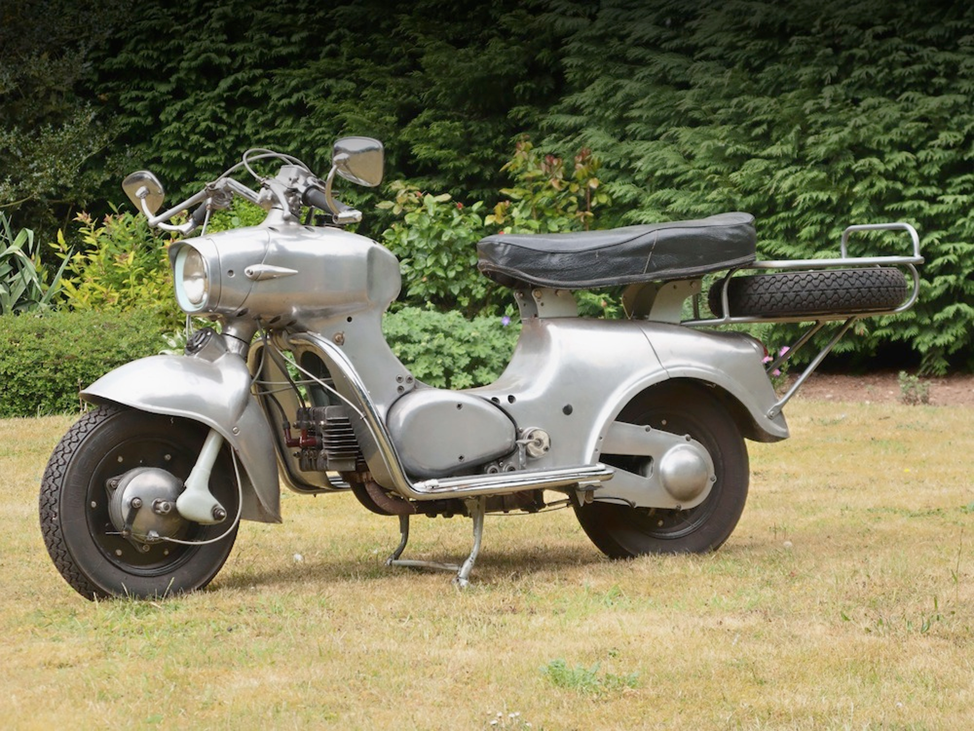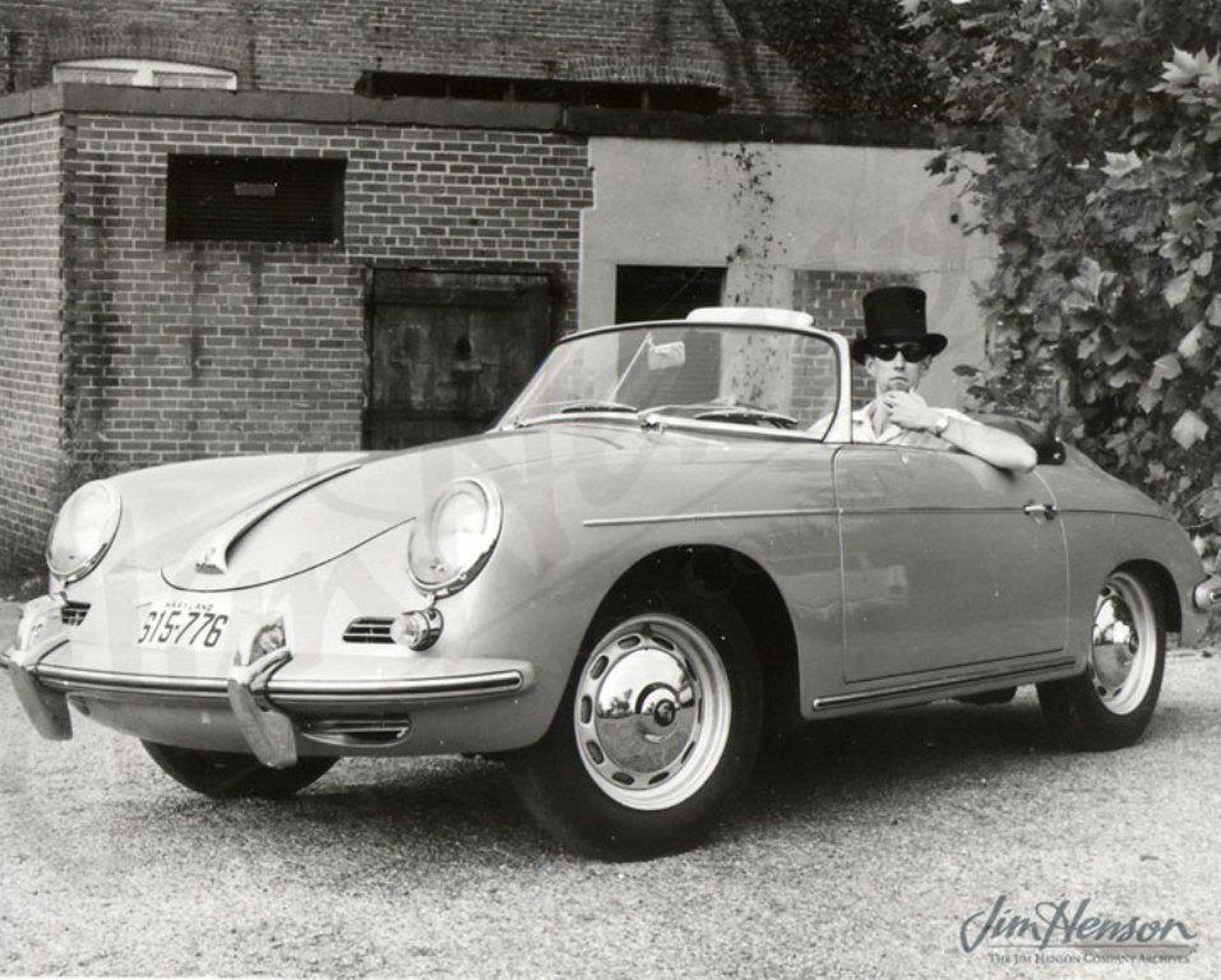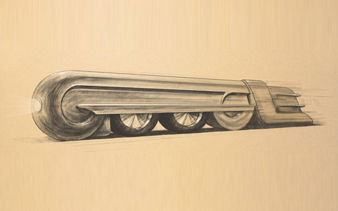
above > homage to the prr s1 | 1939
My first Google on 5 November 2013, would begin a six-degrees-of-separation-like day. I recognized the the clever train doodle and its designer and correctly guessed it was Raymond Loewy’s birthday – the 120th! Image gathering would have to happen later in the day after my evening design course.
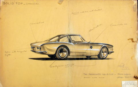
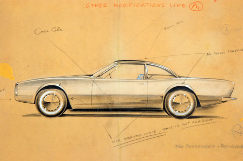 studebaker avanti | 1963
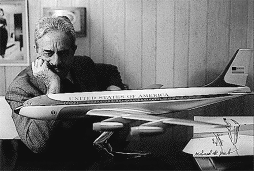 air force one (distinctive blue, white and chrome livery) at the behest of friend jackie kennedy | 1962
In my evening course I asked students if they knew who Raymond Loewy was and none did. They shouldn’t have known Loewy but most students don’t know many of their contemporaries either. It’s interesting that the work inspires them but not so much the designer. Loewy reminds me of the ‘I get it’ chain of events as a student who didn’t think much of what went on outside the classroom. I’m very grateful to my teacher and product design department head Timothy Trapp. He asked his class who wanted to go with him to NYC during Christmas break to visit the offices of George Nelson, Henry Dreyfuss and Raymond Loewy.
Six students and Tim made the trip in his VW microbus. Our tour at Loewy was given by head of engineering Walter Stern who would become a client of mine 16 years later. Hard to believe I hadn’t heard of Dreyfuss or Nelson. Stern brought up Braun designer Dieter Rams which inspired me to buy a Braun shaver while in New York. Later in the 90s Stern suggests that I ask Rams to be a guest speaker at The Art Institute of Chicago. Following the lecture and dinner I walk Dieter back to his hotel. As I’m about to leave he says wait, goes up to his room, and comes back with two Braun watches. I never met Dreyfus, Loewy or Nelson. But I got to know them and now looking for a job that research led to Jay Doblin at Unimark in Chicago, who introduced graphic designer Herb Pinske, who sat down with me and went through a 27 Chicago Designer book looking for offices that interested me. I picked six and one hired me.
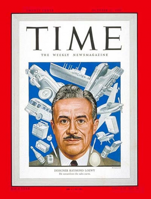 time | 1949

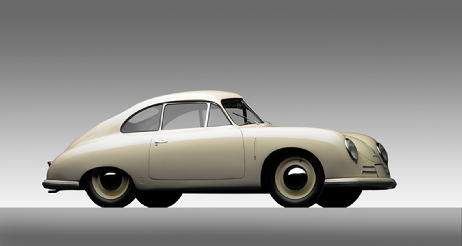
above > loewy coupe | studebaker | 1953>4
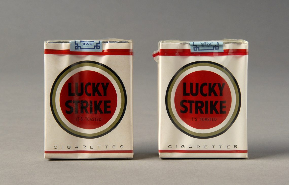
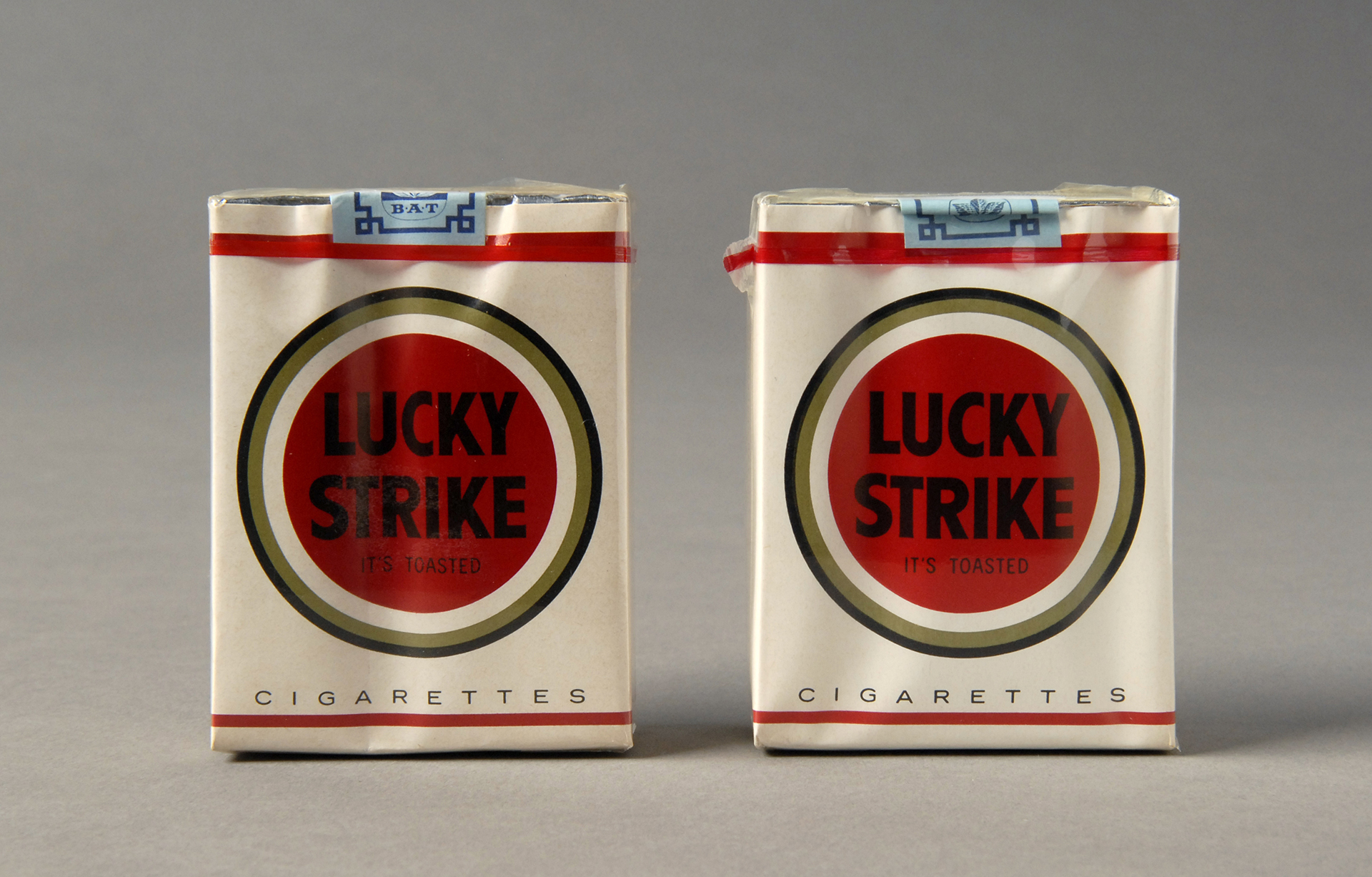
above> logo and package | lucky strike | 1942
I concluded that Dreyfus was a sign, symbol and human factors guy, Nelson a writer, Loewy an innovator. Dreyfuss and Loewy went after similar projects: big companies, industrial, many technical moving parts, where function may have held more sway over form. Loewy was an articulate, persuasive creative force: what an amazing follow up from the PRR K4s to the S1 and T1. He thrived in transportation creating aerodynamic simplicity, not creating ‘artforms’, but many would fall into ‘classic’. Objects that could look speedy, even at rest. Though he didn’t produce much furniture he was skilled in interior design and maybe could have been an art deco architect. He dabbled in fashion and advertising when he was creating consumer goods where the fashion statement was clean and the ads evoked some attitude. He could talk design to the business world and was surnamed: ‘The Man Who Shaped America’ ‘The Father of Streamlining’ ‘The Father of Industrial Design’ and descriptions of his solutions included ‘ first’ ‘only’ ‘biggest’ ‘best’| Dreyfuss died in 1972, both Loewy and Nelson in 86
 1893 > 1986
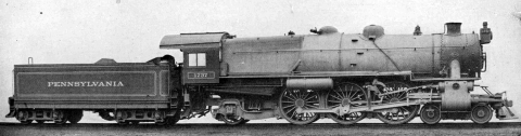
1> prr k4 | widely considered to be one of the greatest steam locomotives of all time | 1914 > 28 | image courtesy library of congress
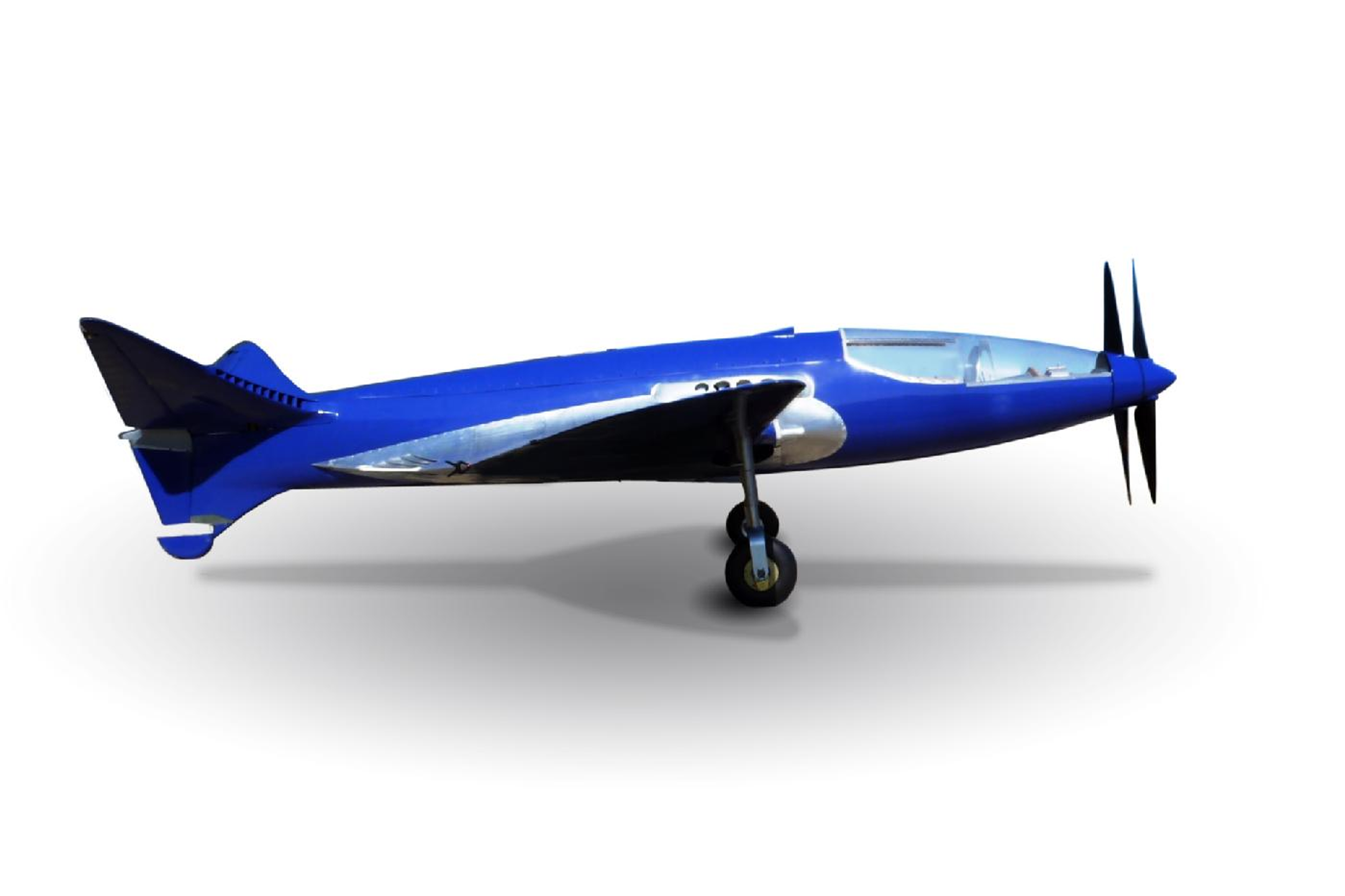
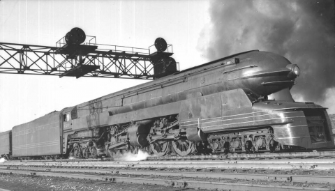
2> The prr s1 | a single experimental locomotive, the longest and heaviest rigid frame reciprocating steam locomotive ever built | 1939 | image courtesy library of congress
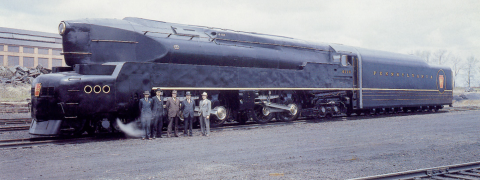
3> prr t1 | pennsy’s last steam engine before switching to diesel | 1942
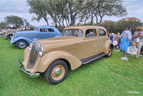
4> avanti | studebaker | 1963
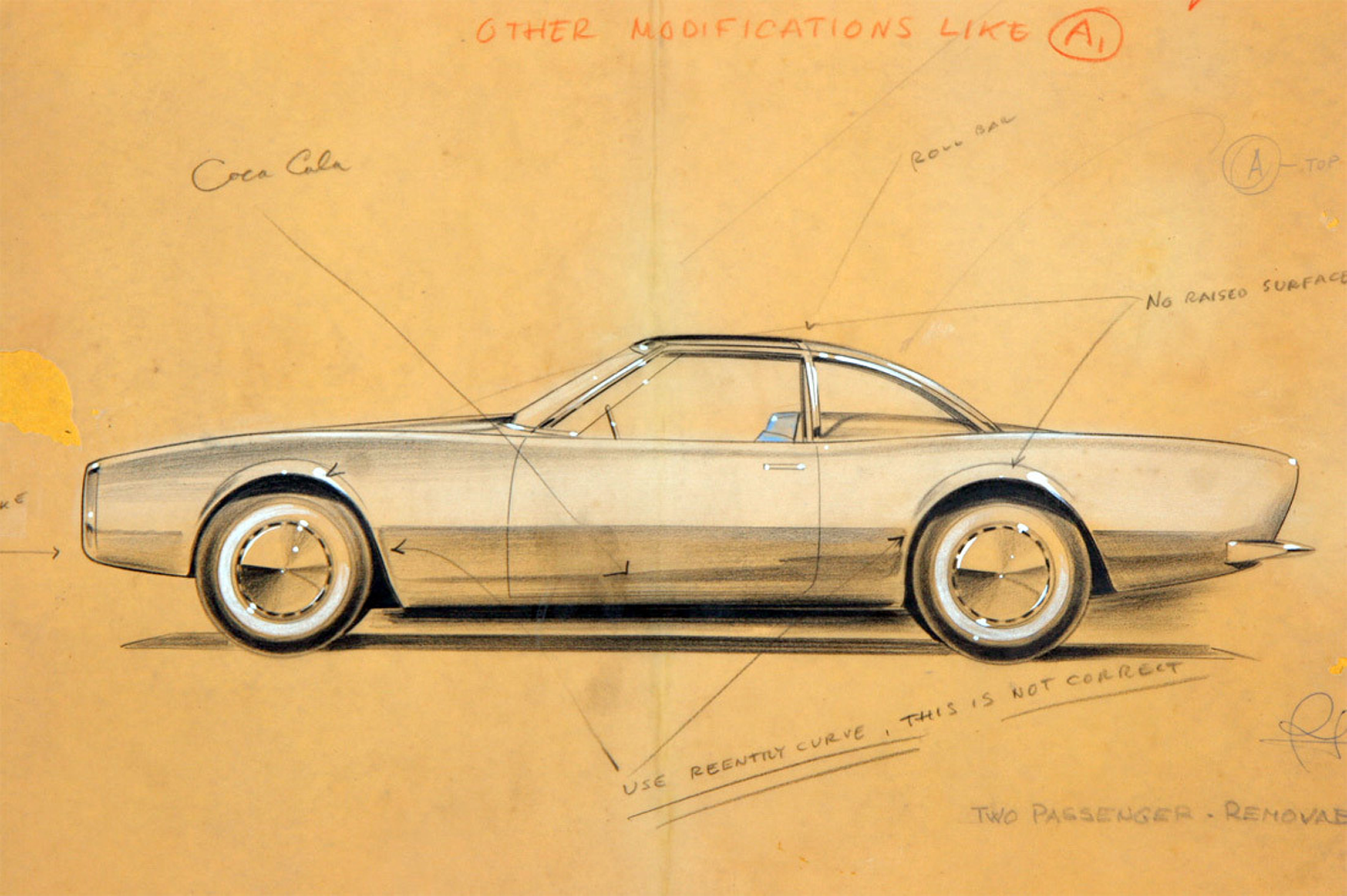
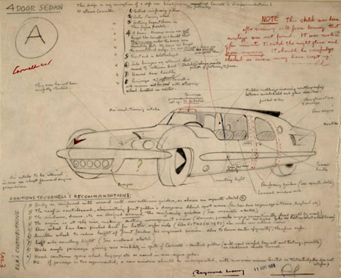
5> cornell-liberty safety car sketch | cornell aeronautical research laboratory & liberty mutual life | 1956
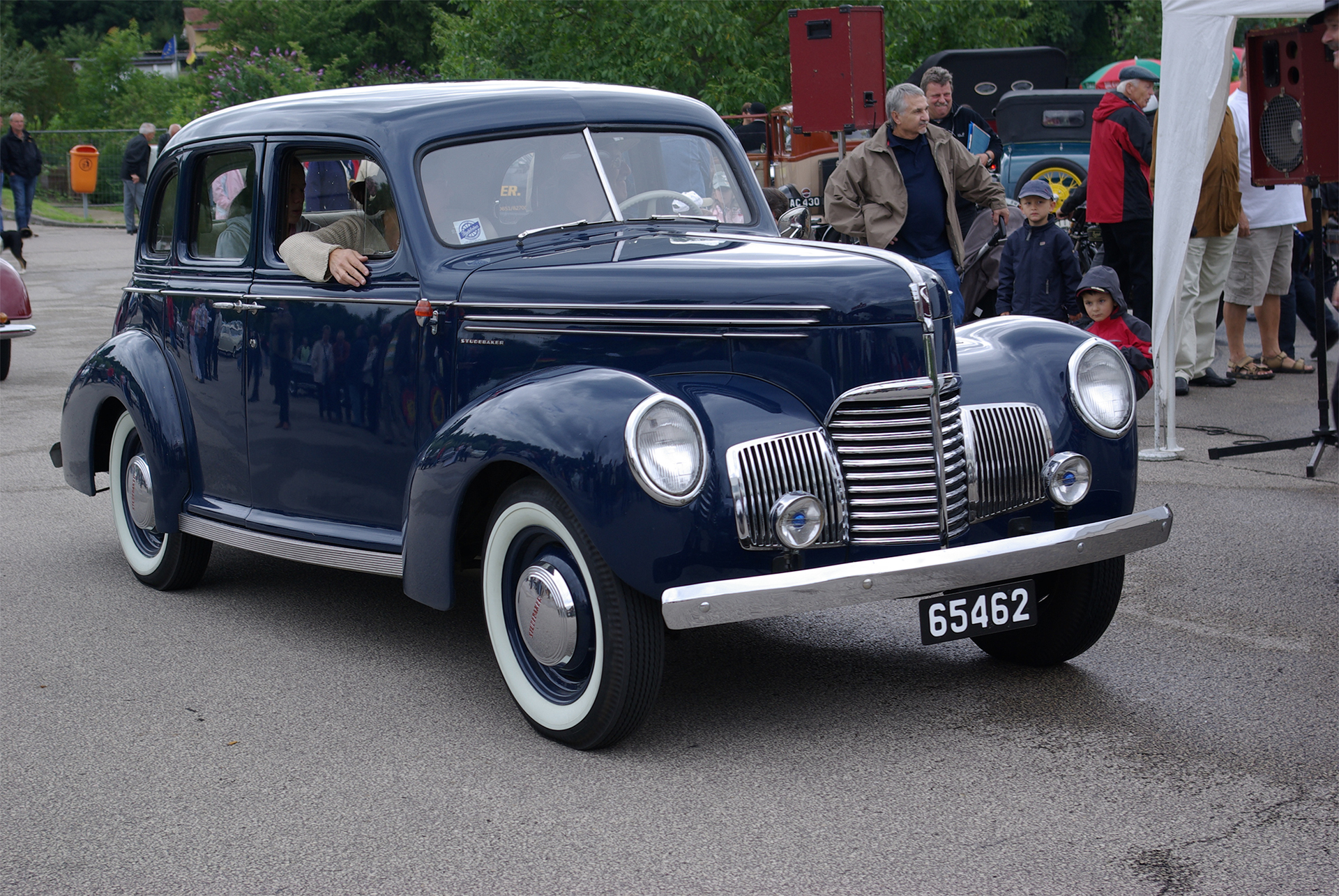
6> champion regal deluxe starlight coupe | studebaker | 1950
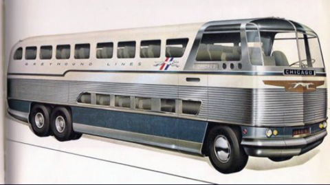
7> scenicruiser | greyhound | 1946
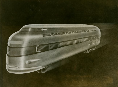
8> concept double-deck bus | new york world’s fair | 1939
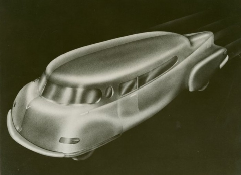
9> concept car | new york world’s fair | 1939
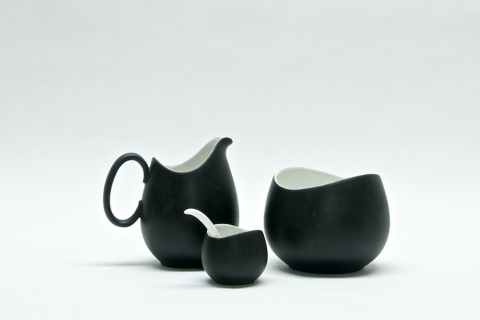
10> charcoal collection | rosenthal | 1950s | image courtesy hagley museum and library
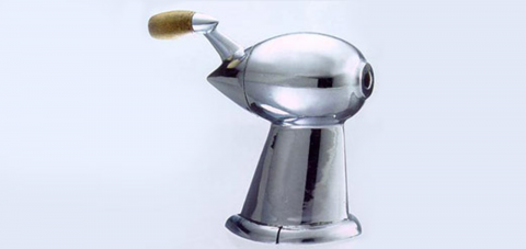
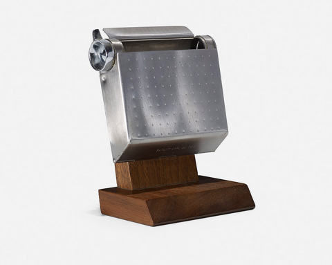
11> pencil sharpener | 1953
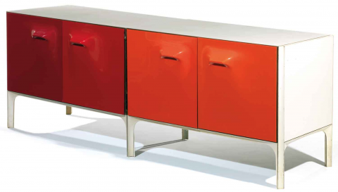
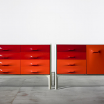
13> df-2000 | image courtesy of wright
14> scenicruiser ashtray prototype | 1952>3 | image courtesy of wright
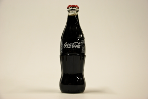
15> coca cola bottle redesign | eliminating Coca-Cola embossing and adding vivid white lettering | c 1955
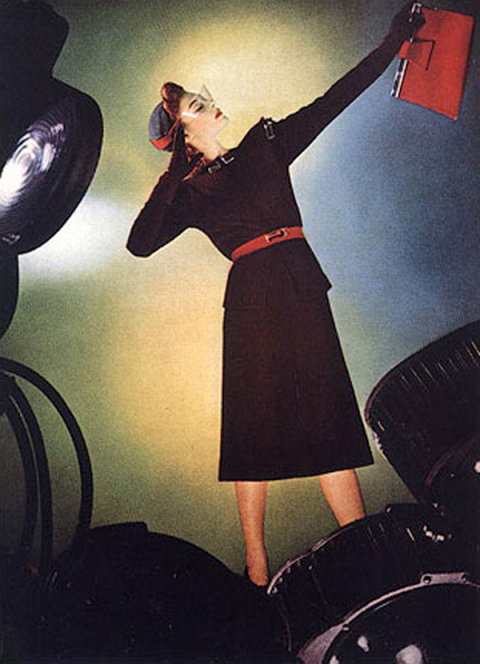
16> modern black ensemble with matching accessories appeared in Vogue | 1939
17> formica |
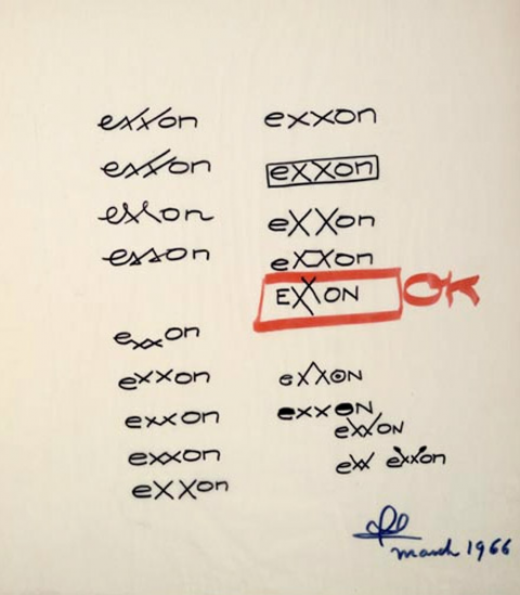
18> logo sheet
19> working at palm springs home
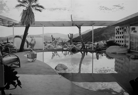
20> loewy house palm springs | albert frey & loewy designed pool and chose wood cladding | 1946>7
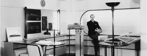
21> Loewy in a mocked-up designer’s office | model of his 1932 hupmobile, one of the first streamlined automobiles | c 1934
[ dieter rams ] [ braun watches ]


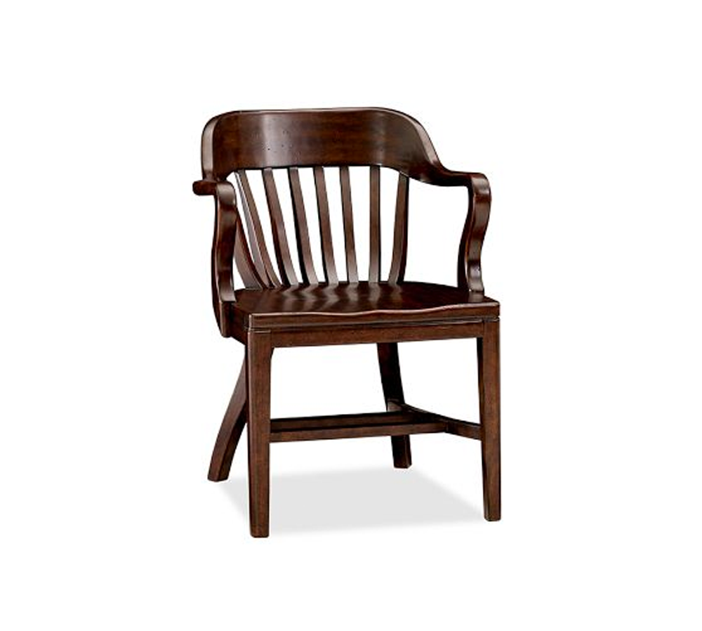 windsor chair | 1940s