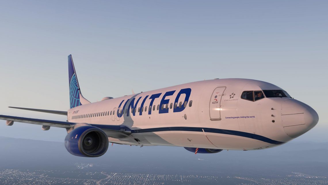
is the united airlines new look bad? no. is it great? no to that too. it’s one of those happenings that’s not good enough to wow you at first glance that’s for certain. then you get used to it.
the oversize logotype reminds us of jetblue and may not work well on the smaller aircraft. the tired continental airlines globe, a sluggish choice, never rose to the rarified air of george gershwin‘s lofty rhapsody in blue anyway.
come to think of it haven’t heard a united advert for some time.


