is the united airlines new look bad? no. is it great? no to that too. it’s one of those happenings that’s not good enough to wow you at first glance that’s for certain. then you get used to it.
the oversize logotype reminds us of jetblue and may not work well on the smaller aircraft. the tired continental airlines globe, a sluggish choice, never rose to the rarified air of george gershwin‘s lofty rhapsody in blue anyway.
come to think of it haven’t heard a united advert for some time.


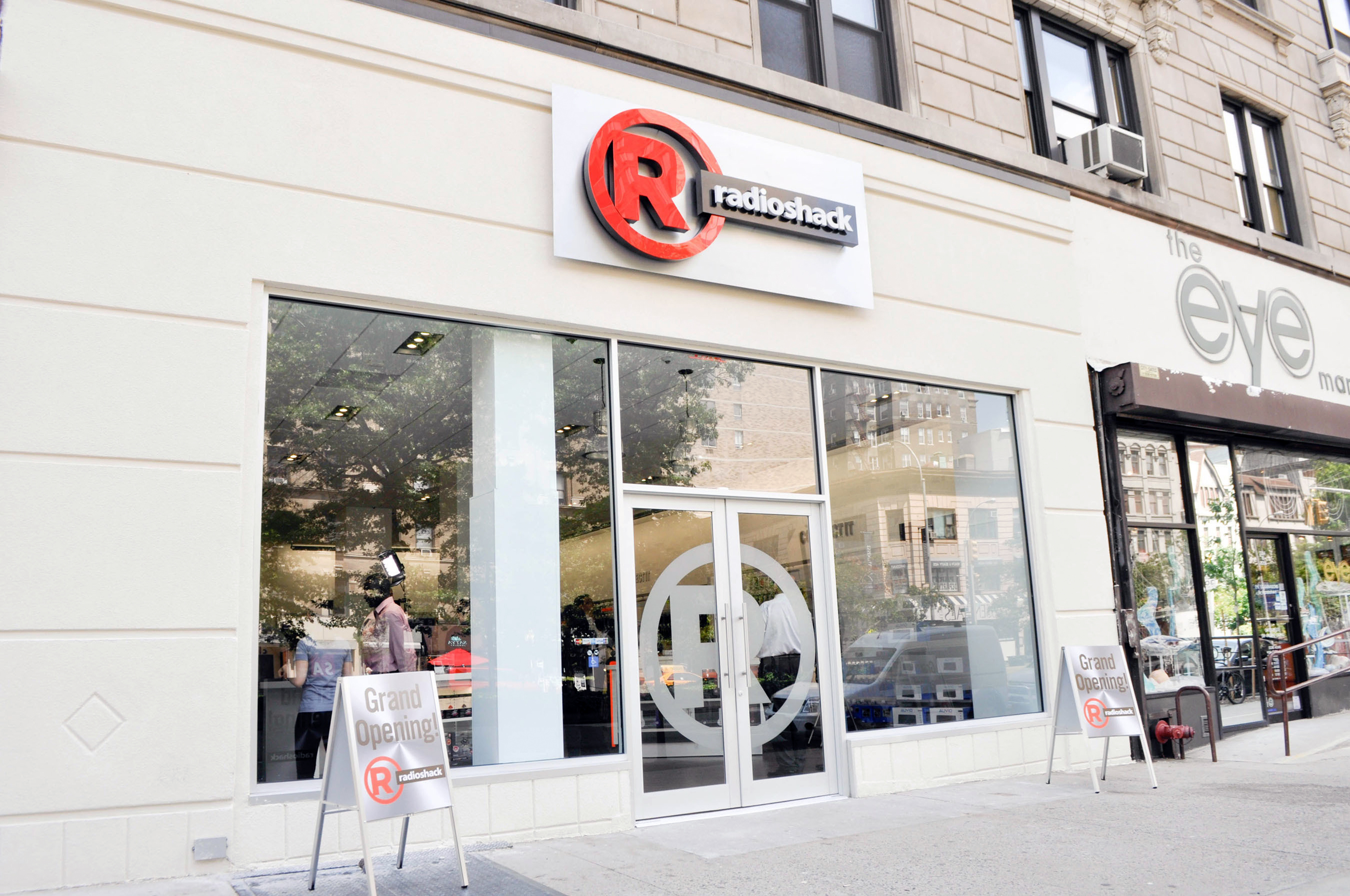
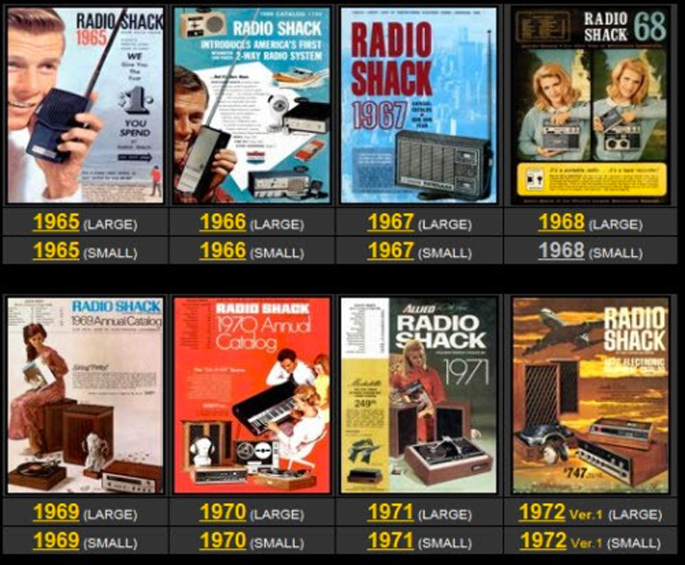
RadioShack stores are closing up one by one across the country retiring like the baby boom generation whose culture it serviced. RadioShack was a place to get spare parts. RadioShack supplied the strange entities called tubes for radios and television sets. Behind the clerks who were never the brightest was the whole area of accessories known as “the grommet rack.”
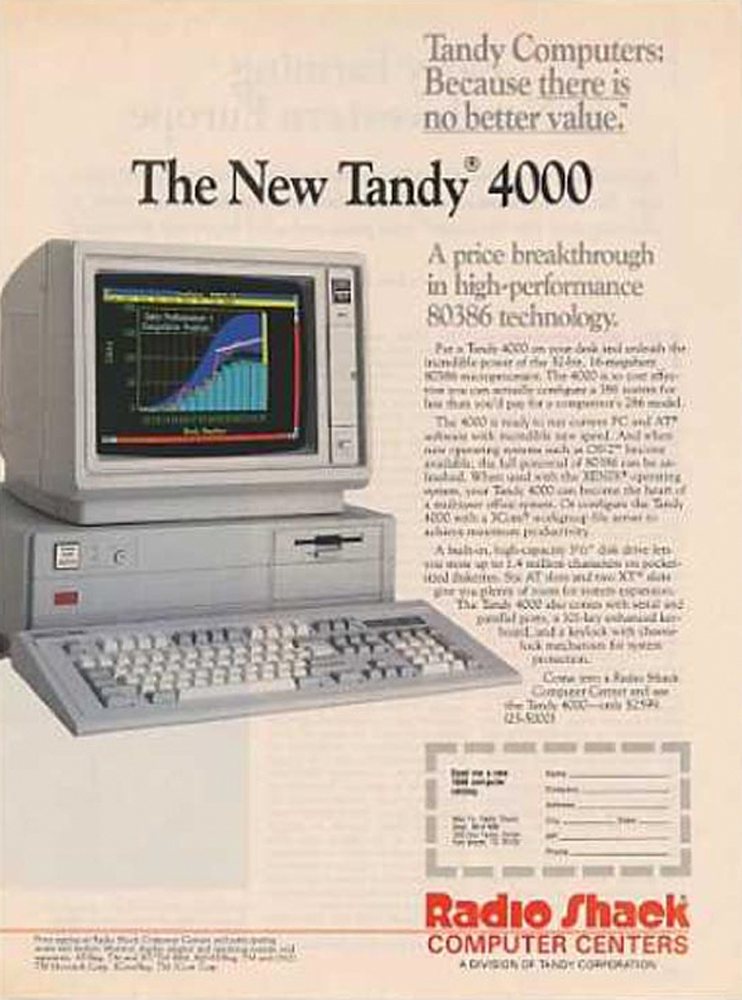
We hardly think of RadioShack as a design store but it was. The RadioShack provided supplies for those who created the mobile phone and the computer and indeed it supplied America with the first personal computers. But today we live in the age of the app. Like many electronic stores they have nothing left to sell but mobile phones. Now that it is closing we can understand what it contributed.


above> tandy 400 ad – 1987
 about phil patton