 collection > no whining on the yacht | carpenters workshop gallery | 2013
[DesignApplause] We’re talking to architect and artist Johanna Grawunder. Please share a little bit of your background?
[Johanna Grawunder] So I’m an architect. I trained in California, at Cal Polytechnic State. And then, at a very young age I moved to Florence to finish my degree in architecture and staying in Florence an extra year. Then of to Milan to work for Ettore Sottsass and ended up staying there 16 years. With Ettore I was doing mostly architecture. I became a partner in 1989. In 2001, I went out on my own. And since then I’ve been doing mostly limited edition art, furniture, custom commissions, some interiors, a little bit of product design.
[DA] Well you know what, you’re American bred, but you have the European combination of all the disciplines. How do you feel about the saying, ‘if you want to be a famous architect, design a chair.’
[JG] The chair is very difficult. I was telling you before about designing jewelry. Jewelry is an object that is so interactive on the body, very physical, a direct interaction and a little different than architecture where the body’s in space, moving through it. A chair is probably the piece of furniture you interact with most. A sofa is a little forgiving, because you can sit and lie on a sofa so many ways. But on a chair, pretty much everyone sits the same way. It has to be ergonomically quiet, you know, perfect and steady. And there so many really perfect chairs I have a difficult time thinking, what can I add that’s new? Whereas with lighting, I feel that there’s a lot I could still do as well as other kinds of more abstract forms of furniture. But a chair, someday, maybe someday.
DA: I predict your chair is going to be terrific. Describe your lighting. What do you try to achieve? Tell us about the white one with the panels. Zoe Ryan from the Art Institute of Chicago picked that out as one of the favorites at DesignMiami 2012.
 line light | carpenters workshop gallery | 2012
[JG] That would be Line Light. I was very happy about that. They have one of my pieces in their collection, which is nice. Line Light is made of aluminum, steel and brass, LED bulbs. It’s a luminous wall light or a bas-relief sculpture, which plays with the surface of the wall it detaches itself from. Its arrangement means the light composes a veritable palette of colors, white and black modulated at will, reflecting off the wall to become a singular, ephemeral work of art.
[DA] Let’s talk about your light that’s in the Art Institute. Is it an LED light or is it a normal, energy-chewing bulb?
[JG] The Art Institute has ‘Boxy’ a luminous table in glass produced by Glasitalia. And it is LED. So, we’re good there. (Both laughing.) From the very beginning, even before LED was quite common, I used fluorescent tubes. At the time when I started doing them, the early ’90s, it was actually more for the form than thinking about the energy conservation. Because that wasn’t really on Milan’s design radar at that point, and it wasn’t really on my radar.
Although in the back of my head, I knew this was actually also a good form of light to use. But I was using it more for the form. When LED came along, there was this added advantage of the energy conservation. But as well, now, you can do so many different things with LED. When I started thinking about using LED, I didn’t feel like it was really ready for prime time. It was a novelty, and quickly was facing extinction because of the poor quality of light. Now I can use LED on almost anything.
[DA] Jake Dyson said the problem was you couldn’t get a reliable chip, and reliable chips have now been out for five years.
[JG] Lighting is polarizing for many right now. The incandescent is sufficiently entrenched and the options are expensive to switch to LED no matter what side you take. [ an aside: this conversation was a year ago and today there’s a shocking abundance of LED options. Home Depot was very smart to totally commit to LED before everyone else. ]
[DA] Making such a conceptually big switch in product is hard to visualize for most and even harder to execute. The car industry is trying to figure it out too because of the electric car.
[JG] But in the car industry, you have the third party, which isn’t just the car maker, it’s the oil companies. I didn’t mean to get so political so quickly.
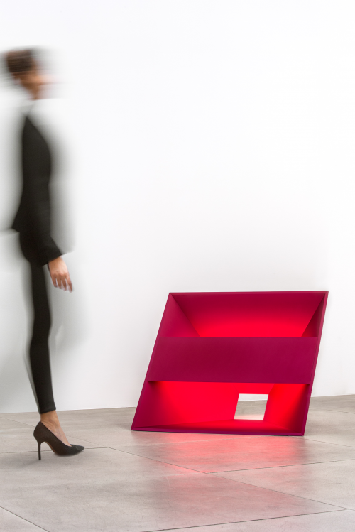 pink void | carpenters workshop gallery | 2013
above> Pink Void, exploits hot pink anodized aluminum to cast a warming glow sure to enhance any interior environment. Simultaneously minimalist and bold, the floor lamp was inspired by a snapshot Grawunder saw of sunlight reflected on mirrored barn doors.
[DA] Let’s continue that thought. How does ‘design’ bump heads with politics?
[JG] The green issue is very interesting. You could say, ‘Well I’m only going to use recycled materials.” But if you say that, you’re still not discouraging the originator of the plastic bags. A philosophy I practice is to use the least material possible. If for one of my pieces, it turns out that steel provides the most thin, lightest, most performance efficient material, then I’ll use steel. We also should take into consideration the amount of energy and bad byproduct waste it takes to reach market. Does that make any sense? It’s not original. Frank Ackerman comes to mind.
[DA] So, if you want to design a ball, you will turn it into a whiffle ball.
[JG] Exactly. Now I don’t do light with regard to weight, nor super, super light. And I’m doing quite large, architectural-scaled abstract pieces. But within that world, trying to use the least amount of material as possible. For example, the Line Lights is comprised of mostly the LED, the rest of it is just a very thin aluminum panel.
[DA] What about that nice, black coffee table I saw at Carpenters Workshop Gallery?
[JG] The coffee table is aluminum too.
[DA] And uses Tron lighting. Was Tron (the movie) in the 70s?
[JG] You are not the first one to bring up Tron and I looked it up: 1982. Blade Runner too. It was ’80s. It was actually, I, I re-looked at it recently. It was right- I think it was a year before Blade Runner. The first one. (DA: Yeah.) And then the second one came out a few years ago, but the first one kind of blew my mind. (Laughing.)
[DA] Not meaning to be cruel but when did the Tron concept burst out of the table?
[JG] I’ve always sort of put light into my furniture and I count light as another material. I think of light as a kind of paint, as a kind of color, as a way to give an extra sort of soul.
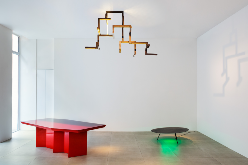
In that table called ‘Platform’ I didn’t want an ‘big’ light, nothing to obvious, not a hybrid light that’s also a table. It was really about a table that just has a slight delineation of light. The gallery (Carpenters Workshop Gallery) was a big part of the concept discussions and everyone was pushing for less and less light. They wanted it even more mysterious. Just a few little pieces here and there. I like it and think it worked.
[DA] So they were a good client?
[JG] A very good client. (laughing.) I think of them more as a collaborator.
[DA] What’s the conception to finished piece process like?
[JG] I first presented the collection pieces, maybe 15 drawings, two years ago earlier. We met here in Miami, and it took a year and a half, which is a little longer than usual but I wasn’t in any hurry myself. I hadn’t done a custom collection like it for a few years, and I wanted to finish things that I had already started before concentrating on this collection. We modified things. We made prototypes. We went to Italy to check the engineering out up close plus thousands of Skype meetings from San Francisco.
All of these pieces were made in Italy. The artisans are fantastic. The two pieces you’re referring to were made by artisan Marzorati Ronchetti. We’re talking about six pieces of each design, so it’s not really an industrial thing.
[DA] Why do you like doing limited edition?
[JG] For a couple reasons. I don’t necessarily want these things following me for the rest of my life, you know? In 20 years someone says, ‘I like that table, can you have it made?’ I’d rather just be done and have moved on. And the limited edition model is good for collectors. And it’s a way to keep being able to propose new things, because if you wind up creating that crowd-pleaser piece you get through that and get out. The designer now has many more opportunities to create.
[DA] Have you done anything that was a production piece?
[JG] I did some lighting for Flos. And glass pieces for GlasItalia and vases for B&B Italia, a mirror for Boffi.
[DA] So it doesn’t really make any difference whether it’s limited or production?
[JG] In a perfect world it wouldn’t. But in a realistic world, I have a lot more creative freedom doing limited. With limited the galleries only have to worry about selling it six times. If you have to sell thousands I have to change my design so a thousand people like it and can afford it. And I feel I can research and experiment more with limited than I would with production. Although more recently, the production side is also having to take more risks than before, just to stay relevant, so both limited and production are sort of converging and good companies like Flos and Glasitalia totally get that.
[DA] The client is a big influence with regard to research and experimentation. Well, it seems like everything takes about 2 years, no matter what.
[JG] That’s interesting, yes.
[DA] When I saw the coffee table I immediately thought of Ad Reinhardt. I learned about Reinhardt because I decided to paint and it took a few years to actually stretch a canvas and put paint on it. I didn’t trust my tools and I didn’t want to ruin my reputation. It was starting from point zero to paint. My first painting was a black six-foot square and people were asking me if I knew Reinhardt.
[JG] (Laughing.) Uh oh, did he do a coffee table?
[DA] I don’t think so.
[JG] I like your story, because I’ve had people reference me to Donald Judd or earlier work people said Dan Flavin. Of course you get influenced by things, but it’s really indirect. I mean, really indirect. And whether that’s intentional or you get it through osmosis. I see stuff now that even younger designers do, which is very derivative, not necessarily of me, but sometimes, you know of other people too. And it makes me more forgiving, because you realize, well maybe they saw that in DesignApplause or something. But maybe they just picked it up in the ether and, or maybe the thought process brought them to the same point. If you came up with the black square by a very pure thought process, you’re in good company. Ha. (Laughing.)
[DA] Like my memory is not very good. (JG: Join the club.) Especially the ‘instant recall’ But mostly a result of our selective memories. I think our influences, our inspirations are selective also. I mean, there are some things you see and you never forget it.
[JG] We’re pre-programmed to react to that (DA: Totally.) not to the other thing, yeah.
[DA] Can you think of anything that was alien, what you thought was unique, and you did it, you got it?
[JG] When I did it, and I got it? That’s interesting. I have to say, when I first went to work at Sottsass, I was just out of college, and my intention was it was only going to be a summer job and then back to California. His layers of, um, sensoriality, was really quite alien to me. Because I had, I think, a kind of minimalist soul. I had studied modernist architecture and grew up in a California modern house. So to go up there and see this like total orgy of color and texture and forms, in fact, was a little bit alien to me.
And I didn’t fight it, because of course he was the master and I was a lowly draftsman for the first few years. Slowly, I started to understand the reasonings behind it, that it wasn’t kind of this irresponsible, crazy, what people were calling it ‘zany’, you know, wacky- it wasn’t that at all. It was a very serious, political statement about design and how we live, the choices that people are given. So, from that, I tried to get into that a little bit. And some of the first work I did on my own was probably much more influenced by Memphis and by Sottsass.
Since I’ve been out of that, not out of it but stepping out and trying to make my own way, I find myself coming back to a more of an original root. Of course, now, hopefully much enriched by this incredible experience I had at Sottsass. And certainly not superseding in any way, but my natural tendency is to be more reductive. And to be a little bit harder, in a sense. And more what I was considering architectural, which was these abstract, straight line forms. Does that make sense?
[DA] Yes. So what was it like working for Ettore and what did you learn?
[JG] I learned enough that someday there might be a book. (Laughing heartily.) I doubt it, but there’s a lot there. It was just an amazing, mind-blowing experience to go up there. First of all, you’re a Californian living in Italy, is already a pretty amazing experience. A lot of people have done it. But he in particular, he was really a master with a whole school of thought. And he’s seeded so many different designers out of that school, who’ve traveled different roads and found different ways of expressing themselves.
I think that’s his main lesson. You have to find your own innate road and then work it and believe it, trust your instincts, but be very aware that every decision you make is – I keep using the word political- because he used that word- it’s actually a political decision.
If you’re using gold, well that means something culturally. That means something in the history of design, but it also means something in the history of class warfare. You have to be very aware of what you’re doing at any given time. And that was a huge lesson. To understand that everything you do has meaning and sort of reverberates in one way or another to what you really believe. If you’re true to yourself.
[DA] You worked with him for such a long time, how would you describe what his mission and vision was? What was his thing? What was he trying to do?
[JG] I worked with him probably I think longer than anyone, except for his original partner, Marco Zanini, I was there 16 years straight. And I do not feel, what’s the word?
[DA] Qualified?
[JG] Qualified. Thats the word. I don’t really feel qualified to try to summarize that. I can only say what it meant to me. So for me the lessons were what I was saying, everything has a reason. What may surprise many, he had no tolerance for decorative things, even when they were definitely the easier way to go. And even though people thought it was decorative. It was instead very precise ways of moving things around. I never heard him say, ‘I did this because it’s cool.’ Or, ‘Yeah, yeah I liked it.’ Or, ‘Well, let’s try that, the kids like it.” I never heard that kind of thing. It was always a very specific discussion about the meaning of things, and finding ideas and inspiration in common places, like the latteria on the corner by his house, which had a crazy op-art plastic laminate counter, in the 70s, and the thing is, he ‘saw’ that, he was open to that kind of stimulus.
And he was so very important in the history of design and you can see his influence all over Miami.
You know, Memphis and Alchemia before Memphis, were the original limited edition design, an experimental kind of really crazy, not normal, not production furniture. It was the first time they were showing these pieces in galleries. In 1981, the first Memphis show was actually in a gallery, and you know, it was a whole new thing.
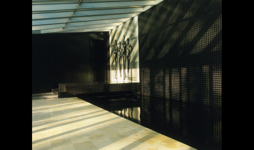 sottsass associati | ettore and johanna collaborate |
Before then, it was rare to see heavy, heavy experimentation with furniture, with few exceptions like Joe Colomobo, or the Radical Design shows in the 70s. In fact only recently has this area been dubbed art design. I think it was dubbed pretty much for Design Miami. With respect to my pursuit of limited edition helped me in the States. In Europe, limited edition design, experimental design was in place at this time. There were people collecting and or just wanting to see it. But in the US, I had a very difficult time early on explaining what I do. You know, they understood furniture design and craftsmanship. So when I did a show in San Francisco in 2003, with pieces from Europe, and people asked me questions like: ‘So you’re a glass blower?’ Because I had pieces in glass. Or, ‘Are you a metal worker?’ Because I had things in metal, and I had to explain, well no, I’m a designer.
Oh, but so are these in limited production? It was a very complicated thing and I think that the market here- although I hate to give the markets too much credit, but it’s been hugely important for this particular field. How valuable this field is, that’s a different question. For me personally, it’s valuable. I think for the history of design, it should be valuable. It’s valuable if product designers are seeing experimentation and using that patrimony of knowledge that comes out of doing prototypes and things like that.
[DA] I’m going to have to learn when and why the design galleries emerged.
[JG] Now I’ve got to check my history, because I’m thinking more 50s’ and 60s’, such as work by Jean Prouve for example, wasn’t really made for galleries. Those were commissions of private people or institutions asking to fill this government building with furniture. The fact that French dealers went in and saw the work and realized what it was and took it out of that context and then put it in a gallery. That’s a different situation.
[DA] Do you feel there’s supposed to be a design statement in your work? Or is it individual?
[JG] For me, after some years of experience, I feel it’s a little bit more individual. It doesn’t mean that I’m creating in a vacuum, but I don’t really necessarily try to consider design history or the direction of how design is going. I feel like it’s a little bit more my own personal road at this point, but hopefully a road that is still extremely valid. And takes advantage of new technology and philosophies about use of materials, any new materials, any new ways to control light. The materials, the technologies do drive the process but form and color, that’s more individual.
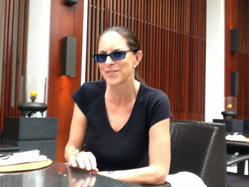 johanna | satai hotel miami beach | 2012
And I am aware when the street is going in a totally different direction, you know, the design street, I should call it. For example, a lot of very Expressionistic and almost organic. And I just don’t feel that’s my road. I’m an architect by training. I like straight lines. It doesn’t mean I won’t do a curve now and then, but I do like straight lines. I like the idea of order and geometry and to follow the basics, which would be technology, material science, function. And my respect for architecture and architectural form is really going to be hard to shake.
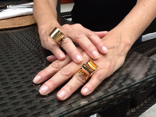
A final thing is designing within an urban environment. Space, or lack of space and lack of light pose challenges. These kinds of challenges for me are what hopefully will keep stimulating the design. (looking at her watch) OMG! Look what time it is!!
Johanna’s current work can be see at [ carpenters’s workshop gallery ] during Design Miami 2013
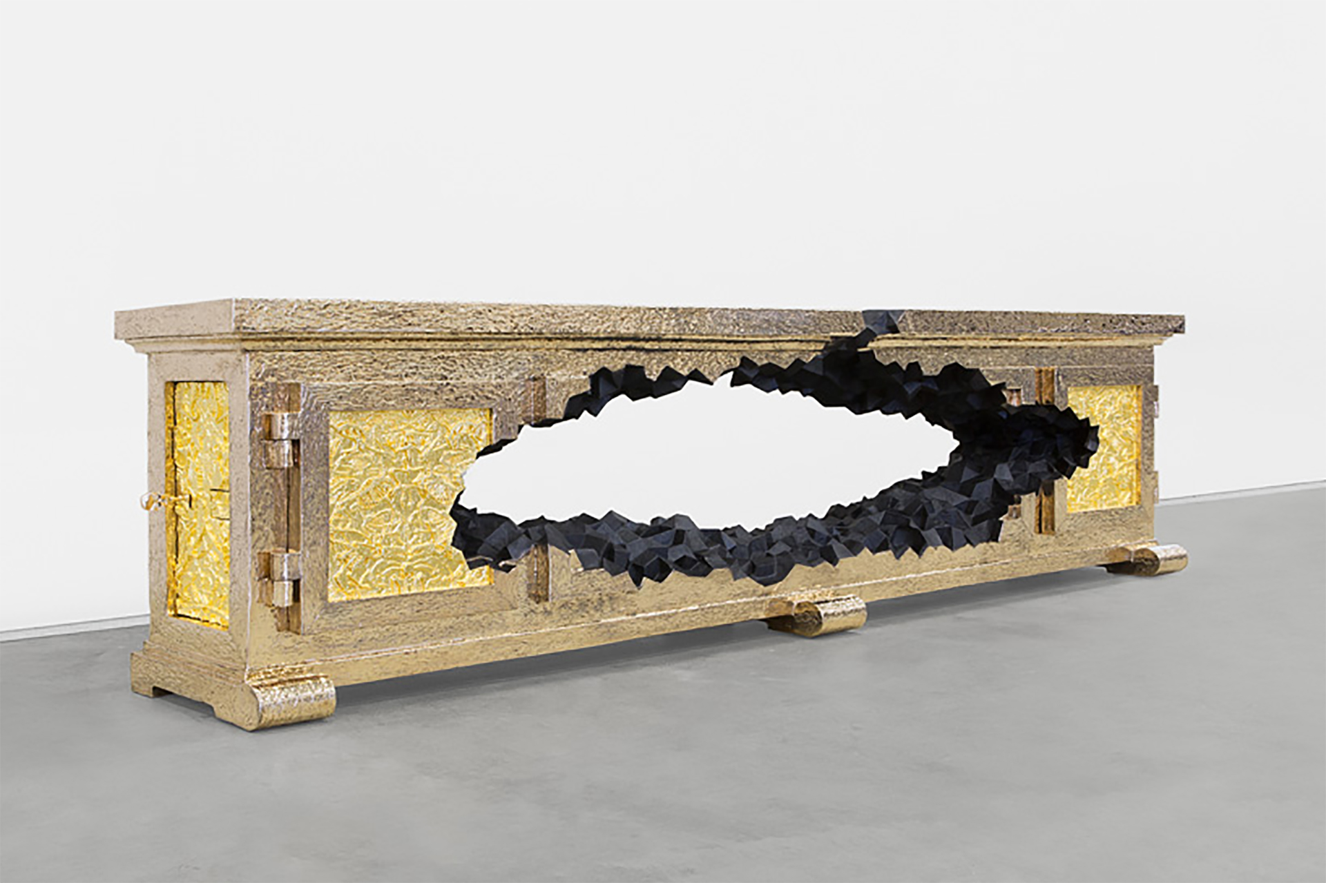
1> gold bar | carpenters workshop gallery | 2013
2,3> red devil | carpenters workshop gallery | 2013
4> line light | carpenters workshop gallery | 2012
5,6> platform | carpenters workshop gallery | 2012
7> corner light | carpenters workshop gallery | 2012
19> millerighe | acme studio


