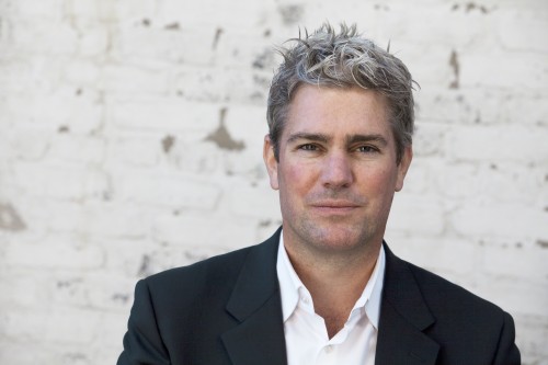
 photo > michelle litvin | click > enlarge
[DesignApplause] We are talking with Chicago Architect John Ronan in his office. John recently was awarded his second 2012 AIA Institute National Honor Award for Architecture for the Poetry Foundation building in Chicago (The Gary Comer Youth Center won in 2008). John, before we talk about the highly recognized Poetry Foundation and other efforts, why don’t you give us a little bit of an idea of your work environment and a little bit about yourself.
[John Ronan] I’ll start with the work environment. We have as you can see an open office. We’re in a big concrete loft. Big open space to kind of foster collaboration and interaction with staff. We have a model shop with a laser cutter and so forth. We make all our models and drawings in-house. Creating physical models are a really important part of our design process. It’s a pretty good model shop. And then the usual conference rooms, library, pantry, kitchen, stuff like that. And lots of light. We recently moved. For many years we were in a timber loft not far from here. But the noise became unbearable so I looked around for a concrete loft and I found this place.
[DA] It was dusty too.
[JR] Yes, the dust was getting all over the models and people up above were watering the plants and water was coming through the ceiling. It was time to go. A little bit about me. I was born and grew up in Grand Rapids, Michigan. I went to the University of Michigan and earned a Bachelor of Science degree. Then I worked in Chicago for Stanley Tigerman for a two years before going to and graduating with Distinction in Architecture at Harvard in 1991. I then came back to Chicago and worked for Krueck and Sexton and Dirk Lohan before starting my own firm. I started out like many people do, doing interiors, galleries, and some residential projects. Then my first house which led to my first building that wasn’t a house, the Akiba-Schechter school in Hyde Park. Things just kind of snowballed from there. I never wanted to be known for a specific type of project, so we do a wide range of work. Ranging on the upper end with master planning down to furniture and products at the smaller end. But most of our work is buildings, and most of those are institutional at this point.
[DA] Are there only architects in the office?
[JR] I look for people that can add something to what we do. It’s akin to building a sports team. Yes, they’re all architects or training to be. Having said that, they all bring something different and unique to the office. One guy might be very technologically savvy and know a lot about digital fabrication. Somebody else might have certain interests they bring to bear on the work. So I try to look at those things when we’re hiring. Can this person contribute something to the work that we don’t currently have?.
[DA] Are most of the projects in Chicago?
[JR] No, we work all over the country. We work in Europe and in the Caribbean. Some of my better known projects are in Chicago, though, like the Poetry Foundation and the Gary Comer Youth Center.
[DA] What’s your process like?
[JR] When we get a project, I like to think about it for a couple of weeks. Usually there’s sort of a programming period where we’re finding out about the project, asking questions. We start out with research looking for things that might impact the project. That research could be anything from sociological to very technical in nature. Environmental research too. Anything that I think might have a bearing on the project, so maybe we’re looking at the history of the site. We’re also researching the program. What is the context of this? The situation of the project? How did it come to be? Why are they (the client) building this now and in this location? We’re trying to tell the story of the building. The research period is also a gestation period of thinking about all this stuff but not outputting anything yet. After this initial period, I now pump out every idea I can and in a very quick manner and begin sketching and creating sketch models. I’ll gather the team working on the project and together we’ll talk to see what makes sense. It’s very research and knowledge based, but also very iterative, looking at many different possibilities initially before it’s narrowed down to one direction. We might even be looking at a specific detail that’s critical to the project in three or four different ways before settling on the best way to proceed.
[DA] What’s your most recent project? Is it the Poetry foundation?
[JR] Our most recently built project was a 17,000 square foot technology training center for Smart GRID Technology at IIT. Smart GRID is a digitally- controlled electrical power grid that aims to use energy more efficiently and more transparently so that people can understand how much energy they’re using as well as a very flexible network to bring power where it’s needed. It’s a very green energy endeavor that Illinois is at the forefront of. We built the demonstration and training center to show what Smart GRID is and to train people for careers in the industry. Before that, the Poetry Foundation was completed last summer.
[DA] Let’s talk about the Poetry Foundation. It’s a special building for me because I walked by the site quite a bit it and watched it grow so to speak. The construction barricade told an interesting story too and I also thought what an unusual location for a Poetry Foundation, situated in a trendy retail and residential venue. What did you think of the site?
[JR] I thought the site was good and well situated for a number of reasons. One, it was not far from other cultural institutions like the MCA. The irregular L-shape of site allowed us to make the building more interesting. And the site was in the middle of an area that experienced a construction burst of large condominium buildings over the last fifteen years. This background plays well with the
notion that the Poetry Foundation was really meant to be something of a sanctuary in the city. I think the trend of large condominium buildings will only increase over time in this area. Perhaps in 20 years, in 30 years, this building will be completely surrounded by very tall mid-rise buildings and will become even more of a sanctuary as the open space disappears as this part of the city becomes more dense.
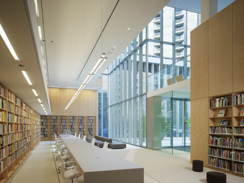 poetry foundation
[DA] How was the architect selected?
[JR] It was an interview process. The Foundation sent a request for qualifications to about 50 firms in the US and around the world. I think they narrowed it down to about 16 and sent requests for proposals. From those 16, they ended up interviewing 6 architects. Then it was narrowed down to 3. Then 2. Then 1. The interview process included giving tours of buildings that we had done. A rather thorough and lengthy process. I believe it took over a year to select the architect. In the end we were very familiar with each other.
[DA] Why do you think they selected you?
[JR] You’d have to ask them.
[DA] Are you into poetry?
[JR] I do read poetry. I was a literature minor in college and they could tell I was poetry literate to a certain degree, but I don’t think that had a bearing on the selection. It was the evidence they saw in my work and when they went to see the work. I think they felt I could do the kind of building that they were looking for, that I worked very closely with clients and was very invested in the work. Not someone that would design a building on a napkin flying on a plane from China to the US.
[DA] What were the goals and objectives? What were you trying to achieve?
[JR] The most difficult to articulate and the main thing I was trying to achieve, which the Foundation was sensitive to, was the kind of building that it should be. I wanted it to be a building that had maybe a little intrigue, that could not be understood in a single glance. Something that you would have to explore to experience. Something that would unfold spatially. Something that unfolds much like a poem unfolds line by line. Something that you could come back to and visit again again and get something new out of each visit. That kind of building is really counter to the prevailing trends in current in architecture which focuses more on “object” buildings that are unusual in their shape or form. What I was trying to do was something different. It was more about space and materiality and less about form. With an “object building,” you’re really on the outside of it with the form of a building; it excludes you, and is primarily a visual experience. I wanted something more inclusive, that had to be something you experienced from the inside to be understood. Architecture that would invite you into the world of poetry, and intrigue you too. Enter our world and explore further. And that’s what they’re trying to do with the poetry end of things.
[DA] Where these goals achieved?
[JR] Yes, I think so. One of the unusual things about their program was that they wanted to incorporate a garden in some way. The design process I pursue is about not knowing the end point before you start, so I started looking at strategies for incorporating a garden into a building. Instances of knotting, or overlapping or superimposing, for example, and then apply these strategies to the site in the form of a sketch model. One model in particular I felt captured this quality of an interiority or being experienced from the inside. You could see how it developed space by space, so we moved in that direction while foreclosing the directions of other schemes that did not have those qualities. In a nutshell, you’re not so much worried about the final end point but whether the next step is going in the right direction. If you know the end point before you start it can actually be very limiting.
[DA] In that context, I recently introduced my wife Barbara to the building and watched her, I felt, being sucked into the space. On that off-hour weekend afternoon a built-in barricade prevented us from entering the garden itself. We couldn’t go into the garden but could peek at things and nose around and before we knew it, we’re at the main entranceway of the building.
[JR] That’s exactly what we we’re trying to do. To draw you in and intrigue you. You can see the garden through the perforated screen from the street. You become more curious. You go into the garden and once in, you can look into the building and see the library and gallery, and understand that you have entered a literary environment. It sort of draws you in further. If you look back, you get these views looking back from whence you came. The thing starts to unfold. That was exactly what we were trying to accomplish.
[DA] The garden was probably to soften an urban statement?
[JR] The garden does a lot of things. One thing, it slows you down, intellectually and takes you out of the city whereas the site itself is very a kinetic and chaotic, noisy place. Not to mention that our life now is filled with a great deal of distractions. And poetry asks for your concentration and works at a different speed. So the entry sequence is to really slow you down and prepare you mentally for what’s inside. To kind of filter out some of those distractions of daily life. That’s why the garden is slightly raised so as you step into this world, you’re stepping out of the city and into a new world.
[DA] That step, that platform. It’s very subtle but agree, it’s a very important threshold. You walk up and now you’re someplace else.
[JR] In addition to acting as a filter there’s a functional aspect that the garden is also programmed space. They have launch parties for the magazine and poetry readings there.
[DA] For me the garden looks very Japanese. Was there any influence there?
[JR] A Japanese garden is very choreographed. The stones are placed such that you have to step on the stones in a certain way, which controls your pace. They use the landscape to slow you down or control your movement through it in an unconscious way. The Poetry garden is also a very small space so there are techniques of Japanese gardens that play there. At night, when you’re looking from the street into the building your eye stops at the screen, then the trees, then the glass and then the gallery wall inside the glass. The perceived depth is much larger than the actual depth. Those techniques are very Japanese in character.
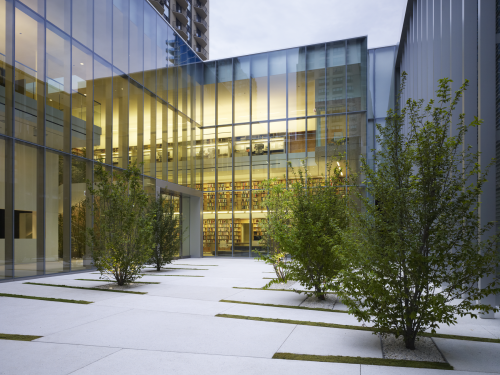 poetry foundation
[DA] The building has a lot of right angles to it. But not the ground cover both inside and outside. The outside cement creases are angled and continue into and through the building. The treatment heightened my awareness of other details. Is that a technique you frequently use?
[JR] Well you noticed the moss strips. We worked with a landscape architect out of Boston on the garden. What the moss strips do is form a bit of subtle path to the front door. While the architecture is very rectilinear, your movement through the architecture is not at right angles. It’s not about your eye seeing curvy things or angular things, but more how your body is moving through the space. That’s where my interest is.
[DA] The tall “screen” barrier on the perimeter, is interesting. My label for the treatment is “fancy plain.” There’s a much more complex richness going on than your first impression. The building, even the space looks different during the day. At sunset. At night. It’s like a one-way mirror. Actually, the metal screen behaves just like view through adhesive vinyl on bus and storefront windows.
[JR] Fancy plain works.
[DA] Do minimalist solutions cost more because you’re hiding much of the execution? Was this an expensive building?
[JR] No, I wouldn’t say so. It cost about $390/sq-ft. That said, because it’s a small building, there are no economies of scale. Everything is sort of unique and the building doesn’t have much repetition. While $390 is not a cheap building, it’s not expensive either. If you look
at the Art Institute, which is probably $1,200 (per sf), ours is relatively inexpensive for a cultural building. The Foundation building looks more expensive than it is. I wanted try to use very simple materials but elevate them to make them special. If you boil it down, it’s concrete, corrugated metal, plywood and drywall—very simple materials. But the concrete, we spent months finding a special mix of stones and doing samples with different kind of sand and cement. Then we sandblasted it. We added the little black specks to pick up the black in the screens. It’s kind of a transcendent materiality. Taking something very simple and making it special. That was the strategy of the materiality and not just for reasons of cost. I see this akin to what a poet does to words. What distinguishes poetry from prose? It’s not that you’re using fancy words or big words. You’re using words that a 4-year-old could understand. It’s how they’re selected and arranged as well as the space between them that makes them unfamiliar, so that you think about them in a new way. That’s what a poet does with words, and that’s what I was trying to do with materials.
[DA] What makes the new Modern Wing so expensive?
[JR] Pretty much everything is custom there. The materials used and the detailing is costly. It’s an art museum so their mechanical systems to heat and cool and humidify the space are very sophisticated. Having said that, it’s beautiful. That’s an architect you can entrust with a big budget and you won’t be disappointed or feel like you wasted your money. He did a great job. Hopefully I’ll get one of those.
[DA] Hopefully you will too. Speaking of materials, you used a lot of glass on Poetry and the Comer School seemed like it had a substantial amount of glass. Is glass expensive and what role does glass play other than the good view and daylight?
[JR] I’ll answer the second part one first. The view and light are obvious things. You rightly connect and mention the use of it in the Poetry Foundation building. Thematically the glass provides a spatial continuity, a spatial layering, and that’s where my interest with glass lies. You can be in one space while looking into a a second space through a third space, right? Maybe it’s a way of experiencing a building, such that you’re both actor and spectator at the same time. That experience is common to both of those buildings. Glass is important to that concept and what allows that spatial condition to arise. An advancement of that idea in Poetry is the duality that glass provides whether you’re on the outside looking in or inside the building and looking outside into the garden. You know, I like that. That in this building, one can look outside to the garden and then back inside the building on the other side. That’s a very interesting spatial condition.
Is the use of glass expensive? That’s a complicated question because of the variables. There’s more and less expensive kinds of glass. It’s more expensive than dry wall, yes. But you can have that quality without glass as well just by creating openings or open conditions. The labor today has gone up compared to the material cost. Labor in general, is 50% of the cost. The labor when using glass in installations that are standard, is not that expensive.
[DA] The glass installation is so clean. Though I see silicone I don’t know what’s holding the glass to the face. Is it a non-standard installation?
[JR] You’re talking about the entry, where we use a thick piece of monolithic glass that disappears into the floor; we used the same glass in the performance space for acoustical reasons. You can certainly justify an expenditure there. It’s three layers of glass for the performance space with the silicone joints inside the room and then there’s an air space of about two feet and then an insulated glass on the outside. There’s an acoustic reason. We’re trying to isolate the outside noise. When you’re in the performance space, you want to feel like you’re in part of the city and also part of the performance at the same time. See the cars and people moving by and look through the garden and into the library. But without the noise which would diminish your appreciation of the poetry reading. You don’t want the noise. Right?
[DA] Understood, the double glass walls are an acoustic barrier not a temperature insulator. The performance space has a huge glass wall and glass is not an ideal acoustic surface.
[JR] Well there’s two components of that, there’s isolation—keeping out the outside noise. There’s also the room acoustics—what the room sounds like when you’re in it. That’s a function of the surfaces. Some of the rooms surfaces in the room need to be are reflective and hard, to bounce the sound. Glass is perfect for this. Others need to be soft to absorb the sound. Some need to be acoustically diffusive with a bumpy or irregular surface. On which surface you tweak is dependent on where the speaker is standing. We need hard, reflective surfaces where the speaker is in front of because that’s the sound of the speaker’s voice bouncing toward the audience out into the room. The glass and the plaster flank the speaker in that room are purposely hard to bounce the noise out. The back wall of the room is acoustically absorbent because we don’t want echoes. The side wall where the textured concrete block is a diffusive wall. Those are all important to the room’s acoustics. We were told to make this room ideal for the human voice so a poet could read poetry unmediated by technology. There were many interesting challenges.
[DA] Did you bring in an acoustic specialist?
[JR] Yes, we worked with Threshold Acoustics on the project. The performance space was not the only acoustically tweaked space as there are many acoustically sensitive spaces in the building. There are proofreading rooms that completely shut out the noise. The performance space was the real challenge there.
[DA] What did you learn from doing the Poetry project?
[JR] I learned so much. It’s such a broad question. Some specific things like the acoustics, I sound like a geek, right? We’ve done many sound studios and I thought I knew a lot about acoustics, but I learned more in this project. I also learned a hell of a lot about concrete, which I thought I knew about from doing concrete projects before. Now I know how to lighten concrete after it’s poured. I also learned a lot about poetry and Poetry Magazine and the Foundation, which opened up a whole new world. I met a lot of interesting poets and that was really one of the special things about this project. I could talk for an hour about that alone.
Other things I learned from the building itself. One of the tectonic ideas is that the building is comprised of a series of layers of different materials that come together and then they spread apart to create the spaces and the spatial sequence of it. For instance, the screen and the glass layers come very close together in that narrow passage that leads into the main garden. The glass pulls back and the space opens up. The wood comes very close to the glass in certain areas, like the performance space, and then it splits apart to create the office area. It’s these layers coming together and then kind of splitting apart to create these spaces. But the space never goes away completely. It just gets smaller. So small that you can’t fit your body through it. So that’s the concept. Sometimes, when a project is built, you see something that you hadn’t anticipated. An example of that in this project is when you’re walking in that narrow passage that leads from the entry off the street into the main garden, you see the reflection of the screen wall in the glass. These layers become more than the sum of their parts. One layer is visually impacting another layer and reinforcing your experience. That was something that we hadn’t really studied in the models and the drawings. But now I see it in the real building and I’ll use that in the next project.
[DA] How do you lighten concrete after it’s poured? You asked a trusted concrete resource and said you wanted a certain look?.
[JR] You meet these people through the concrete contractor, who knows a lot about concrete, and they also have experts who they rely on who know even more. You’re always looking for people who know more than you do to expand upon your own knowledge base and the concrete contractor knows a hundred times more about it than I do and his specialist might know a hundred times more than he does. Materials have interested me since forever. That plays a very important part in our work so I’m always trying to meet the experts to expand my knowledge.
[DA] Can you talk about the use of wood in the Foundation building?
[JR] Wood for the new space was an element that played an important role in the design. I like to work with a reduced palette of materials. Typically we use four, five, or six. Here there are three major ones. You want to get to the point where if you remove one, you’re really missing it. If you add another one, maybe there’s no improvement. You want to get to that point or balance. I felt wood for the space made critical cultural references. When you first walk into the garden and it opens up, the first thing you see is the bookshelves of the library and the message is that you’re entering a literary environment. You walk into that library and it has that second level in the balcony that harkens back to old libraries from the 19th century. Even the books are a wood derivative. Design is about creating the right atmosphere. The space is giving you subconscious cues. For Poetry the wood plays an important role beyond its color and other things. It references things from your memory to bring about a certain atmosphere.
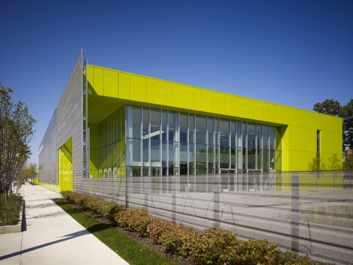 gary comer college prep
[DA] Let’s talk about the Comer school. A beautiful and open structure. Again, an urban setting with bit more edge than the Foundations site. There was mention of bullet-proof glass and a perimeter wall. You used the screen barrier just like with Poetry. You also have a concept for Chicago’s Old Post Office where you incorporate another screen. Is the screen a signature element?
[JR] Each solution resides within a different condition. I’m interested in dynamic spatial experiences, stimulated with different results say with the opaque to transparent to translucent to screen-like. Like the materials palette we talked about the architect also has a spatial palette. On the Comer Youth Center, there was a perforated stainless steel fence that ran around the parking lot that was a security fence so people could look in and see the drill team practicing. When it came time to build Comer Prep we wanted to give it its own identity but tie it to the Youth Center. That material, the perforated stainless, we extended around the building. On the original Youth Center we used bullet-proof glass around it but we couldn’t afford to do that at Comer Prep. But we noticed that if you pulled perforated metal across the windows we achieved this effect that you referenced earlier: it’s very easy to see out but hard to see in. In the process of doing that project I learned different things that we then exploited to a different degree and for different reasons in Poetry. You learn from one project to the next. Things surprise you once you see something built. Maybe we can use that as a point of departure on the next project and push it further. Why we used it on Comer Prep is for a completely different reason than why we used it on Poetry, but I learned something doing Comer Prep that Poetry benefited from.
[DA] The screen is a unique feature of Comer. Are there other unique features?
[JR] We did glass on the classroom wall that borders the public corridor which is highly unusual. You can walk through that school and look into every class as it’s being conducted. It really reinforces the school’s culture of transparency and accountability. It’s an interesting story of how that came to be. The school was operating for its first two years out of the Youth Center. We had taken rooms and spaces and had converted them temporarily to classrooms. Two of the rooms were in an exhibition space on the third floor of the Youth Center that has glass walls that provide a view of the roof garden. The teachers were asked what their favorite classroom was and they all said the glass-walled classroom, so we incorporated this into the new building.
[DA] Were glass walls a good idea? It seems like there would be a lot of distraction.
[JR] No it hasn’t happened. You walk through there now and the kids aren’t distracted. I’m guessing the first two days, they were distracted. If you go there everyday, you’re not distracted; you quickly get used to it. There are design books on schools that say this is a no-no, but it makes that school unique and it really reflects their culture. I’d do it again. It’s been hugely successful.
[DA] It’s interesting how we tune out outside noise after a couple of days. A problem for say marketing and advertising campaigns designed to keep your attention. On your web site there’s a residence that looks quite commercial. What’s the difference between a residence and a commercial building?
[JR] How you design them is very different. With an institutional building, you’re trying to make it very specific to the culture and purpose of that institution. It’s not unlike what you’re trying to do with a house but on a certain level, all houses are the same. The interesting part is determining how they’re different. It’s the family that lives in them that makes it different. You want the house to be reflective of the family culture. It’s very personal. When you’re designing a house, there’s much more time involved because the family is much more involved in the decisions of the design. They’re more invested personally in the design of their home than they would be in the design of their workplace. The materials are very important. How they live. Do they have kids? Do they throw parties? Why do they live in the city versus the suburbs? In both cases you’re seeking unique criteria. Are their needs unique or the site itself unique? It’s not unlike what you’re trying to do when you’re designing for an institution, but it’s much more personal.
[DA] I mention your work and minimalism in the same breath and you mention essentialism? What do you mean?
[JR] There are different kinds of “minimalism.” There’s minimalism that works by exclusion where you’re excluding necessary things to create a perfect environment into which you cannot place a foreign object without diminishing it in some way. That’s not what I’m interested in. I’m more interested in “essentialism “ where you’re boiling it down to that which is essential and executing it in a very thoughtful and considered way. The architecture is really a backdrop for life whether it’s a house or an institution. If you look at Dave & Jeannette Jordano’s house, for example, it’s very much about the couple that lives there. She’s an artist. He’s a photographer. The architecture is minimal, but also a backdrop for their life. Their life and who they are. The selections they made are dominant and the architecture is recessive. It’s minimal, but it’s their curating of the space that is essential. I don’t believe in an architecture that works only on a basis of exclusion. A losing battle, in the end, and not that interesting to begin with. Architecture is for people and the people make it unique and different. Why cut that out of the equation? That doesn’t make sense.
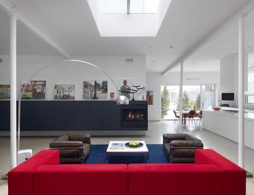 jordano residence
[DA] Do you create products?
[JR] We’ve been asked to do furniture, a boat, and so on. For me, product design is interesting because of the scale relationship between one thing and another. From the spoon to the city. If you’re designing a plate or silverware you also have to think of the table. If you’re designing a table there’s the room to think about. If you’re designing a room there’s the relationship with the house. That’s what I think about with anything we I design, the contextual relationship between scales.
And what of the beauty and even the design? Just because an object is beautiful doesn’t guarantee that the object will live up to it’s potential in usability. You’re a very sophisticated person when it comes to design and I bet you have many objects in your house that you don’t know who designed them. But the object feels right and the balance is right. The shape is right, and so on. But the design is invisible to a certain degree, it doesn’t call attention to itself. If something is so well designed it may not even look designed. That’s where you want to be. There’s another kind of design that’s about signature and authorship. I respect many signature solutions but the kind of design I’m interested in is more transparent. I like to design things that feel intuitively correct and somehow natural, not things that scream for attention.
[DA] You’re right, there are objects that are or seem an obvious solution. Naoto Fukasawa has that quality, creating obvious solutions. Designer Dieter Rams articulates 10 design principles and one of the principles is “good design is as little design as possible.”
[JR] Which is very difficult, by the way. It’s easy to make something complicated, but it takes a lot of effort to design something after which you can say “why would you design it any other way?” Who designed the paperclip? That was a brilliant piece of design and it doesn’t beg the question who the designer is. That holds true for the paperclip, a door knob, a building, whatever.
[DA] There are very cool paperclips out there. I like the circles and squares. Listen to us. Talking about architecture and paperclips. Let’s not stop. I enjoyed the video on your site about the Risk Conference. You were making a point about the diminishing role of the architect. You started with a triangle of contractor, architect, and owner and you wound up with an image of the solar system where the owner is the sun, the architect is all the way out there as Saturn, and the Saturn rings are consultants. It sounded like you wanted the architect to regain some of the authority they once experienced. But things are much more complicated now. Do most architects really want that authority?
[JR] That’s my personal take on it. A young architect has not experienced that kind of authority, so they’re going to operate differently. They’ll say they’re happy being in the periphery, but only because they haven’t known any other condition. This is what I see as the trajectory of the profession and I take the position that the built environment world would be better if architects were more involved in its design rather than less involved. The trend of architects’ diminishing influence is not a positive when considering society’s quality of life. You can talk all you want about collaboration, but that’s just a form of denial. We are witnessing a trend that’s undeniably pushing the architect away from the center and out to the periphery. Architects have themselves to blame for much of this. I’m concerned because I teach architecture, so I care about the direction of architecture—both the discipline and the profession. The most iconic projects, the best spaces you’ve been in, were done by architects that were close to the center [of power]. I’m all for collaboration but I think the architect has to be a leader of the team.
[DA] Leadership is not a privilege, it’s earned. But you don’t want to handcuff the good leader’s for sure. I like the scene in “Hunt for Red October” Alec Baldwin’s character is asked into a Joint Chief of Staff’s meeting to give an opinion and all hell breaks loose. When the meeting is over the head guy asks Baldwin to stay and gives him the green light. Great projects and great clients go hand-in-hand. The head guy in this case is a great client. It sounds like you experienced a great client with Poetry.
[JR] The great thing about the Poetry project is that it was a very important project for a sophisticated client, but also they had a great deal of respect for what we were doing. They deferred to us on design matters. They very carefully selected their architect and then did it right. They interviewed umpteen architects and picked someone. Then they listened to that architect.
[DA] You’re teaching at IIT Architecture. You’re searching for a Dean. Did you find one?
[JR] Yes, we did. I’m Chairman of the Search Committee and it’s not been made official yet. [ED: It’s now official; Wiel Arets is the new dean] But but we have a candidate that I think is really going to do great things at IIT. I’m incredibly excited about the future.
[DA] Why do you teach?
[JR] I teach because I care about the future of the discipline and the future of the profession, which are two different things. I think if you care about the discipline and profession, you want to teach because teaching can have an incredible influence in those areas. I enjoy teaching because it forces me to research and articulate my position on things in a way that I wouldn’t have to if I were just only practicing. I believe teaching is more than simply transferring information. In class you learn by asking formulating questions and seeking answers to those questions. I tell my students I’m not really interested that we come up with an answer to everything. I think it’s more important to come up with an interesting question. That’s kind of my teaching technique, and what I get out of teaching.
[DA] How does your work represent your own philosophy on the state of architecture?
[JR] I think I would use Poetry as an example. My philosophy is that architecture is about an experience, about space and designing from the inside out. My work is more about relationships and not about form. I think over the past fifteen years, the profession has been overly interested with formal innovation. One could say obsessed. The media is sort of complicit in this because it promotes the sexy images and renderings, and it’s usually an image based on how the building looks from the outside. While I’m not opposed to exploring form or formal innovation, I don’t think it’s the primary concern of architecture. I think architects and the design media have focused on form to the exclusion of more important things over the past fifteen years, which will hurt us in the long run.
[DA] What’s next?
[JR] I wish I could say definitively what’s next but we’re in an uncertain period. We’re working on several very interesting projects right now and building types that we haven’t built before, which is always exciting. Unfortunately I can’t talk about the most interesting projects for various reasons and they are in the concept design phase. One is a building in the Loop. One is a recreation building that would be unique to Chicago. And one is a very advanced facility dealing with aquaponics. One needs government approval. One needs money. One needs something else, so I’m hoping they’re all realized. We’re doing a school and some residences as well.
[DA] John, good luck to you. Let us know when that happens. What do you do when you’re not being an architect? What part of what you do satisfies you the most?
[JR] I’m spending time with my kids. I have two daughters, ages 6 and 1. That’s a very fun time to be with them. That’s mostly what I do when I’m not here. Once in a while I get away and go fly fishing. But until I teach my daughters how to fish, the fish are breathing a sigh of relief.
This was a lot of fun. I really enjoyed your questions. Let’s do it again sometime.
[ view photos > poetry foundation building | hedrich blessing ]
[ photos: poetry, gary comer youth center and college prep, iit smart grid, south shore high school | steve hall ] [ photos: yale steam laundry, christ the king, coach house, jordano, and cmk | nathan kirkman ]


