the international design conference is bringing together designers from a variety of disciplines to cultivate a shared understanding and rally around common themes and challenges facing our ever-changing profession.
join us 19 september for the idea ceremony and gala at the national wwii museum at the sugar mill in new orleans, la. emcees debbie millman and john maeda will lead a dialog with top design thinkers and provocateurs representing some of the world’s most visionary companies. hear from google, fitbit, pepsi co., facebook, alta motors, ia collaborative, aruliden and many more!
spacing is limited for this event, register today to secure your seat at the inaugural international design conference.
online registration is open through 10 september 2018.
three years in the making, this landmark event is a revolutionary step by the industrial designers society of america (idsa) to invite influential voices to the table for a long awaited conversation.

I always liked Edith’s name. An American costume designer who won eight Academy Awards, more than any other woman. Google recognizes her today – born 28 October 1897. I always like seeing a doodle upon embarking on the search. While writing this post I learned that 27 October’s ‘hot search’ leader in ‘trendy’ was Lou Reed, 2,000,000 searches. Also discovered the first doodle was 30 August 1998. Larry and Sergey played with the corporate logo to indicate their attendance at Burning Man. Stickman. [ edith head ] [ google doodles ]

<a href=" about ron kovach

Right on the heels of Apple’s announcement of its new office building in Cupertino, CA is Google’s new London HQ, designed by Penson. Is it just me, or does it look more like a really fancy dorm done up in futuristic 60s mod/pod style? I know Google treats their employees well (or so says my friend in San Francisco who gets a gym membership along with the job), but why is there so much lounge space in this office? If you scroll through the images you’ll see a room with padded, reclining benches and what I can only assume is an update on the bean bag chair – a dorm room staple. This is one of the offices many “informal meeting spots,” but whether it will facilitate a relaxing work environment or just a place to relax remains to be seen.
One of the many features is the ability to ‘draw on the walls,’ which sounds cool in theory, but how many designers sketch out their ideas on a white board in the hallway? I give it two weeks until those boards are covered with dirty jokes and amateur drawings of penises – just like a dorm.
Futhermore, I know there’s no accounting for taste, but how long are those all-white rooms (with smatterings of bright mod colors) going to stay so pristine looking? Scroll through some more pictures. What’s up the club scene decor? Royal blue walls with neon tubing for the meeting rooms? That might have worked in Tron (which they actually homage – see the last pic), but not every adult wants to feel like they’re working on the set of bad movie or in the 80s’ idea of what a space module of the future looks like.


design: Penson

about perrin drumm
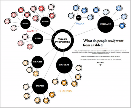
 the bigger a black circle is, the more that subject was searched for. the darker the color in nodes branching off, the more intense the search activity was. >click to enlarge
Tablet computers by now are sufficiently evolved with a diverse and experienced user-base to glean what people expect, like and want from them. Here’s an infographic generated via Google on what people are interested in and searching for.
The infographic suggests people don’t seem to care much about speed, screen size, or memory. Precisely the tech specs marketeers pitch with most gadgets today. That said, the memory vs storage can be construed as the same thing to non-techies: people may want the option for more “memory” to capture movies and music that require processing power hence why the battery is important. Regarding screen size, the tablet size offerings do not vary more than two-three inches. But size is indeed a factor for those who use both a smart phone and a tablet, we much prefer the tablet. A tablet offers a larger visual presentation but people what something compact too.
I’m surprised that price isn’t in here. Looking at non-iPad offerings there’s a big drop-off in price for a vast majority of the tablets. Interestingly, we don’t see lines in front of retailers offering the cheaper tablets.
If Steve Jobs were still here this might not be said this way at this time: he’s hugely responsible for getting a whole lot of people to pony up. We’re reminded in an article that an Apple smart TV could have been in the works and may in fact be coming. The article makes note that Apple and Jobs have a record of taking existing technologies and redesigning them with an emphasis on visual simplicity, enabling users to play songs, open applications and make calls with the click of a mouse or the swipe of a finger — with little technical knowledge required.
Along with price I wonder why age isn’t factored in as a great many older users have jumped many generations of desktop computers to enjoy the simplicity of playing with and using the tablets. Maybe we also need an infographic showing who’s interested and buying the tablet computer.
The infographic reminds us that a survey, a focus group, is the wrong process to generate a great idea by just asking people. Jobs said, “It’s not the consumer’s job to know what they want.” Finally, it does not go unnoticed, we couldn’t get this infographic without the wonder of Google.
The tablet research was conducted by design and branding agency, Method, and commissioned by Dell. Read the following links for other opinions. [ co. design ] [ visualizing.org ] [ chicago tribune ]


