• CALENDAR
    • Add Your Event
  • architecture
    • art & literature
    • awards
    • buildings
    • sustainable
    • prefabricated
    • public space
    • residences
    • urban planning
  • design
    • art & literature
    • awards
    • collectables
    • concept
    • fashion
    • sustainable
    • home
    • lifestyle
    • safety & special needs
    • transportation
    • workplace
  • editor’s pick
    • featured
    • gift ideas.
    • interviews
    • opinion
  • events
    • auctions
    • competitions
    • conference & Exhibitions
    • fairs
  • news
    • latest news
    • elsewhere
    • lifestyle
    • people
    • producer
    • retailer
DesignApplauseDesignApplauseyour daily design dose
  • CALENDAR
    • Add Your Event
  • architecture
    • art & literature
    • awards
    • buildings
    • sustainable
    • prefabricated
    • public space
    • residences
    • urban planning
  • design
    • art & literature
    • awards
    • collectables
    • concept
    • fashion
    • sustainable
    • home
    • lifestyle
    • safety & special needs
    • transportation
    • workplace
  • editor’s pick
    • featured
    • gift ideas.
    • interviews
    • opinion
  • events
    • auctions
    • competitions
    • conference & Exhibitions
    • fairs
  • news
    • latest news
    • elsewhere
    • lifestyle
    • people
    • producer
    • retailer

fast food

Home Tag fast food

Can good design give fast food a makeover?

Nov 30, 2011

Fast food giants may not be redesigning their menu for the better, but some of them are trying to up the quality of their restaurants by hiring actual designers to update their interiors. Recently, McDonalds hired Patrick Norguet to redo all their French chains to appeal less to teenagers and more to families, emphasizing an “urban and adolescent tone.” Norguet, with his affinity for modular storage and corporate meets contemporary furniture, is a good choice. He designed booth where families can sit and order from instead of wrangling all their kids into line at the counter. The Mondiran-inspired white and metal storage facade looks good now, but I imagine some of Norguet’s swopping, atomic-age moves will look dated even before they get dingy with use. Apparently, there’s also some kind of plant metaphor going on, “its branching development, this root common to the brand and to the family, is transformed here into an architecture which is transversal and expansive: birch plywood takes root and branches out in the restaurant in order to create areas, functions and moods for different social requirements without compartmentalising.” Um, yeah whatever, McDonalds.

As a fitting counterpart to my post on redesigning trailer homes and bringing high design to the heretofore undesigned, here are two more fast food chains that got a make-over. The UK-based chain of Little Chefs hire London designers Ab Rogers for their interiors. Do you think it’s supposed to look this dated, or should I say, retro? They did say they were inspired by “influences from the history of roadside eating.” But isn’t red vinyl booths and white tile floors exactly what we’re trying to get away from here? There’s also an “interactive sound” that gets triggered when someone stops along the roadside just to use the bathroom to encourage them to stay for food. I find that weirdly creepy, but I do dig the photo-realistic tiled ceiling.

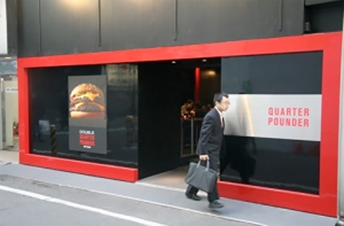
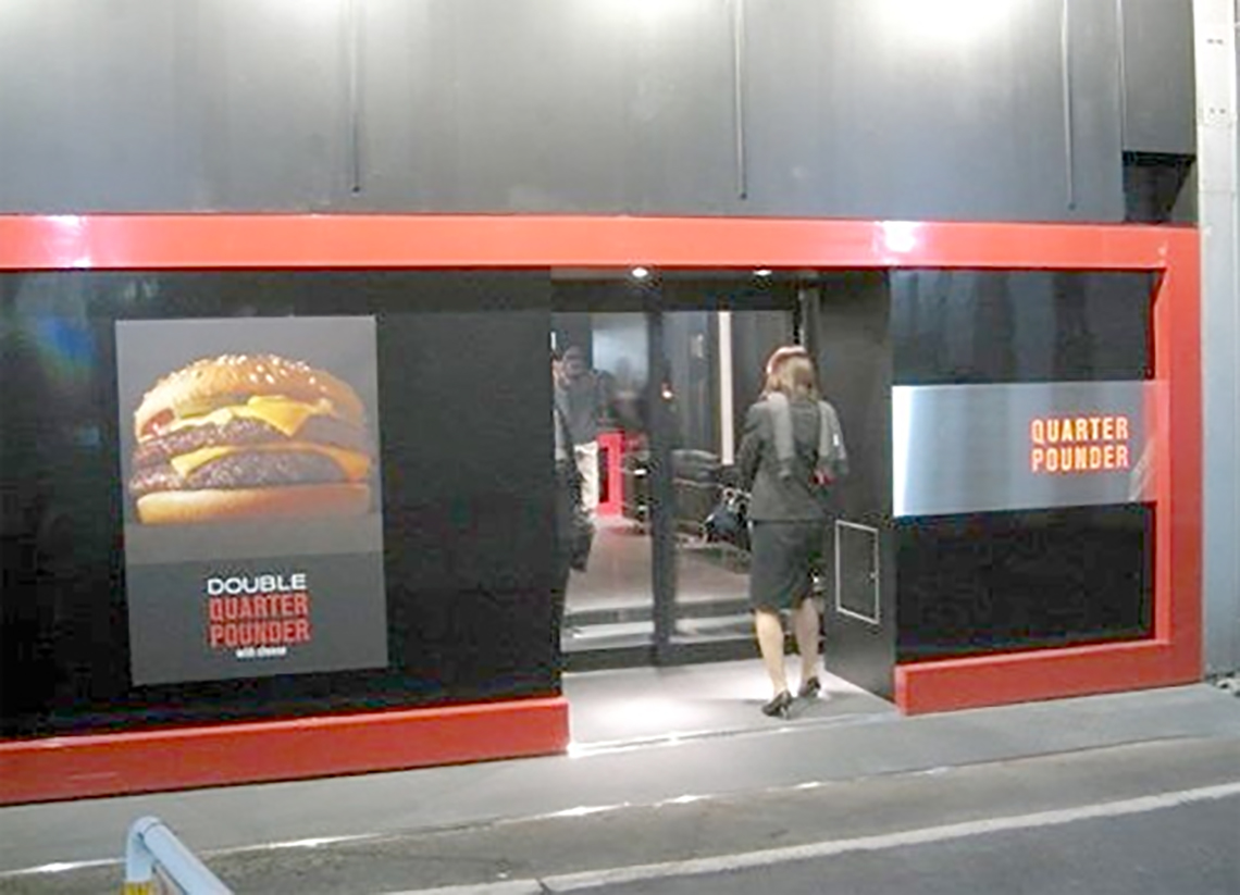
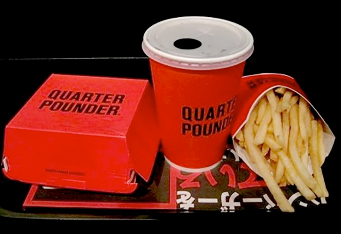
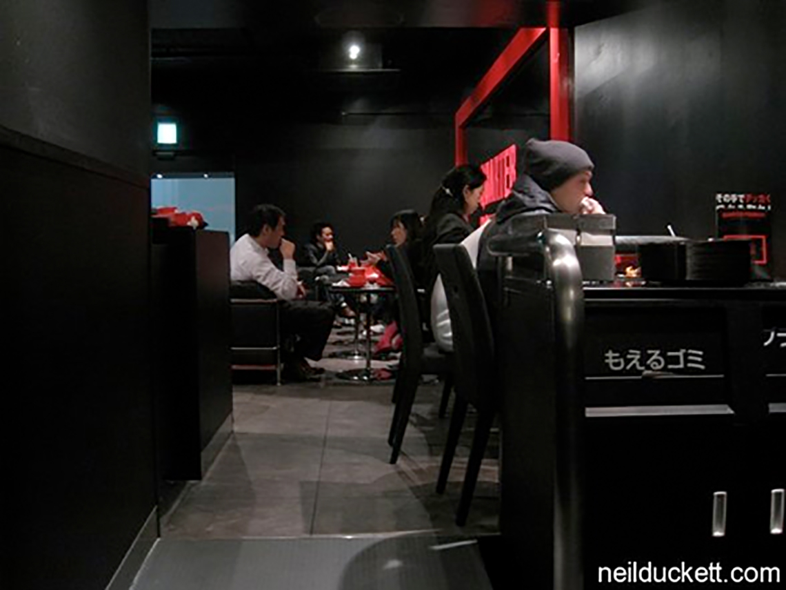
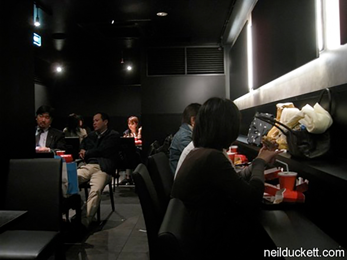
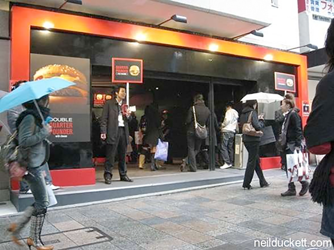
The best example of a real step up in the game is the redesign Ippolito Fleitz Group (personal faves of mine) did for a chicken restaurant in Germany. The wooden floor and outdoorsy wallpaper and calmer paint colors are immediately more relaxing and inviting than the bright white and red combo usually favored in fast food. Seriously, when did hospital white and ketchup-red become the standard? It reminds me more of the ballroom bathroom in Stanley Kubrick’s THE SHINING, not exactly what I want called to mind when I’m eating. But it’s not like I’m ever going to eat in a McDonalds, even if it’s a fancy new one in Paris. As a side note, check out the minimalist, logo-less McDonald’s pop-up built in Tokyo in 2009 as way to introduce the brand to Japan without berating with a sudden influx of golden arches.


[Via]


about perrin drumm

Vending machine of the future.

Aug 17, 2010

last week the world’s first ‘smart’ vending machine was installed in tokyo’s shinagawa station.


The new device from aCure not only boasts a touchscreen interface, but it can also recommend a beverage it thinks you’d like as you walk by. The machine’s internal computer takes a reading of passersby to record their age and gender and then recommends a drink based on that information as well as the season, time of day and location of the machine. It’s paperless, too, accepting only cellphone-wallets or the contactless Suica IC card used for public transit in Tokyo. Still, after all that you’d think they’d figure out a way to dispense your drink of choice in a way that doesn’t require you to stoop over. Looks like they are a few more kinks to work out before the proposed design hits stateside.


about perrin drumm

Green arches.

May 21, 2009

LEED Honors for McDonald’s HQ via businessweek [PR]

How green is your take-away container?

Apr 27, 2009

How green is your take-out? Styrofoam. Plastic. Paper or plastic bags. Cardboard boxes. Bioproducts. Aluminum foil. Recycled paper products. Edible containers made from food. Inedible containers made from food. Bring your own …via coudal [PR]

mcdonald’s cooks up minimal. no logo.

mcdonald’s cooks up minimal. no logo.

Feb 20, 2009

mcdonalds recently opened two of their latest tokyo outlets. to say that it surgically has removed their corporate voice — well its really closer to a lobotomy. wow.

above/below> they have done away with the golden arches, ronald mcdonald, hamburglar, happy meals, and mcmuffins in this mcdonalds. they have even done away with a (the) logo. the only thing they retained is the color red.

above/below> the only products served are the qp (quarter pounder) and the qpc (quarter pounder with cheese) simply in red, white, and black packaging. the fries come with the burger as a menu set, no option here.

above/below> the interior is very lounge-like. one can imagine what the background music is — country & western ?

above/below> quarter pounder may look low key, but there is the viral online marketing to the hired hands handing out flyers to passersby. the “quarter pounder big secret” campaign.

we see the “no logo” look for bars and clubs and fewer restaurants. the “mystique” of a somewhere making all of its patrons feel a bit exclusive and in-the-know. if it looks like a club and sounds like a club. its a club. the stores are next to h&m, etc.

what it will do for the qpc? more than a singular design theme to one product. mcd´s is attempting to make an iconic product out of the qpc by wagering an entire restaurant investment on it. feedback and crowds say good.

this is case study material for the brand police. let’s keep an eye on how it does. could you put up one of these in your town?

editor’s notes via links below > in november of 2008 quarter pounder was mcdonald’s no-brand experiment introducing a larger ‘american style’ burger not found in japan at the time and tested on adventuresome and easily bored tokyoites.

via watashi to tokyo — meta tame

Contact Us

We're currently offline. Send us an email and we'll get back to you, asap.

Send Message
DesignApplause

your daily design dose

Follow Us


about us
contact/help
privacy policy

ADVERTISEMENT

LATEST NEWS

  • the beginning is the most important part of the work. hello 2023.
  • 40m zero-emission domus redefines trimaran concept.
  • this glass is for the birds migratory birds that is.
  • 2023 all-electrifying timeless instant recognition porsche taycan.
  • unrivaled residences found in repurposed chicago tribune tower.

All content ©2007 > 2022 DesignApplause