
mcdonalds recently opened two of their latest tokyo outlets. to say that it surgically has removed their corporate voice — well its really closer to a lobotomy. wow.
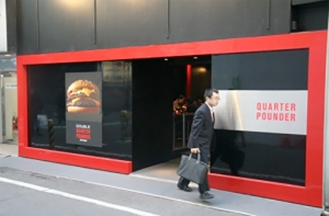
above/below> they have done away with the golden arches, ronald mcdonald, hamburglar, happy meals, and mcmuffins in this mcdonalds. they have even done away with a (the) logo. the only thing they retained is the color red.
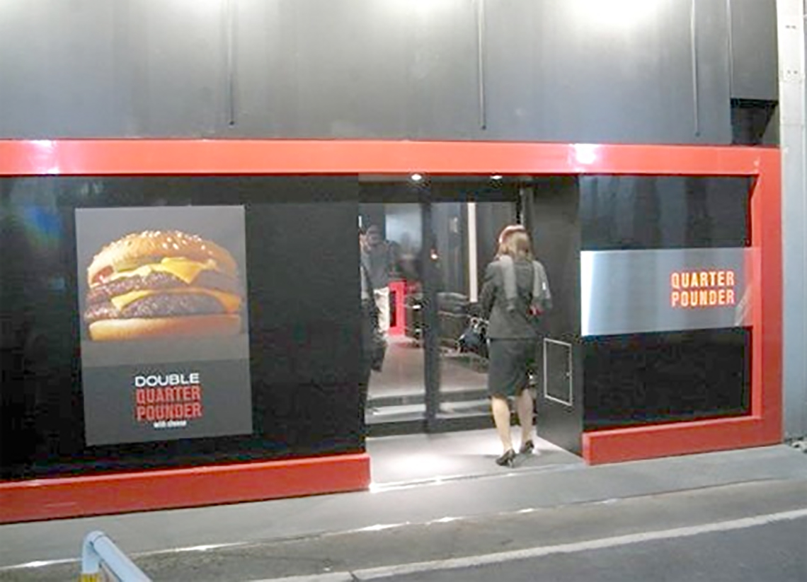
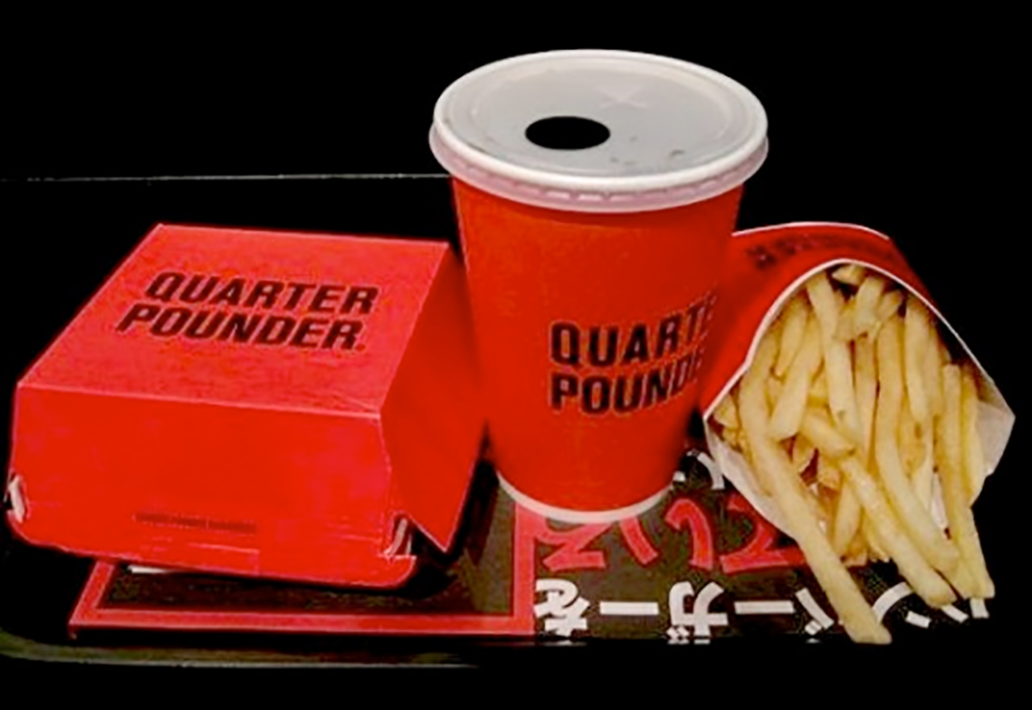
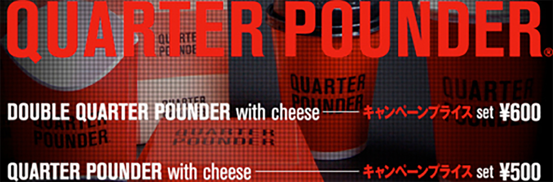
above/below> the only products served are the qp (quarter pounder) and the qpc (quarter pounder with cheese) simply in red, white, and black packaging. the fries come with the burger as a menu set, no option here.
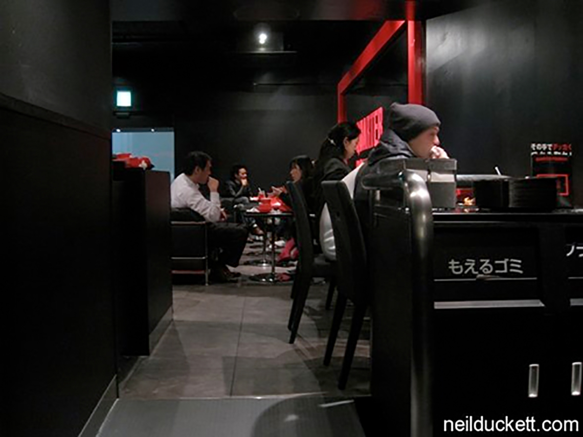
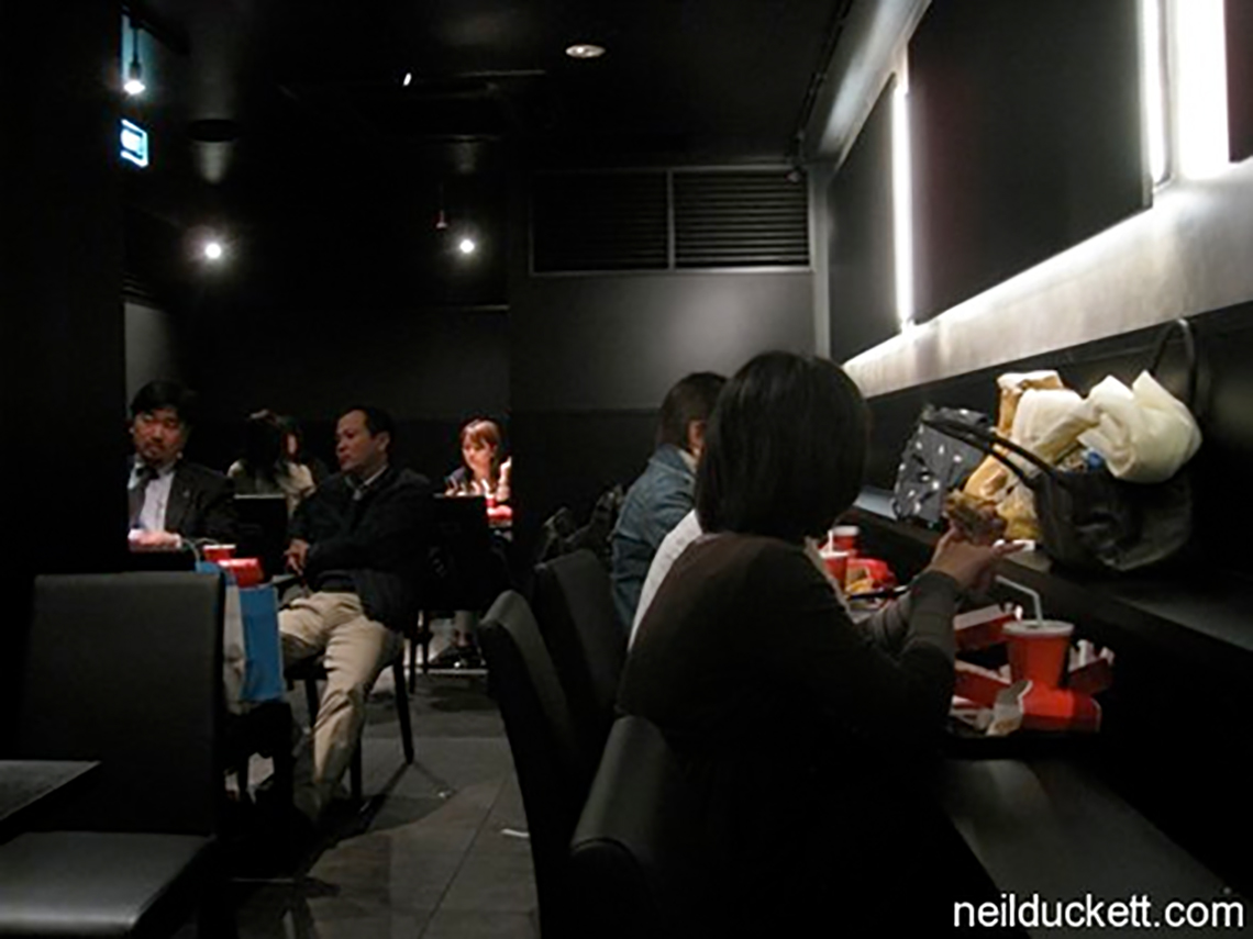
above/below> the interior is very lounge-like. one can imagine what the background music is — country & western ?
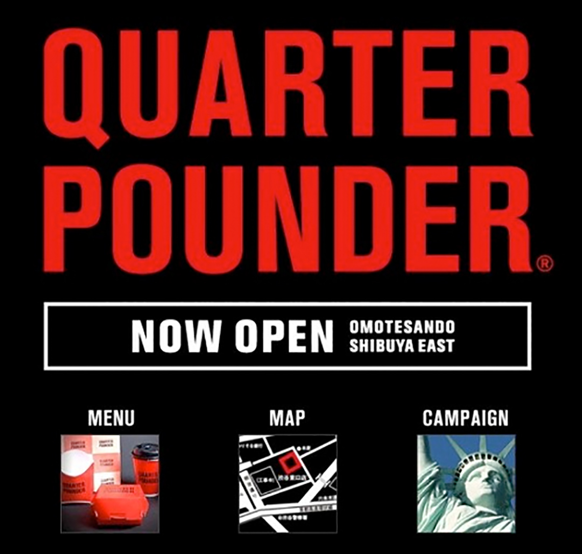
above/below> quarter pounder may look low key, but there is the viral online marketing to the hired hands handing out flyers to passersby. the “quarter pounder big secret” campaign.
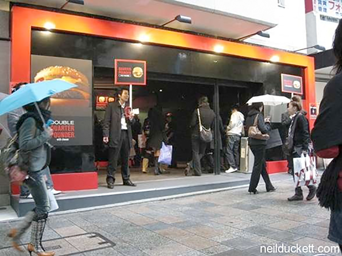
we see the “no logo” look for bars and clubs and fewer restaurants. the “mystique” of a somewhere making all of its patrons feel a bit exclusive and in-the-know. if it looks like a club and sounds like a club. its a club. the stores are next to h&m, etc.
what it will do for the qpc? more than a singular design theme to one product. mcd´s is attempting to make an iconic product out of the qpc by wagering an entire restaurant investment on it. feedback and crowds say good.
this is case study material for the brand police. let’s keep an eye on how it does. could you put up one of these in your town?
editor’s notes via links below > in november of 2008 quarter pounder was mcdonald’s no-brand experiment introducing a larger ‘american style’ burger not found in japan at the time and tested on adventuresome and easily bored tokyoites.
via watashi to tokyo — meta tame