 they’re called green toys because they save energy.


how much energy is saved ? on average(*), every pound of recycled milk jugs used in the making of green toys:
saves energy equal to 3,000 aaa batteries.
saves enough electricity to power a tv set for three weeks.
saves enough electricity to keep a laptop computer running for a month.
(*) compared to non-recycled plastic.
green toys says it uses recycled milk containers as the main ingredient in creating their toys. when you finish your milk and toss the container in the recycling bin, the milk containers are collected at your curb by a local recycling company who separates them from all the other types of plastic. next, the milk containers are reprocessed into super clean fresh plastic. for the plastic geeks, the plastic material is high-density polyethylene (or HDPE). this material is considered one of the safest, cleanest plastics around.
green toys
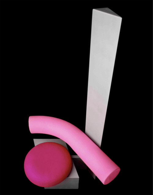
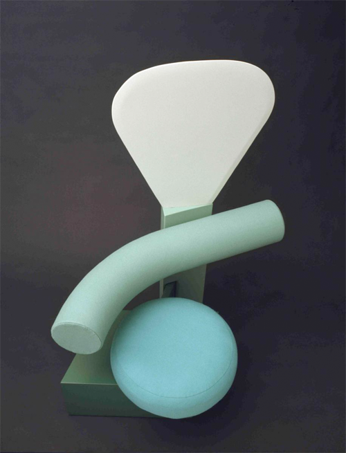
 a design history question. when was this chair designed? to what art genre does it belong?
if you would have said early 80s and maybe designed by peter shire that would have been a good answer. but you would be wrong.

above: bel air arm chair designed by peter shire in 1982 while with the memphis group.
the pink chair was designed in 1968, and by someone you may never have heard of, unless you’re an insider in british design circles. her name is jane dillon. below is a picture of jane, sitting in one of her other late 60s chairs.

in the late 60s as a recent graduate of the royal college of art she found her way to the milan studio of ettore sottsass. for the most part she worked on color studies for a line of olivetti office furniture for sottsass . and she also worked out some absolutely amazing chair designs.

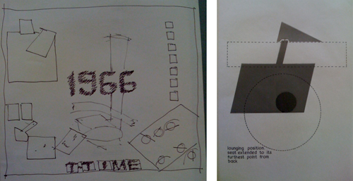
dillon gave the victoria & albert museum some of her archival materials, including the pictures included in this blog post. above are one of the earliest development drawings – with a tentative title of ‘T-Time,’ a reference to the idea of including an integral table in the design – and a geometric study showing the plan of the chair as if viewed from above.
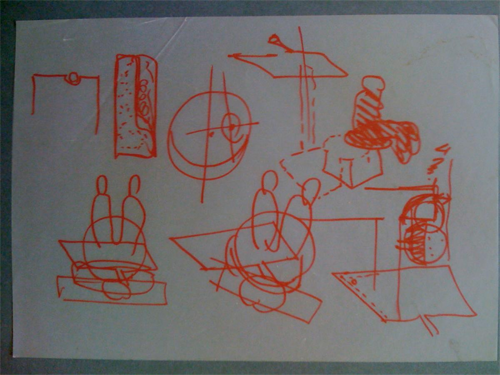
below is another motion study, a quick sketch in red pen. the two vignettes at lower left again show the chair in use from above. the idea being shown is that as the sitter shifts her weight from side to side, the seat beneath her (and the other elements of the chair) will move on a swivel joint.

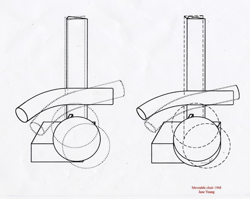
as stylish as the chair looks today dillon’s felt it was mainly an exercise in dynamic ergonomics. the motion study above indicates this, but it’s clearer still in the final preparatory drawing below, which shows how three of the chair’s four parts swivel in coordination according to the user’s shifting posture. she thought of it as a functionalist experiment, more late bauhaus or gerrit rietveld than pop or postmodern.

the chair was put into limited production by a company called planula – sottsass made the connection for her – and was produced in several variations of shape and color, including the green version below. it was received well by the design community and it was reproduced in the magazine domus. in 1972 the chair was nearly included in an important exhibition about italian design at the museum of modern art called ‘the new domestic landscape’. unfortunately the curators decided dillon didn’t count as italian.

dillon has also designed for habitat, herman miller, and cassina. she went back to the royal college of art to teach, and more recently, she has teamed up with designer tom grieves ( studio dillon ) plus to experiment with innovative environmentally sustainable furniture; keeping up to date today seems to be more important to her than having been ahead of the curve in 1968. still, she’s able to marvel at what she came up with back then. “it’s the most amazing kind of object. only when it’s in use does it become a new kind of chair.” she was made an honorary fellow of the royal college of art in 2006.
dillon’s experimentations and her association with sottsass was timely, as 10 years later sottsass assembled the memphis group, composed of italian designers and architects who created a series of products in 1981. they disagreed with the approach of the time and challenged the idea that products had to follow conventional shapes and colors and textures and patterns. the group’s theoretical concepts mixed 20th century styles, colors and materials, positioned itself as a fashion rather than an academic movement, and hoped to erase the international style where postmodernism had failed, preferring an outright revival and continuation of modernism proper rather than a re-reading of it.
[
original story]
Resources:
design museum
memphis group
memphis group-architecture
peter shire–la curbed
michael graves
michele de lucchi
matteo thun
nathalie du pasquier
george sowden
andrea branzi
ronan and erwan bouroullec
gerrit rietveld
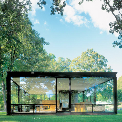
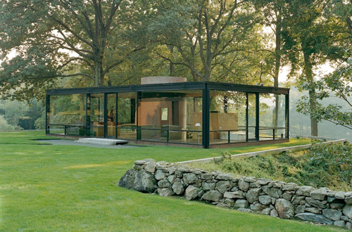
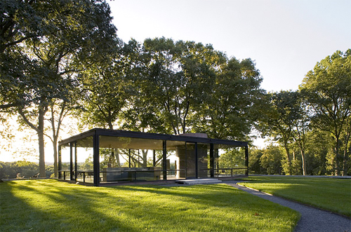
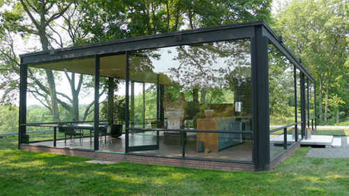
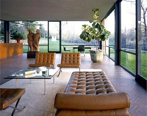
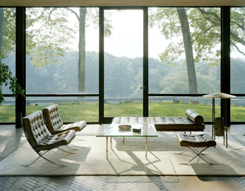
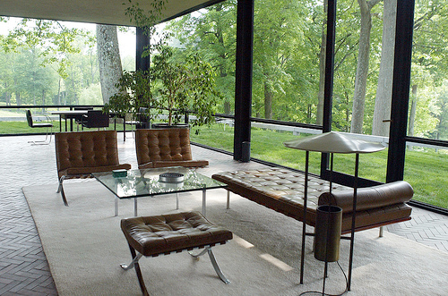
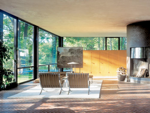
 the glass house or johnson house, built in 1949 in new canaan, connecticut, was designed by philip johnson as his own residence.

On June 23, 2007, a few quiet groups began arriving in New Canaan, Conn., to tour Philip Johnson’s modernist home, the Glass House–the first official tours of the property in more than 50 years. The house, the centerpiece of an estate that Johnson added to over the years, is a 56-foot-long box.


above: more images from photographer michael moran seen in arcspace.com


above: more images from photographer paul warchol seen at metropolismag.com

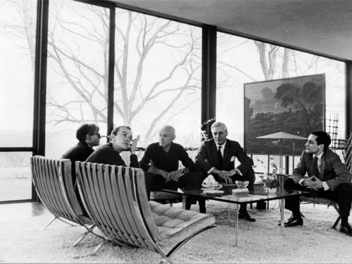
above left to right: andy warhol, david whitney, johnson, dr. john dalton, and robert a. m. stern in 1964. (david mccabe)

above: guesthouse, aesthetic counterpoint to glass house, the brick house holds most of its utilities. (paul warchol)

above: the pavilion 1962. the six foot tall pavilion is situated by a man-made pond. {michael moran)

above: the brick house

above: entrance to the painting gallery

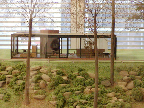
above: a model of the glass house on display at MOMA in NYC
“The house forms a nucleus of 40- acre landscaped complex that contain many other structures. Michael Moran’s photographs present the Glass House in this greater context, and demonstrate that neither part – the house nor its surroundings – would make sense alone”. Hilary Lewis, Philip Johnson’s biographer.
we are reminded that along with the farnsworth house, the glass house is also a national trust for historic preservation ( NTFHP ) site.
Designer: phillip johnson
Resources:
philipjohnsonglasshouse.org
metropolismag.com
time.com
arcspace.com
wikipedia
NTFHP
the farnsworth house
michelle’s and oprah’s fashion designer taking a timeout. first comment on news reminds me of theadore veblen quote, “work for the classes, live with the masses. work for the masses, live with the classes.” hope she comes back. | marinapinto.com via nbcnews [RK]
 economists encourage businesses to think design for post-recession recovery.
a heads up… the redesigning business summit on march 11th and 12th in london will bring together 250 senior business leaders with some of the most influential thinkers in innovative new business models and design-led innovation. via dexigner | designcouncil [RK]
 designed to allow users to read two time zones.
The color contrast off secondary clock hands are delicately reduced to appear like a shadow. The clock is available in both square and round versions in either white, gold, charcoal, and grey. Dimensions (W X.X D): 25cm X 25cm X 3.8cm
Designer: kitmen kueng
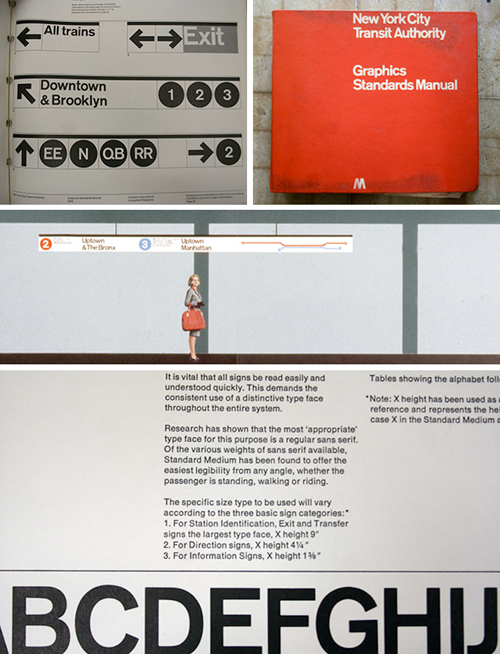
 noorda, one of seven founders for unimark international, an American design firm founded in Chicago in 1964.
the founding designers: ralph eckerstrom, massimo vignelli, james fogelman, wally gutches, larry klein, robert moldafsky, and noorda. he died on Jan. 11 in milan, his adopted city. he was 82.

new book! the cover mirrors the firm’s signature look and ethos: formalized modernism, or else.

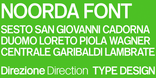
noorda designs metro signage in milan using font noorda

in 1963 he worked for metropolitana di milano and his work inspired massimo vignelli for the new york subway graphics.

this logo was never fully implemented. note the “arrows” inside negative space of letters.


above: “don’t bore the public with mysterious designs,” noorda said, making way for his and vignelli’s 1966 new york subway signage, plainly simple and still in use.
Resources:
unimark international – the book
wikipedia – unimark
new york times
fastcompany
the (mostly) true story of helvetica and new york subway
yes logo
 they’re called green toys because they save energy.


