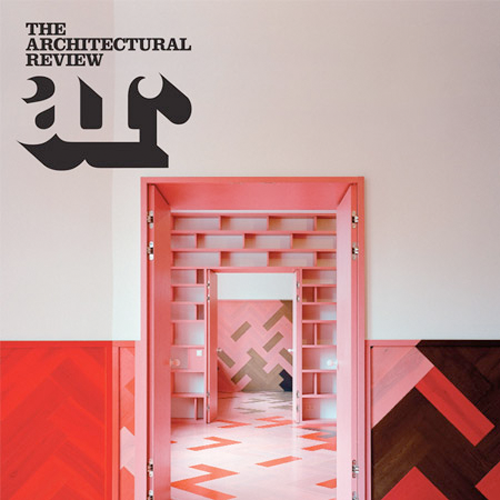
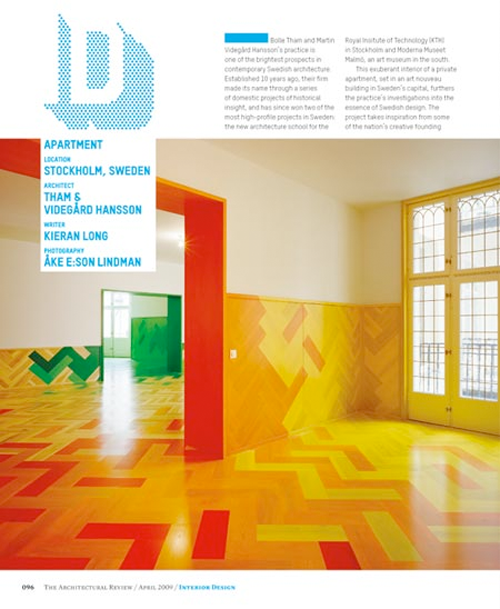
 Graphic designers Alexander Boxill have redesigned architecture magazine the Architectural Review, which relaunches this month.


fonts:
two fonts, (mercury and t-star), a serif and a sans are used in varying hierarchies, weights and intensities throughout the magazine to bring texture and diversity.
headlines:
we have removed all traditional headlines.
each section has a particular treatment to entice the reader.
view: a large brief overview of text
building: a number – a cataloguing system has been introduced so buildings are numbered for an entire year.
marginalia: a quote
Designer: alexander boxill
Producer: architectural review
via dezeen


