2013 webby winners announced.

11,000 entries. good read! [ winners and honorees ]

11,000 entries. good read! [ winners and honorees ]

Design Museum’s [ Designs of the Year ] competition recognizes seven design categories: Architecture, Digital, Fashion, Furniture, Graphics, Transport and Product, one of which will include an overall winner. An exhibition of all entries at the museum open to the public from 20 March > 7 July 2013.
[ digital ] Design of the Year 2013 Winner | GOV.UK website | Designed by Government Digital Service
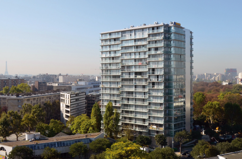
[ architecture ] Tour Bois-le-Prétre, Paris | Designed by Frédéric Druot, Anne Lacaton and Jean-Philippe Vassal

[ fashion ] Diana Vreeland: The eye has to travel | Directed by Lisa Immordino Vreeland
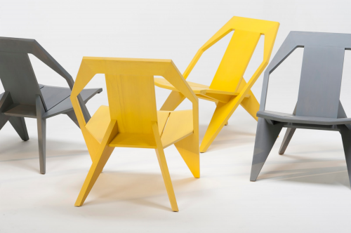
[ Furniture ] Medici Chair | Designed by Konstantin Grcic for Mattiazzi
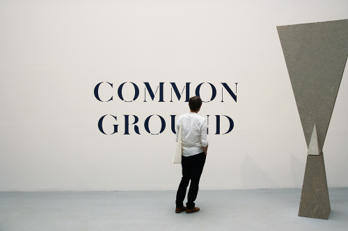
[ Graphics ] Venice Architecture Bienalle Identity | Designed by John Morgan Studio
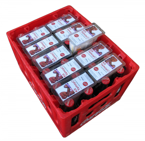
[ products ] Kit Yamoyo | Designed by ColaLife and PI Global
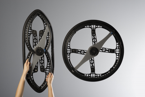
[ transport ] Morph Folding Wheel | Designed by Vitamins for Maddak Inc.
[ 2013 Jury ]
Johanna Agerman Ross (Editor of Disegno)
Ilse Crawford (Designer, Chair of the jury)
Amanda Levete (Architect)
Olga Polizzi (Director of Design for Rocco Forte Hotels)
Sarah Raven (Garden designer)
Griff Rhys Jones (Actor and presenter)
Nicolas Roope (Designer)
A website out-duels architecture, fashion, furniture, graphics, product and transport. Deyan Sudjic, Director of Design Museum said: ‘GOV.UK is a remarkable success on so many levels. It makes life better for millions of people coping with the everyday chores, from getting a new passport, to paying their taxes. It’s a reflection of the government understanding how to communicate with the country in a way that works, it’s simple, direct, well mannered, all the things that we would like to take for granted from the government, but in a sea of red tape and jargon, usually can’t. GOV.UK looks elegant, and subtly British thanks to a revised version of a classic typeface, designed by Margaret Calvert back in the 1960s. It is the Paul Smith of websites. The rest of the world is deeply impressed, and because it has rationalized multiple official websites, it saves the taxpayer millions, what’s not to like?’
The award was presented to Mike Bracken, Executive Director of GDS, Ben Terrett Head of Design at GDS (Government Digital Service) and Nick Hurd Minister for Civil Society at an awards reception held at Angler, South Place Hotel, London. The jury unanimously agreed that GOV.UK was the overall winner for Design of the Year 2013 for its well thought out yet understated design, making the user experience faster and easier. The website is regarded as one of the leading government websites in the world.
The Rt Hon David Cameron MP, Prime Minister and Conservative Party Leader said: ‘I am delighted that the GOV.UK website has won the Design of the Year Award 2013. This government is committed to being the most transparent in the world. For the first time, people can find out what’s happening inside government, all in one place, and in a clear and consistent format. It is just another example of Britain’s world class design talent standing out on the global stage; in this case helping to enhance the modern relationship between the public and government.’ [ designs of the year 2103 ] [ designs of the year 2013: shortlist ]
<a href=" about phil patton


Designs of The Year exhibition at the Design Museum runs 20 March > 7 July. Winners announced on 17 April. Pete Collard is curator of Designs of the Year..
The full list of nominees is as follows…
 the shard | renzo piano
[ architecture ]
Druot, Lacaton and Vassal: La Tour Bois-Le-Pretre, Paris
Studio Egret West: Clapham Library, London
Farshid Moussavi Architecture: MOCA, Cleveland
Hackett Hall McKnight: Metropolitan Arts Centre, Belfast
David Kohn Architects in collaboration with artist Fiona Banner: A Room For London
SO – IL: Kukje Art Center, Seoul
Andrés Jaque Arquitectos: Ikea Disobedients
MVRDV: Book Mountain, Spijkenisse
Renzo Piano: The Shard, London
Gonçalo Byrne Arquitectos & Barbas Lopes Arquitectos: Thalia Theatre, Lisbon
Witherford Watson Mann: Astley Castle, Warwickshire
Orhan Pamuk with Ihsan Bilgin, Cem Yucel and Gregor Sunder Plassmann: The Museum of Innocence, Istanbul
Akihisa Hirata, Sou Fujimoto, Kumiko, Naoya Hatakeyama, Inui and Toyo Ito: Home For All
Klein Dytham: T-Site, Tokyo
Zaha Hadid: Galaxy Soho, Beijing
BIG, TOPOTEK1 and Superflex: Superkilen, Norrebro
Louis Kahn: Four Freedoms Park
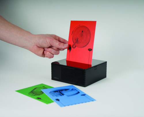 digital postcard and player | uniform
[ digital ]
rAndom International: Rain Room
Shing Tat Chung: Superstitious Fund Project
Raspberry Pi Foundation: Raspberry Pi
Jason Jameson, James Hall and Rhys Griffin of Unanico Group, with Andrew Tanner Design and Royal Winton: English Hedgerow Plate
Uniform: Digital Postcard and player
Microsoft: Windows Phone 8
Government Digital Service: GOV.UK Website
Six to Start and Naomi Alderman: Zombies, Run! App
Free Art and Technology Lab and Sy-Lab: Free Universal Construction kit
Martin Wattenberg and Fernanda Bertini Viegas: Wind Map
Moritz Waldemeyer for Ingo Maurer: Candles In The Wind
Patrick Bergel: Chirp
Nippon Design Centre Inc: Dashilar App
Stamen: City Tracking
Lytro: Light Field Camera
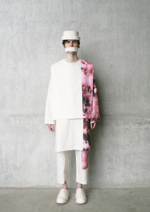 a/w12 collection | craig green
[ fashion ]
Jacqueline Durran: Anna Karenina Costumes
Giles Deacon: A/W12
Yayoi Kusama: Louis Vuitton Collection
Diana Vreeland: The Eye Has To Travel
Elisha Smith-Leverock: I Want Muscle
Craig Green: A/W12 Collection
Commes De Garcons: A/W12
Prada: S/S12 Collection
Proenza Schouler: A/W12 Collection
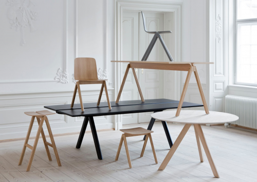 a-collection | ronan and erwan bourellec | hay
[ furniture ]
Studio Swine & Kieren Jones: The Sea Chair
Zaha Hadid: Liquid Glacial Table
Ronan and Erwan Bouroullec for Hay: A-Collection
Jolan Van Der Wiel: Gravity Stool
James Shaw and Marjan van Aubel: Well Proven Chair
Pinwu: Tie Paper Chair
Marni: 100 Chairs
Konstantin Grcic for Mattiazzi: Medici Chair
Studiomama (Nina Tolstrup and Jack Mama): Re-Imagined Chairs
Studio Markunpoika: Engineering Temporality
Ronan and Erwan Bouroullec for Vitra: Corniches
Muller Van Severen: Future Primitives
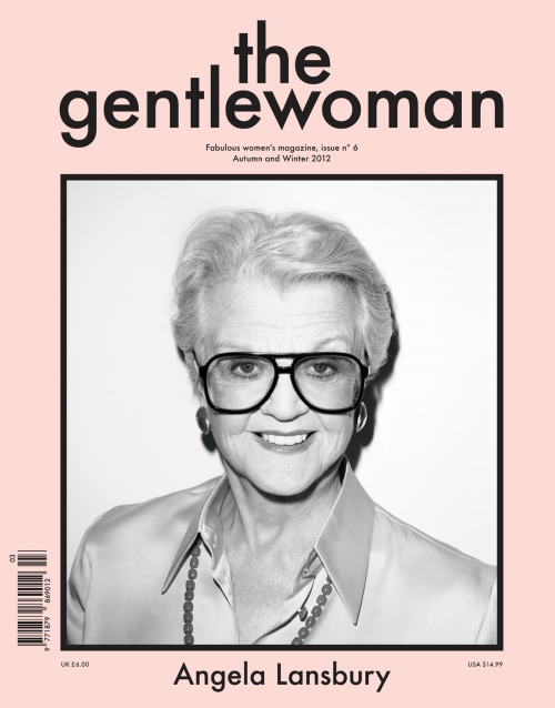 the gentlewoman #6 | veronica ditting
[ graphics ]
Brighten the Corners and Anish Kapoor: Zumtobel Annual Report
A Practice For Everyday Life: Bauhaus Art as Life exhibition
OK-RM: Strelka Institute Identity
Tzortzis Rallis and Lazaros Kakoulidis: Occupied Times of London
Veronica Ditting & Jop van Bennekom: The Gentlewoman #6
Serviceplan: Austria Solar Annual Report
Irma Boom: Rijksmuseum Identity
Studio Frith: Kapow!
Kapitza: Organic
Pedro Nora: Doc Lisboa ’12
Cardon Webb Ralph Ellison Collection
John Morgan: Venice Architecture Biennale Identity
CoDesign: Dekho Conversations on Design in India
Anthony Burrill: Made In Los Angeles
Australian Government Department for Health and Ageing: Australian Cigarette Packaging
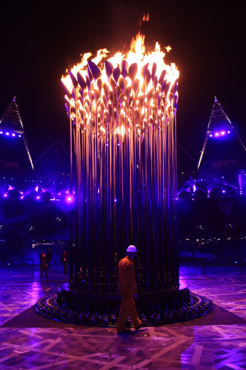 olympic cauldron | heatherwick studio
[ product ]
Heatherwick Studio: Olympic Cauldron
Cecilie Manz: Bang & Olufsen Beolit 12
Dave Smith/Varanasi Research Group MIT: Liquiglide Ketchup Bottle
Scholten & Baijings/1616 Arita Japan: Colour Porcelain
Hal Watts: E-source
Berg: Little Printer
Inga Sempe for Legrand: Switch Collection
PostlerFerguson: Papa Foxtrot Toys
The Centre for Vision in the Developing World and Goodwin Hartshorn: Child Vision Glasses
Dirk Winkel for Wästberg: w127 Lamp
Form Us With Love: Plug Lamp
MakerBot: Replicator 2
Nemours/Alfred I. duPont Hospital for Children in Wilmington, Delaware: 3D Printed Exoskeleton
Unfold Studio: Kiosk 2.0
Jasper Morrison/Japan Creative: Oigen Kitchenware
Anthony Dickens: Tekio
Olafur Eliasson: Little Sun
Simon Berry: Colalife
Pierre Hardy: Frederic Malle Travel Sprays#!
Phil Cuttance: Faceture Vases
Front: Surface Tension Lamp
Nike: Flyknit Trainers
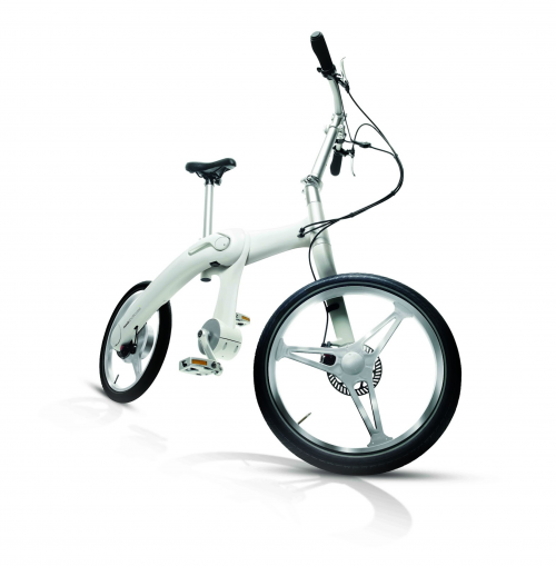 mando footloose | mark sanders
[ transport ]
Vitamins for Maddak Inc: Morph Folding Wheel
Priestmangoode: Air Access Seat
BMW: i3 Concept Car BMW
Mark Sanders: Mando Footloose
Honda: N-One Honda
Ben Wilson: Donky Bicycle
Dixon Jones / The Royal Borough of Kensington and Chelsea: Exhibition Road
TfL /JEDCO / LOCOG: Olympics Wayfinding
DB Mobility Logistics AG: Touch&Travel
[ previous designs of the year winners ]
2012 – London 2012 Olympic Torch – Barber Osgerby
2010 – Folding Plug – Min-Kyu Choi
2011 – Plumen Lightbulb 001 – Samuel Wilkinson for Hulger
2009 – Barack Obama Poster – Shepard Fairey
2008 – One Laptop per Child – Yves Béhar of Fuseproject
 click > enlarge
Japanese architect Toyo Ito, has been named the 37th recipient of the prestigious Pritzker Prize. Ito’s works, described by the jury as “timeless buildings” that express “optimism, lightness and joy” have made waves throughout the world for their distinct pairings of organic form and technological innovation. The award is often referred to as the Nobel prize of the architecture world.
Ito’s Sendai Mediatheque, which survived the devastating magnitude -9.0 earthquake in 2011, is now a striking example of seismically-resistant architecture, while his dragon-shaped stadium in Taiwan was notable not only for it’s unusual form, but also for being entirely solar-powered.
Japanese architect Toyo Ito, 71, joined such luminaries as Frank Gehry, IM Pei and Renzo Piano and became the sixth Japanese architect to receive the prize since it was first awarded in 1979.
Ito, who was recognized for buildings he has designed in Japan and beyond, accepted the honor by saying that whenever he finished designing a building, he became “painfully aware of my own inadequacy, and it turns into energy to challenge the next project. Therefore, I will never fix my architectural style and never be satisfied with my works”.
Some of Ito’s notable creations include the curvaceous Municipal Funeral Hall in Gifu, Japan; the transparent Sendai Mediatheque library in Miyagi, Japan; the arch-filled Tama Art University library in suburban Tokyo; the spiral White O residence in Marbella, Chile; and the angular 2002 Serpentine Gallery pavilion in London.
Chilean architect and Pritzker Prize jury member Alejandro Aravena said: “His buildings are complex, yet his high degree of synthesis means that his works attain a level of calmness, which ultimately allows the inhabitants to freely develop their life and activities in them.”
Ito began his career at Kiyonori Kikutake & Associates after he graduated from Tokyo University in 1965 and he founded his own firm in 1971. His works have been exhibited in museums in the US, England, Denmark, Italy, Chile and numerous cities in Japan.
Ito will receive a $100,000 (£66,000) grant and a bronze medallion at the formal Pritzker ceremony on 29 May at the John F Kennedy Presidential Library and Museum in Boston.
Sponsored by the Hyatt Foundation, the Pritzker Prize was established by the late entrepreneur Jay A Pritzker and his wife, Cindy, to honor “a living architect whose built work demonstrates a combination of those qualities of talent, vision and commitment, which has produced consistent and significant contributions to humanity and the built environment through the art of architecture.” The Pritzker family founded the prize because of its involvement with developing Hyatt Hotel properties around the world and because architecture was not included in the Nobel prizes. AP
[ toyo ito architects ]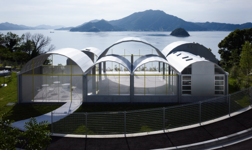
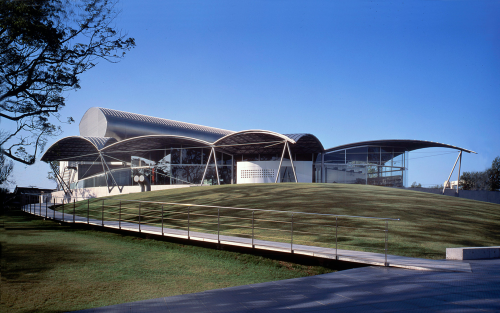
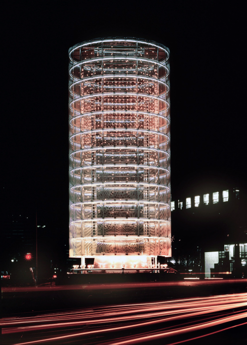
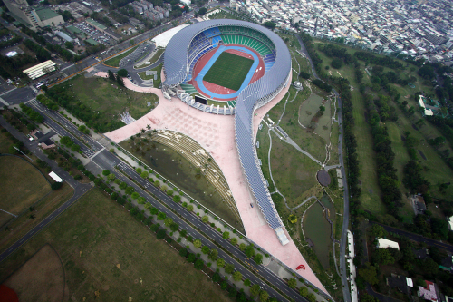
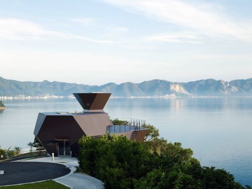
1> White U residence 1976
2> Silver Hut residence | 1984 | rebuilt 2011 for Toyo Ito Museum
3> Tower of Winds | 1986
4> Yatsushiro Municipal Museum | 1991
5> Sendai Mediatheque 2000
6> Serpentine Gallery Pavilion | 2002
7> Taichung Metropolitan Opera House | 2005
8> Mikimoto Ginza | 2005
9> TOD’S Omotesando Building | 2006
10> Tama Art University Library | 2007
11> Za-Koenji Public Theatre | 2008
12> Main Stadium for The World Games | 2009
13> Museum of Architecture | 2011
 click > enlarge
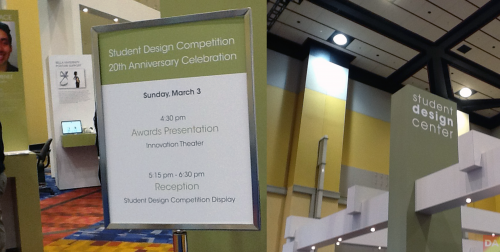
The Student Design Competition turned a proud 20 years-old this March, paying homage to IHA and the 125 winners who launched their careers via this event. IHA said that in 20 years there were over 4,000 entries and 160 industry professional judges. All have contributed with a common goal in mind: to encourage and recognize young designers and raise awareness in the design housewares market of the value of design. Out of the 256 entries received in 2013, six top winners (below) were chosen along with five honorable mentions. BTW, this is Vicki Matranga’s, IHA Design Programs Coordinator, 20th trip to this dance. She founded the competition 20 years ago.
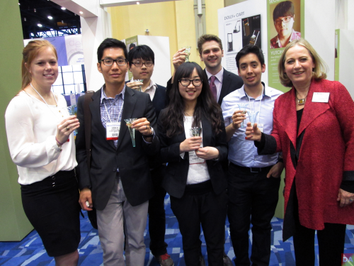 l>r breanna, heman, yutong, yungi, cole, juan and vicki matranga
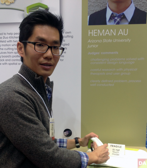
heman au
DesignApplause talks to the first place winners:
[ First Place $3,000 ]
Duo Kitchenware by Heman Au | Arizona State University, junior
[DesignApplause] I am interested in hearing how you got the inspiration to develop this product, Duo Kitchenware. Can you tell me your name, age, school and major?
[Heman Au] My name is Heman Au, I’m a Junior Industrial Design student at Arizona State University, 31 years-old. The idea came from my aunt who owns a restaurant out in Palo Alto, CA.
[DA] And what’s it called?
[HA] Ada’s Cafe. And the entire restaurant is staffed by people with disabilities. She trains them and staffs them to help them become a productive citizen. So a couple years ago she came to me telling me how the knives that she has at her restaurant don’t really work, and since I’m a design student- you know, help her come up with something that would work for her staff members. At the time, I was only a freshman and I told her, “You know, give me a couple years while I develop my skills as a designer and I’ll come back and help you out.” So, a couple of years passed. I heard about the Housewares competition, so I decided to use this opportunity to design a knife for people with disabilities. And you know, from my research I found out that there’s over 800,000 Americans with one form of disability or another, and also through my research I found that there really is a lack of knives for people with disabilities. There’s a lot of spoons, cups, you know, forks- but no knives to help you cook. So I decided to take the opportunity to design something for kind of more the home use instead of the restaurant use. And that is where the idea came from.
[DA] You said it took 12 weeks to conceive and execute your idea. Four weeks of that was research and testing by two people? Now, going forward, you’re looking for a manufacturer to produce this for you?
[HA] Yes. Mmhmm.
[DA] Would you consider doing Kick Starter?
[HA] Yeah.
[DA] Are there any designers who really inspire you or that you aspire to be like in your work?
[HA] I really admire Joseph Joseph’s design aesthetic.
[DA] Right. OK. How did you select your materials for it? What is it made out of?
[HA] Actually drawing a blank so…The knife uses a high carbon stainless steel blade, and I picked that not because of its – I mean, it’s durable, but at the same time it has a stark [appearance], so it contrasts with the white cutting board. So it also helps with people who have kind of visual disabilities or spatial disabilities. The handle is just injection molded polypropylene with over-molded TPE, just for comfort. Kind of like the OXO Good Grips. OXO is kind of like another inspiration, just their focus on ergonomics and comfort. And the cutting board is made out of high density polyethylene, just because it’s very durable, but at the same time it won’t damage the blade’s sharpness. So it will keep it sharp longer and it’s great for harsh chemical cleaning or chemicals, it will withstand that. And again you’ll have over-molded TPE for the handle and the back side just for grip.
[DA] What’s the expected lifespan of this product? Did you come up with a way to sharpen this knife yet?
[HA] Yes, so I tested it out. I mean, I didn’t actually test it out, but I tried fitting it with a lot of knife sharpeners out in the market, and it fits in a lot of existing knife sharpeners. So it doesn’t need any special sharpening tool.
[DA] How many times did you actually have to go through the physical process of creating it before you got it right?
[HA] What do you mean?
[DA] Did you know which materials to use right away before you actually created a prototype version or did you have to make a couple of them before you got the right mixture of materials, process, etc?
[HA] Well, the materials are kind of hard because I don’t have a functional prototype to actually see how long the cutting board material lasts. But from the design aspect, just the form and function of it, I went through at least four or five design revisions before kind of settling on what this- what you see in front of you.
[DA]Is there anything else you’d like to say about Duo Kitchenware that you think people should know?
[HA] I actually want to add that besides it being a good tool for people with disabilities, I’ve gotten a lot of feedback telling me that it would be great for kids as well as seniors, who have maybe arthritis or just low strength. And even everyday moms, dads would love to have something like this in their kitchen. You know, that was kind of one of the things that I was trying to keep in mind in my design, was to keep it nice and simple- at the same time, making it look like an everyday, household item. Because obviously people with disabilities, they’re already very self-conscious of their short-comings and they don’t want to use something that’s kind of branded as, you know, of disabled equipment. You know, I’m just pretty excited to see it out in the market, because I think there’s definitely, you know, a group of people that really need something like this. And it would be great for the younger market. I know a lot of times people don’t design for that group, because there’s not a lot of them. You know, it’s better to design for like 7 billion people versus only 700,000 people, but I feel like by making my design more universal to fit, you know, all different sorts of people- it could really help bring it out to market because people want to pick it up.
[ Judges’ Comments ]
>challenging problems solved with consistent design language
>careful research with physical therapists and user group
>clearly defined problem, process well conducted
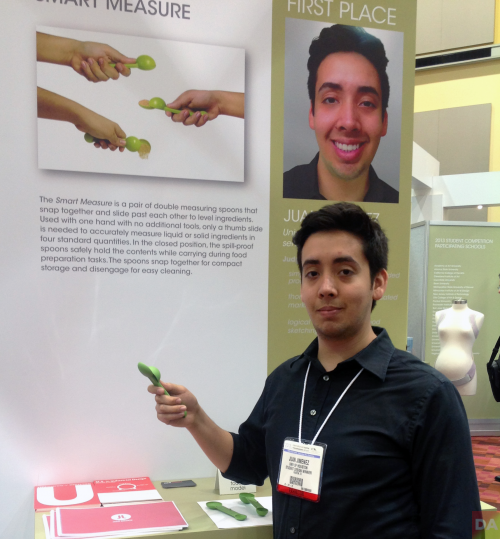
juan jimenez
[First Place $3,000]
Smart Measure by Juan Jimenez | University of Houston, senior
[DesignApplause] Can you tell me your name, age, school, major?
[Juan Jimenez] My name is Juan Himenez, from the University of Houston. I am 23 years-old, and I’m majoring in Industrial Design.
[DA] Can you tell me about the inspiration and thought process that lead to your actual final product, Smart Measure?
[JJ] Yeah, so the project when we began, it was to design a kitchen utensil. And the way I began to do research was really just to print out a bunch of recipes and follow them to try to use as many utensils as I could. And what I began to do is to take pictures and document the different problems I found with different products and just narrowing it down until- to something that I felt had a good opportunity. So eventually I narrowed it down to measuring spoons. So from there I began to really just think of how can I solve these problems simply? And I basically just started sketching, making models and stuff like that.
[DA] OK, cool. So do you have a lot of personal experience with faulty measuring spoons or ways you can make it easier?
[JJ] Yeah, I really didn’t start cooking that much until I was given this project. But I think in a way that gave me a little bit of an advantage, because I was immediately like, “this isn’t working” or “this doesn’t work.” I wasn’t someone who is more experienced who would probably be like, “oh, that’s just the way it is.” So I think that actually gave me a little bit of an advantage.
[DA] And how did you decide on the material for the measuring spoon?
[JJ] For this material really what I did was- usually the way I go about it is I think: OK, what properties do I need this to have? So it needs to be- it needs to have a certain amount of flexibility, it has to be strong, and it has to be food-grade safe. So with that I just think, OK what other products have these same properties? And then I look at those products and say OK, what are these made of, and then I use that as kind of like a foundation to begin my material research.
[DA] How long did it take you to complete this project, from conception to completion?
[JJ] A year overall to refine the measuring spoons. The project itself took two weeks, but I went through a lot of different versions as the idea remained in my head.
[DA] OK, so now what’s next? You’ve won this award. How are you going to try to take this idea further?
[JJ] Well, the idea is to try to- I’ve taken it as far as I can with my knowledge of manufacturing. So I’m trying to meet other people who can help me develop it further and possibly take it to market.
[DA] So are you going to try to do, like Heman mentioned Kick Starter, or are you looking for manufacturers that are specifically looking to carry this product?
[JJ] Yeah. There’s a few companies that I like that have this similar, I guess, design style that I’m interested in. But it’s also a possibility to do something on my own, like a Kick Starter project or something to have it still be mine [IP] and just take it further.
[DA] Awesome. Have you ever submitted to this design contest before?
[JJ] No, this is the first time.
[DA] Well, Congratulations.
[JJ] Thank you very much.
[DA] Just another question I had was, are there any particular designers or brands that you really admire that influenced, you know, your desire to do this?
[JJ] I’m a really big fan of OXO. I think they have really simple solutions to problems, to everyday kind of things that maybe you wouldn’t think would be a problem. But they’re just simpler ways of doing things, and that’s definitely a big inspiration to me.
[ Judges’ Comments ]
>simple, novel offering in a crowded product category
>thorough and well-communicated market research
>logical design process, good sketching and mock ups
Other winners for the 2013 Student Design Competition include:
Second Place $2,000 | Yutong Wu | Dolly + Cart | Ohio State University, junior
Third Place $1,000 | Yunqi Yuan | Bella Maternity Posture Support |Ohio State University, junior
Third Place $1,000 | Cole Mishler | POR Painting Organization System | Cleveland Institute of Art, senior
Third Place $1,000 | Breanna Stachowski | The Neat Seat | University of Notre Dame, senior
2013 Honorable Mentions Include:
Xiaolei Mao | Go Grill | Arizona State University, junior
Alexander Bennett | Certain Spice Dispenser | Rochester Institute of Technology, junior
Justin Bechstein | Pulbak Vehicle Roof Rack | The Ohio State University, junior
Morgan Perry | DuoPress Glucogan Kit | The Ohio State University, junior
Sunoh Choe | The Rack-Over Bathroom Organizer | University of Notre Dame, senior
Grants to the winners’ schools | Each school receives a $415 grant for each winning entry.
 click > enlarge
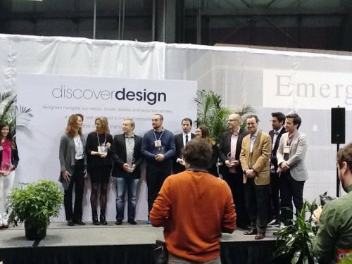
Discover Design is in it’s 3rd year. Over 100 hand-picked suppliers contributed to this year’s show in which 200 products were juried. The juried finalists are on display at a Discover Design exhibition booth. There are two categories, product design and collections. There are two winners in each of those categories, Global Honoree and Finalist as seen below.
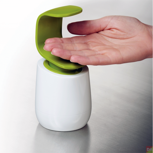
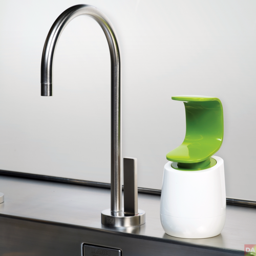
product design global honoree
c-pump | unique soap pump that can be operated with the back of one hand
[ joseph joseph ]
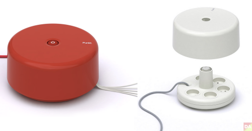
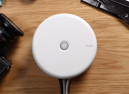
product design global honoree
ES.01 extension socket | cleans up clutter | designer george moanack under art direction of jasper morrison.
[ george moanack ] [ jasper morrison ] [ punkt ]
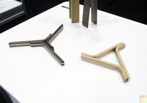
product design global honoree
troika trivet | an adjustable, easily stored adaptive serving tool designed by cutter hutton
[ cutter hutton ] [ teroforma ]
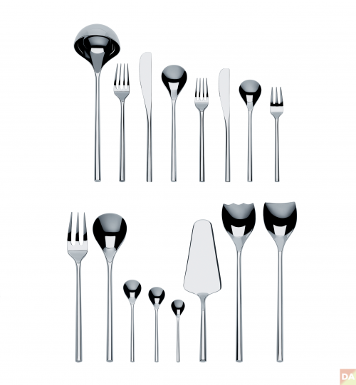

best collection design global honoree
mu | cutlery collection | distinct hexagonal handle which took two years to produce due to difficult production process | designed by japanese architect toyo ito
[ alessi ] [ toyo ito ]
[ product design finalists ]
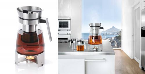
sencha tea maker | simple. brew and serve tea without removing the strainer | [ blomus ]
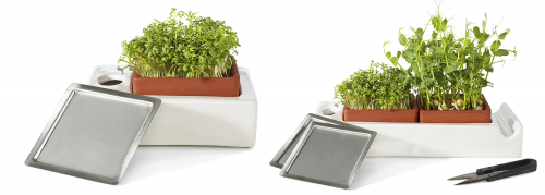
green farm | grow sprouts and herbs indoors in terracotta trays | [ cult design ]
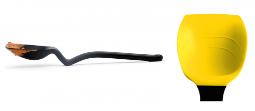
mini supoon | dirty head sits off of counter and also measures a perfect tsp/tblsp | [ dreamfarm ]

couleur | clever nesting of teapot cup and saucer | [ kinto ]
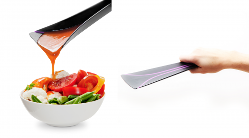
turner spoon | world’s only turner that you can also use as a spoon | [ magisso ]

cool breather | aerates bottle of white wine in two minutes and keeps wine cool |[ menu ]
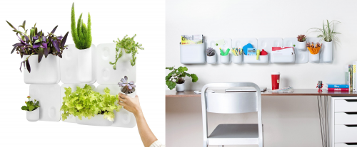
big happy family | vertical garden / organizational system. plates of powder coated steel and vessels from polypropylene with neodymium magnets | [ urbio ]
 The deadline for entries in the Second Annual International Housewares Association Innovations Award is Friday, 25 2013. Winners announced 3 March [ details ]

On 15 December the 2012 Good Design Award winners were announced. Thousands of entries were vetted to highlight the best designs based on innovation, form, materials, construction, concept, function, utility and aesthetic appeal. Select 2012 winners on this page via [ BDE ] The [ complete list ] of winners.
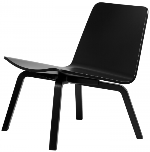
Lento Lounge Chair | Harry Koskinen | Friends of Industry | Artek | 2006-11
![]()
Pixel Graphic | Heather Bush, Carnegie Design Studio | Carnegie Fabric | 2010-11
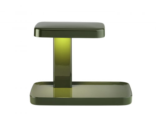
Piani Lamps | Ronan & Erwan Bouroullec | Flos | 2011
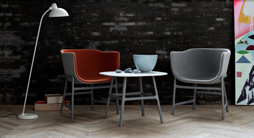
minuscule Chair and Table | Cecilie Manz | Fritz Hansen | 2012
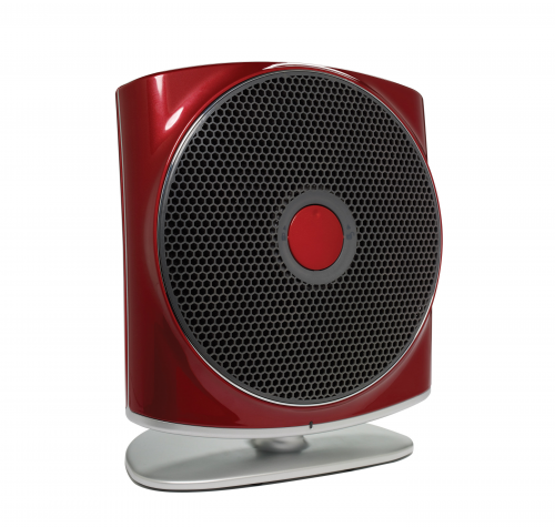
ZŌN® Max Air Purifier | Stefan Spoerl and Andrzej Loreth | Humanscale | 2011-12
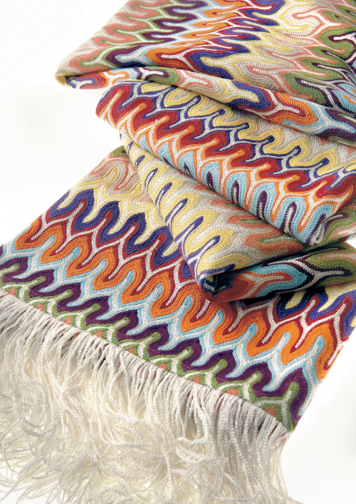
Nadal Throw | Rosita Missoni | MissoniHome | 2012
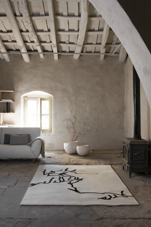
Dibujo tinta | Eduardo Chillada | Nanimarquina | 1957
1> AlessiLux |Giovanni Alessi Anghini and Gabriele Chiave | GAA Design Farm | Alessi | 2010-11
2> Floating Earth Tray | Ma Yansong, MAD Architects | Alessi SpA | 2011-11
3> Ape Aperitivo | Giulio Liacchetti Industrial Design | Alessi | 2011-12
4> Ming Tray | Zhang Standardarchitecture | Alessi | 2010-11
5> Lento Lounge Chair | Harry Koskinen | Friends of Industry | Artek | 2006-11
6> Pixel Graphic | Heather Bush, Carnegie Design Studio | Carnegie Fabric | 2010-11
7> Piani Lamps | Ronan & Erwan Bouroullec | Flos | 2011
8> D’E-light | Philippe Starck, Starck Network | Flos | 2011
9> APPS Luminaire | Jorge Herrera, | Flos | 2011- 12
10> minuscule Chair and Table | Cecilie Manz | Fritz Hansen | 2012
11> Float Sit -Stand Height-Adjustable Table | Humanscale Design Studio | Humanscale | 2012
12> ZŌN® Max Air Purifier | Stefan Spoerl and Andrzej Loreth | Humanscale | 2011-12
13> Nadal Throw | Rosita Missoni | MissoniHome | 2012
14> Dibujo tinta | Eduardo Chillada | Nanimarquina | 1957
15> Manos | Eduardo Chillada | Nanimarquina | 1995

[ good design award ] is the oldest Design Awards program organized annually by The Chicago Athenaeum Museum of Architecture and Design in cooperation with the European Centre for Architecture, Art, Design and Urban Studies. The awards program covers new consumer products designed and manufactured in Europe, Asia, Africa, and North and South America. The trademarked awards were created in Chicago in 1950 by three architects: Eero Saarinen, Charles and Ray Eames and Edgar Kaufmann, Jr. The logo was designed the same year by the late Chicago graphic designer, Mort Goldsholl.
 click > enlarge
Leave it to Porsche Design to offer the best looking mobile phone around–one makes Apple and Samsung products look like downright toys. There’s only one catch to the Porsche Design P’9981
It’s a BlackBerry.
A new version of the P’9981 is about to arrive and Blackberry is showing signs of new life.


From Porsche Design: “The new version features a striking, completely black, design, further emphasising the iconic essence of the brand. The Porsche Design P’9981 smartphone from BlackBerry® is distinguished by a linear and purist look combined with innovative technology. The P’9981 Black will be available from mid of January 2013 in Porsche Design stores all over the world and in the luxury brand’s official online shop.
The black look creates a stylish new take on the product’s outstanding design and high-quality materials. The P’9981 Black consists of a stainless steel frame encased in black plastic with a hand-applied leather backing. Additional highlights include a special black QWERTY keyboard and a crystal-clear touch-screen display. Just like the first P’9981, the black version features an exclusive user interface and an own BlackBerry-Massenger-PIN. The choice of materials and classy black design are typical hallmarks of Porsche Design.
“Since the very beginning, our brand has been identified with the colour black,” said Jürgen Geßler, CEO of the Porsche Design Group. “Our very first product was a completely black watch. It was a revolutionary product at the time and proved to be a great talking point all over the world. As is typical of Porsche Design, the choice of black had a functional significance. The “Chronograph I” was inspired by the non-reflective design of racing car controls, with everything in matt black apart from the instruments. The aim was to ensure a clear and easy-to-read display. The Porsche Design P’9981 Black follows this tradition.”
[ powerful hardware and software ]
The Porsche Design P’9981 smartphone is based on a very powerful platform with a 1.2 GHz processor and HD video recording, as well as high-resolution 24-bit graphics and modern sensors compatible with new Augmented Reality applications. The P’9981 also has 8 GB of internal memory and a 16 GB micro SD card. The memory can be expanded up to a total of 40 GB. The BlackBerry 7.1 operating system of the Porsche Design P’9981 Black incorporates a latest-generation browser, one of the best on the market, to ensure a fast and flowing surfing experience. The smartphone also features Liquid GraphicsT technology for smooth and very high-resolution graphic displays.
In May 2012, the judges for the prestigious Plus X Award® selected the Porsche Design P’9981 smartphone from BlackBerry as the “Smartphone of the Year 2012”.
<a href=" about phil patton
All content ©2007 > 2024 DesignApplause