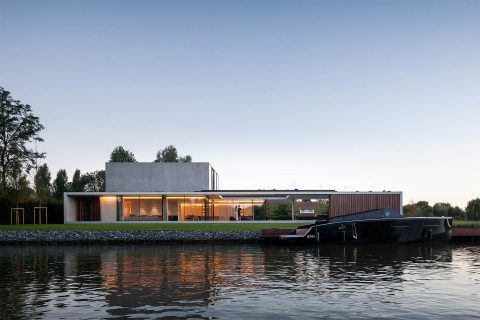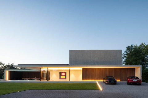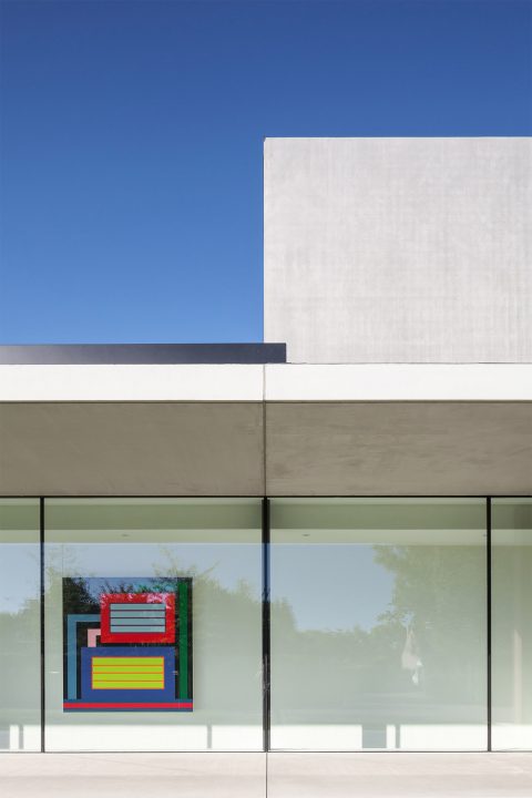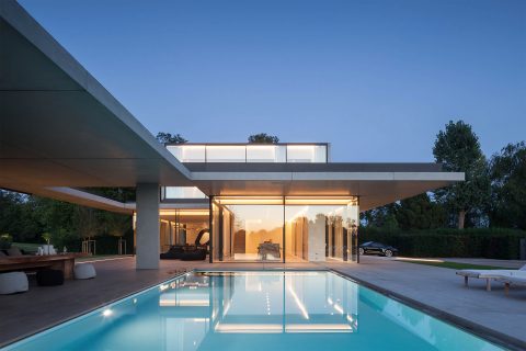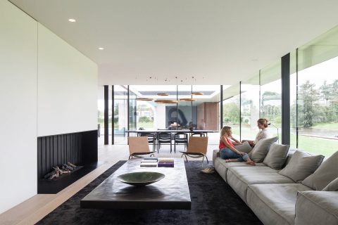
flemish studio govaert & vanhoutte architects designed a single-family concrete bachelor pad for a mid-century style enthusiast.
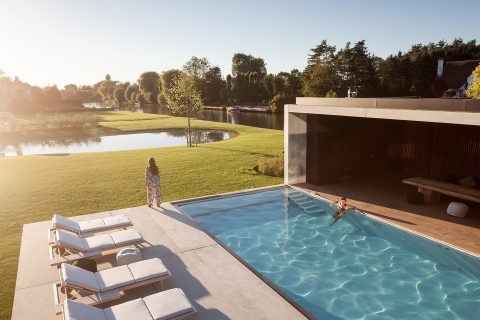
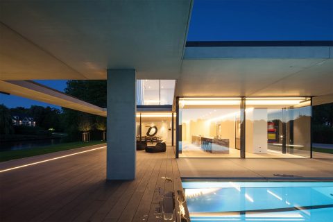
the view from the river shows a long floating horizontal concrete framework that defines the ground floor, which holds all day functions, the pool area and pool house. a second smaller concrete volume contains the master bed and bathroom and two extra rooms with their own service bathroom. a private terrace on the roof, linked only to the master bedroom.
the entire ground floor area favors the river. to allow more privacy, a wooden box that looks like the pool house can extend via sliding panels to completely hide the pool area from the passing boats on the river. the front facade facing the street discreetly presents two entrance doors and a gate for the car elevator.
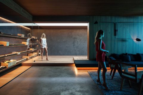
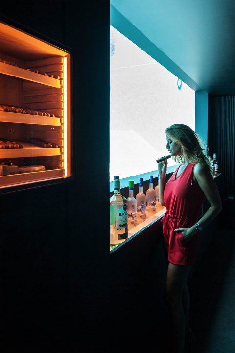
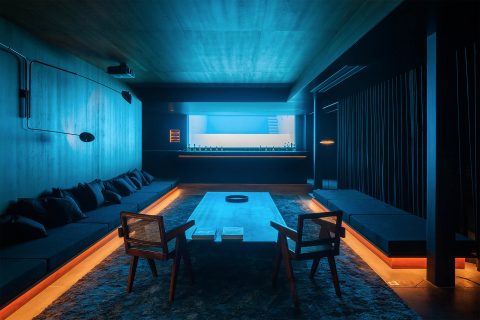
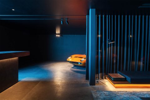
on the first floor each bedroom has a private terrace. nightly activities reside underground: descending the stairs along the glazed front facade, the luminous ground floor becomes dark with wood and black moroccan tadelakt to set the tone. the focus in the basement is the big window behind the bar, revealing the inside of the pool. the bar, a dj booth, a glazed wine cabinet, long lounge benches, the area for exclusive cars, and a built in cigar cabinet, resemble an exclusive underground club.
photography> tim van de velde
residence vdb
venue> sint-martens-latem, ghent, belgium
architects> govaert & vanhoutte architects, benny govaert, damiaan vanhoutte
structural engineering> cobe ingenieurs bvba
main contractor> de mey eddy bvba
completion> 2016
 click > enlarge
Portuguese designer Martinho Pita makes his Bichos from Holly Oak tree branches, which he prunes, peels while they’re still soft and fresh and then sands, shapes and details before they dry completely. Bichos is a loose translation of creatures, which the branches resemble, as if wild and strange forest animals were frozen in motion. The fabric-covered cord is run through narrow pathways and holes made in the branch like the creature’s veins. In a way they really do work like veins – the object’s lifeline – delivering the vital mechanics to power the bulb, or the creature’s brain, on the end.

about perrin drumm
 click > enlarge
With a dizzying number of options to personalize your iPad, iPhone and all of Apple’s other offspring, we’re frankly a little surprised that there aren’t more ways to customize your actual desktop computer. We’re not talking about slapping a bunch of stickers on the back, but about introducing new materials into Microsoft and Apple’s line of lovely yet cold, hard-edged metal clad computers. French entrepreneur and tech trend scouter, Julien Salanave, presaged the move – nay, mass migration – back to the handmade with Oree, a wooden keyboard that marries traditional materials and woodworking techniques with new manufacturing processes.
Salanave said he noticed that “modern technology products look very much alike, are highly impersonal, made out of eco-unfriendly materials and are designed for rapid obsolescence.” To realize his concept for a handmade wooden keyboard he brought on designer Franck Fontana, who has worked extensively with wood products since he graduated from ENSCI, and woodworker Christophe Della Signora, who began apprenticing in the craft when he was just 15-years-old. Using “cutting-edge milling technologies and timeless woodworking techniques passed down through generations of French woodcrafters and cabinetmakers,” each Oree keyboard “is crafted, polished, oil-finished and assembled by hand” in southern France.
Available in Maple and Walnut, the wireless keyboards work not only with Apple products, of course, but with any Bluetooth enabled device. When you include shipping an Oree keyboard costs about $200, but each keyboard is custom made with one of three font options (Fedra, Didot or MrsEaves) or left blank, though we’re not sure why anyone would choose that. You can also personalize your keyboard with up to 45 characters of text or an engraved background.
 about perrin drumm
 click > enlarge
One day when I have a couple thousand quid lying around I’ll treat myself to one of Young & Norgate‘s buy-it-for-life home furnishings. The small design group makes all of their products by hand (“we make, not manufacture”) in their Devon workshop, using high quality, high price materials. THey hand select FSC certified timber from local suppliers and source premium leathers tanned and dyed in Scotland, while their iron work is done in New York.
Each pice in their pared down collection is made to order and is one of a limited edition of 100. Since each item is made for a particular buyer, you can specify details like the type of wood, the finish or the color of the leather. No project is too big or too small, “from umbrella stands to custom made libraries.”
With my penchant for writerly paraphernalia, I fancy the Animate Writing Desk. It has a slim profile and a tray sunken into the pullout drawer, which is lined with red leather (or color of your choice). I love details like the contrasting wood finish on the drawer pulls and the outer panels, giving it a kind of racing stripe on either side. And while I’m at it I might as well spring for the coordinating Animate Bedside Table, with contrasting American Black Walnut and bright formica. I know, formica! It’s great to see unexpected materials used in high quality craftsmanship, especially in retro baby blue. Take a behind-the-scenes tour of their workshop.

about perrin drumm
 click > enlarge
Is it just me or does the Medici chair by Konstantin Grcic, a Munich-based industrial designer, look like a much improved version of the classic Adirondack chair? Not that I don’t like the Adirondack chair – I have half a dozen on my back patio – but Grcic’s chair is the meeting point between American NorthEastern traditional and European chic.
Designed for the Italian furniture manufacturer Mattiazzi, the chair was actually “born” on their factory floor. Grcic said “The chair was inspired by the material, the machinery and, of course, the skill and craftsmanship of the people we worked with…Right from the beginning, I was looking for a distinct grammar for my design, a language that would express the characteristics of wood. I liked the idea of working with planks. They signify the very beginning of the production process – a tree trunk that is cut into slices. I like the way in which a carpenter joins wood. It is immediate and direct. The construction remains visible and easy to read. Structure turns into form.”
Medici comes in three different kinds of wood: Walnut, Douglas Fir (in natural and yellow) and, for outdoors, thermo-treated Ash.
“Designing for Mattiazzi was like a personal time travel. It took me all the way back to my professional roots. At the very beginning of my career, I was trained a cabinet maker. Working with wood is what I learnt from scratch. It is where it all started for me.”


about perrin drumm

Much of Berlin-based furniture designer Johanna Dehio‘s work is inspired by make shift structures. Wandwinkel, or Wall-Angles, is a two-legged side table that “requires only the correct inclination and support of a wall.” Similarly, Kleiderstiele, or Clothing-Sticks, is a coat rack that’s really more like experimental furniture; Hangers are attached to long rods that lean up against the wall, pinning your jacket there until you need it again.
One piece that doesn’t require ample wall space is Dehio’s clever Hockberbank, or Stool-Bench. It does, however, require a little user participation. The system consists of several wooden planks with circular cut-outs that fit over stools. If you only need seating for two, simply take the two-seater plank and stack the other stools. If you need four, or want two three-seater benches, just make the combinations and store the rest of the system. The planks are so lovely you don’t even need to tuck them away in your closet. If Dehio’s other designs are any indication, I’d suggest leaning them against the wall.


 eyrie chair, a bird nest-inspired chair
Looking through the work of Dutch design group Studio Floris Wubben, the first thing you notice is a lot of wood. I know the whole natural, recycled wood thing is hot right now, but this way beyond just slapping some reclaimed barn wood onto the sides of a credenza and calling it a day. Two of the studio’s projects look more like tree trunks that exploded than actual, usable, sit-able chairs. That’s because they’re made from inverted willow trees. Yeah, I’d never heard of that either. They basically take a thickly knotted, gnarly section of a tree, bust it open and smooth out the inside so you can (sorta) sit on it. To make the legs (which look like they’ve sprouted out from the chair and are about to walk away), the tree’s branches are split and twisted into position and then allowed to dry into shape. If it sounds more art than furniture design, that’s completely intentional. “By using uncommon materials and applications (like the use of decorative materials for constructive purposes) we focus on diminishing prejudices and giving these materials a new face.”
Their latest project is the Eyrie, a bird nest-inspired chair made from tree branches. Definitely more form than function, the Eyrie looks downright painful to sit in. While the overlapping, intertwining strips of wood do give it the woven look of a nest, the haphazard slats and the large ‘nails’ remind me more of the hastily slapped together club house a la Spanky and the gang. See more of Studio Floris Wubben design projects, or buy one the busted open willow tree chairs at Anthropologie in NY.
 “upside down” was done in collaboration with artist bauke fokkema.
more wood? > [ diy panton chair ]

about perrin drumm

Wood was the word at this year’s Toronto Interior Design Show, and among the best in show was this chandelier by Brothers Dressler from the Sibling Revelry project. The Brother Dressler do beautiful things with wood. Their portfolio ranges from side tables made from salvaged tree stumps to seating made up of intricately bent wooden slats to whimsical benches and shelves adorned with antique wooden shoe forms.
The chandelier they exhibited at IDS11 last week has a wonderful undulating quality that makes it seem as if the individual pieces of wood aren’t stationary, but free-flowing, like seaweed under water. The name of the chandelier, “Branches,” gives away what it’s actually intended to resemble, but whatever you call it, it’s a first-rate stunner.
[ brothers dressler ]

about perrin drumm
 bae sehwa fits into that small gap between furniture design and art.
When he presented his work at this year’s Art Basel, he was known as an artist, but Sehwa himself prefers the term ‘furniture artist.’ He first made a name for himself with his series of Lighting Tables that look like plain birch wood until you plug them in to reveal the pattern underneath.
His recent work, however, leans towards more craft-based, one-of-kind furniture, made entirely out of wood. The work that blew away the crowds at Art Basel are from his Steam series that includes lighting and “sittable” pieces made from bent wood.
designer: bae sehwa
 about perrin drumm
 the fincube is contemporary, modular, high-tech, sustainable, low-energy, what else? transportable! house with contemporary wooden interior and exterior styling.
It can simply be dismantled and rebuilt on a new site. Requiring only two square meters of foundation, the impact is minimal after the Fincube is moved to another location.

Horizontal ledges provide privacy and assimilate the home into forests, meadows, and let’s also include mountainsides.

The original home was created 1200m above sea level near Bozen in Northern Italy. Made entirely of local wood, the building provides 47 m≤ of living space with a minimal CO2 footprint: local suppliers and local crafts using local long-lasting and recyclable materials manufactured with the precision and care of tyrolese handwork. A prototype of this nomadic housing concept is exhibited in Ritten, above Bozen.
The combination of long-lasting design and portability make for a flexible house or hideaway and a lifetime companion.
Per the designer:
Long-lasting Design: The design is minimal, material-orientated, and in close touch with nature – the wooden space with a 360-degree triple glazing is furnished with a second facade layer, producing shade and giving the building a unique overall mushroom-like mono-shape.


Hospitality Vision: Together with South Tyrolean hotelier Josef Innherhofer, the Fincube was also conceptualized as a vision for future hospitality: a temporary FINCUBE village with minimum soil sealing can be placed in the middle of the most beautiful landscapes without permanently altering them. In contrast to all permanent buildings it could be easily changed, extended, scaled down or removed and the area would soon be re-naturalized back to normal. These qualities turn the unit into an answer to future needs of flexible and smart tourism.
Technology & Space: Technology wise the FINCUBE is a smart house – all vital house-functions are controlled by a central touch panel. The supporting structure is made of local larch and the interior is a combination of larch & stone-pine. The 3m-high space is organized in a helical structure: the entrance area blends into a generous open kitchen with an adjacent sofa living space, around the corner one enters the bedroom and further down is the spacious bathroom.

[fincube]
Designer: Werner Aisslinger – Berlin .
Interior design: Tina Bunyaprasit, Studio Aisslinger .
Wood structure: Markus Lobis – Ritten, Italy
Interior finish: Matthias Prast – Ritten, Italy


