A clip from an upcoming mini documentary, the Draplin Project ( he swears to god ) via from Jess Gibson on Vimeo. thanks carlyn meyer [PR]
Fascinating essay in NYT on the consequences of living in an age of perpetual distraction. The benefits of over-stimulation. Another addiction. via nyt [PR]
World Trade Center design details made public. One theme that emerged forcefully was that many visitors would want to be able to make rubbings of the names to take with them as tangible and personal mementos. Remembering now the Viet Nam Memorial designed by Maya Yang Lin via new york times. [PR]
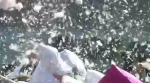
 OT. A stimulus package NYC-style.
above: pillow fight 2008
Head down to Wall Street, 3pm, April 4. Bring your king-size pillow.
[visual culture]

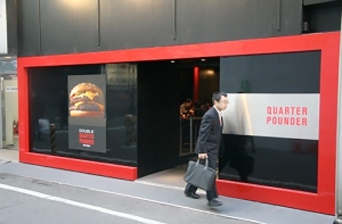
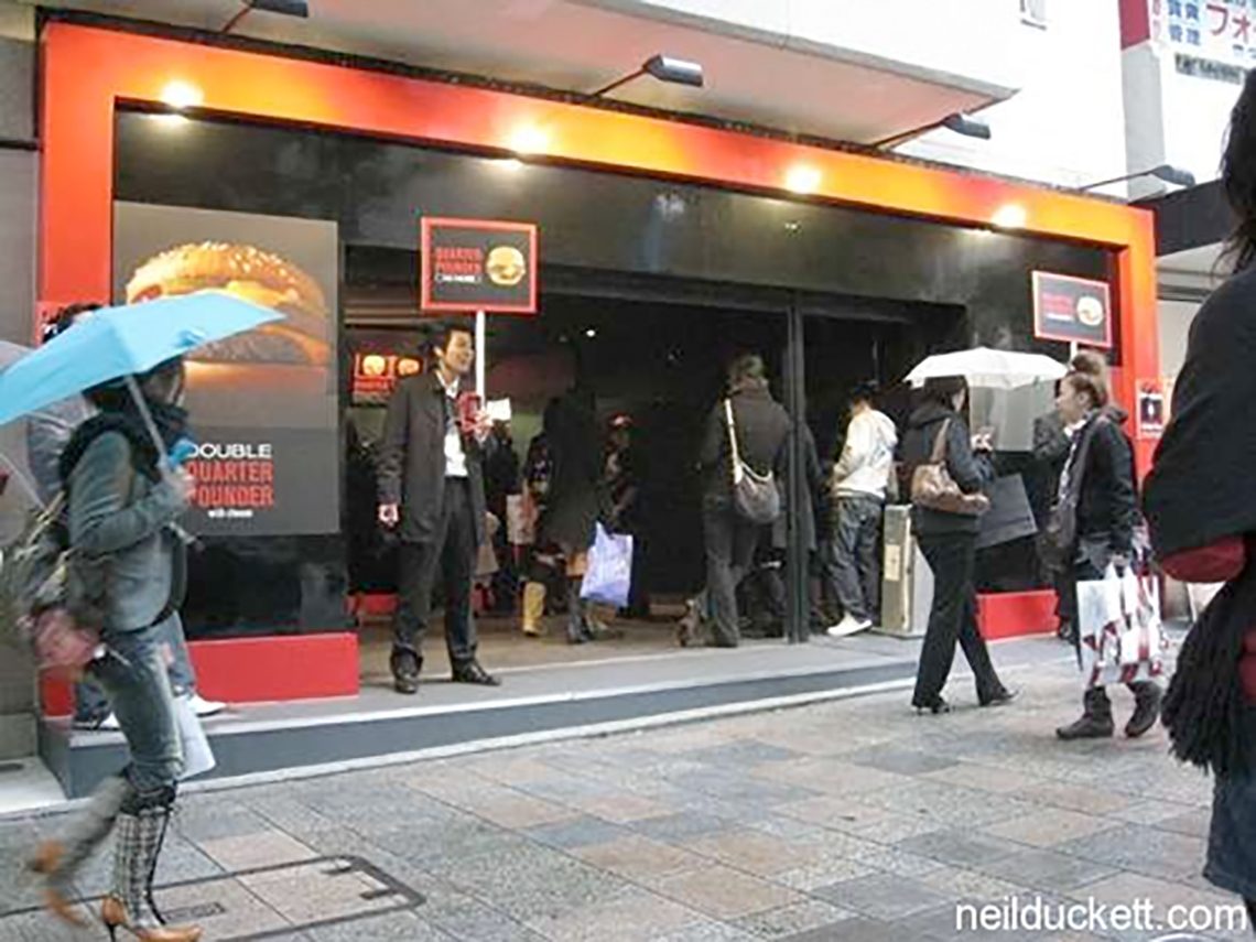
mcdonalds recently opened two of their latest tokyo outlets. to say that it surgically has removed their corporate voice — well its really closer to a lobotomy. wow.

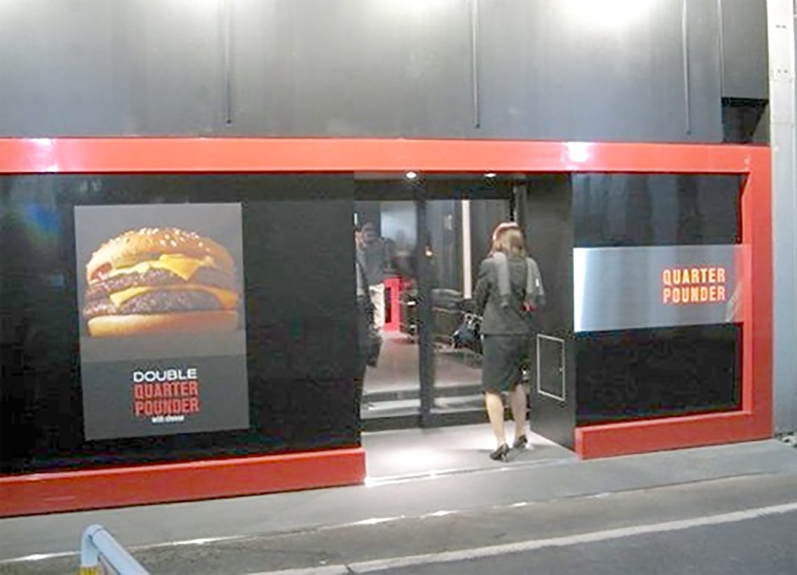
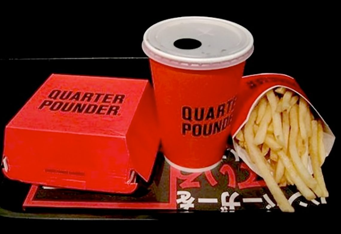
above/below> they have done away with the golden arches, ronald mcdonald, hamburglar, happy meals, and mcmuffins in this mcdonalds. they have even done away with a (the) logo. the only thing they retained is the color red.


above/below> the only products served are the qp (quarter pounder) and the qpc (quarter pounder with cheese) simply in red, white, and black packaging. the fries come with the burger as a menu set, no option here.


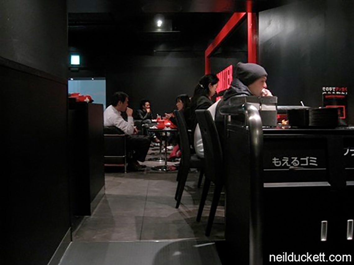
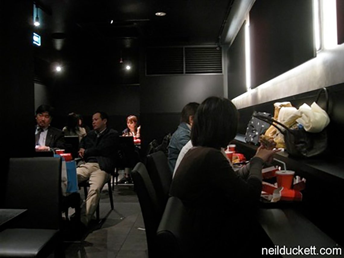
above/below> the interior is very lounge-like. one can imagine what the background music is — country & western ?


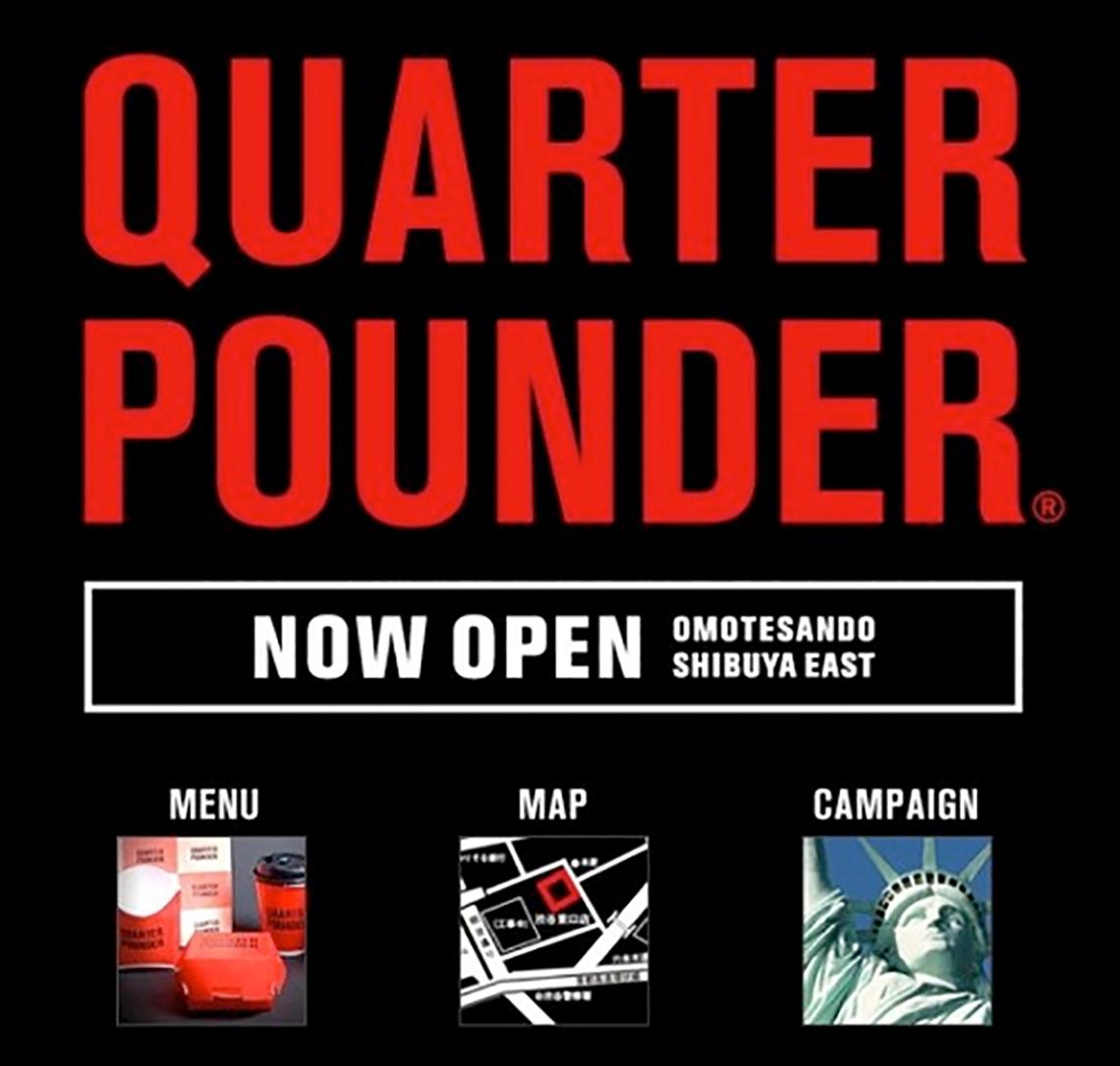
above/below> quarter pounder may look low key, but there is the viral online marketing to the hired hands handing out flyers to passersby. the “quarter pounder big secret” campaign.

we see the “no logo” look for bars and clubs and fewer restaurants. the “mystique” of a somewhere making all of its patrons feel a bit exclusive and in-the-know. if it looks like a club and sounds like a club. its a club. the stores are next to h&m, etc.
what it will do for the qpc? more than a singular design theme to one product. mcd´s is attempting to make an iconic product out of the qpc by wagering an entire restaurant investment on it. feedback and crowds say good.
this is case study material for the brand police. let’s keep an eye on how it does. could you put up one of these in your town?
editor’s notes via links below > in november of 2008 quarter pounder was mcdonald’s no-brand experiment introducing a larger ‘american style’ burger not found in japan at the time and tested on adventuresome and easily bored tokyoites.
via watashi to tokyo — meta tame

The Pantone Color Institute has released its report detailing the top colors for Fall 2009.
According to men.style.com as described by designers showing at New York fashion week, the list suggests something of a Team USA bent (see “Purple Heart” and “American Beauty”). These shades (pictured above, left to right, top to bottom) are “a direct outcome of what’s happening in the world around us,” says Pantone’s executive director. Maybe so. Notably absent: cash green.
1. Iron (Pantone 18-1306): Percentage of designers who used this color, 16.5
2. Purple Heart (Pantone 18-3520): 15.6
3. Majolica Blue (Pantone 19-4125): 12.8
4. American Beauty (Pantone 19-1759): 11.9
5. Honey Yellow (Pantone 16-1143): 10.1
6. Rapture Rose (Pantone 17-1929): 9.2
7. Burnt Sienna (Pantone 17-1544): 8.2
8. Warm Olive (Pantone 15-0646): 7.3
9. Nomad (Pantone 16-1212): 5.6
10. Creme Brulee (Pantone 13-1006): 2.8
via future blog: design hotels
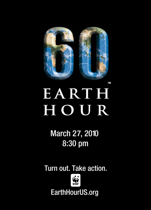 join one billion people in 1760 cities around the world. march 27, 2010, 8:30 pm local time.