photos courtesy of patrick norguet
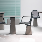
Design Democracy – From Cappellini to McDonalds – Patrick Norguet doesn’t discriminate. McDonalds hires one of Frances top creatives, Patrick Norguet to design an outdoor collection. In collaboration with the producer Alias and the fast-food giant McDonald’s, designer Patrick Norguet has designed a line of outdoor furniture as part of McDonald’s “Come” project. The furniture collection will equip terraces and outdoor spaces McDonald’s worldwide. [ patrick norguet ] [ alias ]

The design solution responds to the ‘COME’ objectives – to design, engineer, develop and install a specific turnkey modular furniture system. The collection consists of 28 pieces made of steel, hand-sanded concrete and Corian tables, chairs, benches, lamps, planters, litter bins and screen. The introduction of the collection will be in Bordeaux and northern France.

Patrick Norguet says:
“For this project, like each of my projects, I wanted to give great attention to the final use. Draw a quality space that fits into the time that meets the demands and requirements specific to McDonald’s. Not all completely outside or completely inside the terrace is experienced as an extension of the restaurant, a separate space for a different experience. It is also a major project for me because we were able to connect two worlds around the project, and thus develop products of high quality. The association with Alias, I was able to reach the level of demand that I wanted for this set consists of 28 objects. A family of tables, chairs, low chairs, lamps, planters, benches, litter bins and screen.”

“I’m lovin it.”
 click > enlarge
Without specifically naming Bertoia, French designer Patrick Norguet cites the “tradition of iron wire chairs” as the inspiration for his Kobi chair, designed for Italian furniture manufacturer Alias. Of course, if you want to make a woven metal chair, references to Bertoia are impossible to avoid. Still, Norguet expands on is predecessor’s basket-weave seat, bringing it up higher on the sides. The base is more prominent, too, with thicker legs and a wider support belt made from cast aluminum that wraps from the seat bottom all the way out to the sides.
Seat cushions are available in fabric and leather, and there are two options for the chair as well: support and legs in stove enamelled aluminum with a colored or chrome shell, or a stove enamelled support with aluminum legs in oak veneered aluminum and a shell lacquered in a variety of colors.
Even though my family’s hand-me-down Bertoia patio chairs are rusty and badly in need a paint job, I still prefer the shape of his seat over Norguet’s. What do you think? Is the Kobi an unnecessary remake, an overdue upgrade, or simply another option?

about perrin drumm
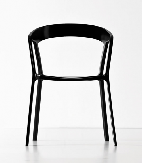
 “compas” chair | click > enlarge
First previewed at Silvera-Université, the prototype of the Compas chair shows the continuing collaboration and affinity between Patrick Norguet and Kristalia which began in 2011 with the “Poule” occasional table and the “Degree” stool/storage henceforth available to the public. The definitive version of Compas will be presented at the Milan Fair in April.
[ “compas” chair ]
“Compas” is a timeless tribute to contemporary furniture conceived in the forties on the principle of fluidity and comfort. Here Patrick Norguet uses current technical possibilities to the full to refine the lines in order to achieve a chair which is both welcoming and stackable, for use inside and out. The seat and the back are polypropylene and the feet are epoxy lacquer die cast aluminum.
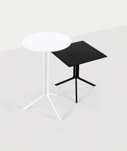
 poule occasional table
[ poule occasional table ]
The Poule table has a light and cheeky soul, first of all because of its name, a veiled reference to chicken legs of which the base recalls the shape, but it is above all functional: produced with drawn wire aluminum and die cast aluminum elements with its constant and recyclable qualities.
It folds and is available in two heights, with a black or white epoxy lacquer, for outside use, and its laminated top is offered in two versions: round or square. Poule will be available from the end of April 2012.
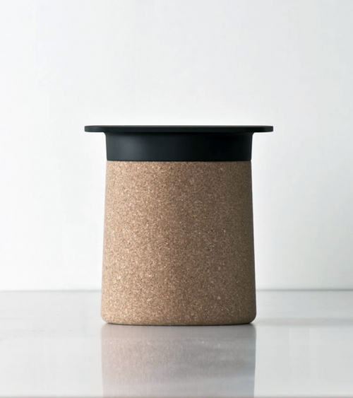
 degree stool/storage
[ degree stool/storage ]
Is it a pop sculpture, a scenographic element or an enormous cork? No, it’s Degree a veiled reference to the British qualification and its unique hat. Presented last year as a prototype at the “Salone del Mobile” in Milan, it is currently available in two versions: in either black or white polypropylene, with or without cork cladding. Versatile and amusing, it is a coffee table which also acts as a small piece of furniture for storage. Degree is available from mid-March 2012.
[ patrick norguet ] [ saloni 2012 ] [ kristlia ]
</strong.

Fast food giants may not be redesigning their menu for the better, but some of them are trying to up the quality of their restaurants by hiring actual designers to update their interiors. Recently, McDonalds hired Patrick Norguet to redo all their French chains to appeal less to teenagers and more to families, emphasizing an “urban and adolescent tone.” Norguet, with his affinity for modular storage and corporate meets contemporary furniture, is a good choice. He designed booth where families can sit and order from instead of wrangling all their kids into line at the counter. The Mondiran-inspired white and metal storage facade looks good now, but I imagine some of Norguet’s swopping, atomic-age moves will look dated even before they get dingy with use. Apparently, there’s also some kind of plant metaphor going on, “its branching development, this root common to the brand and to the family, is transformed here into an architecture which is transversal and expansive: birch plywood takes root and branches out in the restaurant in order to create areas, functions and moods for different social requirements without compartmentalising.” Um, yeah whatever, McDonalds.
As a fitting counterpart to my post on redesigning trailer homes and bringing high design to the heretofore undesigned, here are two more fast food chains that got a make-over. The UK-based chain of Little Chefs hire London designers Ab Rogers for their interiors. Do you think it’s supposed to look this dated, or should I say, retro? They did say they were inspired by “influences from the history of roadside eating.” But isn’t red vinyl booths and white tile floors exactly what we’re trying to get away from here? There’s also an “interactive sound” that gets triggered when someone stops along the roadside just to use the bathroom to encourage them to stay for food. I find that weirdly creepy, but I do dig the photo-realistic tiled ceiling.
The best example of a real step up in the game is the redesign Ippolito Fleitz Group (personal faves of mine) did for a chicken restaurant in Germany. The wooden floor and outdoorsy wallpaper and calmer paint colors are immediately more relaxing and inviting than the bright white and red combo usually favored in fast food. Seriously, when did hospital white and ketchup-red become the standard? It reminds me more of the ballroom bathroom in Stanley Kubrick’s THE SHINING, not exactly what I want called to mind when I’m eating. But it’s not like I’m ever going to eat in a McDonalds, even if it’s a fancy new one in Paris. As a side note, check out the minimalist, logo-less McDonald’s pop-up built in Tokyo in 2009 as way to introduce the brand to Japan without berating with a sudden influx of golden arches.


[Via]

about perrin drumm


