 click > enlarge
Nipa Doshi and Jonathan Levien established Doshi Levien, their London-based design office, in 2000. For the past thirteen years the partners have focused on work that “celebrates the hybrid and explores the coming together of cultures, technology, storytelling, industrial design and fine craftsmanship.” In an interview Doshi said, “The language that interests me is that of the hybrid. The visual language that cannot be placed or defined. The language that talks about plurality of global culture and ideas.”
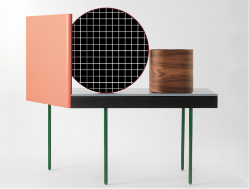
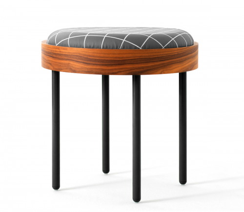
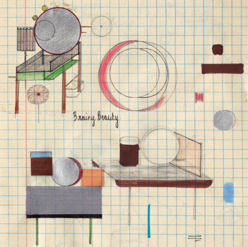
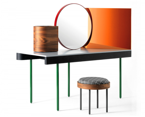
One of their recent projects, a vanity called Chandlo, is a perfect example of Doshi Levien’s ethos. The design for Chandlo draws inspiration from Bauhaus and, apparently, from the bindi worn by Indian women on their forehead. The elements from Bauhaus and De Stijl are obvious in the skinny, linear legs, the gridded pattern on the stool cushion and the strong, mirrored geometric shapes on the tabletop. The reference to the bindi is a little more conceptual and is rooted more in the general idea of the ritual of grooming.
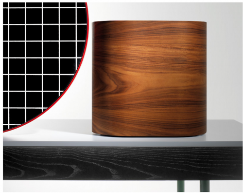
Chandlo is composed of “a central, front faced mirror with a red steel frame, a side mirror with a rose colored filter and a plywood jewelry box with rosewood veneer, all structured on a solid ash surface.” From Doshi Levien’s website:
“Chandlo was designed as a special prototype made by BD Barcelona for Das Haus 2012. This was an installation by Doshi Levien for IMM Cologne that explored their vision of a perfect home. Das Haus consisted of interconnected spaces opening up to a central courtyard. The different areas of the home depended mainly on objects and furniture to define space.”


about perrin drumm
 click > enlarge
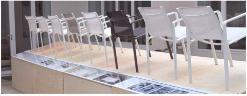
It took designer Jasper Morrison four and a half years to perfect his new line of outdoor furniture for Kettal. The stackable tables, chairs, a sofa and lounger were made especially lightweight to make moving them into winter storage as easy as possible. The collection was shown as part of Kettal’s display at Salone del Mobile in Milan, along with pieces by their other designers, like Patricia Urquila.
Apparently, it took Morrison almost five years to design the collection because he spent much of the time researching outdoor furniture products, analyzing standard codes and testing materials for durability. I like his clean, streamlined collection because it reminds me of the simple, well-made, modern patio furniture my grandparents had in their backyard. Like Park Life, those pieces were built to last. In fact, many of those pieces currently furnish the pool area at my cousin’s home. That kind of generational lifespan is one of Kettal’s biggest selling points – along with considered design, of course. Morrison took ergonomics seriously in his approach to make leisurely summer afternoons as comfortable as they ought to be.


about perrin drumm

Milan design week may be over and done with, but so many incredible ideas made their debut on the vast showroom floor that the event still has us buzzing.

Take this deceptively simple idea from Italian designer Peter Bottazzi and Denish Bonapace that turns used up and useless old furniture into artfully rendered homes for plants. Called Da Morto A Orto, or from redundant to abundant, Bottazzi and Bonapace took various pieces of furniture and combined them into hybrids – rolling desk chair with a wooden dresser drawer and an aluminum lamp or a plush armchair with metal pots sprouting out its back. The combinations are endless and these pictures are the ultimate inspiration for DIY-ers.
Of course, Da Morto A Orto isn’t just horticultural eye-candy or a collection of one-off pieces. It’s “a critical, ironic reinterpretation of everyday objects that we no longer recognize or that are on their last legs.” Objects and furniture around the house that are destined to be discarded or destroyed are given a new life and purpose. What was once trash is now a thing of beauty.

about perrin drumm

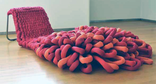
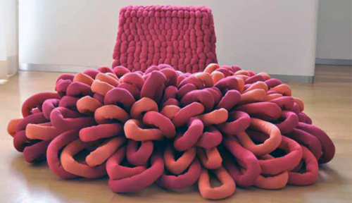
Born from a love of tufting, Danish furniture designer Sophie de Vocht’s “Loop Chaise Lounge” takes a technique typically reserved for carpeting and applies it to seating instead. Bright, playful and overwhelmingly tactile, de Vocht’s lounge chair practically begs to be touched and, of course, lounged upon.

To create it, de Vocht wove over-sized yarn through a metal frame, tufting it tightly on the back rest and loosening (and brightening) it up along the length of the chair until it fans out and acts as a sort of carpet/ottoman.
Oftentimes really innovative furniture is a pleasure to behold and admire form afar, but actually using it can be an uncomfortable prospect. Clearly, that’s not the case here. The “Loop Chaise Lounge” is as inviting as a pile of freshly raked autumn leaves, waiting to pounced upon or curled up in. See other examples at salone internazionale del mobile
designer: sophie de vocht

about perrin drumm
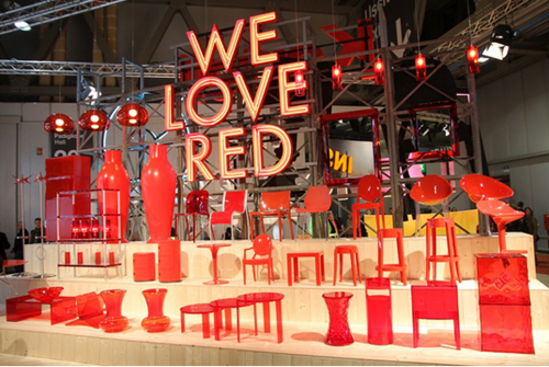
 left: kartell
Apartment Therapy called this year’s show-stopping booths “a mix of design carnival, furniture circus and visual theme park,” and if we’ve learned anything so far from Salone Milan this year, it’s that designers love a good show. Years of planning and hard work go into each and ever product featured on the exhibition floor, but what would these designers be without a good display? Out of the hundreds of chairs at Salone, what draws your attention to one and not another? Let’s take a look at who’s sitting down on the job and who’s strutting their stuff.
Kartell’s unabashed use of red is real winner in my book. Displaying all their wares side by side in a single color is also an effective way to show off the individuals designs without distraction. It’s simple, bright and straightforward, and the flawlessly executed big, bold lettering is downright eye-arresting.
 left: dedon
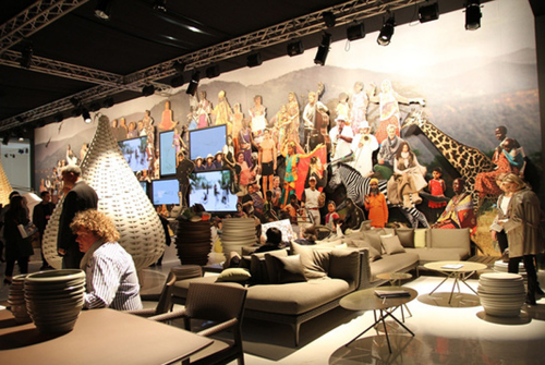
I also love the collaged wall mural Dedon used. Their mostly neutral-colored wares benefit from the backdrop of bright shapes and patterns.
 left: alias
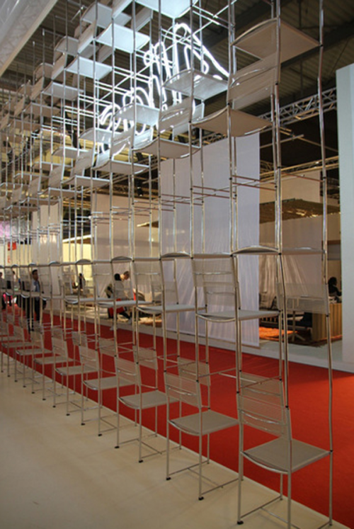
Lastly, Alias wins for cleverness with their great wall of stacked chairs. Talk about a way to effectively display your product while using the product as the display itself. Of course, it doesn’t hurt that all of these booths also have stellar products to hawk.
[ at the salone internazionale del mobile ]

about perrin drumm

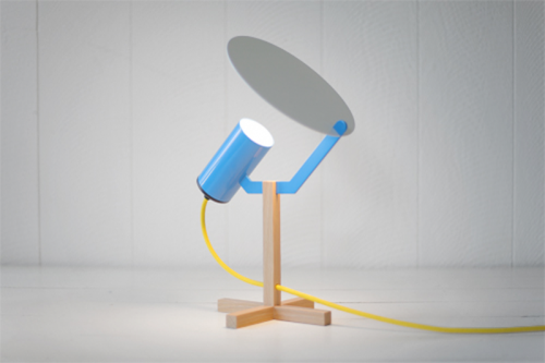
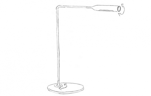
Big Bounce, “inspired by lighting techniques used on film sets” — we learn that reflective bounce can soften the hardness of high power LEDs. The lamp is made of FSC Certified White Oak, powdercoated laser cut steel. May be purchased through the designer.
designer: jonah takagi
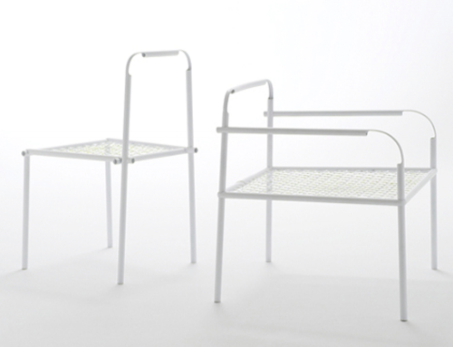
 bamboo-steel chair by nendo for yii
an inspiring, crack-a-smile, head scratching, take a load off array of 21 chairs called stacking throne, tubular chairs and plopp.
[ at the salone internazionale del mobile ]

For design addicts, yet another thing to visit while at milan 2011. You’ll get the best of both worlds. The new and the timeless classics. Try to fit it in, you won’t be sorry.
Triennale de milano
viale alemagna, 6
metro – linee 1 e 2, fermata cadoma – triennale
autobus – linea 61, fermata triennale
[ la triennale di milano. design museum ]
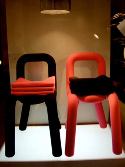
 bold chair by big-game for malo. felt-covered.
Let’s start with the premise that design is off to a good start in 2011. The Guardian reports the Milan Furniture Fair, in its 50th year has 2,700 companies exhibiting although attendance might not reach that of record year 2008. An interesting sidenote is this “furniture fair” has inspired the city to host hundreds of related events in showrooms, fashion stores, galleries and vacant warehouses. The fringe events are so numerous now that they take over entire districts.
 no evidence this year to date of similar sentiments sketched out in 2010.
Design’s good start in 2011 might have been predicted based on what happened in Miami Basel & Design/Miami in December 2010. Last year for the first time, Design/Miami built a pavilion right across the street from the main draw, the art show, rather than their historic venue in the Miami Design District. And just like Milan, a similar pattern of creative multi-disciplined fringe events popped-up outside of South Beach and spread throughout the Design District and elsewhere. The Art Basel attendance was down but not so for Design/Miami ( in essence, this year a furniture show ) which experienced a best in their ten-year run.
Another thought, The Guardian, if they chose their words carefully, says design plays an important role in urban economies. Here we assume furniture and urban are co-dependent. What about the non-urban economies? Maybe the 2011 International Home & Housewares Show in Chicago in March, which is not urban-centric, gives hints to this question. This year for the first time the show introduces Discover Design, a juried event, with design awards for design-driven home products. This year’s houseware’s show was a very good show.
Below, a few 2011 offerings…
[ milan 2011 furniture fair hosts record numbers ] [ 2011 housewares discover design product winners ]
 click > enlarge


