• CALENDAR
    • Add Your Event
  • architecture
    • art & literature
    • awards
    • buildings
    • sustainable
    • prefabricated
    • public space
    • residences
    • urban planning
  • design
    • art & literature
    • awards
    • collectables
    • concept
    • fashion
    • sustainable
    • home
    • lifestyle
    • safety & special needs
    • transportation
    • workplace
  • editor’s pick
    • featured
    • gift ideas.
    • interviews
    • opinion
  • events
    • auctions
    • competitions
    • conference & Exhibitions
    • fairs
  • news
    • latest news
    • elsewhere
    • lifestyle
    • people
    • producer
    • retailer
DesignApplauseDesignApplauseyour daily design dose
  • CALENDAR
    • Add Your Event
  • architecture
    • art & literature
    • awards
    • buildings
    • sustainable
    • prefabricated
    • public space
    • residences
    • urban planning
  • design
    • art & literature
    • awards
    • collectables
    • concept
    • fashion
    • sustainable
    • home
    • lifestyle
    • safety & special needs
    • transportation
    • workplace
  • editor’s pick
    • featured
    • gift ideas.
    • interviews
    • opinion
  • events
    • auctions
    • competitions
    • conference & Exhibitions
    • fairs
  • news
    • latest news
    • elsewhere
    • lifestyle
    • people
    • producer
    • retailer

milan design week 2015

Home Tag milan design week 2015
welcome home. milan design week 2015.

welcome home. milan design week 2015.

Jun 5, 2015

In one of the more successful brand interventions at a Milan Design Week that was criticized for being too commercial, airbnb partnered with Fabrica to create Housewarming. 19 international designers were invited to interpret the theme of “welcome” and the results were displayed in Palazzo Crespi, a private home never before opened to the public, that was originally built to celebrate the coronation of Napoleon Bonaparte, along with the other buildings on Corso Venezia.

airbnb-IMG_0074 1

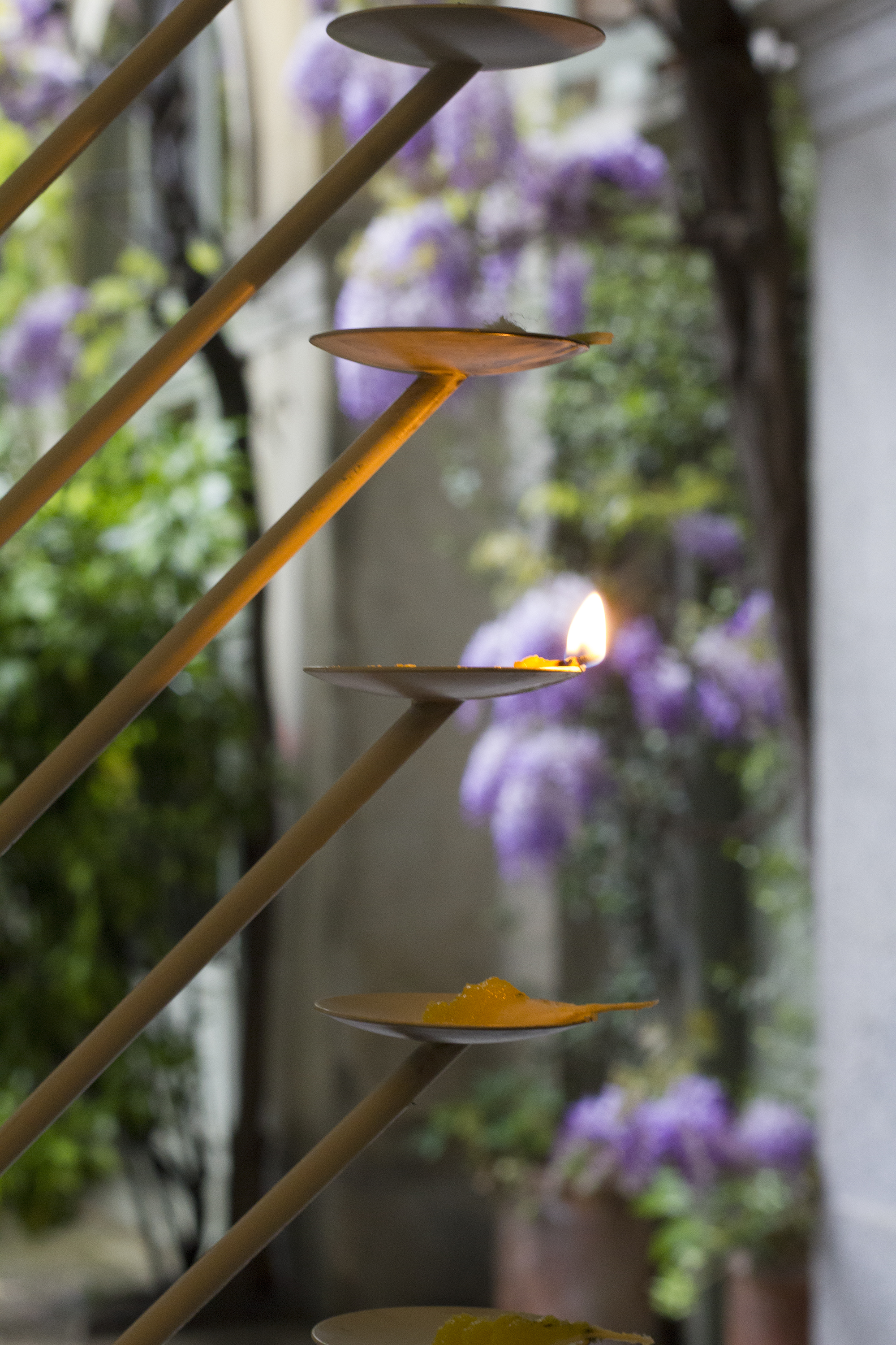
Nikita Bhate’s Samai took inspiration from the Indian ritual of lighting candles. It is a mark of honor to ask a guest in your home to light a candle, and Nikita asked all those visiting Housewarming to light one. “This is my own interpretation of the piece,” said the designer. “I wanted this object to grow with time, so as you see now as the guests come it will keep on getting better.”

airbnb-IMG_0073 1

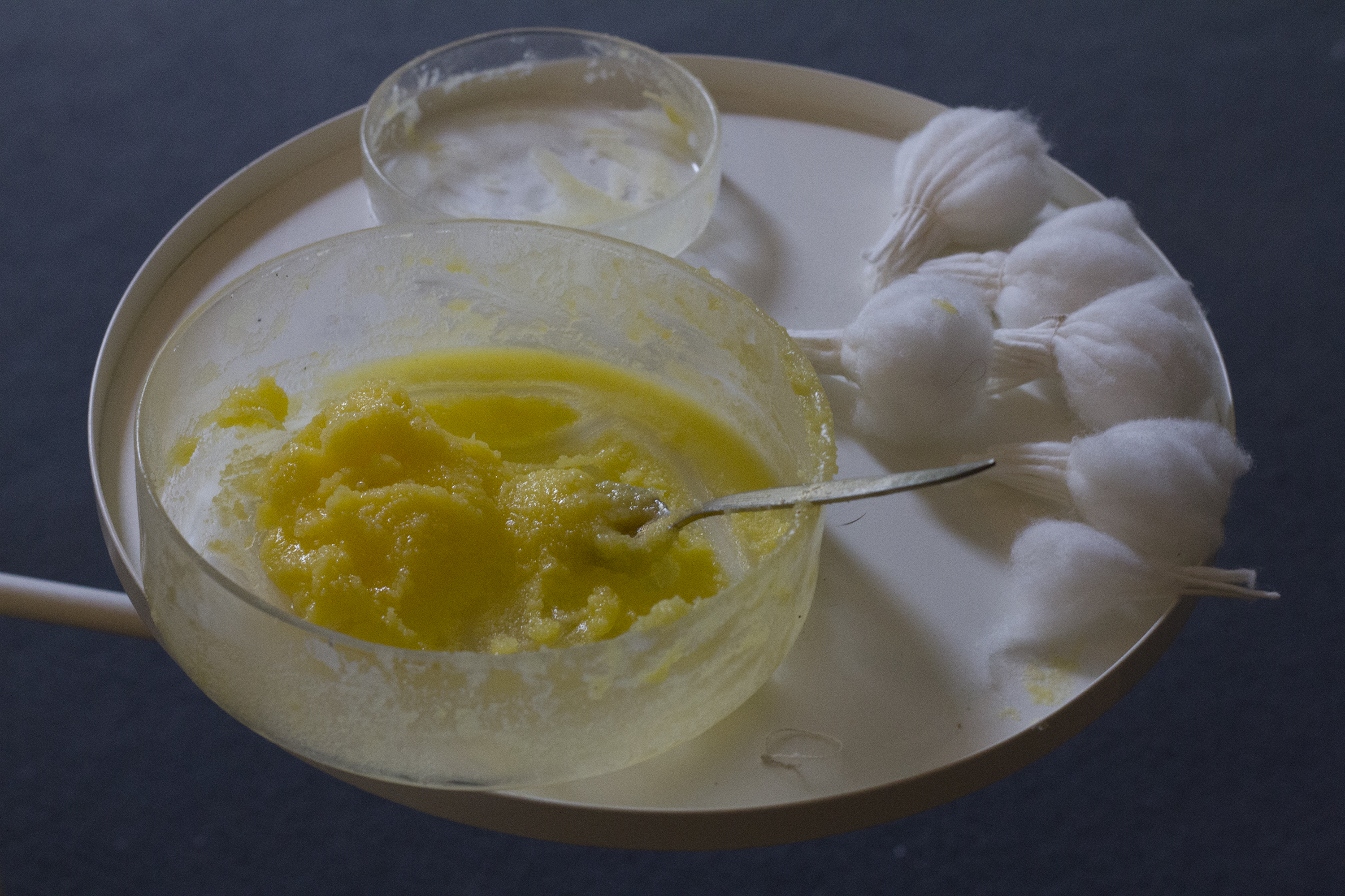
The lights were made from ghee and handmade cotton wicks. “Every morning the ladies of the house prepare all of this because we do this ritual every single day,” Nikita said. “This ritual is about the victory of light over darkness – it symoblizes the victory of knowledge over ignorance, and reminds us to be more humble and be detached from material world.”

airbnb-IMG_2804

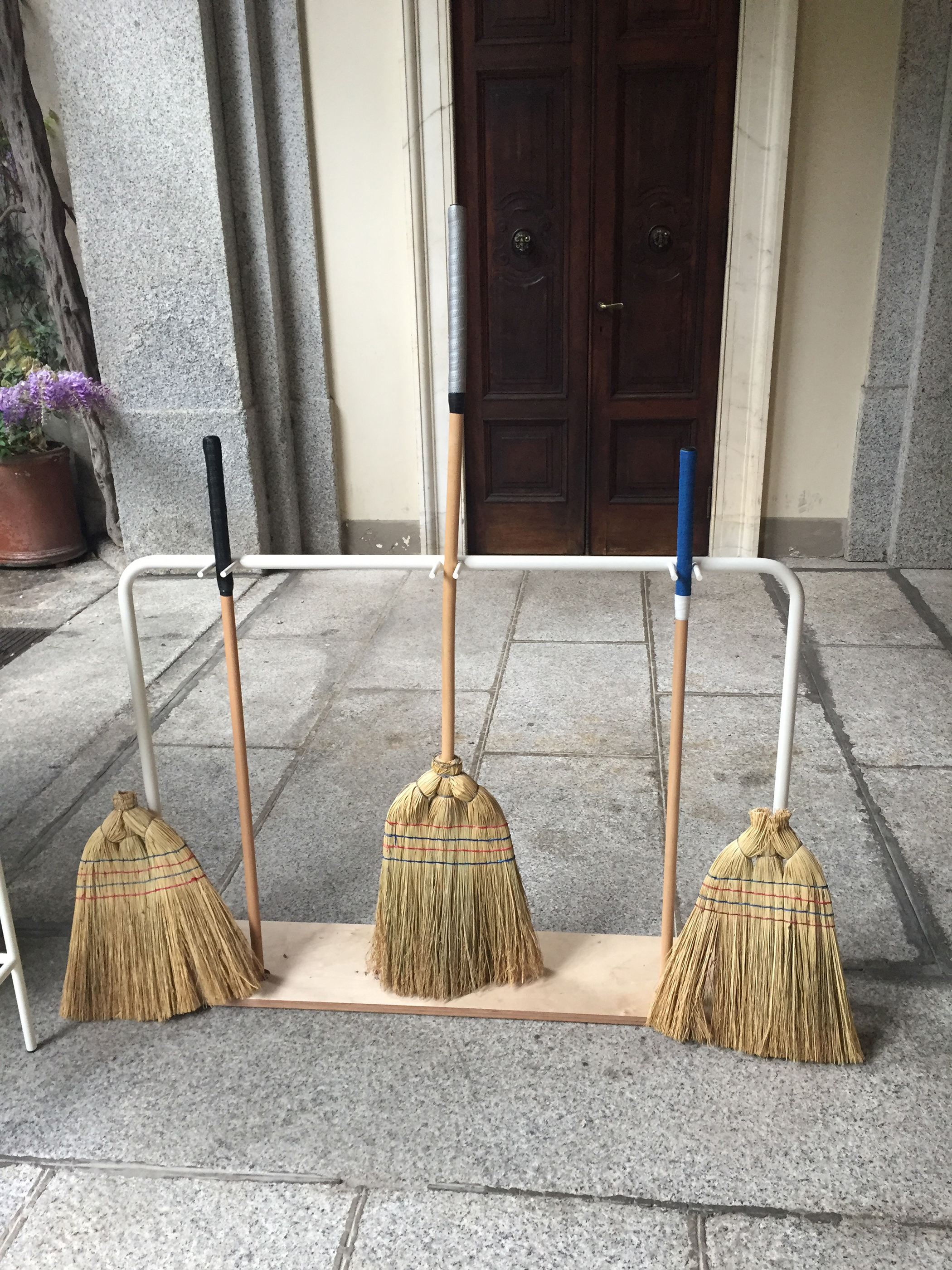
Digital designer Alex Rothera went completely analogue and transported his childhood game of ‘stickball,’ played with the handle of a broom and half a tennis ball, from the streets of Philadelphia to the Palazzo Crespi courtyard.

airbnb-IMG_2806

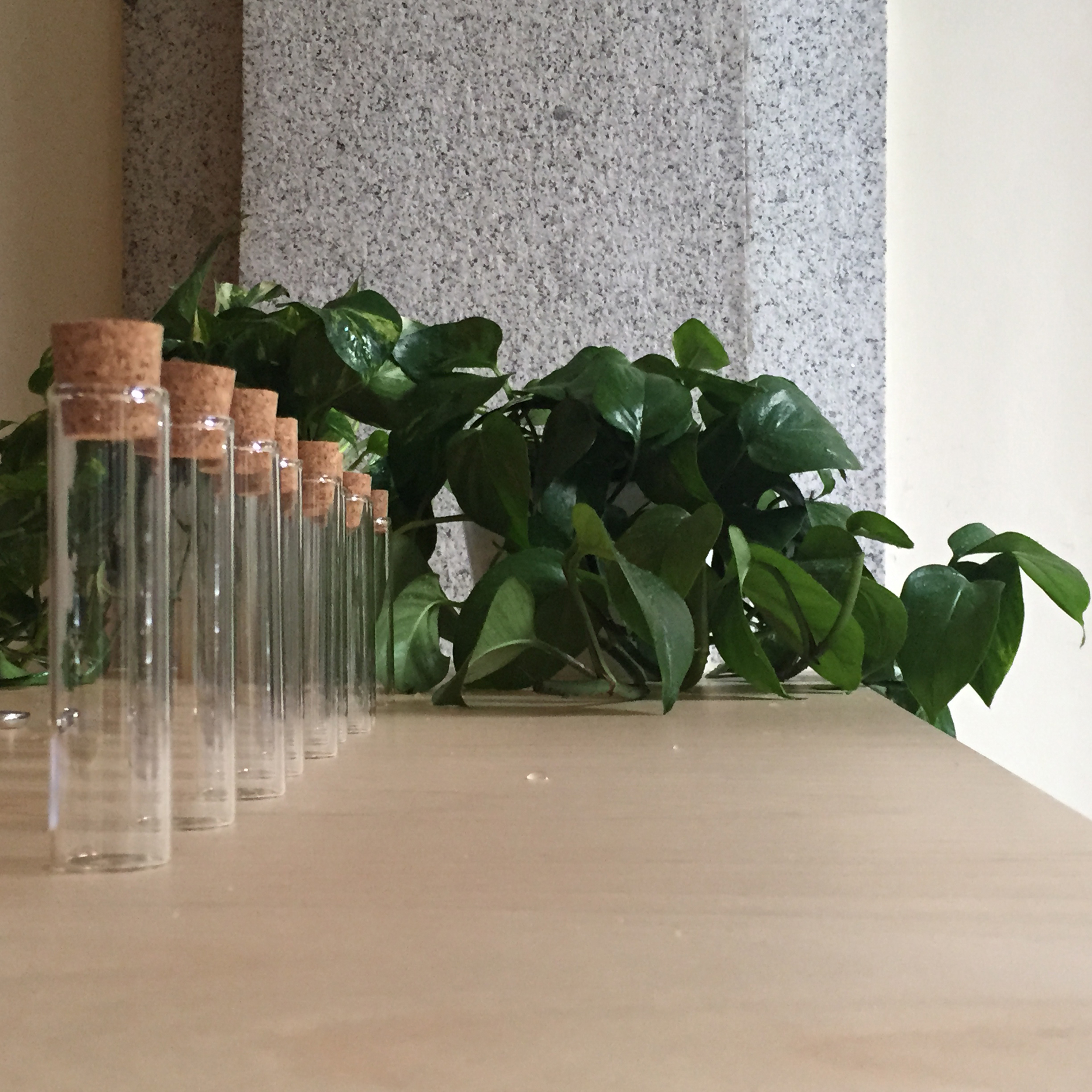
Australian designer Aaron Gillet was creating plant cutting in tiny cork-capped test tubes. “When you go to someone’s house or garden in Australia, and maybe in Britain too, you might take a plant cutting,” he said. “So that’s what I’m doing today. Australia is such a young country – younger than this house, so I wanted to talk about the environment that people are in, and avoid some of the stereotypes.”

airbnb-IMG_2807

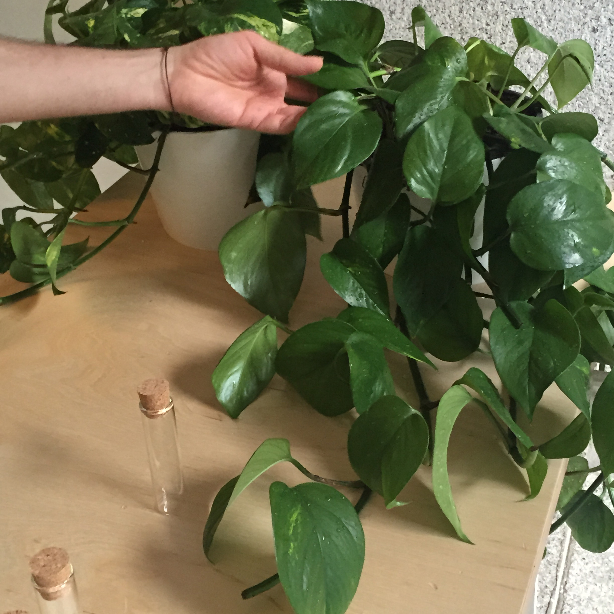
He made a clipping from a native Australian monster for each visitor who could take it home and watch it grow. Mine is on my desk as I type.

Angelo Semeraro’s From Outside to Inside was a motion-sensitive set of wooden hands that welcomed visitors from the outside courtyard into the main house. “The idea is to interpret the non-verbal languages and body language and how passive it is and how you can say something without saying a word,” said the designer. “You get straight to the point and invite people to come from the outside of the house to the inside of the house.”

airbnb-IMG_2811

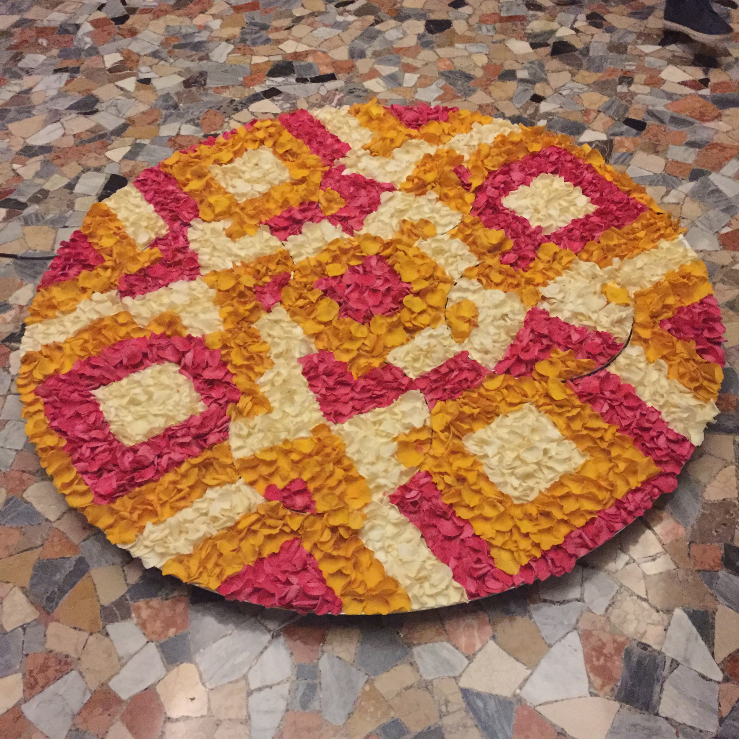
The Welcome Carpet, made from real rose petals by Chandni Kabra was inspired by another Indian ritual. “When we know guests are arriving we make a fresh flower carpet just outside our house door,” explained the designer. “The reason is that when someone comes from outside, their mind is occupied with a lot of thoughts. As soon as they look at something really striking and beautiful, they stop thinking for that moment, and that makes them fall into the present moment, so before they enter the house they’re a bit more grounded.” Being an interaction designer, Chandni added a moving element to the pattern to absorb visitors further.

airbnb-IMG_2814

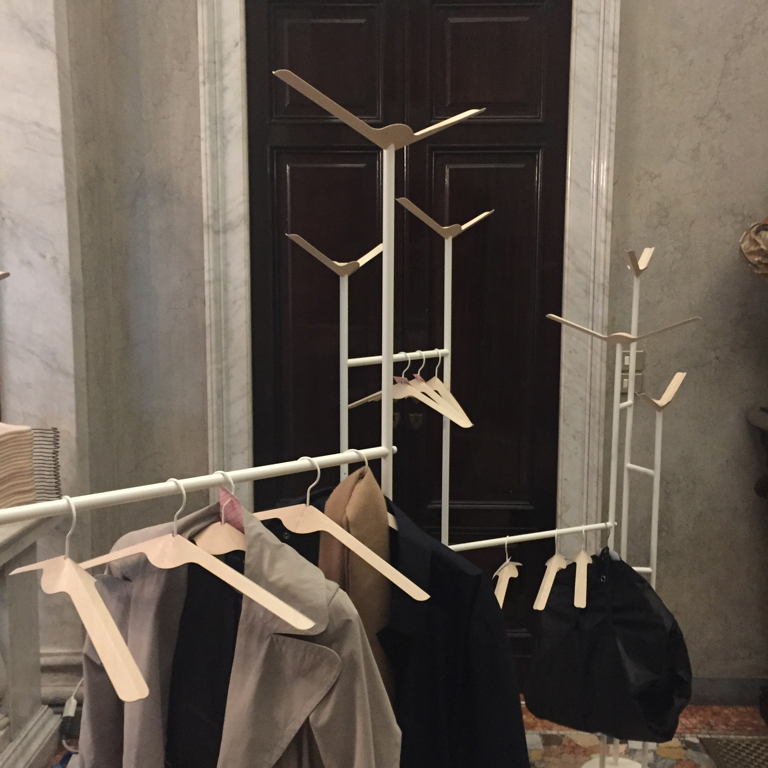
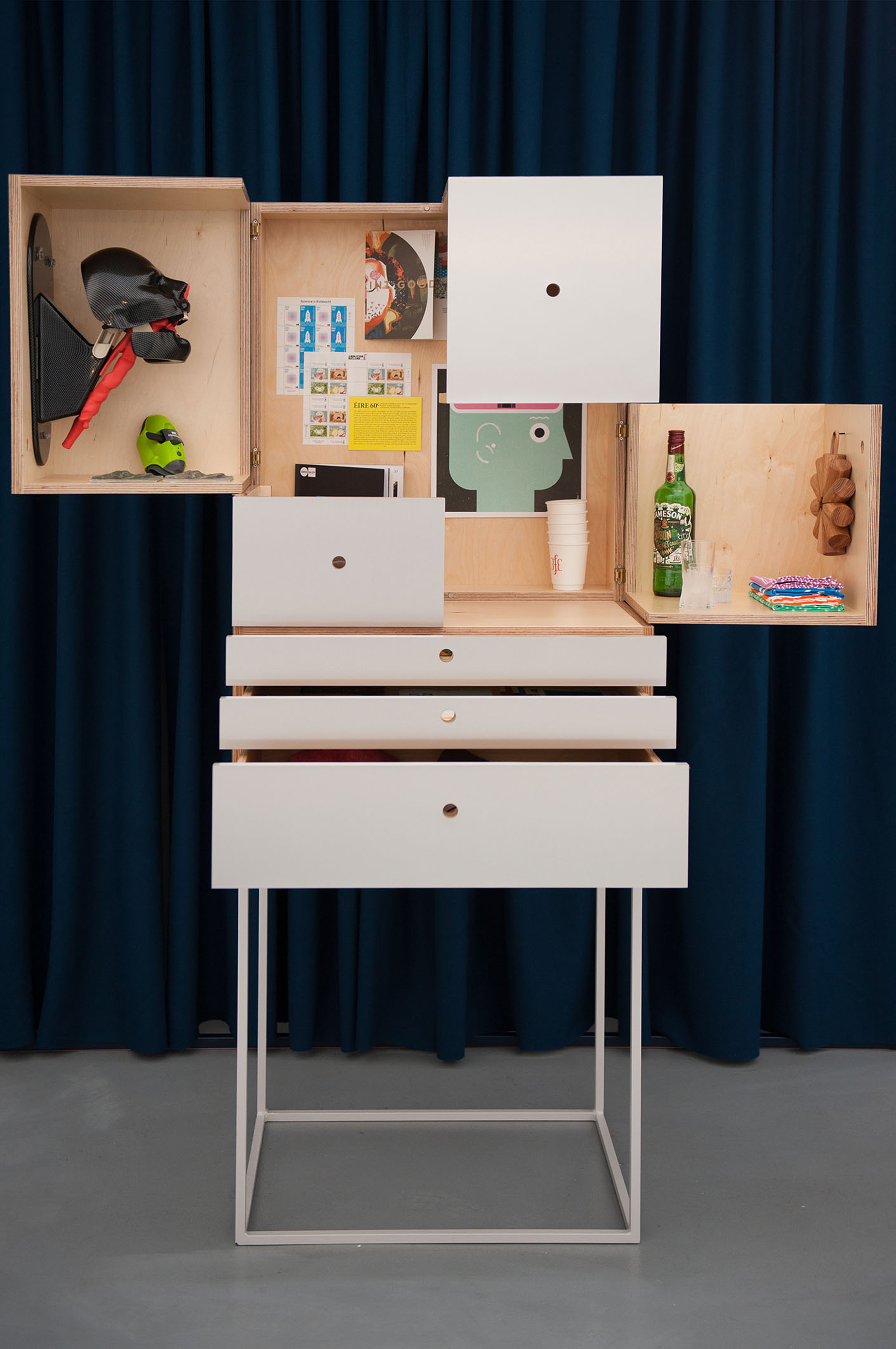
Fabrica’s current design resident Pascal Hien created Foldhanger, coat hangers made from a single sheet of folded plywood, which can also be used as coat hooks when upside down. “I’m from Germany and what we do in Germany when you enter the house as a gesture of welcome is we say, ‘Hey, take off your jacket, put down your bags,” and we hang their coat on a coat hanger, and then the guest feels welcome.”

airbnb-IMG_2818

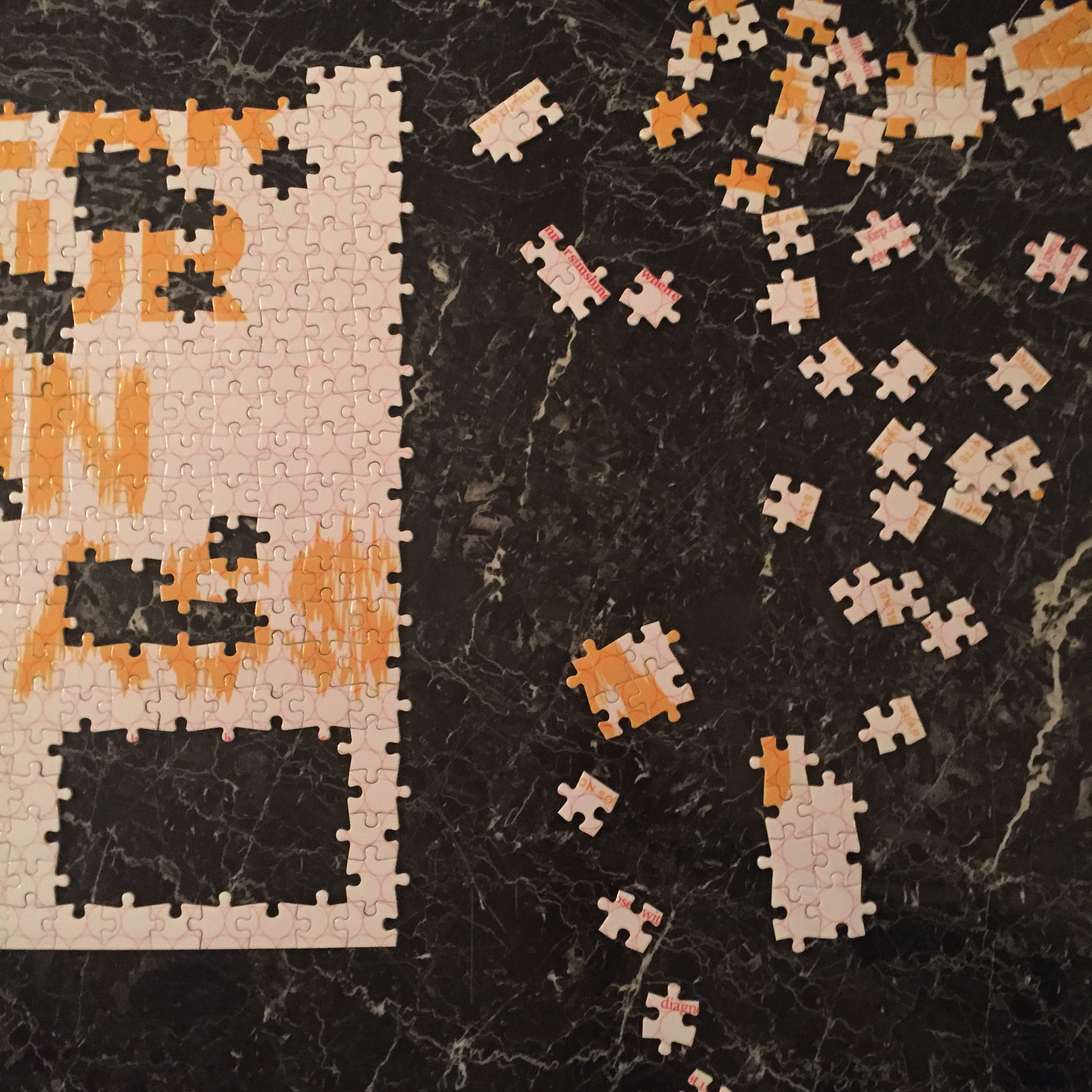
Another Australian, Thomas Fethers, had created typographic advice and then broken them down into jigsaws. “I’m completing the puzzles with the guests throughout the four day period to make them feel welcome. My personal favorite is ‘Get drunk on boxed wine’,” he said.

airbnb-IMG_2820

Following the idiom that the best way to see a city is to get lost in it, Coralie Gourguechon was making bespoke maps to help visitors do just that. “This is a map, but it’s not a map to find your way – it’s a map to lose your way,” she said. “I fill it with different information created at random for every guest.” By rolling dice, asking guests to name something that might interest them, and assigning letters, she creates directions that can be followed in any city.

airbnb-IMG_2822
airbnb-IMG_2825


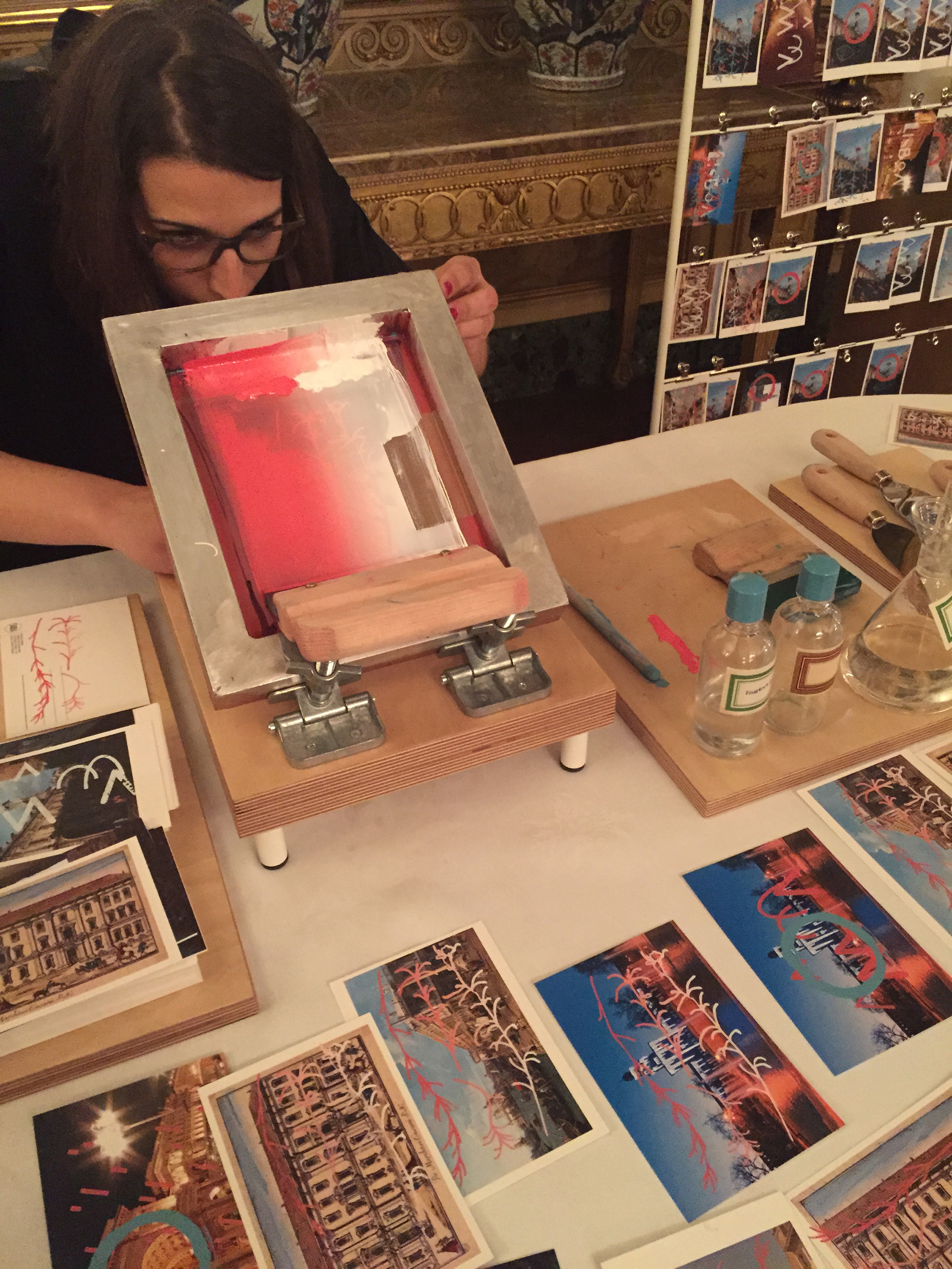
Lisbon-based designer Mariana Fernandes collected postcards from all over Milan and screen-printed graphics that connected Milan to her home city over the top. “The graphics talk about simple facts, simple stories,” she said. “For example I’m printing the rosemary because we use a lot rosemary in cooking in Portugal and the same is true in Italy so these kind of simple facts, when overlapped, create a story.”

airbnb-IMG_2828

Marlene Wolfmair’s Jausensackerl is based on a typical picnic handkerchief and the tradition in her native Austria for a late afternoon picnic or Jause. “I was inspired by the north of Austria where I’m from,” she said. “We enjoy food together with family and friends at tea time and we eat a lot of heavy food, drink beer and sausages, so there’s also this image of the hiking person with the stick with carrying food – it’s very typical.”

airbnb-IMG_2829

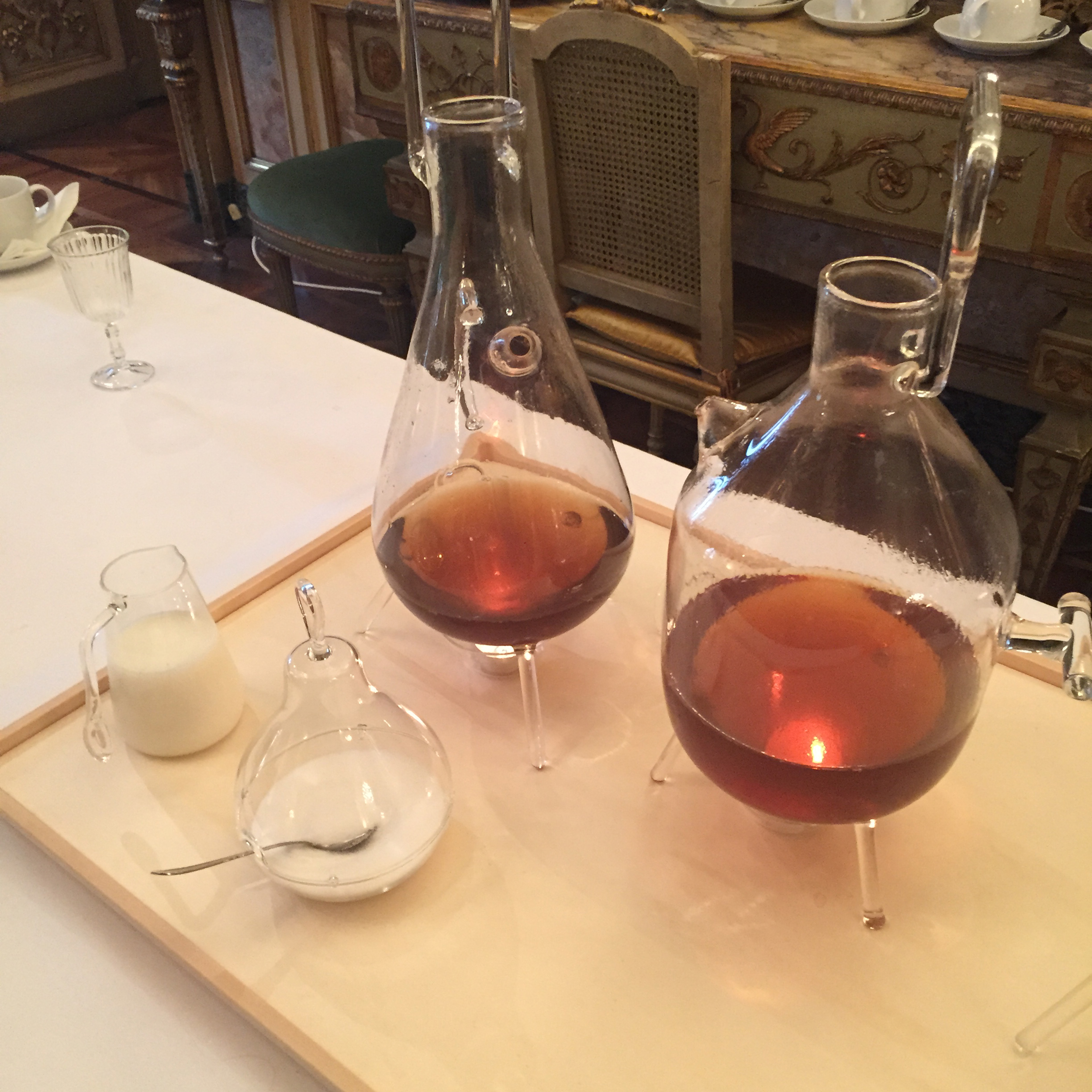
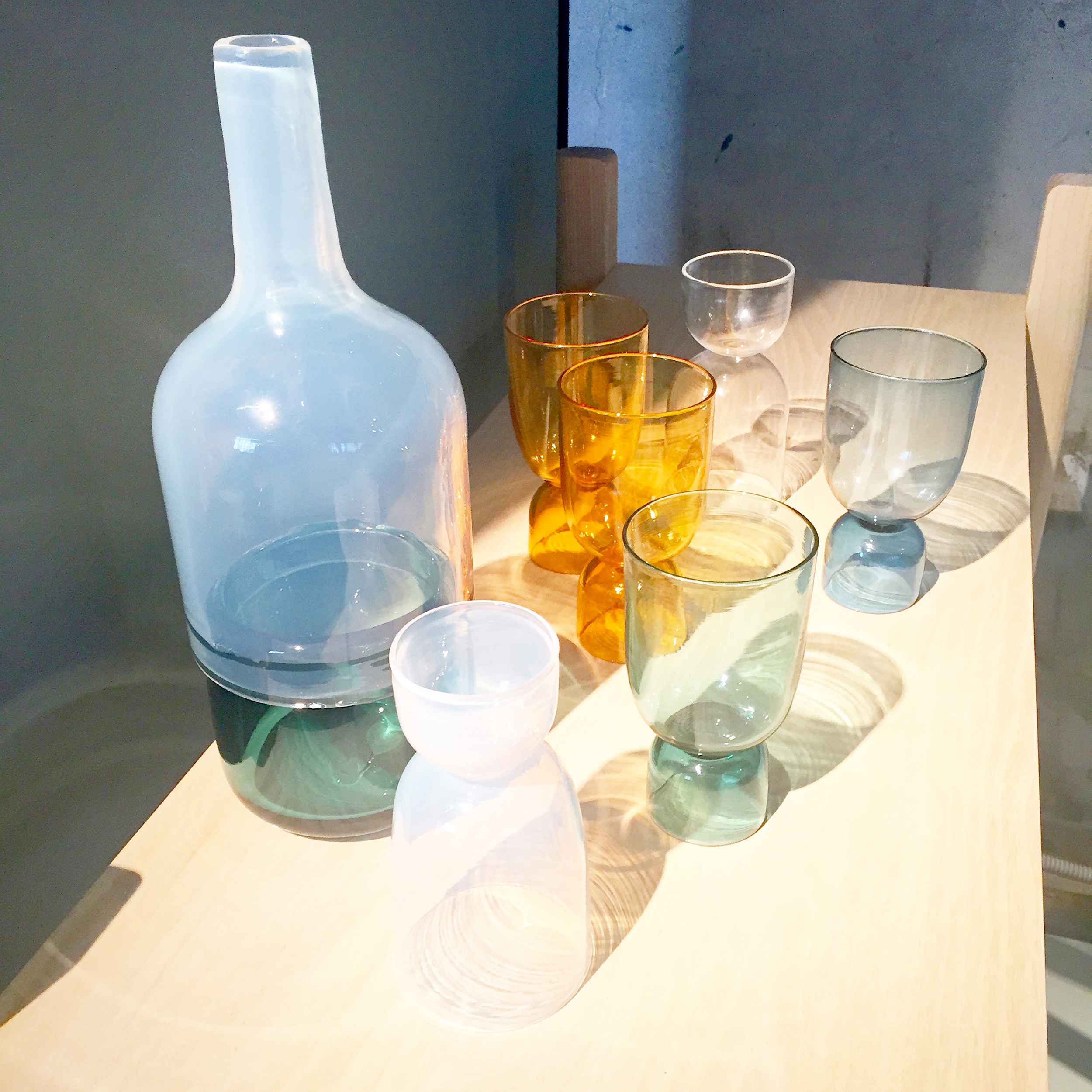
British designer Daniel Rous played with the traditional tea-drinking ritual, creating an intricate hand-blown glass tea station to provide people with refreshment on their visit to Palazzo Crespi.

airbnb-IMG_2833

In Japan it’s customary for guests to bring a gift for the host, but also for the host to give the guest something in return. Japanese designer Tonomi Maezawa
made rubber stamps symbolizing a deconstructed Japanese alphabet, and taught visitors how to print her name and their own onto a cloth bag as a gift for them to take away.

airbnb-IMG_2834

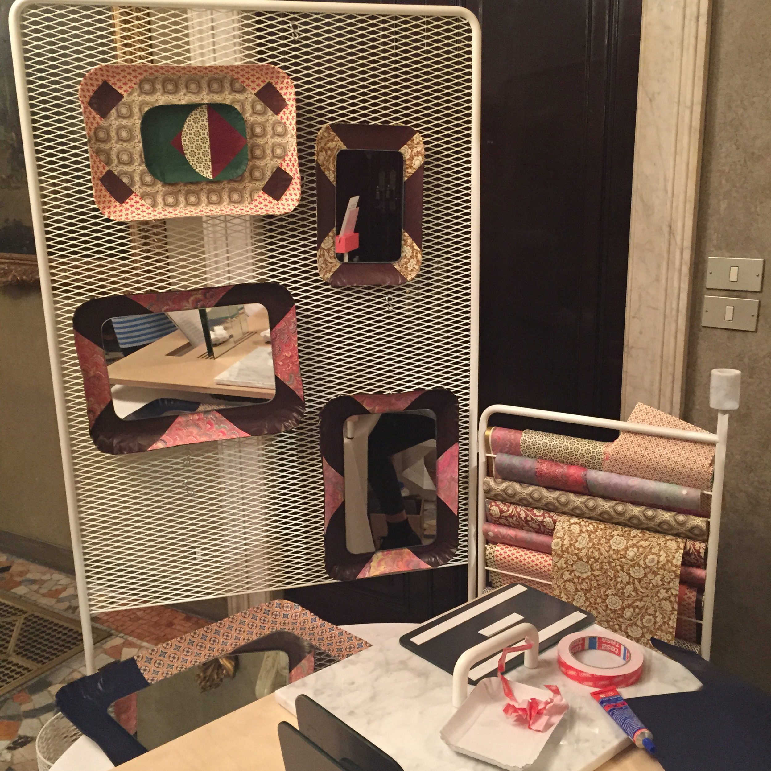
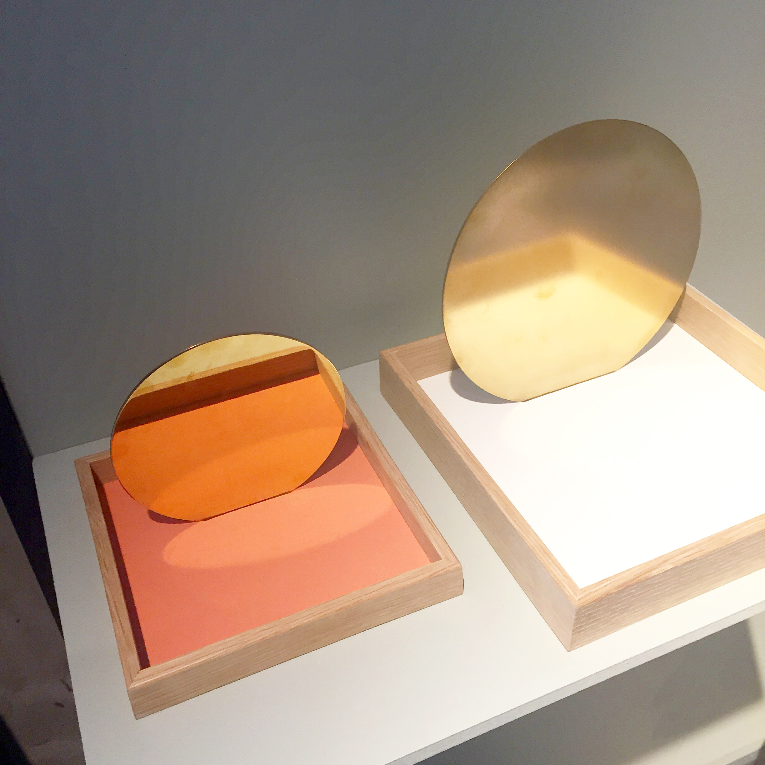
“I start with these paper trays that are like welcoming symbol in Italy – we use them offer pastries,” said Giorgia Zanellato. “I personalise them from papers from Venice, the city where I am from and two mirrors to create a new object and so it becomes a welcome mirror.”

airbnb-IMG_2839

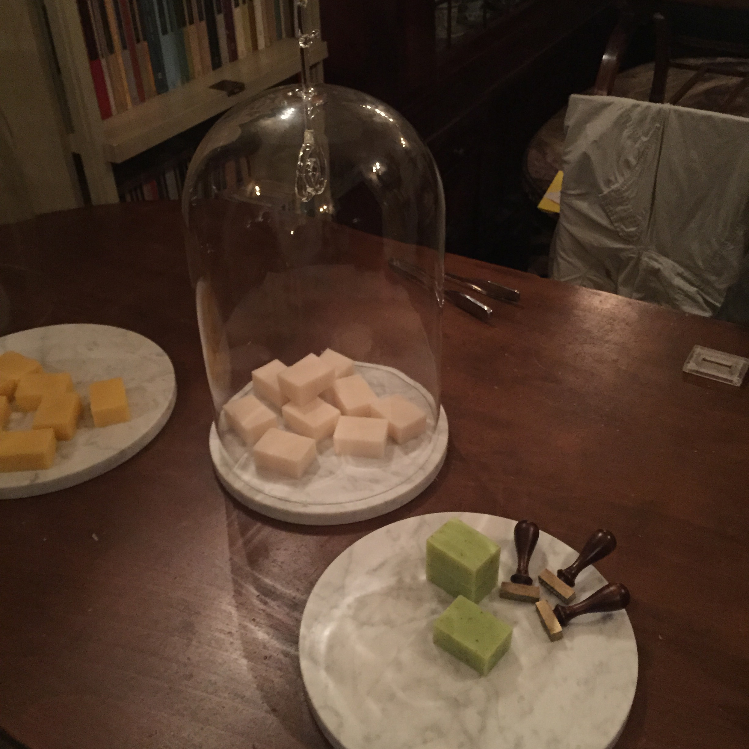
With a spot right outside the (very beautiful) toilets, Marcello Venturini was making scented soaps to signify the special soap that is reserved for guests in many homes. “I like it when people leave one soap for the guest because it’s not just to give something a present to the guest, but it’s also a nice way to say something to the guest: ‘Take your time, refresh yourself, stay a little bit in this intimate space as the bathroom is, we wait for you, no problem’,” explained the designer. “It is also an homage to the city of Milan because I choose three ingredients for the soaps that are connected with three recipes that came from Milanese traditional cuisine, rice for the risotto, yeast for the pannetone and wheat germ for the michetta – a traditional and iconic kind of bread that belongs to the Milanese tradition.”

Housewarming was one of the highlights of Milan Design Week and on a rainy, cold morning, I felt very welcome indeed.

the department store. milan design week 2015.

the department store. milan design week 2015.

May 27, 2015

dmw15-broom-window1

Lee Broom took over a row of shops on Via Alfredo Cappellini and created a faux department store to launch his largest collection to date in what OnOffice Magazine is calling, “Milan’s biggest head turner.”

dmw15-broom-taxi1

“I typically work on over 50 products at any given time. I started to see that a lot of pieces were all coming together into something that could become a collection and I didn’t want to wait, so I decided to release everything at the same time,” said Broom.

mdw15-broom1Window_CrescentLights1

The result is a collection of over 20 new products spanning lighting, furniture and glassware, showcased in a row of six shops that the British designer converted into a pastiche of a department store, complete with dismembered mannequin arms, theatrical reveals and Vivienne-Westwood-clad shop assistants.

mdw15-brom-ClockTower_CrescentRing1

“The other reason for launching such a large collection is that I have been inspired by lots of different things over the past 18 months, so I wanted to show as much of that as I could,” said Broom. “I’ve been very much influenced by a simplicity of shape, working in different materials and taking very simple shapes or classic things that you’ve seen before and just giving them a twist.”

mdw15-broom-CrescentLight1

“For instance the Crescent Light is a classic globe light from the Art Deco period that I’ve sliced in half on an angle to reveal this brass surface inside,” he said.

mdw15-broom-LadiesAccessories_Crescent1

The lights were shown in “Ladies Accessories” – one of 12 departments across two floors in the imitation Department Store. Other departments the designer created included the Gents Fitting Room, the Book Store and the Haberdashery.

mdw15-broom-GlassBrass1

Glass on Brass is a development of Broom’s 2014 On The Rock collection – brass replaces the previous marble, resulting in classic crystal glassware forms delicately balanced on solid spun polished brass bases.

mdw15-broom-WineShop1

The collection was shown in the “Wine Shop” in front of 38 glass bottles, each of which was individually painted in Broom’s signature grey and shipped over to Milan along with all the other props in the store. “This show is the most theatrical yet,” said Broom. “It’s got a cinematic feel to it, it looks very fake, almost like a film set, which is really nice. Everything is grey, absolutely everything, except for the products, so they really stand out.”

mdw15-broom-Shoe Dept_HoopChairs1

The Hanging Hoop Chair is formed of two circular brass-plated hoops suspended from the ceiling. The two hoops join at the bottom and the inner hoop contains the seat and backrest, upholstered in red or grey Kvadrat wool.

The Hanging Hoop Chair, together with the Hoop Dining Chairs, a similar concept with the inner hoop sitting on a four-footed brass-plated base, were displayed within the “Shoe Department” alongside grey high heels all perched on cylindrical grey plinths.

mdw15-broom-ringlights1

As ever with Mr Broom, there is a hint of the illicit and the Ring Light mimics a contemporary piercing as much as any lighting form. The light comprises a polished brass sphere impaled on a dimmable ring-shaped fluorescent tube.

mdw15-broom-crystal-perfume1

The Crystal Tube is another development of a previous collection. Tube was a hollow cylinder of Carrara marble with LED bulbs inside creating the illusion of a glowing tube of solid marble. For Crystal Tube, the marble is replaced with cut crystal creating a tension between traditional and contemporary lighting archetypes.

The Crystal Bulb was showcased in the Department Store’s Perfumery, alongside the Tumbler Lights and 16 grey-painted perfume bottles and 14 bespoke Lee Broom perfume boxes.

mdw15-broom-stockroom1

Finally, Broom’s ‘back catalogue’ of existing products such as the Decanterlight, Carousel and One Light Only were displayed in the “Stockroom”.

“I had had the idea of the department store theme in the back of my head for a few years. As soon as I saw this space, I knew it would be the perfect way to display the collection,” said Broom, speaking before the show. “Having had this vision in my head for so long, the most important thing is that it’s as I imagined. The second most important thing is that people really enjoy and understand the experience. It’s not just about furniture and lighting – it’s a show. I hope people get that and that they enjoy it. Milan is very stressful and I’m hoping that the show will kind of be a breath of fresh air.” Now that the show is over, Broom can breathe a sigh of relief – it’s safe to say that it was nothing if not that.

fluorisalone università statale. milan design week 2015.

fluorisalone università statale. milan design week 2015.

Apr 29, 2015

During FuoriSalone and following a theme of ‘Energy for Creativity’, Interni turns Milan into an open-air laboratory to help support the theme of Expo 2015 ‘Energy for Life’, a theme that points to a sustainable city of the future.

Renowned architects and designers with leading companies in the field of innovation and research, are asked to create temporary installations, experimental prototypes that provoke discussion and inspire creative problem solving. The following installations are in the magnificent settings of the Università degli Studi di Milano.

above> Vitruvius in Quarantine (6xh5,5m) | Bernard Khoury with Margaf
At the ends of a tunnel composed of circular marble rings stand the statue of the Vitruvian Man and a video showing moments in the life of a refugee.

mdw15-pietro-citterio1
above> Deep Words Light (17,5×7,35xh9,60) | Antonio Citterio, Patricia Viel and Partners with Gruppo Cosentino
Four monumental steles in Decton form theatrical wings for the portico of the university, each features engraved texts of literature, philosophy and jurisprudence.

mdw15-pietro-ferrari1

above> Operafood – visual music facilities theatre (6xh5,5m) | Valerio Maria Ferrari – VMCF Atelier with Bioseutica
A scale model presents a new spacial concept of musical theatre, in which the audience and stage are connected by an ascending spiral.

mdw15-pietro-karim1

above> Camera Chiara (6,8×7,5hx5,4m) | Annabel Karim Kassar architects and interiors with HSC
Two telescopic pavilions contain spaces based on Lebanese domestic interiors, to narrate a story of crafts and lifestyle.

mdw15-pietro-libeskind1

above> Future Flowers (30x20x h 0,80m) | Daniel Libeskind with Libeskind Design with Oikos
Straight lines of colored metal panels intersect on diagonal axes in a composition based on the graphic study Chamberworks by Libeskind.

mdw15-pietro-michele-1

above> Folklore (2,74×3,72xh4,75) | Alessandro Michele for Richard Ginori
A wooden structure inspired by the Renaissence. Covered with pieces of porcelain and lights, the redesigned portals transform them into festive archways.

mdw15-pietro-mindini-1

above> Monumento a Il Rossetto (1,2Xh8m) | Alessandro and Francesco Mendini with Deborah Milano
A large rotating pencil composed of steel cylinders pays tribute in sculptural form to the object that is symbol of feminine charm in an explosion of color.

mdw15-pietro-piuarc1

above> Punti di vista (10x6xh5,85) | Piuarch with Marazzi
A structure organized in three volumes encourages reflection on the architectural elements of the portico through oriented views and kaleidoscopic effects.

mdw15-pietro-speec1

above> Living Line (19x14xh4,3) | Speech Tchoban & Kuznetsov with Agniya Sterligova and with Velko 2000
A ribbon of mirror walls traces a design of rings, reflecting the portico: it represents the perpetual motion of creativity that generates new visions.

mdw15-pietro-starck1

above> We love We care ( 1,29×0,93xh2,41m) | Philippe Starck for TOG
The renowned designer becomes a performer, distributing a rosè beverage of his own creation from a special tricycle cart.

mdw15-pietro-steve1

above> Black Hole (6xh5,5m) | Steve Blatz and Antonio Pio Saracino with Marzorati Ronchetti, Vetreria Bazzanese, Zordan
A tower pavilion in wood, glass and steel, open to the sky, contains the silhouette of a black hole that catalyze energy and shape space.

mdw15-pietro-trazzi1

above> Yellow Tower (7x6xh20m) | Luca Trazzi with Veuve Clicquot
A tall sinuous metal cage reinvents the forms of the champagne bottle in a tribute to the spirit of Barbe-Nicole Ponsardin Clicquot.

mdw15-pietro-wonders1

above> The garden of wonders. A journey through scents by Open Foundation
Design meets the world of perfume at Orto Botanico, in ten golden pavilions that narrate the past and design the future of a product of fine craftsmanship.

venue > università degli studi di milano
dates > 13 april > 24 may 2015
photography > pietro terzini

557-mariav-mug300-1
about maria vittoria capitanucchi

norway in ventura lambrate. milan design week 2015.

norway in ventura lambrate. milan design week 2015.

Apr 28, 2015

above> styles by kråkvik & d’orazio / photo by siren lauvdal

‘Norwegian Presence in Milan’ was one of the highlights of Ventura Lambrate this year – and not only because it was good place to shelter from the unexpected rain! A collaboration between Klubben (The Norwegian Designers’ Union), Norwegian Crafts and Norwegian Icons, the exhibition showed the best of Norwegian craft and design in a suitably Scandi space color-coded with paint from Jotun, a company established in Sandefjord, Norway in 1926.

NorwegianP-IMG_2960-1

above> Dual by Oslo National Academy of the Arts graduate Runa Klock caught my eye because of its bold color and slender lines. The stool features a footrest at different heights on either side so both tall and short people will feel comfortable sitting on it. The optional cushion is upholstered in Kvadrat’s new two-colored wool textile Rime.

NorwgianP-IMG_2936-1

above> Bjørn van den Berg’s angular Platter Tray Series is reminiscent of folded paper. It was in fact inspired by overlapping plates at a dinner party served on a tiny table. Bjørn felt this “landscape of trays” in the center of the table created intimacy and a nice atmosphere, so he wanted to replicate it in this collection. The trays’ differing heights ensure they overlap one another comfortably.

NorwegianP-IMG_2939-1

above> Bergan-based design studio Morten & Jonas presented Treet, a small lounge table with a playful tabletop comprising three solid oak trays in different colors and proportions, supported by a coated metal frame.

NorwgianP-IMG_2942-1

above> Textile and ceramics designer Margit Seland’s Tuthanka collection combines white and colored porcelain – sanded on the outside and glazed inside – with a yellow spool from a hardware stool as a lid. Margrit studied textile and ceramics in Norway and the Netherlands and is now based in Amsterdam.

NorwegianP-IMG_2946-1

above> Kristine Five Melvær’s Mikkel blankets are currently prototypes made by Norwegian manufacturer Røros Tweed. They combine Kristine’s industrial design training with her graphic design background, and inspirations from the Bauhaus movement with the Norwegian wool tradition. The blankets come in four colorways and seemed particularly appealing as the temperature in Milan started to drop!

NorwegianP-IMG_2948-1

above> Lolly, by Oslo-based design duo Gridy, is a solid oak stackable stool with legs inspired by wooden popsicle sticks. Its flat seat means it doubles up as a side table. Girdy aims for “simple and honest products that are user-friendly and have a Nordic feel,” and judging by this product, they’re doing pretty well.

NorwegianP-IMG_2950-1

above> Bottoms Up by Ingrid Aspen is a playful and colorful collection of multifunctional drinking glasses inspired by the Italian lifestyle, but executed with typical Scandinavian simplicity. By eliminating the stem of a traditional wine glass, Ingrid has been able to incorporate another ‘upside down’ glass for a nightcap after the wine is finished.

NorwegianP-IMG_2951-1

above> Kristine Bjaadal’s Hegne is a hand-turned wooden vessel with a ceramic lid. Kirstine wants her to work to make people notice the hidden beauty in the everyday – to turn daily routines into rituals to appreciate. Hegne can be used to contain something functional, a personal memento or be purely decorative. “A container can be empty, but still contain the idea of keeping something, preserving something, taking care of something,” she says.

NorwegianP-IMG_2952-1

above> I loved Flip it! by Furniture, product and spacial designer Marte Frøystad – a little cluster of mix and match circular, semi-circular and semi-oval tables on slender metal legs with reversible tabletops – each side is covered with a different colored linoleum. “The classic round table is cut, separated and stretched in varying levels – creating a set of sharp tables in various heights, serving different needs, paired or intersected,” said the designer.

NorwegianP-IMG_2956-1

above> The trend for warm metallic finishes was still very much in evidence at this year’s fair, and Siv Lier’s Spring – a wooden and brass tray for storing keys, coin and mail in the hallway, or pens, paper and desktop accessories in the office, was the perfect example. “The wood gives a down-to-earth feeling, and is spiced up with fresh colors,” said Siv. “The brass makes a shiny contrast, adding a bit of glamour into your life.”

Scandinavian design might be having its moment in the sun, but the Norwegians have sometimes struggled to find their own identity – this show certainly put them on the map, and in the most happening quarter of Milan, the design capital of the world.

liminal – the space between the known and the unknown. milan design week 15.

liminal – the space between the known and the unknown. milan design week 15.

Apr 25, 2015

Liminal was a real highlight of Zona Tortona, and in fact of the whole festival. Part of government-backed initiative Irish Design 2015, it was a showcase of design from the Gaelic nation. Well curated, thoughtfully designed, and full of beautiful objects, it did Ireland proud.

“Liminal spaces lie between the known and the unknown – transitional spaces of heightened intensity that we experience when we cross the threshold of what is known,” said co-curator Alex Milton. “They are doorways, gateways and pathways between ideas, feelings or disciplines. Taking the theme of ‘the Liminal’, this exhibition explores the craft of collaboration and presents the exploratory journeys undertaken by designers.”

mdw15-AndrewLudick_Liminal_1

above> Andrew Ludick studied illustration at the Columbus College of Art and Design, Ohio before moving to Ireland in 2003. I have long been a fan of his organic forms decorated with optimistic patterns and colors.

mdw15-CeadogranRugsAndrewLudick_Liminal_9

above> In the spirit of transition, it was great to see his designs turned into rugs by Ceadogán Rugs. To mimic the handmade forms of his ceramics, the rugs are not perfectly round or perfectly square. “The intricate nuances of the small-scale ceramic pieces change dramatically when blown up to the rug size,” said a statement from Ceadogán Rugs. “Each subtle, fine distinction of the original designs evolves to take on a boldness, confidence and delicate playfulness in the larger scale of the rugs.”

mdw15NotionMourne_Liminal3

above> Another fascinating collaboration was between Mourne Textiles and NNotion Design. In 1951, the Mourne Milano rug, designed by Mourne Textiles founder Gerd Hay-Edie, was exhibited at the Triennale di Milano, as part of a room display with furniture by Robin Day, where it won the silver medal. Fast forward 64 years and Mario Hay-Edie handed the last of his Grandmother’s original yellow yarn to Notion Design Studio who designed the Frame chair and side table collection to complement the rug. The resulting set looked like it would be equally at home at the 1951 Triennale di Milano or the 2015 Salone – timeless design all round.

mdw15-ClaireAnneOBrien_Liminal8
above> Claire Anne O’Brien’s furniture draws on Ireland’s material heritage and traditional techniques such as weaving, knotting and basketry. The Casta Yellow Chair, made of Swiss stone pine and pure knitted and stitched wool from the Shetland Islands, was commissioned by Happens Projects as a contemporary interpretation of the traditional Alpine chair.

<a href="http://designapplause.com/wp-content/xG58hlz9/2015/05/mdw15-mdw15-CathalLoughnanePeterSheehan_Liminal11

above> The idea for ibi by Cathal Loughnane and Peter Sheehan came about when Cathal noticed that his wife is immediately transported back to her childhood whenever she hears seagulls. Each cylinder contains a different audio file, which is played when you touch it. The materials of the cylinder – which include wood, steel, stone and fabric – have been selected to reflect the sounds inside.

mdw15-CathalLoughnanePeterSheehan_Liminal10

above> Peter Sheehan and Cathal Loughnane also showed their first collaboration, the History Chair.

mdw15DerekWilson_Liminal7

above> University of Ulster graduate Derek Wilson’s structured ceramic vessels come from a practice inspired by everything from mid-century British Constructivism to the history of the ceramic industry in Europe and Asia.

mdw15-DesignPartnersSeedLabs_Liminal6

above> Design Partners and Seed Labs Inc. have been collaborating since 2013, and have just launched the prototype of Silvair Control, a small handheld device the size of a large pebble that uses Bluetooth to control household appliance such as lighting.

mdw15-DesigngoatIndigo_Liminal5

above> Dublin-based industrial design studio Designgoat collaborated with Garrett Pitcher, creative director at Indigo & Cloth, a menswear boutique and branding studio also based in Dublin, on the development of a steel frame and leather chair and magazine rack. Inspired by the current trend for all things Scandinavian, the starting point for the design was the question: “If the Vikings had never left, what would Dublin as a city be today?” The result is a collection that combines Irish manufacturing and materials with Scandinavian clean lines and simple forms. “The chair and magazine rack are designed to be beautiful when they are not being used and invisible when they are,” said the designers.

mdw15-Snug_Snug_Liminal2

above> Snug is trained cabinet-maker Conor Kelly and passionate designer Nell Roddy and together they make furniture from a small workshop in Snugboro, Co. Wicklow. The Snug bench, chair and table are made from moulded ash or birch plywood veneer. “Our aim is always to achieve a balance between simplicity, function and beauty,” said the designers.

mdw15-CabinetModernStudio AAD_Liminal12

above> And finally, The Cabinet of Modern Irish Life, curated by Studio AAD, provided an opportunity to show a wider breadth of Irish design than could fit into the exhibition. “The Cabinet of Modern Irish Life is like a window on Ireland – I wanted to bring breadth to how people understand Irish design,” said Scott Burnett of Studio AAD. “I’m thinking of it as a glimpse of modern Ireland through the lens of design. I imagined it like a kitchen dresser, the eclectic backdrop to family life; and that let me bring in quite disparate things that nevertheless have a relationship through how we use them, and how they give us a sense of who we are.” photos courtesy of liminal

The exhibition started in Milan during the city’s annual design week, and will be coming to NYCxDesign 08 – 19 May 2015, before moving on to Dublin and Eindhoven.

ventura lambrate 1. milan design week 2015.

ventura lambrate 1. milan design week 2015.

Apr 24, 2015

[ Ventura Projects ] can both described as a design district or integrated exhibition. Each Ventura Project involves selected exhibitions that also feature temporary initiatives, special projects and/or creative hospitality concepts. VL sixth edition’s focus is on content, creativity and experimentation with 176 exhibitors originating from 36 countries participating.

>Giopato & Coombes Editions is a new collection of LED lights in brass and hand-blown glass that all take advantage of Italian manufacturing excellence through a network of artisans to update traditional manufacturing through contemporary design.

mdw15-lambrate-gc4
mdw15-ventura-spazio6

>In Galvanotecnica Bugatti (via Ventura 3), a renovated building from the early 1900’s developing around a charming courtyard, SPAZIO900 proposes a visionary and kaleidoscopic loft concept designed by STUDIOVITTORIBORIN. The installation conceptualizes three different vintage environments, suspended between the walls, the floor and the ceiling, showcasing a wide selection of furniture and accessories, special and unique pieces and excellent anonymous design from the 50s to the 80s. It’s a trip through time and space to grab the charm of vintage décor.

>Visser & Meijwaard Multilateral is a temporary collective formed by Floor Nijdeken, Mark Sturkenboom and Visser & Meijwaard. With their presentation ‘Ensembles’ they create a surprising, interactive combination of objects that re-question and reinterpret, and let their work reconnect as well as their visitors.

>Visitors will experience how the wind can become a source of energy. Enessere Hercules is a wind generator that comes from the knowledge of the Italian artisans of the Vicenza area with a powerful engine and a unique design. Six have been sold already. >below

>A Belgian Village derives from a typical Belgian annex culture (they call it ‘Koterij’) to an exhibition concept: DIFT brought together a selection of more than 30 fine labels to build a village, from scratch, in a secret garden in Ventura. Plant-based restaurant included. >below

mdw15-lambrate-belguim3
mdw15-lambrate-light1

>yellow design presents the ‘Perfect Day Light’ installation, a composite experience of sound, light and space, an experimental analogy of the new LUCTRA® series of biologically effective light developed by yellow design and DURABLE®. >above

557-mariav-mug300-1
about maria vittoria capitanucchi

ready for your design applause? milan design week 2015.

ready for your design applause? milan design week 2015.

Mar 13, 2015

da_clap-theatre1

We’re reaching out to you directly > If you’re showing your work during #MDW15 and wish to be considered in our Milan coverage, please submit your press materials. Submit regardless of the event you’re participating in: Brera, Fiera, Spazio Rossana Orlandi, SaloneSatellite, Superstudio, Ventura Lambrate, Zona Tortona, or anywhere else in Milan.

Provide as many images as you feel tells your story in high resolution jpg format crediting (designer, object, brand, project and photographer, etc.) Also include your story, a press release in pdf format (project description, you, your brand, team, etc.) Send your submissions and include in the subject – MILAN DESIGN WEEK 2015 – YOUR PROJECT NAME. Though this is not a competition, our team will curate and post select submissions. DesignApplause has a DropBox entryway if needed.

The deadline for submissions for publication last week of April is 08 April 2015.
If you wish to post a preview of your work prior to design week, please submit your materials no later than 05 April 2015.

Thank you. Designapplause [ questions / submissions ]

Contact Us

We're currently offline. Send us an email and we'll get back to you, asap.

Send Message
DesignApplause

your daily design dose

Follow Us


about us
contact/help
privacy policy

ADVERTISEMENT

LATEST NEWS

  • the beginning is the most important part of the work. hello 2023.
  • 40m zero-emission domus redefines trimaran concept.
  • this glass is for the birds migratory birds that is.
  • 2023 all-electrifying timeless instant recognition porsche taycan.
  • unrivaled residences found in repurposed chicago tribune tower.

All content ©2007 > 2022 DesignApplause