above > studio job master pieces
during fuorisalone 2019 guiltlessplastic will unfold in 3 events:
ro plastic prize
ro plastic-master’s pieces – see below
ro ring
ro plastic-master’s pieces
april 6-14
ro plastic-master’s pieces, curated by rossana orlandi, is an exhibition of 29 one-of-a-kind pieces in recycled plastic made by world-renowned artists, designers and architects. exhibition design: studio vudafieri • saverino partners. from april 6th-14th, the exhibition will be open to the public at the railway pavilion of the museo scienza e tecnologia leonardo da vinci in milan.
on exhibit: massimiliano adami – william amor – nacho carbonell – matteo cibic – enrico marone cinzano – jacopo foggini – formafantasma – barnaba fornasetti – maurizio galimberti – jaime hayon – piet hein eek – thierry jeannot – studio job – max lamb – piero lissoni – massimiliano locatelli -fernando mastrangelo – alessandro mendini – lucio micheletti – brodie neill – fabio novembre -studio nucleo – italo rota – james shaw – patricia urquiola – dirk vander kooij – tiziano vudafieri -marcel wanders – nika zupanc.
#roplasticprize #guiltlessplastic #rossanaorlandi @rossanaorlandi

the iconic symbol of timberland, the oak, take new form and significant in the hands of the designer elena salmistraro. an installation that will not miss to amaze and excite!
after the debut of the last edition with the artwork “the flexible living” of matteo cibic, timberland is ready to amaze again with a new and interesting collaboration.
elena salmistraro is the creative mind behind the artwork “don’t call me… dafne” that will be exposed in piazza xxv aprile from 17th to 22th of april.
a tree, the oak, symbol of sacredness, perfection, energy and life, and, since its beginnings, also the recognized and much coveted timberland logo. this is the subject that elena reinterprets with her emotional language in an interactive installation with a “beating heart” that aims to seduce and embrace those who interact with it.
the tree, called daphne after the greek nymph – but i’ll recommend you, don’t call it like that! – represent a sort of “mother nature”, who protects and welcomes as a woman knows how, embodying the brand’s spirit and desire to produce footwear collections designed for women and their world.
in this way, timberland’s female universe breaks free from stereotyping and pigeonholing, to become a tree trunk with a sinuous feminine silhouette in the soft colours from the new collection. on its majestic slender branches hang 4 big acorn-shaped seats, ready to welcome, cosy up and protect visitors of design week, cradling them gently in a cocoon effect.
empathic immersion with this installation is an all-encompassing experience. when the tree is hugged, it comes to life revealing its heartbeat and lighting up at night thanks to the vibrations caused by the intensity of the hug. a powerful emotional experience and one to remember.
artwork reveal event:
tuesday 17th april – piazza xxv aprile – 9:00 pm
for more information about the women collection visit timberland.it or come to visit the milan stores:
– corso matteotti, 7
– galleria san carlo, 6
– corso buenos aires, 45

happenings at the fuorisalone worth checking out:
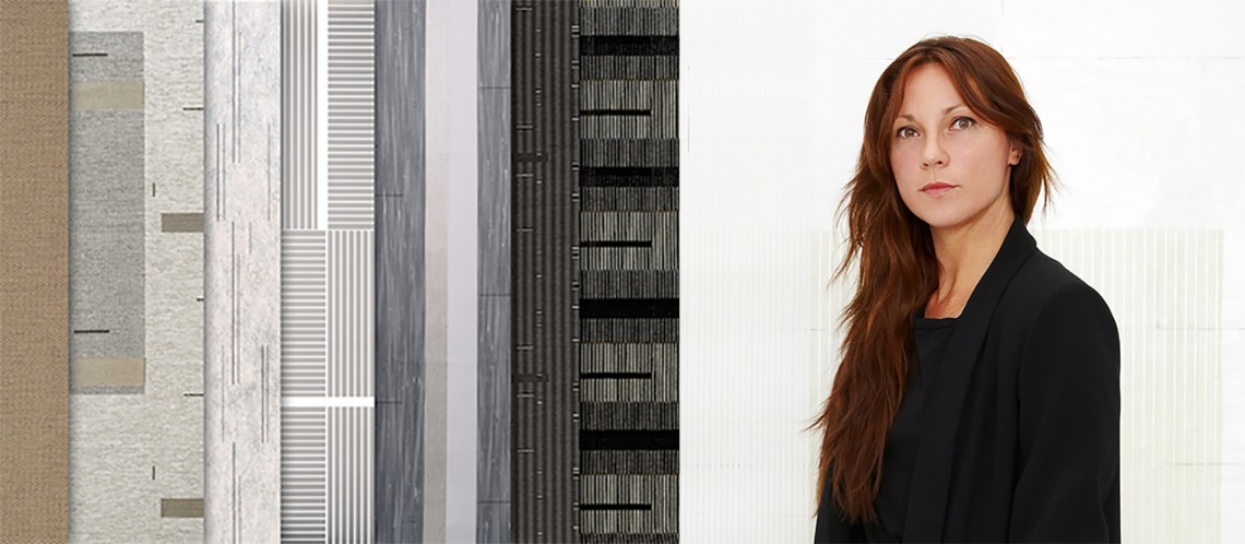
>> american design company wolf-gordon introduces level / will be previewed in spazio rossana orlandi – space g5 / via matteo bandello 14/16
a collection of eight interior surfacing products created in collaboration with amsterdam-based textile designer, mae engelgeer. the collection, comprising four upholstery, one drapery textile, and three digital print wallcoverings,

wolf-gordon collaborated closely with engelgeer to design a cohesive collection characterized by repetitive geometries of varying scales. engelgeer’s graphic elements and diverse explorations of texture evoke the craftsmanship and authenticity of dutch modernism. engelgeer draws heavily on her knowledge of traditional weaving techniques, interpreting them through a 21st century lens. the resulting collection is a series of patterns that celebrate dynamic equilibrium—asymmetrical yet balanced—clean lines, abstract geometric forms, rich textures, and simple, sophisticated detailing. the palette for level includes a broad range of elegant neutrals and muted hues, many incorporating accents of metallic threads.
mae engelgeer: perhaps because of my background in fashion, i always tend to think in terms of a collection in my design process. the challenge of finding a color combination or a graphic element that can be used in different ways across a collection is very rewarding. the result is a cohesive, contemporary collection that combines sleek, urban 21st century design with a sense of craftsmanship and authenticity.
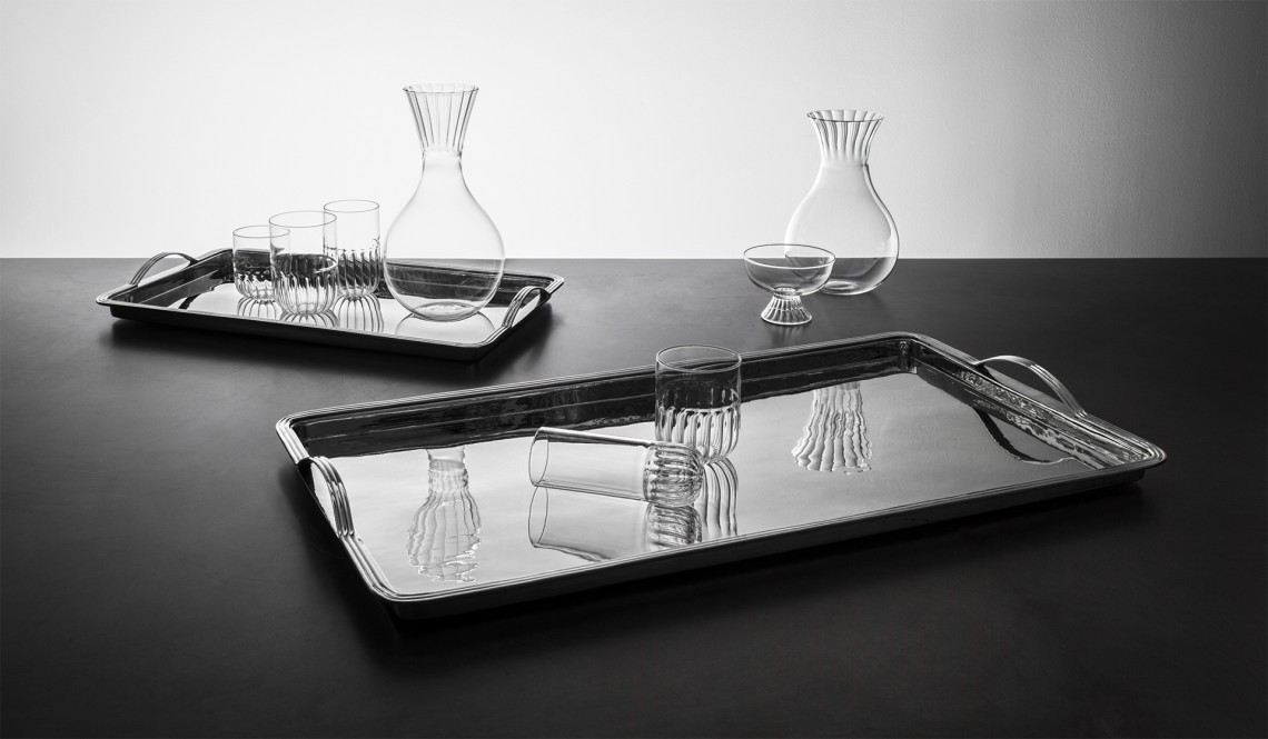
>> paola c. / via solferino, 11 /// ondina / aldo cibic / steel tray with handles and routine / matteo cibic / glasses and jugs in blown borosilicate

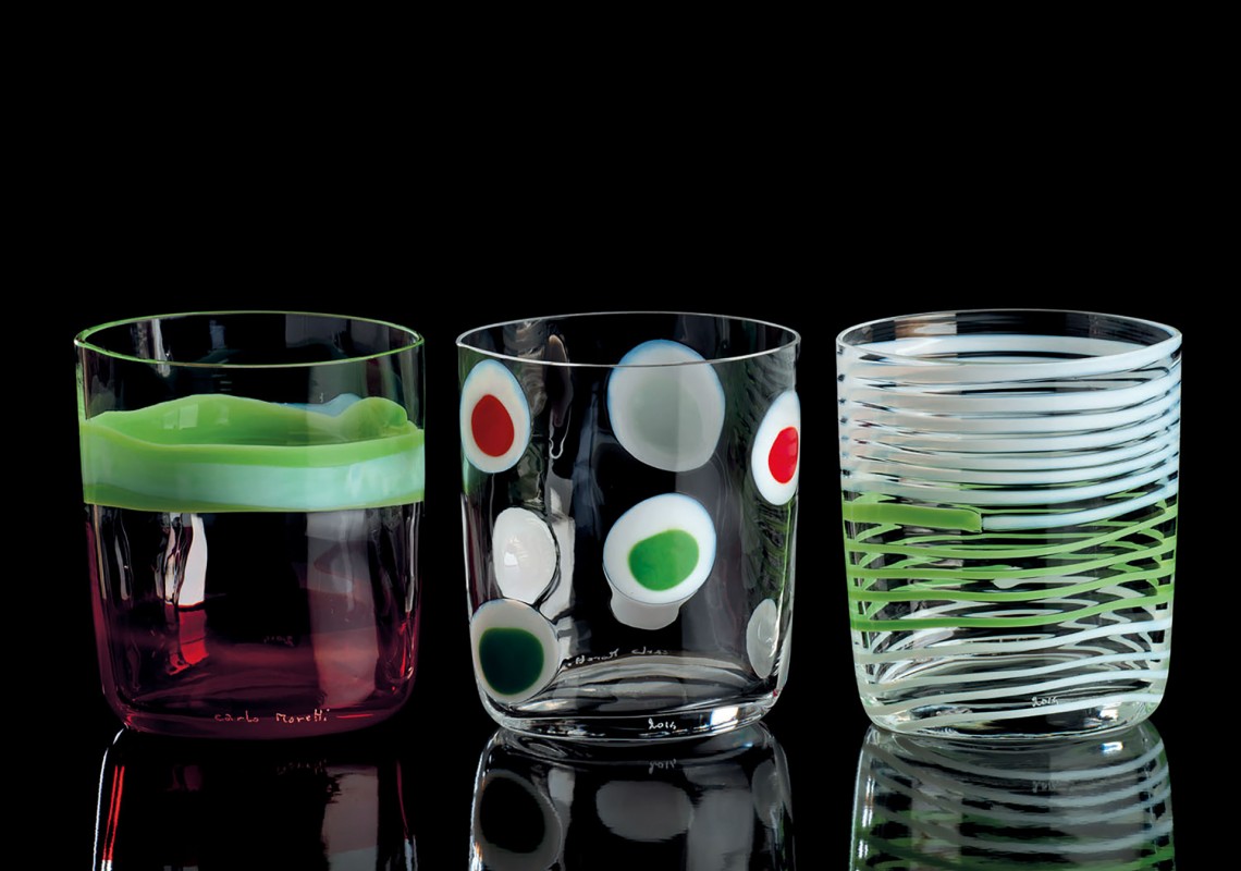
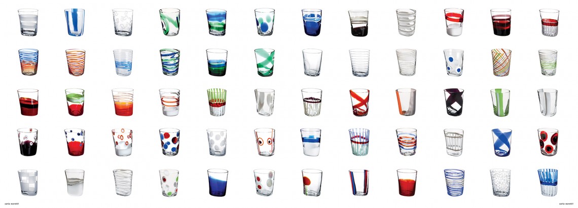
>> bora. i bicchieri singolari by carlo moretti / duvetica showroom – via senato 41/a
the complete history of the “bora” drinking glass on display in the duvetica space designed by tadao ando. its unique and original shape with its curved lines – “as if the bora wind had blown against it” – is a design of carlo and giovanni moretti. a collection of over 130 pieces of the venetian artisan factory realized from 2001 to today in murano crystal. 12 > 22 april 2016


hem presents ice cream social / via varese 12
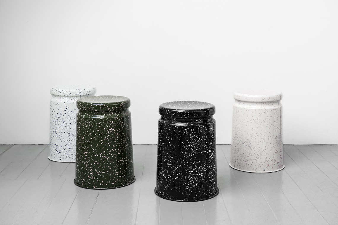
to celebrate the launch of splatter-painted last stool splatter by british designer max lamb, hem has collaborated with italian gelato maker gelateria rigoletto on four custom gelato flavors inspired by stracciatella gelato – one to match each style stool. tuesday through friday, hem will be hosting ice cream socials with philippe malouin, karoline fesser, max lamb and studio deform. 12 > 15 april
