The divis table.
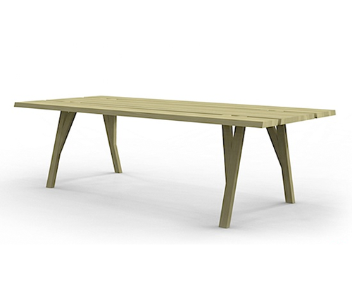 High in concept, clean in lines. This is a nice dining table.
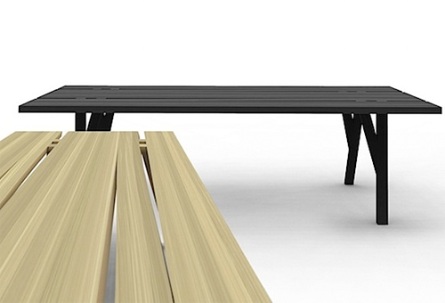
Your pets who were discouraged from lounging under the dinner table while you’re entertaining…
Designer: mike and maaike
Producer: Council
 High in concept, clean in lines. This is a nice dining table.

Your pets who were discouraged from lounging under the dinner table while you’re entertaining…
Designer: mike and maaike
Producer: Council
Your growling stomach overpowers the runway at Paris Fashion Week. A list of dining tips. via newyorktimes [PR]

mcdonalds recently opened two of their latest tokyo outlets. to say that it surgically has removed their corporate voice — well its really closer to a lobotomy. wow.
above/below> they have done away with the golden arches, ronald mcdonald, hamburglar, happy meals, and mcmuffins in this mcdonalds. they have even done away with a (the) logo. the only thing they retained is the color red.
above/below> the only products served are the qp (quarter pounder) and the qpc (quarter pounder with cheese) simply in red, white, and black packaging. the fries come with the burger as a menu set, no option here.
above/below> the interior is very lounge-like. one can imagine what the background music is — country & western ?
above/below> quarter pounder may look low key, but there is the viral online marketing to the hired hands handing out flyers to passersby. the “quarter pounder big secret” campaign.
we see the “no logo” look for bars and clubs and fewer restaurants. the “mystique” of a somewhere making all of its patrons feel a bit exclusive and in-the-know. if it looks like a club and sounds like a club. its a club. the stores are next to h&m, etc.
what it will do for the qpc? more than a singular design theme to one product. mcd´s is attempting to make an iconic product out of the qpc by wagering an entire restaurant investment on it. feedback and crowds say good.
this is case study material for the brand police. let’s keep an eye on how it does. could you put up one of these in your town?
editor’s notes via links below > in november of 2008 quarter pounder was mcdonald’s no-brand experiment introducing a larger ‘american style’ burger not found in japan at the time and tested on adventuresome and easily bored tokyoites.
via watashi to tokyo — meta tame
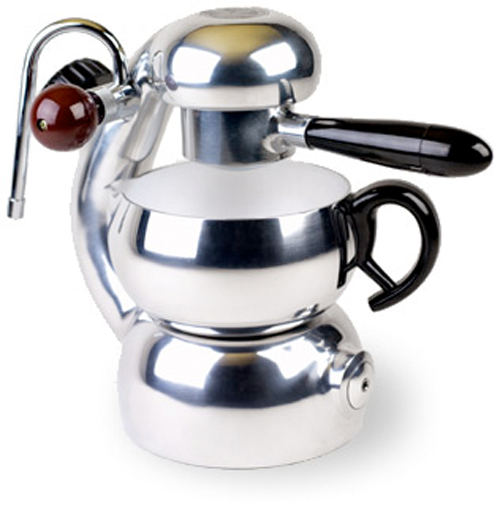 Mid–twentieth–century Milan designer Giordano Robbiati achieved a spiritual union between form and function when he devised a new type of coffee maker in the late 1940s. Ciao bella.
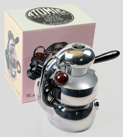
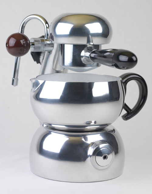
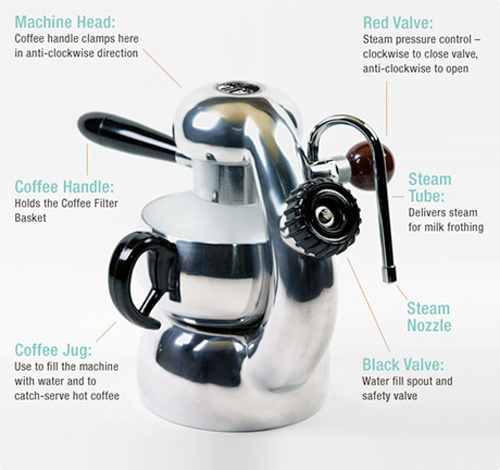
If you “love” retro modernism and espresso, go no farther. Loved around the world, Robbiati’s patented coffee machine is a classic design of the ‘Atomic Age'(1945–1960). Known as the ‘Atomic’ it embodies the explosive energy and creativity of the post-war era of Italian coffee machine design.
It would be impossible to improve on the organic lines and sleek modernism of Robbiati’s extraordinary machine or to find a more versatile stovetop coffee maker. The quality and simplicity of the machine ensures trouble free operation for a life–time.
The all new “La Sorrentina” Coffee Machine is the result of close collaboration between Ikon Exports, Australia and the Bellman Company in Taiwan. Our goal was to produce a new product worthy of the Atomic style machine. A love of coffee and reverence for the beauty and functionality of the original design united us in this endeavor. After years of refinement the end result is a premium reproduction of Robbiati’s patented coffee machine, manufactured to the same dimensions and high standard.
Having just visited the Wolfsonian museum’s Streamline Show, this coffee maker shoulda been there.
More info at made in england
Designer: Giordano Robbiati
Producer: Ikon Exports (?)
Retailer (exclusively) : atomic coffee house
 Branding 101. What does it take for a brand to make it in this economic environment? First off, consider hiring a professional – the positioning matrix (left) a valuable professional tool.
Killer product.

Killer concept.


Just what the doctor ordered. For today’s branding quiz – Identify three elements in a killer marketing plan.

Value item: Here is an innovative, quirkly little product that may make a big (lemon) splash. The UTILO, Lemon Squeezer designed by Nicole Schaffert. Just insert spout into your lemon and squeeze for quick and easy seed-free juice. Made of stainless steel.
Producer: Blomus was established in 2001 to innovatively manufacture stainless steel items utilizing modern design. Blomus offers a great selection of kitchen accessories, fireplace accessories, bathroom accessories, office accessories and waste bins. Inspired by premiere European designers and created by German craftsmen, each and every Blomus product, whether a contemporary stainless steel mirror, kitchen accessories, bathroom hardware, bar and wine tools or a modern styled set of candle holders, Blomus offers only the finest quality of stainless steel kitchen accessories today.
Seen at allmodern.com


With cold weather just around the corner, tea anyone?
Gems Teastick
The Teastick GEMS bring new light to your cup of tea. Now with two brilliant colors so sparkling clear you can see the steeping tea bloom.
With classic “scoop it, slide it, steep it” functionality The Teastick GEMS are as useful as they are beautiful in your cup. With The Teastick GEMS, a fine stainless mesh enables the steeping of herbal teas that often have smaller particles than traditional teas—all while continuing to be convenient and easy for one-cup brewing. Constructed of the highest standard FDA-approved polycarbonate. Designed for use in a 10-14 oz cup.

The Original Teastick
The ultimate infuser for tea enthusiasts features intuitive “scoop-slide-steep” functionality while it reflects the aesthetic of traditional loose tea service.
Durable enough for industrial use, it has no breakable mechanisms and is constructed entirely of 304L stainless steel with holes small enough to infuse the finest of teas. The innovative design provides optimum flow for perfect steeping and incorporates a fill-line.
The Teastick fits nicely into glasses and mugs and is ideal for a 10-14 oz perfect cup of tea.
via Gamila Company


This cool coffee maker offers up a smart industrial design which cleanly integrates a ceramic mug in place of a carafe.
The WMF1 Coffee Pad takes a single portioned coffee filter and can brew up a fresh cup of Java in about 1 minute. The compact coffee maker features a clean white design, with a choice of four accent colors: kiwi (green), mango (yellow), berry (red) and stone (dark grey). And yes, it includes the perfectly-fitted ceramic mug. The brilliantly minimal design even won a 2007 red dot award for its creators.
At this point, the Coffee Pad is only available in a European 220-volt configuration, so you’ll need a power converter to use it here in the States.
Product: WMF 1
Producer: WMF
Designer:
via technabob
When does form and function equal art? Here is an example. A recent reviewer said “If Apple did housewares, this might be the iPot.
Inspiration: Brooklyn, designer Joey Roth— “I’ve always been entranced by small, beautiful things that are so detailed, they seem like miniature worlds, yet so ordinary they’re often left unnoticed. I designed Sorapot to emphasize one of my favorite- the unfurling of tea leaves. Sorapot suspends the process of tea making in a glass tube a few centimeters above your tabletop. Unlike standard teapots that confine tealeaves in a small mesh basket, your leaves will have full run of Sorapot’s interior as they unfurl and change the hot water into tea. You might even see a tea-colored shadow cast by sunlight that passes through the tube and comes to rest in a gossamer puddle on your table.”

The Sorapot package benefits aesthetically from naturally imperfect corrugate patterns and earthen hues. Natural materials such as jute and recycled paper ensure its biodegradable impermanence. The molded pulp composition of the package provides a sturdy yet forgiving structure that is stout enough to function as a nested shipper and attractive enough to present well at retail.
Glass teacup
Joey is not done. There is also a twist to the new teacup. Joey says, “As you can see in the Sorapot video, glass tumblers are my favorite teacups. The contrast between the smooth glass and the fragrant amber tea may not make the brew taste better, but it definitely heightens the experience for me. I designed this teacup to emphasize the the beauty of tea on glass while insulating your hand and tabletop from heat.”
Another distinguishing feature is the Sorapot’s glass and metal components are fully recyclable.
The Sorapot and glass teacup can be purchased online at joeyroth.com We are going to get one. A spot of tea anyone?
All content ©2007 > 2024 DesignApplause
Notifications