Design miami 2011. Alert.
 30 november—4 december miami beach [ design/miami ] [ design/miami blog ]
 30 november—4 december miami beach [ design/miami ] [ design/miami blog ]

Nilufar Gallery is one of Italy’s most active galleries in the fields of historical and contemporary design, as well as in the fields of antique Oriental carpets and furniture. Founded in 1979 by Nina Yashar, the gallery presents eclectic, unexpected exhibitions and often presents new artists making their debuts in Italy. In Basel, Nilufar will present a selection of post-war Italian and contemporary pieces including works by Franco Albini, Gio Ponti, Tobia Scarpa, and young British designer Bethan Laura Wood, among others.
designers: asif khan | mischer’traxler | studio juju
schedule of events
Design Miami/ Basel 14-18 June 2011
Public Hours of Admission 11a-7p daily
VIP Opening (invitation only): 13 June
Press Preview: 13 June 3-6p [ pre-register online ]
Vernissage: 13 June 6-10p
Nocturne (invitation only): 16 June 7-9p
about design miami/
Design Miami/ is the most prominent and substantive forum for collectible design, representing a convergence of commerce and culture. Its annual shows in Basel, Switzerland (June) and Miami, USA (December) bring together the most influential galleries, collectors, designers, critics and curators from around the world. [ details ]
Design Miami/ Basel is presented in partnership with HSBC Private Bank, whose dedication to innovative international design is an example of its emphasis on the value of connections.
about w hotels worldwide
W Hotels is a contemporary, design-led lifestyle brand and the industry innovator with 41 hotels and retreats in the most vibrant cities and exotic destinations around the world. With more than 12 years of proven success, W Hotels is on track to reach more than 50 hotels by the end of 2012. W Hotels and W Retreats have been announced for Paris, St. Petersburg, Guangzhou, Shanghai, Abu Dhabi, Bangkok, Athens – Astir Palace, and Verbier, among other international destinations. [ details ]
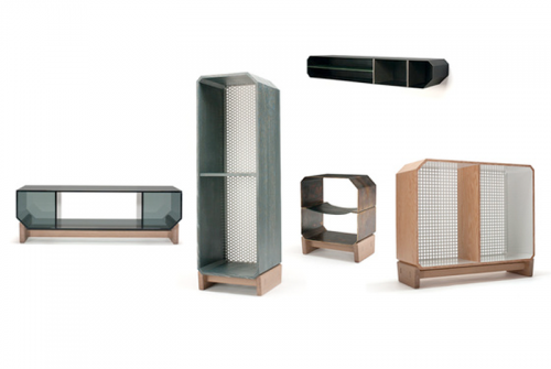
 this show, collection, is titled “Pro Forma”
This is Interview2 of a two-part interview with Sam Vinz of Volume Gallery in Chicago and Alex Williams of Rich Brilliant Willing in New York. The interview took place on March 17 on site at the new installation called “Pro Forma”.
In LAST WEEK’S EPISODE [ Interview1 ]
[DA] Let’s talk about the design gallery which seems like a very niched concept. How old is the design gallery concept?
[SV] There’s been a particular iteration of them for the last 20 or 30 years. In New York in the 70s you would find galleries that concentrated on 20th century, mid-century modern furniture. And on through the 80s and 90s. And there was a historical perspective. But then contemporary pieces presented themselves in a gallery setting and I don’t think that concept is all that old, 15 to 20 years old. And it is a niche market with collectors who have always done it. And we’re trying to extend and broaden the model. Claire and I feel that young designers need the opportunity to explore different processes and materials and then take what they learn and fold it back into their studio work for their production design.
[DA] The nature of the collection is so few pieces are produced and the unit price is expensive. Is it because of the limited edition or the materials or both?
[AW] It’s a combination of things. For us, this is our first collection and our names are just getting out there and we’re trying to say something with the work obviously. And part of it is these objects have a lot of inherent value. They’re large, they’re heavy. The value is related to the weight of the materials, the leather, the brass, the fact that they’re all handcrafted.
[SV] When it comes to the cost of the piece, the amount of hands that goes into making these pieces is significant. Each of the pieces has at least two to three stops to make. And the fact that we are trying to make heirloom quality objects that will last for 100 years. That’s where the limiting comes from. And we can only get so many pieces made during this production period because the fabricators are very busy doing other projects, because they’re excellent resources and in demand.
[AW] But I think it’s important that the price be a reflection of the work, not the other way around, not shooting for a price category. Trying to build something that justifies the price is like working backwards.
[DA] Let’s talk about the studio mix. There’s a cheeky saying that if you want to be a famous architect you have to design a chair. And the thought that just occurred to me. If you want to be a famous designer you have to make art. Have you heard of that phrase?
[AW] I haven’t heard is quite like that before.
[DA] When you started your studio to make money you started to make your own objects. Then people started asking you to design their objects. And now you are making art here. Right?
[AW] I guess it’s all about intent. If calling it art is convenient, ok. For our case it’s work, furniture, it’s beautiful furniture that we’re extremely proud of. It’s the kind of work we’ve always wanted to be making. And Volume gave us the opportunity to make it. The distinction isn’t that important.
[DA] OK, agreed. Some will call it art and some will call it beautiful, well-made furniture. In 2008 you did work for Innermost, a company based in London and Hong Kong and that work was shown in Milan. Now that you have experienced working with a European company here’s a question. American designer Todd Bracher has chosen to live and work n Copenhagen and he says he sees a huge divide between the European and American design worlds. In a Metropolis article, which RWB was also included, he says, “With the American bit, it’s really two months of heavy market research, psychological research, anthropological research, and then we start to look at what it looks like.” The market-driven focus comes from American companies’ desire for long-lasting huge sellers like the Aeron chair. “Whereas in Europe, it’s a one-to-four-year life cycle, so they want something really interesting and beautiful.” Would you agree with that?
[AW] It’s a little difficult to say. We actually met Innermost in New York. We were exhibiting with several other designers with a group we helped found, The American Design Club in New York. We were showing early prototypes from our Klinker series. Steve Jones from Innermost was there and he happened to see it and expressed an interest in developing a collection around it. Interestingly, within the last few weeks actually, the collection is now just available here in the States. Klinker has done very well in Asia and has been the primary market for it. Getting back to your question. We are starting to work with more and more European clients now. I think the disposable, almost fashion aspect of the consumer culture, does exist. But it’s only one segment that supports the design industry and always has. I think we have the same thing here in the United States only it’s different. We have this sort of disposable need and desire for a stream of new things but it manifests itself in a different way.
[DA] Sam, you were quoted in TimeOut Chicago that designers have distinctive cultural identities?
[SV] I said that? (group laugh) Well, I think it’s true. You can tell an Italian designer from an English designer, from a French designer. I don’t know what it stems from, not knowing whether it’s a cultural or national identity per se. It may be a design identity that’s been engrained in a particular country.
[DA] For instance.
[SV] With the French there has always been an element of whimsy. That can be seen from Serge Mouille to Bouroullec. I think in Italian design there has always been a clean, hard, minimal edge, and dating from the 40s until now. With English design, British design, they pretty much have stamped themselves as “British” design, for you. With American design, there’s some sort of independence you can see, more individual statements.
[AW] The most obvious thing for me is, whether you like it or not, if you’re a young designer say working in Paris, Milan, London, you can reference certain periods that you can’t readily reference here. Of course there are important milestones here but the playing field is more wide open. So that means the American designer is looking for references outside of design. And that’s one of the most interesting aspects of American design.
[DA] Alex, what, who, inspires your firm?
[AW] All kinds of things. And people. Of course we have our design heroes (DA failed to follow up on that one ) and many of them are European. But just going to work, all the things going around us in New York City. And of course we are inspired by industrial processes, finishes, techniques.
[DA] Alex, what are the key characteristics of the Pro Forma series?
[AW] Pro forma is a term that we lifted from our experience with international shipping. And the words more or less mean “for the sake of form”. Another meaning is the invoice that accompanies an international shipment, the declaration of its theoretical value. We’re using it as a pun to refer to the fact that the collection is conceived from a form taken out of context. The form is air shipping containers that you may see when you’re boarding your plane. They all have these weird blunt noses and chamfered edges, and sometimes they’re curved a little bit. And there’s a perfectly good reason why and that’s so they fit more efficiently into the curved fuselage of the airplane. But when you see them in context, sitting around in a pile, you wonder why does this box look like this and have this quirky little detail. And we started there to explore these forms and how they play off of each other. We started thinking about the world we live in now. We live in a global culture where everyone’s constantly on the move, and these containers started to be symbols for these cross cultural exchanges. There are people who live in more than one city and their stuff moves around with them and they own fewer objects. These containers for the global citizens became steamer trunks in concept. Air freight containers are made of dinged up aluminum and nylon straps and these kinds of industrial materials. We take the opposite approach using steamer trunks as objects of luxury travel for an era that no longer exists.
[DA] Alex, how does Pro Forma represent your own philosophy on the state of design?
[SV] Good question.
[AW] I think the most important part about design is that you can’t really nail it down. And that it means completely different things to different people and it’s constantly in a state of flux. And that’s very exciting. And now we’re at this moment where a lot of people think that design all of a sudden means something specific. Like there are a lot of problems in the world that need solving and a lot of important things need to be designed. I think people are striving for a little uniqueness and there’s an urgency to this striving as a means of shaping your voice in a crowded world. I think what we’ve tried to do here with Pro Forma is to make the most of a situation and that we make a beautiful collection of work that we hope will last for a long time with the resources at hand.
[DA] Sam, what did you learn from this whole process?
[SV] This the first time we worked with a group of designers first of all. And second of all we worked with designers outside of Chicago. There was a less casual relationship arranging meetings and Skyping, that kind of stuff. And this forced us to be more organized on that level and that’s a good thing.
[DA] What part of what you do satisfies you the most?
[AW] Being able to work for myself, to go into work every day, and for the most part, do what I enjoy doing. To not have a boss and get paid to be creative basically.
[SV] Ha, I say almost the exact same thing. The most important thing is that we are sort of writing our own rules and it’s been really enjoyable to do that. It makes a 12 hour day not like a 12 hour day.
[DA] What’s happening next?
[AW] We’re showing a bunch of new work at the ICFF (Contemporary Furniture Fair) in New York in May. We’re showing an exciting collection of pendant lamps at a little shop in New York called Partners in Spade. And we’re designing our first office for a foundation in New York which is really exciting.
[SV] There’s a show opening on April 30th, by a Minneapolis designer named Jonathan Muecke The name of the show is “Objects” and he’ll be showing what he calls eight different projects.
[DA] Sam, Alex. Thank you.
Prices start at $4,500 (the nightstand, above, starts at $4,500). Through April 3 at 328 South Jefferson Street, Chicago, 414 841 3003 or volume gallery [ rich brilliant willing ] [ Jonathan Muecke ]

 this show, collection, is titled “Pro Forma”
It’s March 17, 2011, St. Patrick’s day here in Chicago, and we’re talking to Volume Gallery’s Sam Vinz and Alex Williams of RICH BRILLIANT WILLING.
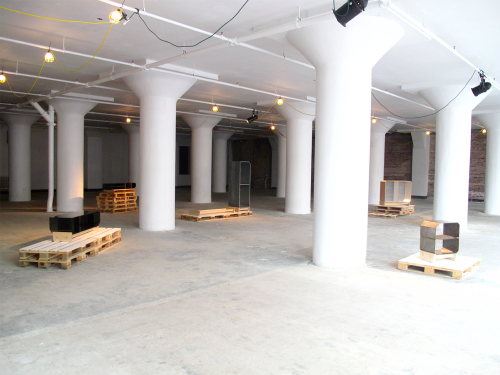
Today the two of them are setting up the pieces for their new exhibition opening tomorrow. For two weeks the installation will exist in a freshly rehabbed 9,000 square-foot ground-level retail space just west of Sears/Willis Tower where we are conducting this interview. This will be RBW’s first solo show. This is Volume’s third exhibition.
Before we start, a little background. Volume gallery, was conceived in 2009 by Sam and Claire Warner. Volume is virtually located in Chicago, as an event-based gallery with a specific focus on American design, particularly emerging contemporary designers.
RICH BRILLIANT WILLING, founded in 2007, is by now an internationally renowned furniture and product design studio based in Manhattan. The three founding partners are Alex Williams, Charles Brill and Theo Richardson.
This show is titled “Pro Forma”
The installation will consist of five objects with limited editions of 12 to 16 each. The role Volume plays in this collaboration is selecting the talent and proposing a broad stroke concept of the collaboration. The designer’s role is to build a concept into finished drawings and specifications. At this point Sam will become a general contractor finding local craftsmen here in Chicago to build the designs.
[DA]Sam, as an events-based gallery, your model is to seek out and then cast the talent and once they submit drawings and specs you become a general contractor so to speak, and take over the outsourcing and management of the fabrication. Is this unusual?
[SV] I don’t know if this is unusual and you might ask Alex. But that’s kind of how we started. Helping the designers along as a resource base to build the projects. At first I would just pass the info between designer and fabricator but it became a bit tedious being the go-between once the project got rolling. It became more efficient for me to take over and handle the production here in Chicago. And we go elsewhere as needed to find a fabricator.
[AW] From our end it is pretty typical. The drawings are in our office and the fabricators can be anywhere, Asia, Europe. We are very hands-on in our office where we experiment and tinker. That said, with this many special pieces and the distance there was a new element involved. But very exciting. We got to learn a whole new city. We discovered new resources, new craftsman. A bit like surgeons doing surgery remotely. Like repairing soldiers in a battlefield while the doctors are someplace else.
[DA] Alex, you mention hands-on so let’s talk about your firm’s process. What’s the difference between production projects and limited editions?
[AW] There are a lot of differences. Audience is one of them. Designing for production we are designing for a broad audience base where the numbers could be in the thousands and the objects are more or less the same and there are elements of efficiency, economy and scale. With limited editions the goals and objectives are completely different. For example, doing limited really pushes our studio process to experiment with materials, which we really love to do. And you’re trying to create something special but you’re really not sure of what you will end up with when you start out. In effect, we are now looking for magic.
[DA] How do the three of you work together, or do you? What are the individual strengths you bring to the partnership?
[AW] Though anyone of us can bring in a project our process is entirely collaborative, we don’t work on anything separately. We each bring something different and play off each other in the studio. I am not the artist of the group but I’m a pretty spontaneous thinker. Theo has a great mind for strategy and relationships. Charlie has a great mind for business and a knack to work through the dealings with the vendors, a materials sensibility sourcing things, putting all the pieces together.
[DA] Would you agree that you share the same aesthetic?
[AW] No, I think we all have quite different aesthetics, actually as they apply to our personal lives and interests. But our three different voices are compatible. When they come together that’s what you see in our work.
[DA] Back to you Sam. Who dreams up the theme, the title? What is the genesis of Proforma?
[SV] I’d say it started a year ago with a visit to their office in New York. We don’t give the designers perspective. We don’t ask for anything particular. We want them to come to us with a broad range of ideas or a very specific idea. And then we work with them to develop a collection. Four months later the designers propose seven to eight pieces and we narrow it down to five and then begin talking about materials. And then, all of a sudden, we have a collection. The gallery has a very little to do with the theme, the titles, the names of the pieces. That all comes from the studio. We just sort of guide the designers, to push them into an area that they may be uncomfortable with. We’re looking for a collection that has a broad range and a wide perspective. But still has a narrow focus.
[DA] I just finished reading an interesting article in Vanity Fair where Ridley Scott is casting the stars in Thelma and Louise, which was over a year-long process. Sam how did you and Claire select this studio?
[SV] Claire and I made a list of talent back when we were talking about starting a design gallery. It wasn’t a very long list. In fact, it was a pretty short list. The talent that caught our eye in our minds were doing something a little special. With Rich Brilliant we saw something special in the “Excel” line, which they produced in 2008. The use of materials, the proportion and scale of that line led us to want to talk to the designers.
[DA] Alex, your firm was founded in 2007. Were you guys every approached in this manner before?
[AW] You mean from a design gallery? We were coming to a place out of school, being exposed to work in New York City, sort of the tailed end of what people think of as art, an artist-driven world of excessive limited edition designed objects. A lot of that work we were thinking about as we began forming our studio. And then we went to Design Miami in 2008 and right from the get-go we were inspired in many ways by the boundaries that were being pushed by the Galeri Kreo in Paris, who showed how the Bouroullec’s were working with ease in both the gallery world and consumer products. So there was a desire from the beginning to create and show that kind of work. But Sam and Clair provided the first relationship that made sense. We were approached by someone at the same level, pretty much starting out.
TO BE CONTINUED… [ Interview2 ]
next up: clarifying the nature of the design gallery concept; identifying distinctive cultural identities of English, Italian, French, and American designers; the economics of limited edition vs production design; among other things.
what when where: “Pro Forma,” the first solo exhibition of the work of Rich Brilliant Willing, the New York design studio, at the Volume Gallery in Chicago. The show features five pieces inspired by airplane shipping containers. Each piece, made in editions of 12 to 16, is being sold with two bases, one vertical and one horizontal, to allow for dual uses of each design.Prices start at $4,500 (the nightstand, above, starts at $4,500). Through April 3 at 328 South Jefferson Street, Chicago, 414 841 3003 or volume gallery [ rich brilliant willing ]
[ Interview2 ]

 more design happenings in miami.
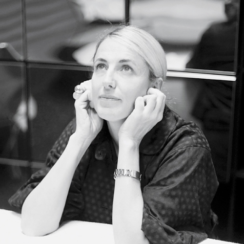
Luminaire is hosting an event with Patricia Urguiola. Urquiola was selected to Fastcompany’s 2010 Masters of Design and most recently featured in Surface in a special icon issue. above: “fat” seating system
 view of ten thousand waves. nine-screen installation, 35mm film transferred to high definition, 9.2 surround sound, 49 min 41 sec.
Isaac Julien/Creative Caribbean Network at the Bass Museum of Art in partnership with PUMA.Creative presents the most comprehensive exhibition of the artist’s work in the last ten years. The exhibition features the US premiere of the installation Ten Thousand Waves along with films and photographs from earlier series Paradise Omeros, Better Life, Baltimore, and Vagabondia. In subtle yet complex narratives, Julien’s body of work is a meditation on the cultural impact of global migration. His installations are presented on an epic scale; poetic and art-historical references are interwoven into frank portrayals of human drama.
Conceived and made over four years, Ten Thousand Waves meld the legendary siren of Chinese cinema Maggie Cheung; rising star of Chinese film Zhao Tao; poet Wang Ping; master calligrapher Gong Fagen; artist Yang Fudong; acclaimed cinematographer Zhao Xiaoshi; and a 100-strong Chinese cast and crew. The film’s original musical score is by fellow East Londoner Jah Wobble and The Chinese Dub Orchestra and contemporary classical composer Maria de Alvear.
above: excerpts from 10,000 waves
above: excerpts from “better life”
above: excerpts from “baltimore”
“
resources:
10,000 waves
issac julien
puma.creative
shanghai eye
art-it asia
isaac julien ” baltimore</a
 this year the design / miami space is adjacent to the art basel miami convention center.
there are 15 galleries who voiced appreciation being this close to the art show where the previous venue was the miami design district. the galleries include: barry friedman/new york, carpenters workshop gallery/london, cristina grajales gallery/new york, d&b lab/brussels, demisch danant/new york, galeri kreo/paris, gallery seomi/seoul, johnson trading company/new york, jousse entreprise/paris, ornamentum/houston, perimeter art & design/paris, r 20th century/new york, sebastian + barquet/new york, todd merrill/new york.
the 40,000 sq. ft structure is designed by moorhead & moorhead. the interior space uses a “scatter” pattern to engage the visitor and designed by architectural firm aranda/lasch. the pavilion includes: food bar, vip section, store, and a theatre for the many lectures. this show marks the sixth anniversary. [selected photos from design / miami]

1 – 5 december. miami beach usa.
reporting live from the show floor, the design miami blog will provide the latest news and happenings from Design Miami/ 2010. [ DesignApplause on blogroll ]
All content ©2007 > 2024 DesignApplause
Notifications