Che. Pop culture icon.
Obama alter-brand. Why is Che Guevara such a pop culture icon? via designboom [PR]
Obama alter-brand. Why is Che Guevara such a pop culture icon? via designboom [PR]
Obama’s inauguration — in Lego form via The Guardian [PR]
Looking back. The Steelcase coordinated office approach. via The Midcentury modernist. [PR]
Classic via old style messaging: the “post stamp” from Royal Mail. “We always like to start the year with a classic and this year we’re launching our Special Stamp programme with ten, in one very special issue– British Design Classics.”
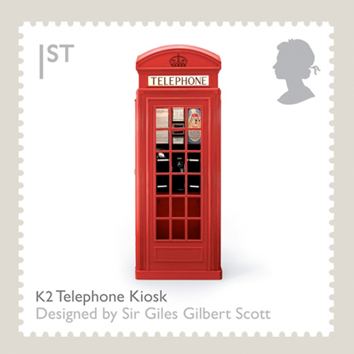
1st Class – K2 Telephone Kiosk
Sir Giles Gilbert Scott’s design bright-red phone box always stood out on the streets of the UK.
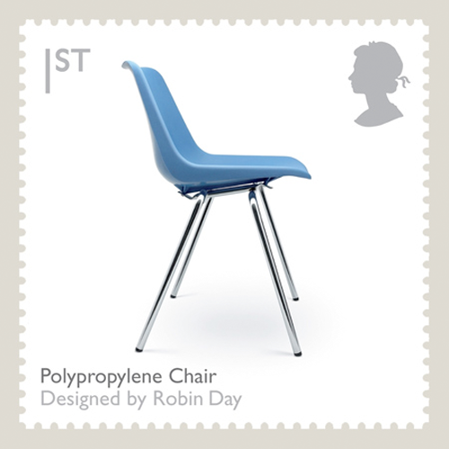
1st Class – Polypropylene Chair
Found in public buildings throughout the world, almost everyone will have sat on a Robin Day chair
at some time.
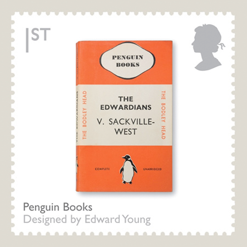
1st Class – Penguin Books
Edward Young’s book jacket design was instantly recognizable as a Penguin edition.
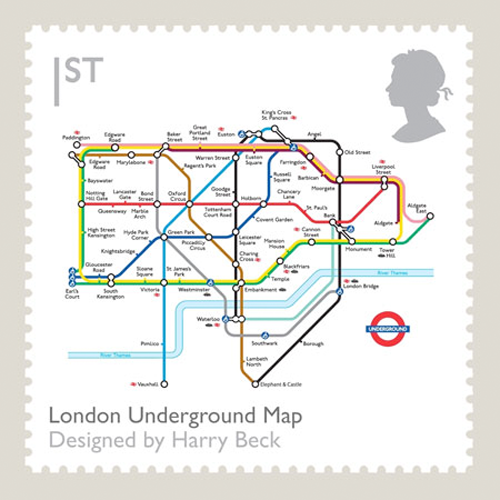
1st Class – London Underground Map
Harry Beck’s easy to understand design was based on an electrical wiring diagram.
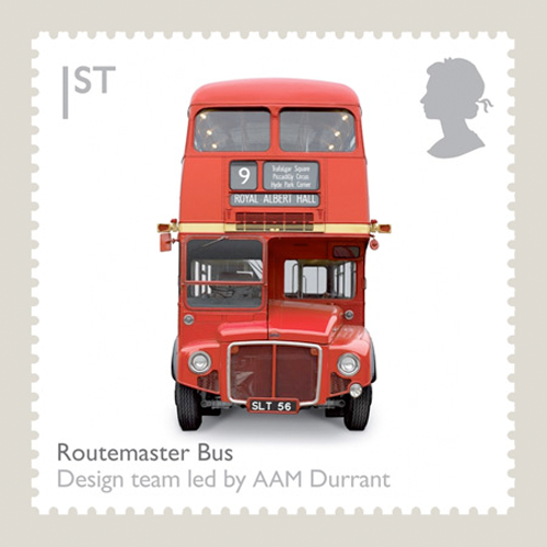
1st Class – Routemaster Bus
Once a symbol of London to visitors from all over the world now only a few of Douglas Scott and Colin Curtis’s remain on London’s streets.
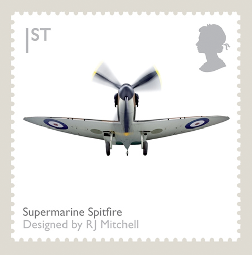
1st Class – Supermarine Spitfire
The superlative Battle of Britain fighter with its distinctive elliptical wings was designed by R J Mitchell who sadly died before the plane went into production.
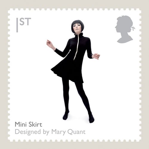
1st Class Large – Mini Skirt
Mary Quant rewrote the fashion rules for women forever with her daring design.
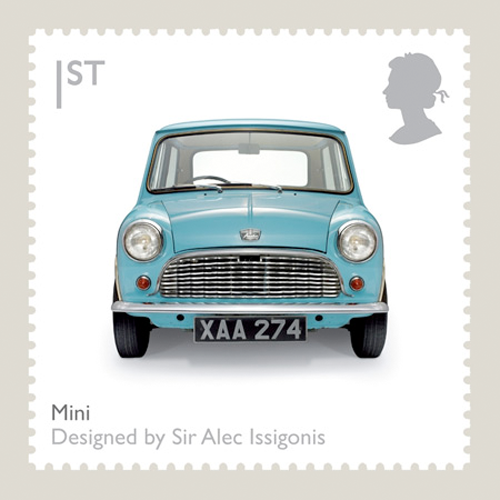
1st Class – The Mini
Sir Alec Issigonis made use of every available space in the small car that was as much a fashion statement as a means of transport.
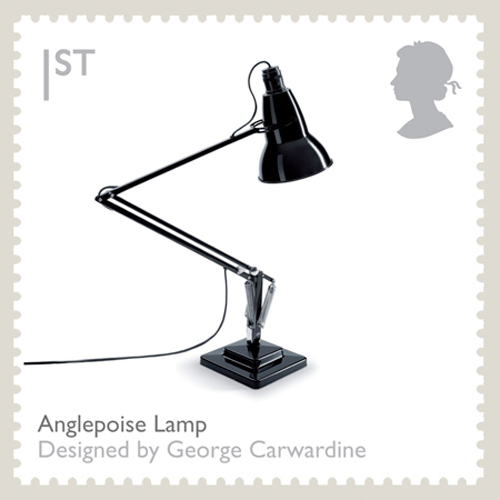
1st Class – Anglepoise Lamp
George Carwardine’s flexible design brought light wherever it was needed.
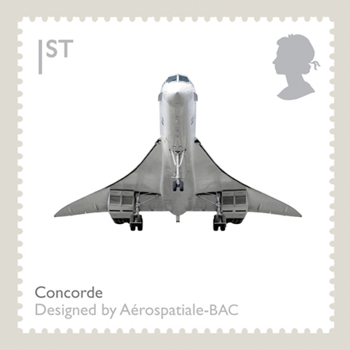
1st Class – Concorde
Aerospatiale and BAC’s supersonic jet was capable of twice the speed of sound and beautiful to look at too.
Producer: Royal Mail
<a href=" about ron kovach

An election wrap up: more creative generated in presidential election 2008. Passion trumps strategy — the bulk unsolicited, unapproved by either candidate. (more…)
 Five more days to vote. Did you know Crayola’s evolution? A corporate ethos, marketing statement.
via pearweed
DA editor responds to comment…

Artist: cane toad

Artist: diem chau
Overheard: the crayon was mightier than the sword.

artist: todd peterson

Check out twenty-five crafty carvings.
oh, yes, the obligatory political pumpkins …
via designobserver
The final stretch. Our feature article leading up to and thru the election will recap what many “branders” have concluded: Obama’s campaign is case-study worthy. ( collage on left from special edition – Creative Marketers Report 2008, Creativity; campaign logo/button from on-line store on official Barack Obama website. )
( above ) logo design: collaboration – mo/de and sender llc
If you are a creative and have been following the election, you have seen this stuff. If you are a creative not following the election, you have probably seen this stuff.
Is this a perfect storm? The economic environment. A war. The candidate. The marketing team. The technology. The financial resources. When all the stars are in alignment.
Speaking of “financial” resources, Obama raised a great sum of money by declining public campaign funding. A bit more intangible were the “intellectual” and ’emotional” resources: the generation of creative marketing materials that became available, and may be still is arriving, which is unsolicited, donated. It’s what possibly sets branding a president apart from introducing and marketing, let’s say a product like the new iPhone or a service, Virgin America, a new domestic airline.
We know that Apple consumers can easily be classified as cult-like. It’s possible Virgin America will also attain a fanatical following in the near future. But, it’s hard to imagine Steve Jobs or Richard Branson being bombarded with donated print ads, apparel, signage, videos, graffiti, twitterings from uber-fans of their companies. ( Of course, we might find out differently from someone who knows… )
At first glance, that what it looks like. The bulk of the effort looks good too. Though some application control is lost the campaign is an evolving marketing-mix that’s strategic, creative, curated by a talented and experienced Obama team. We’ll strive to identify contributors as this post develops.
Even if creatively challenged but you read, shop, jog, walk your dog, you have seen this stuff. But if not, enjoy a sampling of images. It’s just a tip of an iceberg.

( above ) designer: tom fox from louisville, kentucky

( above ) designer, shawn hazen

( above ) street artist, shepard fairey from los angeles, california

( above ) from juicy couture

( above ) designer zac posen

( above ) designer: lisa marie regan from tulsa, oklahoma — this is a signpost

( above) documentary filmmaker: errol morris

( above ) parodies of fairey

( above ) photomosiac artist” charis tsevis

( above) artist: dee

( above ) autographed sticker, upper playground artist: munk one

( above ) fashion designer: marc jacobs

( above ) designer: tia salmela keobounpheng from minneapolis

( above ) designed by” artmags.com from oregon

( above ) design firm: thunder dog studios, long island city, ny

( above ) tribute to warhol, artist/designer: terri bell

( above ) fashion designer: jean charles de castelbajac.

( above ) screenshot 30-minute ad, october 29, 2008
( above ) robocall from cincinnati
Official logo
An official presidential logo and it’s usage. Innovation is not a design criteria requirement though it’s said the circle bucks convention. Familiarity, mass appeal is important and it succeeds on many levels of perception expressed by many. Colors for one. Less obvious, Pepsi another easily recognized, friendly image.
A good logo permits a wide range of application and it succeeds, giving a credible, official imprimatur and doesn’t get in the way of the messaging. Despite good visual qualities we find applications sans logo as the logo isn’t a mandate. Creatives enjoy artistic freedom. Hats off to a non-cookie cutter visual rule book.
New Media
Four years ago it was new media vs old politics. John Dean was light-years ahead of the pack establishing a grassroots network via the Internet to get out the word. In 2008 both candidates are better Internet matched but there is a big difference and many voters “won’t get” the difference. If you aren’t a blogger, don’t have a Facebook or Flickr account the savvy Obama site will be unappreciated. ( New media director Joe Rospars powered Dean’s 2004 Website and co-founder of Facebook, Chris Hughes help to develop Obama’s site. ) But the creative community says Obama “gets it” with how Web savvy users, social networkers, communicate, interact, organize, raise money, and respond to the media.
Integrated design
The campaign to date has successfully integrated both online and off messaging. Creative director of DIGO Brands, Mark DiMassio, “the Obama brand is the social creation of the community rather than the creature of the media or ad people of the campaign organization itself.” This bottom up approach aligned with the mantra of “change” is what truly sets the campaign apart.
Creative sources
moveon.org
meaningful distractions
obama art report
creative review
more pro-bono election work
tale of obama
shepard fairey: progress
the learning curve
logobama
upper playground
democracy, designers, and obama
artist spotlight: dee
rene wanner poster page
thunder dog studios, obama bike
terri bell, tribute to warhol
jean charles de castelbajac
new hope, switzerland
the obama art report
design and political communication
Media sources
npr.org
huffington post
washington post
blog.newsweek
new york times
freshness
counterforms for obama
people in the middle
all that glitters
salon: obama’s infomercial night
crain’s chicago business: 30-sec ad – nbc’s best
politico: designer’s like obama
politico: obama cuts radio ads for dems
businessweek: election designs 2008
obama’s 2008 presidential campaign staff members including campaign manager, david plouffe, and chief strategist, david axelrod.
official presidential sites
barack obama
john mc cain
 Branding 101. What does it take for a brand to make it in this economic environment? First off, consider hiring a professional – the positioning matrix (left) a valuable professional tool.
Killer product.

Killer concept.


Just what the doctor ordered. For today’s branding quiz – Identify three elements in a killer marketing plan.
 poster power. it’s real.


And there doesn’t seem to be enough of them when you see really good ones. Really good ones are on display for a month in Chicago’s Daly Bicentenniial Park.
The medalists:
The poster exhibit runs until October 29 in Daley Bicentennial Park. See the 31 winners at Design Observer and Chicago International Poster Biennial official site.
See additonal posters featuring animals.
All content ©2007 > 2024 DesignApplause