Fast food giants may not be redesigning their menu for the better, but some of them are trying to up the quality of their restaurants by hiring actual designers to update their interiors. Recently, McDonalds hired Patrick Norguet to redo all their French chains to appeal less to teenagers and more to families, emphasizing an “urban and adolescent tone.” Norguet, with his affinity for modular storage and corporate meets contemporary furniture, is a good choice. He designed booth where families can sit and order from instead of wrangling all their kids into line at the counter. The Mondiran-inspired white and metal storage facade looks good now, but I imagine some of Norguet’s swopping, atomic-age moves will look dated even before they get dingy with use. Apparently, there’s also some kind of plant metaphor going on, “its branching development, this root common to the brand and to the family, is transformed here into an architecture which is transversal and expansive: birch plywood takes root and branches out in the restaurant in order to create areas, functions and moods for different social requirements without compartmentalising.” Um, yeah whatever, McDonalds.
As a fitting counterpart to my post on redesigning trailer homes and bringing high design to the heretofore undesigned, here are two more fast food chains that got a make-over. The UK-based chain of Little Chefs hire London designers Ab Rogers for their interiors. Do you think it’s supposed to look this dated, or should I say, retro? They did say they were inspired by “influences from the history of roadside eating.” But isn’t red vinyl booths and white tile floors exactly what we’re trying to get away from here? There’s also an “interactive sound” that gets triggered when someone stops along the roadside just to use the bathroom to encourage them to stay for food. I find that weirdly creepy, but I do dig the photo-realistic tiled ceiling.
The best example of a real step up in the game is the redesign Ippolito Fleitz Group (personal faves of mine) did for a chicken restaurant in Germany. The wooden floor and outdoorsy wallpaper and calmer paint colors are immediately more relaxing and inviting than the bright white and red combo usually favored in fast food. Seriously, when did hospital white and ketchup-red become the standard? It reminds me more of the ballroom bathroom in Stanley Kubrick’s THE SHINING, not exactly what I want called to mind when I’m eating. But it’s not like I’m ever going to eat in a McDonalds, even if it’s a fancy new one in Paris. As a side note, check out the minimalist, logo-less McDonald’s pop-up built in Tokyo in 2009 as way to introduce the brand to Japan without berating with a sudden influx of golden arches.


[Via]

about perrin drumm
20 experts and a readers poll make a case for 20 best logos. let the debates begin. via creative review [RK]

The new Media Lab logo really represents a vast galaxy of ideas generated past and future. This is an algorithmic generated logo that can create 40,000 logo shapes in 12 different color combinations, providing the Media Lab an estimated 25 years’ worth of personalized business cards.
designers: e roon kang & richard the
Last Spring in my Corporate Branding class, design student Seth Hoekstra created a similar sui generis concept for his mythical Center for Design, Chicago. Seth’s concept behind each mark variation begins with each museum staff member. Each individual would be prompted with an assignment to contribute a unique shape they feel represents the museum. Here are several pages from his CDC manual of style to guide the way.
 esquire magazine commissions twelve artists and designers to re-engineer their logo and kick off a logo sweepstakes.
tom geismar

universal everything

aaron rayburn

tronic
Esquire’s logo sweepstakes is part of a unique experiment in Augmented Reality with GoldRun — a technology firm who helped put the logo letters from the sweepstakes all across America. Find them, and you could win an iPad. How to find and Esquire letter in your city. Letters created by design firm Tronic.
<a href=" about phil patton
“we love the design, but we’re open to other ideas and we want to move forward with the best logo possible,” he says bill chandler, vice president of corporate communications. via fastcompany [RK]
the dollar rede$ign project hopes to bring about change for everyone. we want to rebrand the US dollar, rebuild financial confidence and revive our failing economy. [RK]
 a bike with a brain.
what’s this post all about ? as their website says, “It’s pretty simple really. It’s about taking a self-indulgent goal—riding across the USA—and using it as a two-wheeled vehicle for helping those fighting the biggest douchebag of all, cancer.”
the livestrong foundation, brand, does a great job of staying in our face in an inspiring way.
designer: breakfast, new york
producer: livestrong
info: yes i am precious
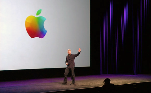

 1976 apple logo on a 2011 apple product