 high in concept and history.
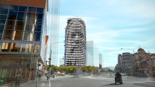
A high-rise apartment building bearing the image of an indigenous leader is set to become one of Melbourne’s most dramatic landmarks.
The proposed Portrait building, earmarked for the old Carlton brewery site, features a 32-story portrait of Wurundjeri tribal leader and artist William Barak. The contouring of the building’s balconies and the play of light and shade will feature his face when viewed from the correct angle.
A clever concept, while other buildings have featured screen prints of landscapes, think Bjarke Ingles Mountain Dwellings, and others have featured contoured balconies like the Aqua building this building will be the first to combine the two if completed in 2014.
The best line of sight for viewing the image will be from the Shrine of Remembrance, Victoria’s largest and most visited war memorial which is approximately 3 km away. When viewed from close up the building will simply appear to have an oddly contoured facade. The portrait will be created using a number of horizontal white panels that have been cut to make Mr Barak’s face to appear via positive and negative space. The panels will be distanced from the balconies themselves so that residents will not accidentally alter the imagery.
The building design is by Australian architecture firm ARM. The brewery project is a five building development by Australian firm Grocon who is firmly behind paying tribute to an important figure in Australian history and have received the blessing of both the Wurundjeri elders and the trustees of the Shrine of Remembrance.
The ARM architecture firm has attempted buildings with portraits on their facades in the past, the Dupain Building and 347 Camberwell Road however, neither of these projects were completed. Maybe the proper stars are in alignment this time.

about randy shear
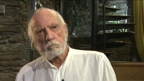
 last living member of harvard five: marcel breuer, landis gores, philip johnson, eliot noyes, and john johansen.
“certain aspects of human life are celebrated by organized religion, birth, marriage, death, and the design and building of one’s house for their family.”
Resource:harvard five

about randy shear
 this home is called the minimalist house. has the feel of a hip bachelor pad but is custom designed for a couple.

above: the home consists of solid walls on four exterior surfaces. the space is internally divided into three equi-distant sections running length of floor plan.


above: the first strip is an open courtyard; the second strip the bedroom / living / dining area. a glass wall separates courtyard and living space.


above: the front door in the third strip admits you into the kitchen. midway in the strip is the bathroom with study and closets at the far end.
Per the architect: The home is designed around a three-meter grid module in all xyz directions. Taking into account the natural light of Okinawa’s climate, the internal space connects with the outside via the glass wall separating inside space and courtyard. An eave runs the length of the glass wall to control the amount of direct sunlight coming inside. Consequently, this layout and efficiency of this home aspires to a minimal but flexible lifestyle.
* location : okinawa, japan
* program : residence
* structural system : reinforced concrete
* stories : 1 stories
* site area : 211.59 m2
* building area : 102.22 m2 ( about 1,100 sq ft )
* total area : 102.22 m2
* completion date : 2010.01
designer: shinichi ogawa & associates
 the uk architecture firm groves-raines recently snagged first place in craftsmanship at the annual aia excellence in design award for their innovative use of re-bar in a compost shed in edinburgh.

With all the other awards this year going to large-scale projects, it’s important to highlight the smaller but important contributions to design.
The bending, sinewy lines of the rusted metal cords look elegant, calling to mind Richard Serra’s undulating marvels of bent steel. Let’s not overlook the hidden beauty the firm discovered in a material that usually plays a hidden role, and how they turned something that’s all about function into something that’s all about form.
[
aia 2010 excellence in design winners]
designer: groves-raines

about perrin drumm


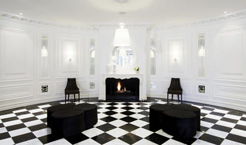
if you are both super minimalist and art collector you probably gravitate towards the residence better known as the white cube.
you tell your architect to bunch up the windows, the passage-ways, because you want immense uncluttered / neutral wall space to hang your art. on the other hand if you don’t have a ton of art you can tell the architect you wish your home to be the art statement. the armella house is such a house.


one wonders what one wears in a house like this. all white, black, or grey ? and one also wonders if after a time the color palette needs to be changed. that said, this is indeed a beautifully conceived and festive home built in mexico, rich in local colors.
Designer: bosco gutierrez cortina
Date: 1994
 the fincube is contemporary, modular, high-tech, sustainable, low-energy, what else? transportable! house with contemporary wooden interior and exterior styling.
It can simply be dismantled and rebuilt on a new site. Requiring only two square meters of foundation, the impact is minimal after the Fincube is moved to another location.

Horizontal ledges provide privacy and assimilate the home into forests, meadows, and let’s also include mountainsides.

The original home was created 1200m above sea level near Bozen in Northern Italy. Made entirely of local wood, the building provides 47 m≤ of living space with a minimal CO2 footprint: local suppliers and local crafts using local long-lasting and recyclable materials manufactured with the precision and care of tyrolese handwork. A prototype of this nomadic housing concept is exhibited in Ritten, above Bozen.
The combination of long-lasting design and portability make for a flexible house or hideaway and a lifetime companion.
Per the designer:
Long-lasting Design: The design is minimal, material-orientated, and in close touch with nature – the wooden space with a 360-degree triple glazing is furnished with a second facade layer, producing shade and giving the building a unique overall mushroom-like mono-shape.


Hospitality Vision: Together with South Tyrolean hotelier Josef Innherhofer, the Fincube was also conceptualized as a vision for future hospitality: a temporary FINCUBE village with minimum soil sealing can be placed in the middle of the most beautiful landscapes without permanently altering them. In contrast to all permanent buildings it could be easily changed, extended, scaled down or removed and the area would soon be re-naturalized back to normal. These qualities turn the unit into an answer to future needs of flexible and smart tourism.
Technology & Space: Technology wise the FINCUBE is a smart house – all vital house-functions are controlled by a central touch panel. The supporting structure is made of local larch and the interior is a combination of larch & stone-pine. The 3m-high space is organized in a helical structure: the entrance area blends into a generous open kitchen with an adjacent sofa living space, around the corner one enters the bedroom and further down is the spacious bathroom.

[fincube]
Designer: Werner Aisslinger – Berlin .
Interior design: Tina Bunyaprasit, Studio Aisslinger .
Wood structure: Markus Lobis – Ritten, Italy
Interior finish: Matthias Prast – Ritten, Italy
 no one blends styles better than hecker, phelan & guthrie.

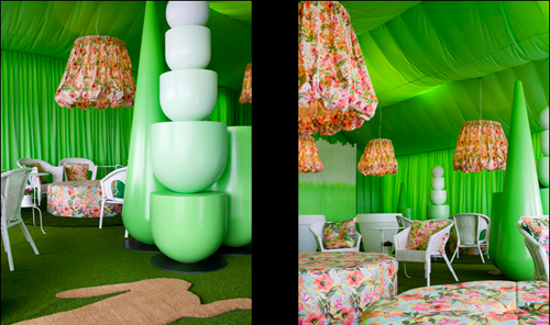
above: event space at flemington racecourse

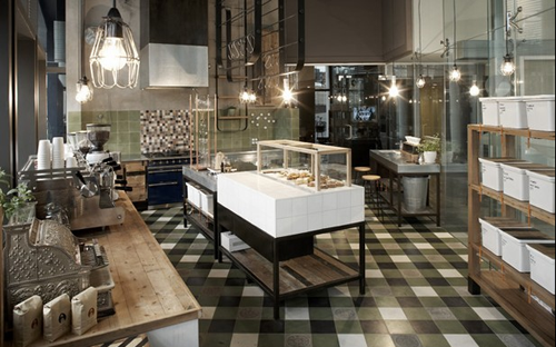
above: st. ali outpost

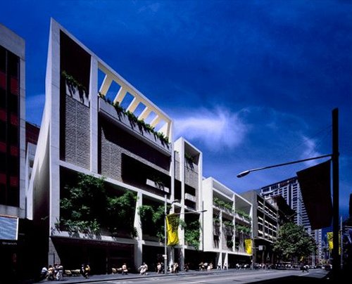
above: ivy venue
The interiors designed by this Melbourne-based firm are a veritable grab bag from the last five centuries. You’re just as likely to see a Louis XVI chair in neon pink as you are a Mies van der Rohe sofa or a floral print lamp shade of unknown origin – often times all in the same room. The result is a feast for the senses.
Their portfolio is vast, ranging from sleek and modern residences and retail spaces to projects like the 65,000 square ft. “hospitality venue,” Ivy, in Sidney, a landscaped public oasis that includes eighteen bars, nine restaurants, two penthouse suites, a ballroom, a rooftop pool and a sunken courtyard. Even more eye-catching is their 2008 event space at Melbourne’s Flemington Racecourse.
The company hosting the event was tired “of all the bling and superficiality” of most corporate events and hired HP&G to bring their trademark playfulness and sense of humor to the traditional atmosphere. They came up with a “frivolous and cheeky temporary marquee” where guests could experience classic horse racing at its most exaggerated – “think Pimms on the lawn, vintage furniture, English china, strawberries and cream, British fusion tunes and waitresses in 50s-inspired dresses serving high tea.”
A space like this forces you to leave your pretensions at the door so even the stuffiest of stuffed shirts can laugh, relax and have a good time.
designer: hecker, phelan & guthrie

about perrin drumm


