 dyson dco2 / click > enlarge images
 vax air
Vacuum cleaner mastermind James Dyson has been in the news quite a bit lately, first after he lost a case against a Chinese company that ripped off his eponymous product and again when the winner of the James Dyson Award was announced. Even though Dyson recently won a similar case in France against the same Chinese company, Vax, the British courts failed to find fault with the similarities between the Dyson DCO2 and the Vax Air, which, as you can see from image above, is pretty much a blatant knock-off.
Dyson himself was understandably upset, especially since they won the same case in France (seriously, wtf British court?). “We’ve invested decades, not to mention millions, in creating better technology. And sadly we waste millions more in cases like this. We need to better protect British design.”
On a more uplifting note, the annual James Dyson Award went to Edward Linacre from Swinburne University of Technology in Melbourne, who’s developing the Airdrop, a moisture extractor to help irrigate crops in dry regions. It’s a universal problem, but after the draughts that affected Australia earlier this year it’s especially topical for Linacre. At first glance it looks like a weird lamp stuck in the ground, but here’s what going on beyond its plastic exterior: underground pipes connected to the Airdrop pump air into the soil, lowering the temperature to the condensation point. This creates water that’s then cycled to roots of the surrounding plants. With the £10,000 in prize money, Linacre will develop his project and hopefully get this baby into production in time for the next draught. Check out the other great projects that were nominated this year.
 edward linacre | airdrop
 airdrop
yes, you’re right if you think there are design knock off awards… [ plagiarius awards 2009 ] [ plagiarius awards 2008 ]

about perrin drumm
 the original panton chair
Some designers are crying fowl at Peter Jakubik’s “Arbor Chair.” Also called the DIY Panton Chair, Jakubik’s project includes an instructional video showing people how to make their very own “original fake” of Verner Panton’s iconic chair. Copycat or not, he intends to produce and sell the chairs to people with a love of modern design and a yen for something more homey than Panton’s original injection-molded plastic.

But the design world needn’t be so shocked. This isn’t the first time someone has ‘borrowed,’ ‘copied,’ or ‘ripped off,’ (whichever you prefer) Panton. In fact, United Nude released their “Pixelated Verner Panton Chair” not too long ago. Are these chairs two examples of stealing a famous design or paying homage to a well-loved designer?

about perrin drumm

koons is going after two businesses that his lawyers say have violated his intellectual property rights by producing and selling bookends that resemble his famous “balloon dog” sculpture,

the defendants say theirs are not a copy. what do you think ?
fyi “balloon dog” bookends, sells in a san francisco gallery for $30 each. koon’s smaller dogs on sale
on ebay for $7,250 to $12,500.
[artknowledge]

this repurposed old chair is technically a makeover, but the end result is so grotesque, so utterly appalling i’m naming it as the “makeunder” of the year.

The last days of December is usually the time when we compile our ‘Best Of’ lists – best movies, best books, best music, best design etc. But for there to be a best, there has to be a worst, and Dirk Vander Kooij’s nastily old brown chair is it. The dutch designer’s other work actually isn’t all that bad, but taking a puffy brown chair that was ugly to begin with and skinning and restuffing it to make a bean bag has disaster written all over it. The retch-inducing plasticky leather makes it look like a sick animal ridden with tumors and its teetering, off-kilter balance gives the impression that it’s about to spring alive and pounce. I don’t care how noble it is to recycle, the Earth would be a lot better of this was hauled straight to the dump.
designer: dirk vander kooij

about perrin drumm

in a response to london’s annual design festival, now in its 9th year, and to the “25 years of cultural deep freeze, the anti-design festival will attempt to unlock creative fires and ideas, exploring spaces hitherto deemed out-of-bounds by a purely commercial criteria.” So says founder Neville Brody, who takes the Anti in Anti-Design seriously. “The Anti Design Festival is anti-everything. The Anti Design Festival is anti-nothing. While the ADF is not against design, there is also a need for change. We are not anti-design as much as we are anti-everything.”
If you have any doubts just check out the event website. The ADF logo includes the London Design Festival’s logo – with a big X through it. The front page also does things with kerning and font size any design teacher would shake their finger at. Of course, that’s the point. ADF is not only a chance to play with design without the imposition of clients, bosses or market restrictions, but it’s a chance for your work to rub shoulders with contributors like Jonathan Barnbrook, Stuart Semple and Stefan Sagmeister. It’s nonprofit (i.e. no prize money); If that’s a problem, ADF probably isn’t for you.
ADF takes place in Shoreditch, London from 18-26 September (the last week of The London Design Festival).

about perrin drumm
This content is password protected. To view it please go to the post page and enter the password.


The lawyers and accountants have been working weeks on the presentation: the hubs and destinations, the common culture, the synergy, and why this isn’t a trust-buster merger. If this “flies” they know they’ll be the biggest airline on the planet.


Now alone in the new United Loop office space at 77 W. Wacker, United CEO Glenn Tilton, and Continental CEO Jeff Smisek maneuver to close the deal.
Tilton asks, “Scotch? If we’re going to do this the headquarters stays in Chicago. What do you want?”
“No problem with that. I’ll be the new CEO. I’m now wondering what we stick on the planes? What did it cost to paint your planes grey? BTW, I’ll admit I’m getting an adrenaline flow over this. ”
“Yeah, it may have been bad timing to start repainting the planes while we’re filing for bankruptcy I guess. The jury’s out on what our passengers think of the packaging. Probably don’t give a damn.”
“Ready for another? I went to the trouble to talk to our creatives. They said the marriage could be a complicated brand issue and said to stick with what we have.”
“Let’s keep the process simple. It’s the name and logo. You keep your name and we stick on our logo. They’ll be naysayers but it’s a no-brainer.”
“Come to my computer, I’m getting good at retouching my press head shots.”
Cut. Paste. Cut. Paste. “Wait. Need to type this.” Click. Click. Click. “Shit. Do you text message?” Click. Click. Click. Cut. Paste. “There, what do you think?”


“Very impressive. I’ll be sending you my head shots. I’m hungry as hell, let”s call the wives.”
above: saul bass – designer of united logo / brand identity
Resources:
fastcompany
reuters
chicago architecture
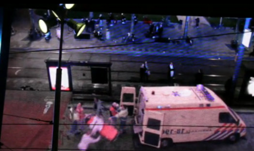
 creative dutch government implements an integrated reality billboard in amsterdam to educate and shame passers-by.
Wondering if this really works: Passing by an interactive billboard playing out a violent street crime. It probably causes your head to spin for a few hours while looking over your shoulder. What would you do if it was really happening in front of you? Whatever you do, if you’re going to act on behalf of the victims be safe and smart, do it at a distance.
###
In the Netherlands, it’s apparently not uncommon for public employees to encounter aggression and even violence while carrying out their day-to-day responsibilities. And Dutch citizens, it would seem, would rather not get involved in somebody else’s altercation.
So the Dutch government got creative with a public service ad aimed at urging citizens to stand up for their public workers, using augmented reality to place people on the street in the middle of a violent confrontation.
An interactive billboard placed above crowded Amsterdam and Rotterdam thoroughfares displays, in real time, a view of the street below. Passers-by can see themselves live on the massive screen, but though the curb space in front of them is empty, on the screen there’s a tense confrontation unfolding as they stand there and gawk.
The idea is to more or less shame citizens for their inactivity when they see a violent confrontation taking place. By making citizens aware of what they look like when they ignore a wrong being committed right in front of them, the government hopes to engender a sense of shared responsibility and a willingness to come to victims’ aid.
[
source ]
 dyson dco2 / click > enlarge images
 vax air
 edward linacre | airdrop
 airdrop


