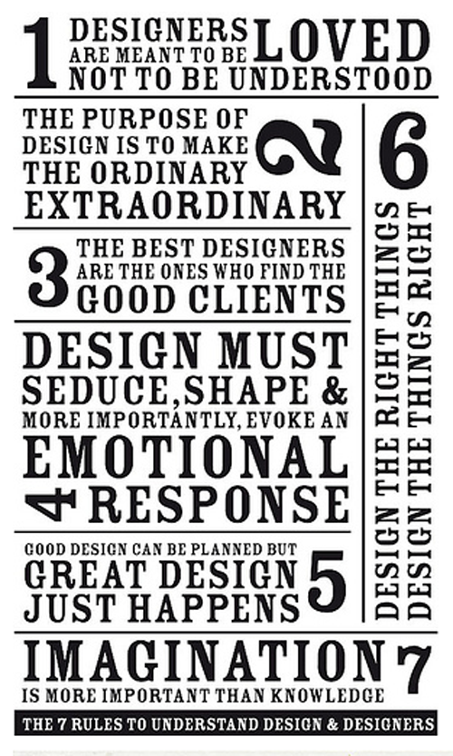

this nifty little 7-piece chart of command – ments for designers has been making the rounds lately.
I especially like numbers 5, 6 and 7. But when I look at it I can’t help but be reminded of another list with 10 bullet points that, like their creator, are simple and streamlined. I’m talking about Deiter Ram’s “Ten Principles for Good Design.” No good designer ever really forgets them, but if you haven’t checked in with Dieter in a while it’s worth a refresher. Like his products, his principles will, no doubt, stand the test of time. [ Ten Principles for Good Design ]

about perrin drumm
wallpaper’s october issue is out.
The guest editors Robert Wilson and David Lynch have inspired the magazine to ask Dentsu London to bring the motion to print via pre-cinema French technique OmbroCinema OmbroCinema. Dentsu had previously used the technique on its award winning relaunch for Japanese paper Asahi Shimbun, in order to “animate” every ad in the publication.
 last living member of harvard five: marcel breuer, landis gores, philip johnson, eliot noyes, and john johansen.
“certain aspects of human life are celebrated by organized religion, birth, marriage, death, and the design and building of one’s house for their family.”
Resource:harvard five

about randy shear

good solar power video that few have seen.
[source: solardude1]
 a bike with a brain.
what’s this post all about ? as their website says, “It’s pretty simple really. It’s about taking a self-indulgent goal—riding across the USA—and using it as a two-wheeled vehicle for helping those fighting the biggest douchebag of all, cancer.”
the livestrong foundation, brand, does a great job of staying in our face in an inspiring way.
designer: breakfast, new york
producer: livestrong
info: yes i am precious

(Images are from the cooper hewitt national design awards)
above: Tupperware Flatout! from frog design, one of three winners for Product Design

above: Stephen Doyle, winner for Communication Design

above: Lisa Strausfeld’s One Laptop per Child
With the National Design Awards in the recent past and London Design Week in the near future, competition is at the forefront of the design world. A little friendly competition never hurt anyone, but in a recent piece at Core77, Apple VP Don Norman argues that design contests are flat out bad for design.
The position he takes is this: Because jurors often have to rate designs based on drawings, photographs and videos accompanied by text instead of the physical product (either because it hasn’t been made yet or, in the case of something like a car or bed, it’s physically impractical). “As a result,” Norman says, “jurors cannot experience them in use, they can’t watch the intended audience use them, they can’t assess how well they provide for graceful interaction, what pleasure or pain they provide, what benefits they provide. “If design contests reward styling alone and ignore the most important, but hardest parts: interaction, experience, truly meeting needs, and even economic success, they “perpetuate the myth that industrial design is primarily about style and that brilliant styling leads to success in the marketplace. Both statements are false.”
He suggests that all entries should be accompanied by an “evaluation performed by an independent testing group that evaluates its functionality, usability, durability, and market impact,” and that judges be made familiar with the constraints and expectations of each category and be required to serve on a panel for more several years. “I recommend rolling three-year terms, with 1/3 of the jurors appointed each year. Each jurors would have one year to learn the ropes, one year to practice what had been learned, and a final year both to practice and to mentor newer jurors. ”
Resources:
cooper hewitt national design awards
core77

about perrin drumm
 it’s ironic that the world’s first floating dining room is built on a bed of plastic bottles.
The surprisingly spacious dining area sits on a reclaimed pinewood frame that houses 1700 plastic bottles and can accommodate 12 guests for a 6-course sustainable seafood meal. It’s ironic by intention, of course. Designer Shannon Ronalds is trying to make a point.


Ronalds, founder of The School of Fish Foundation, is using the floating restaurant to educate chefs on the seafood industry and the impact that discarded plastic has on the ocean environment. All proceeds from the meal go to supporting the School of Fish’s education initiatives, like Shannon’s mission to make comprehensive sustainable seafood courses a requirement for graduation and providing schools with scientific data from marine conservation organizations. These initiatives are especially relevant now that the ocean has far more than just plastic bottles to contend with thanks to the Gulf oil spill, and chefs will have to make increasingly informed decisions when it comes to planning a seafood-based menu.
designer: shannon ronalds

about perrin drumm
 ask pieke bergmans a simple question and you’ll get anything but a simple answer.
To the Dutch designer, a light bulb is not a light bulb. When a light bulb, or indeed any simple object, is placed under her personal design imperative, “Design Virus,” it becomes something else altogether. “A light bulb,” she says, “is a light bulb that has gone way out of line. Infected by the dreaded Design Virus, these bulbs have taken on all kinds of forms and sizes you wouldn’t expect from such well behaving and reliable little products.”


The same goes for everything else she designs from tables and cabinets to dinnerware and vases. Still, the Light Bulb series remains her most eye-catching work, garnering plenty of oohs and ahhs at Art Basel this year. The bulbs themselves are made of crystal, but Bergmans has also experimented with glass blowing to create some pieces that look particularly infected by the virus.
designer: pieke bergmans

about perrin drumm


if you are both super minimalist and art collector you probably gravitate towards the residence better known as the white cube.
you tell your architect to bunch up the windows, the passage-ways, because you want immense uncluttered / neutral wall space to hang your art. on the other hand if you don’t have a ton of art you can tell the architect you wish your home to be the art statement. the armella house is such a house.


one wonders what one wears in a house like this. all white, black, or grey ? and one also wonders if after a time the color palette needs to be changed. that said, this is indeed a beautifully conceived and festive home built in mexico, rich in local colors.
Designer: bosco gutierrez cortina
Date: 1994


