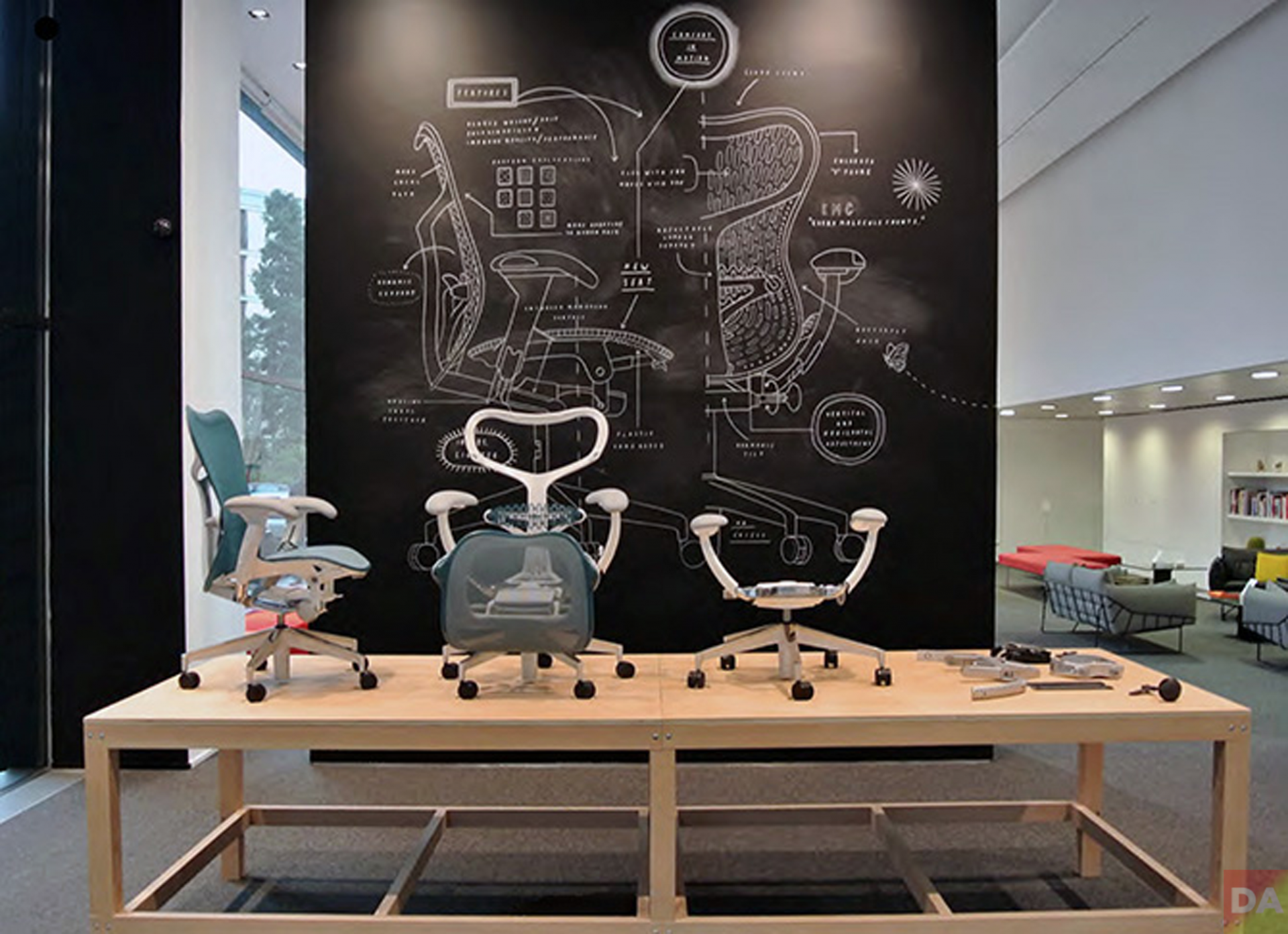
We’re in the Milan Herman Miller showroom with designer Clauda Plikat and engineer Roland Zwick, two of the four-person team with Studio 7.5 who designed Mirra.

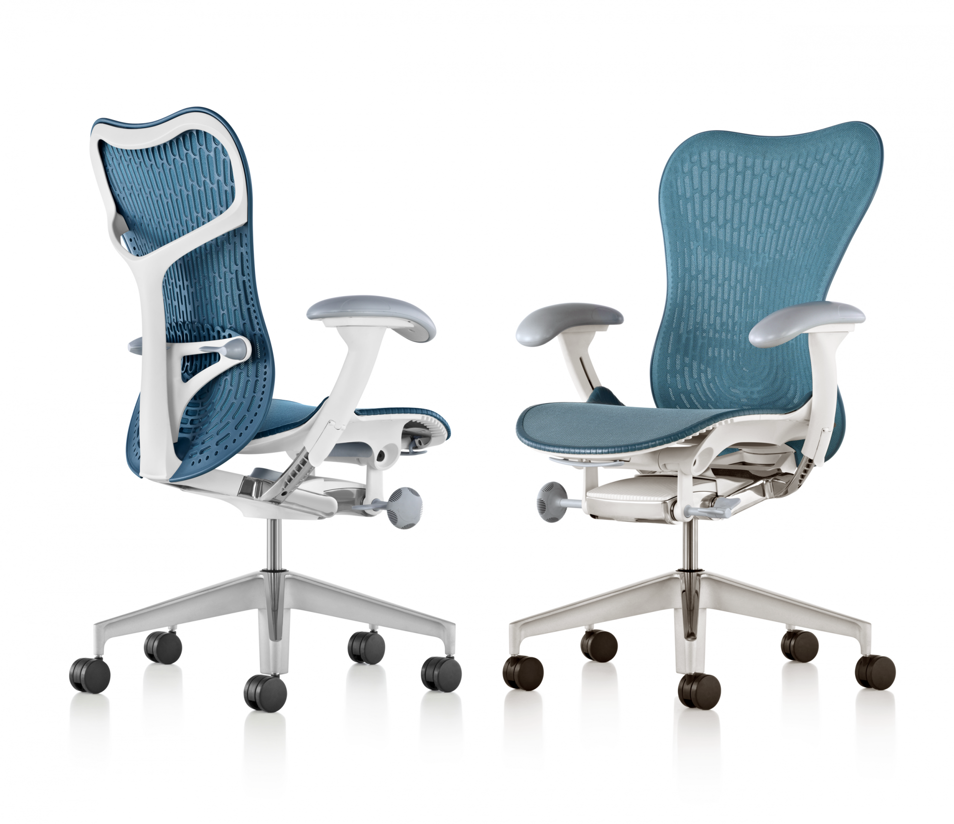
mirra 2 | studio 7.5 | 2013
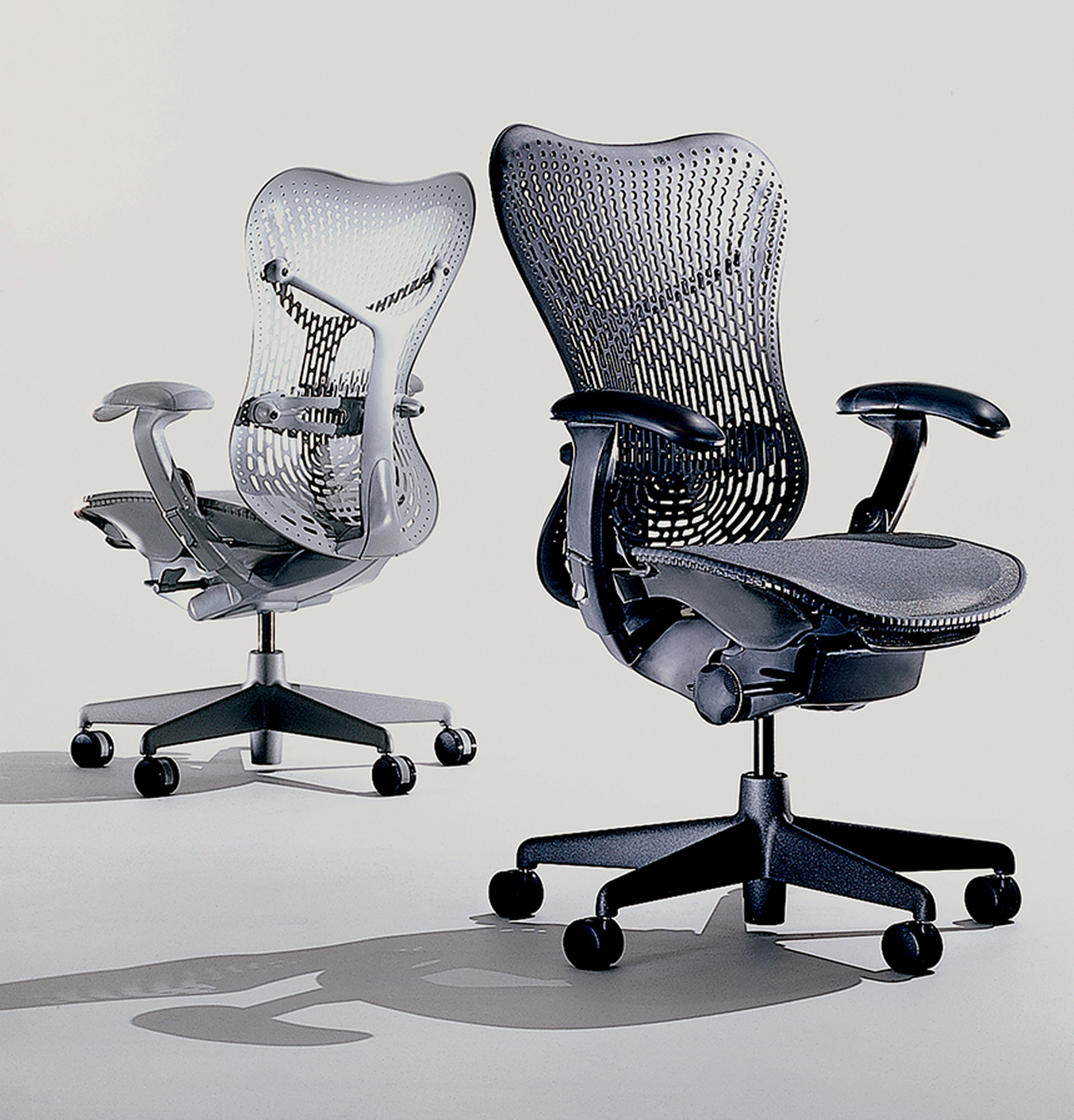
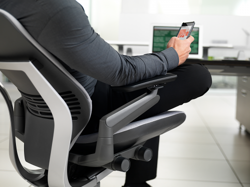
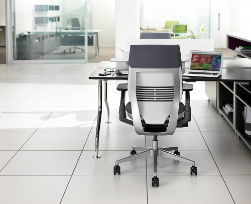
Created in 2003, ten years (and 1.5M sold) later, Mirra 2 is yes, smaller, lighter, stronger and greener than the original At first glance you can see a more svelte profile but it takes a bit more to see the new details. Sitting in Mirra 2 you can feel a difference and if fine-tuning while sitting in the chair is an important criteria the new chair is more intuitive.

mirra | studio 7.5 | 2003
[Claudia Plikat] Herman Miller had called us and said they were thinking about when Mirra would be ten years old in 2013. They asked if we would be willing to revisit the project and see if the concept as a whole is still valid, or are there elements we would like to rethink. We were eager to look at Mirra again though it’s quite a challenge to reinvent your work because as a designer and an engineer, you already the gave blood, sweat and tears the first time.
Mirra was designed as a one-size fits all chair which means it’s adjustable. From the beginning we wanted to have both active and passive adjustments. So when you sit in the chair for the first time it begins to adjust to your body on it’s own. Mirra 2 soul and essential DNA remain intact.

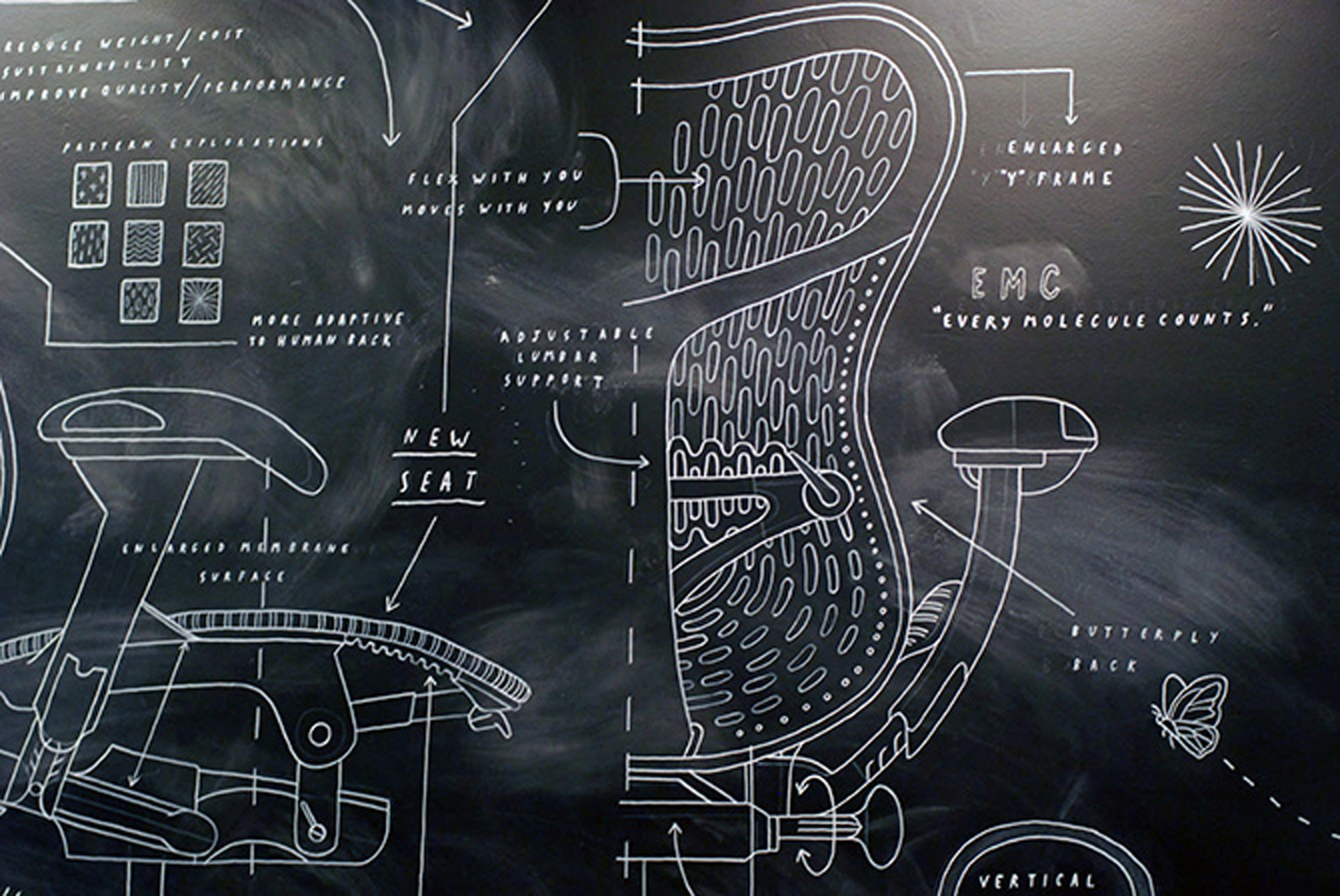
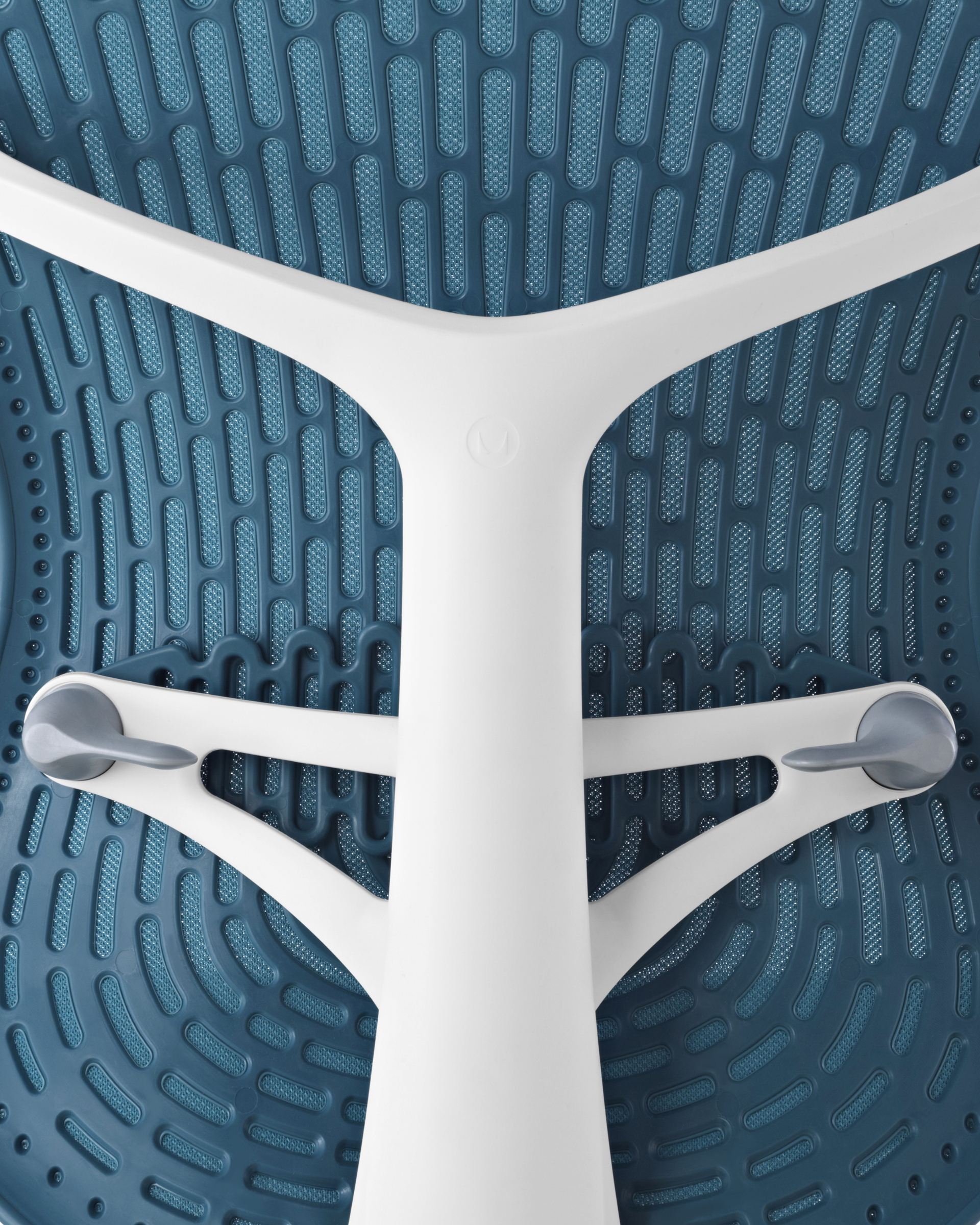
[Roland Zwick] On the new chair we aimed for a more adaptive chair back. We created a patented new system of support: a refined shell with larger holes; a new ‘butterfly back’ structure with controls to vary the tension of a new membrane surface.

[CP] The membrane is much like nature and it’s structure of the leaf, the veins providing rigidity and the skin completes the support, very adaptive to the shape of your body. The seat itself is new. The foam pad from under the seat is gone and uses the new membrane to create a very breathable chair. The new ‘dial-up’ controls give you immediate feedback.The chair’s name “Mirra is a synonym for ‘mirroring your body’ and Mirra 2 advances this idea.
[RZ] We are most proud of the new ‘engine’ which is an assemblage that holds all the parts in place: the chair easily assembles or disassembles without the need for tools and is now produced and assembled in-house at Herman Miller. The new chair is 25% lighter because aluminum was substituted for steel and plastic, aluminum is corrosion-proof and only needs a blast of ceramic paint. Aluminum is 90% recyclable.

[DA] Tell us about the actual design thru production process.
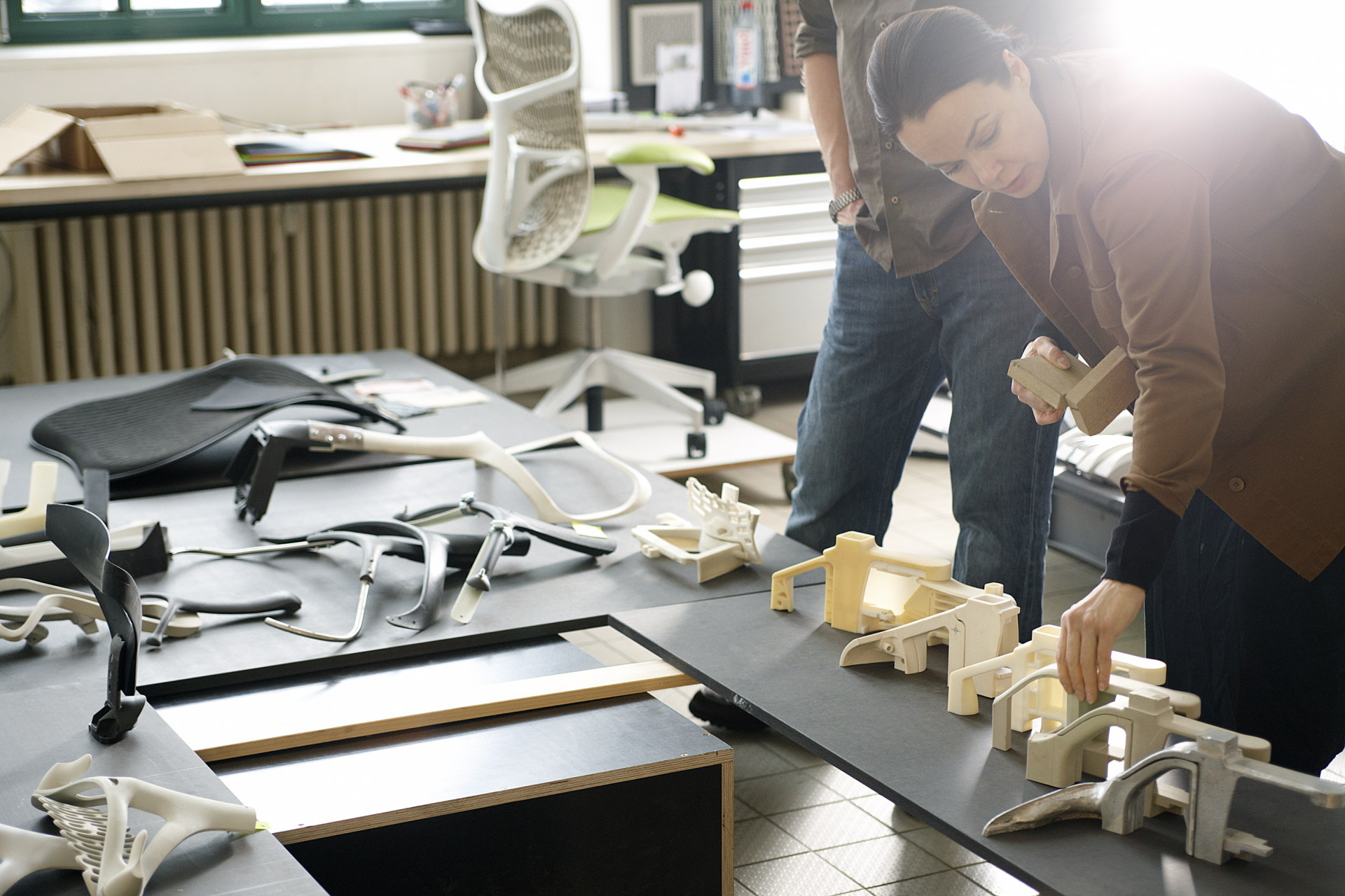
[RZ] We may be unusual in that we don’t sketch. We immediately start building prototypes ourselves. We may start with foam then move to a 3-D computer rendering and use the print to make aluminum parts for testing. These studies are only for our own nosiness and see how the parts go together. To test we eventually need the real part and eventually make very accurate one-off parts. We make a few prototype chairs that lack detailing, but these unfinished chairs will go through boot camp designed to mimic 10,000 sittings, or movements to see what if anything shows unusually quick wear-and-tear, or breaks.

[DA] How do you determine what material to use?
[RZ] Actually most of the solutions are about geometry and not materials. Once we have the geometry and the function determined we can determine the material. As a designer you want to have this honesty of the material. We usually use polypropylene for it’s strength/weight, ease of use, and it recycles well and we now use more aluminum.
[CP] Of interest, the fancy materials are difficult to recycle because they are not well-known enough. A well-known material, the recipe is well-known and the industry knows how to handle it. You really don’t know what’s in many new materials and that’s a risky environmental problem.
[DA] Tell us about the designer / engineer relationship.
[CP] A designer is not an expert, whereas an engineer is an expert in their specialty. To arrive at something new you have to forget conventional methods. An experienced designer knows enough to operate in between specialties. Engineers working with designers are more comfortable experimenting and taking some risks. Roland and I are always talking. Can we take out material here, can we make this side wider and this thinner: form and function at the ground level.
[DA] Which comes first, form or function?
[CP] We don’t start with the form. From our perspective it doesn’t make sense. If you observe how the object functions, how it is used, the form is always the expression of the performance. When we work on objects, we wind up giving parts names. Like ‘fly-back’ which is pretty much the function we are trying to achieve. That’s our inspiration, the bionic universe. Maybe you look at nature very close and see how nature does things.
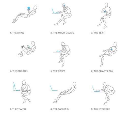
8>13 brian rea illustrations
14>17 studio 7.5
16> Claudia Plikat, Burkhard Schmitz, Carola Zwick, Roland Zwick
[ herman miller ] [ studio 7.5 ] [ illustrations > brian rea ]

 about phil patton