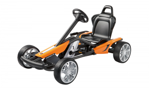
First porsche go-kart!
 click > enlarge
[ porsche ]
<a href=" about phil patton
 click > enlarge
[ porsche ]
<a href=" about phil patton
 click > enlarge
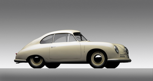
Porsche, Type 356 Gmund, 1949.
COURTESY OF THE INGRAM COLLECTION, PHOTOGRAPH ©2013 MICHAEL FURMAN.
I saw several of these cars two summers ago at [ allure of the automobile ] in Portland. The North Carolina Museum of Art in Raleigh has curated a mother lode of this species of all-animal cars. It opens 12 October 2013 thru 20 January 2014. You may feel the presence of Steve McQueen, James Dean, Janis Joplin, Jim Hensen. [ porsche by design: seducing speed ]
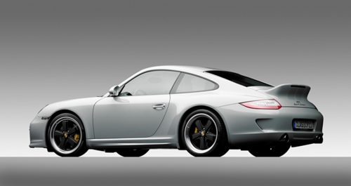
Porsche, Sport Classic Carrerra, 2010.
COURTESY OF THE INGRAM COLLECTION, PHOTOGRAPH ©2013 MICHAEL FURMAN.
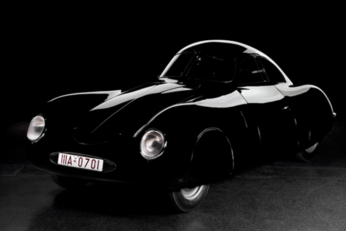
Porsche, Type 64 Berlin-Rom Racer, 1938. COLLECTION OF THE AUTOMUSEUM PROTOTYPE, HAMBURG, GERMANY, PHOTOGRAPH ©2013 PHOTOGRAPHERS HAMBURG.
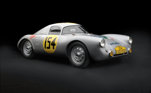
Porsche, Type 550, 1953.
COURTESY OF REVS INSTITUTE FOR AUTOMOTIVE RESEARCH, COLLIER COLLECTION, PHOTOGRAPH ©2013 PETER HARHOLDT.
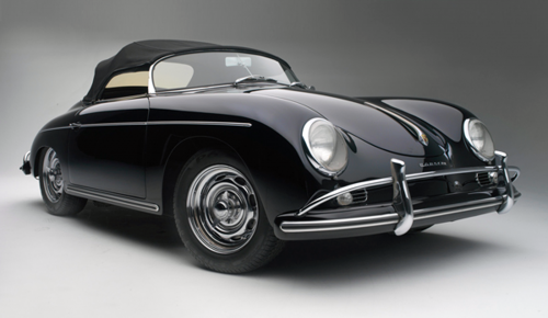
Porsche, Speedster 1600 Super, 1958.
COLLECTION OF CHAD MCQUEEN, PHOTOGRAPH ©2013 PETER HARHOLDT.
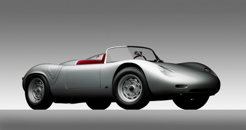
Porsche, Type RS60, 1960.
BOWMAN MOTORS, PHOTOGRAPH ©2013 MICHAEL FURMAN.
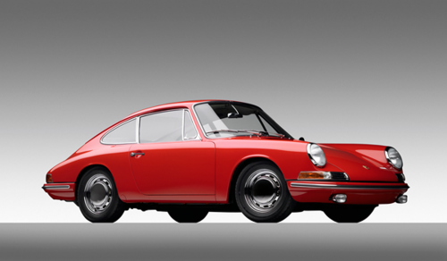
Porsche, 901 Prototype, 1963.
COURTESY OF DON AND DIANE MELUZIO, PHOTOGRAPH ©2013 MICHAEL FURMAN.
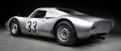
Porsche, Type 904/6, 1965.
PRIVATE COLLECTION OF CAMERON HEALY AND SUSAN SNOW, PHOTOGRAPH ©2013 PETER HARHOLDT.
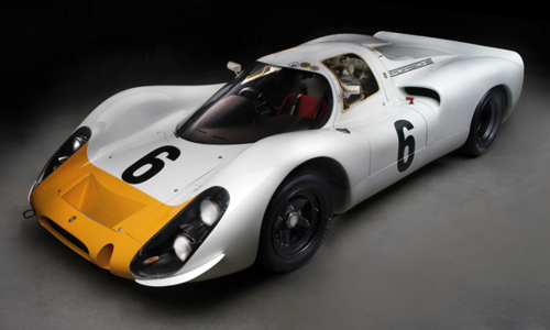
Porsche, Type 908K, 1968.
PRIVATE COLLECTION OF CAMERON HEALY AND SUSAN SNOW, PHOTOGRAPH ©2013 PETER HARHOLDT.
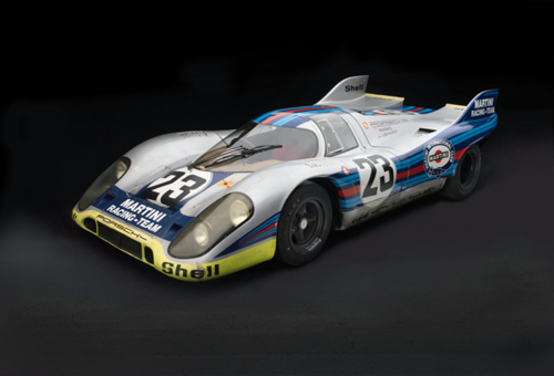
Porsche, Type 917, 1971.
COURTESY THE REVS INSTITUTE FOR AUTOMOTIVE RESEARCH, PHOTOGRAPH ©2013 PETER HARHOLDT.
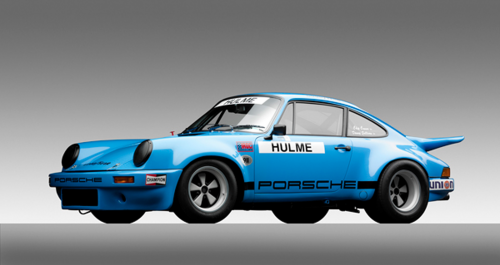
IROC Porsche, Carrerra RSR, 1974.
COURTESY OF THE WILLIAM E. (CHIP) CONNOR COLLECTION, PHOTOGRAPH ©2013 MICHAEL FURMAN.
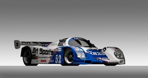
Porsche, Type 962C, 1990.
COURTESY OF THE WILLIAM E. (CHIP) CONNOR COLLECTION, PHOTOGRAPH ©2013 MICHAEL FURMAN.
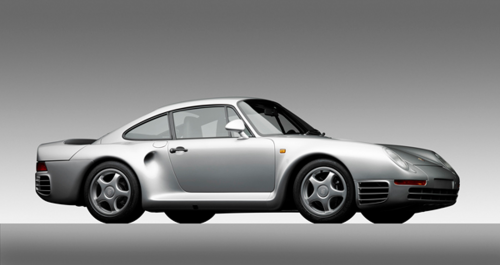
Porsche, Type 959, 1988.
COURTESY OF THE RALPH LAUREN AUTOMOBILE COLLECTION, PHOTOGRAPH ©2013 MICHAEL FURMAN.
Poked around a bit and found the following.
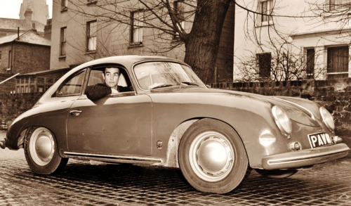
sean connery | porsche type 356 | edinburgh 1964
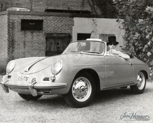
jim henson | porsche type 356-B T-5 roadster | c1961
<a href=" about ron kovach
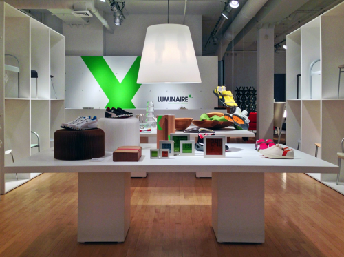 click > enlarge
On Saturday, 9 March 2013, LuminaireX introduces two new partners to the experimental, ever-evolving, dynamic design community. Katrin Schnabl, the eponymous women’s designer brand by Katrin Schnabl, will present her Spring 2013 collection, celebrating women with modern classic clothing typified by bold colors and shapes and enhanced by exquisite tailoring. Visitors will also experience LIMB, a limited edition series of framed, knitted plastic membranes, each hand knit from a distinct variety of recycled plastic bags and suspended from a welded frame. The work draws from the tension of negotiating contradictions in desire and activity, between the individual, the environment and the community.
 katrin schnabl
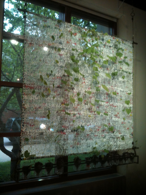 LIMB | katrin schnabl
A bit of a surprise, and a fun one at that, the other partner is a bicycle shop. JC Lind, a truly unique bike shop, dedicated to spreading the European biking culture to Chicago and North America. At LuminiaireX, on display will a specialized cargo bike along with two stylish and practical city bikes designed for everyday urban transportation – a literal form and function pairing.
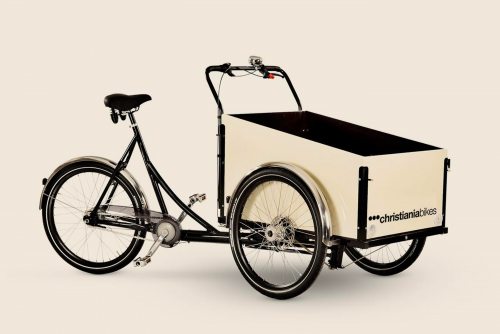 christiania trike
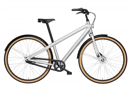 vanmoof m2 6
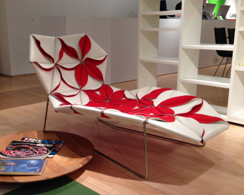
antibodi | patricia urquiola | moroso | 2006
By joining hands with these two like-minded partners representing the best of their fields, LuminaireX continues the company’s tradition of collaborating with others to expand the understanding of design for the public it serves. LuminaireX will also continue to offer great design at affordable prices. Notably, these designs represent some the same celebrated designers found in Luminaire’s showrooms, including Patricia Urquiola, the Bouroullec Brothers, Konstantin Grcic, Philippe Starck and many, many more.
8> christiania trike ( on display )
9> vanmoof m2 3 ( on display )
10> vanmoof m2 6 ( on display )
11> pilen lyx step over
12> pilen lyx step-through
13> yuba mundo ( child seats not included )
14> winther wallaroo
[ about luminaire ]
Luminaire is more than a furniture showroom. It is an interactive design research center, a playground for the soul, an esplanade for discovery. More than anything else, however, it is a resource focused on creating environments that affect people’s lives. The component parts of this unifying philosophy – the necessity of design education, the desire for limitless inspiration and the requirement for impeccably detailed execution – affect every item in our collection and reflect our dedication to make good design accessible to all.
[ about luminaire chicago ]
Since its opening in 1989, Luminaire Chicago has captivated visitors with expertly curated environments and an exceptional event program with many design luminaries including Massimo Vignelli, Jasper Morrison, Maarten Van Severen, Patricia Urquiola, Naoto Fukasawa, Amanda Levete, Bouroullec Brothers, Konstantin Grcic, Claudio Silvestrin, and Piero Lissoni to name just a few. The three-level, 21,000-square foot showroom displays the latest collections from the world’s most preeminent designers, consistently evoking the company’s philosophy of how good design can affect people’s lives.
luminaire(x) | 301 west superior / floor 2 | chicago | 312 664 9582 | mon > sat 10 > 6
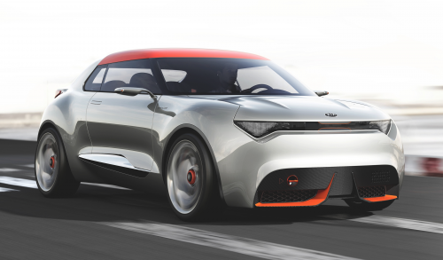 click > enlarge
Pictures of an unnamed Kia crossover leaked two months ago. That car is the Kia Provo concept which will make its debut at the 2013 Geneva motor show. It’s small, a bit longer and wider but lower than a MINI Coupe. Its four-wheel drive hybrid power train combines a 201bhp 1.6-liter petrol engine with an electric motor that drives only the rear wheels and a 7-speed DCT gearbox,. There’s a one-piece carbon-fiber dashboard and single panel front seats that look, slippery. Overall, Provo looks cool.
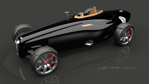 click > enlarge
Design intern Ben Knapp Voith was directed to create a modern day version of a 1920s Bentley. The Bentley Barnato Roadster concept was created over his eight-month internship and then shown at Art Center College of Design graduation show.
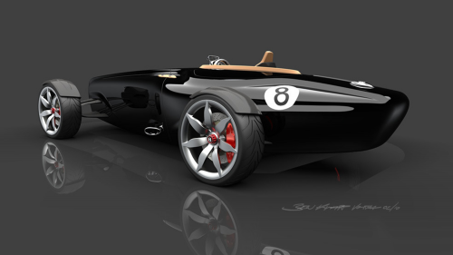
A detail is the asymmetrical seating arrangement with an optional passenger seat. The body is carbon fiber and the racer would be powered by a modified version of the Audi S4′s V6.
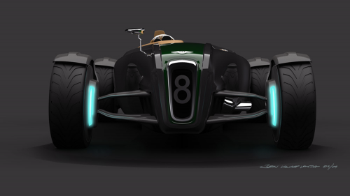
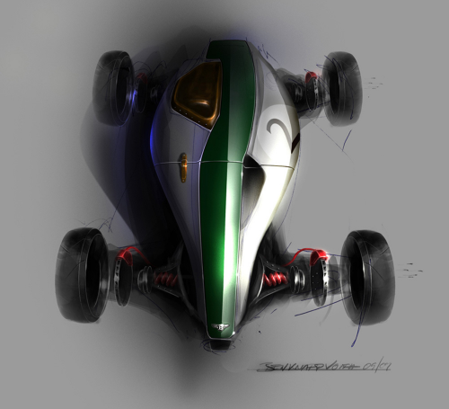
1920s Bentley 3-Litre Open Tourer

above> rendering of new brand / might have liked to see a more dynamic, less mechanical solution.
an iconic identity that had a nice long run. if American was a women, she was a dame.
When American Airlines debuted its new brand identity on 17 January I was on a AA 767-300 red eye to Maison&Objet in Paris. I think that same plane on the return leg was one of the last to leave Charles De Gaulle Sunday afternoon as snow was falling. The plane was old with no smoking stickers in the galley. The week before I was in a very new United Airbus 320-200. The 16-hour roundtrips produced measurable differences. As for the news of the redesign, designers of my generation are very aware of the AA brand, its longevity and legendary designer, Massimo Vignelli. The rebranding will become a branding benchmark in graphic design history.
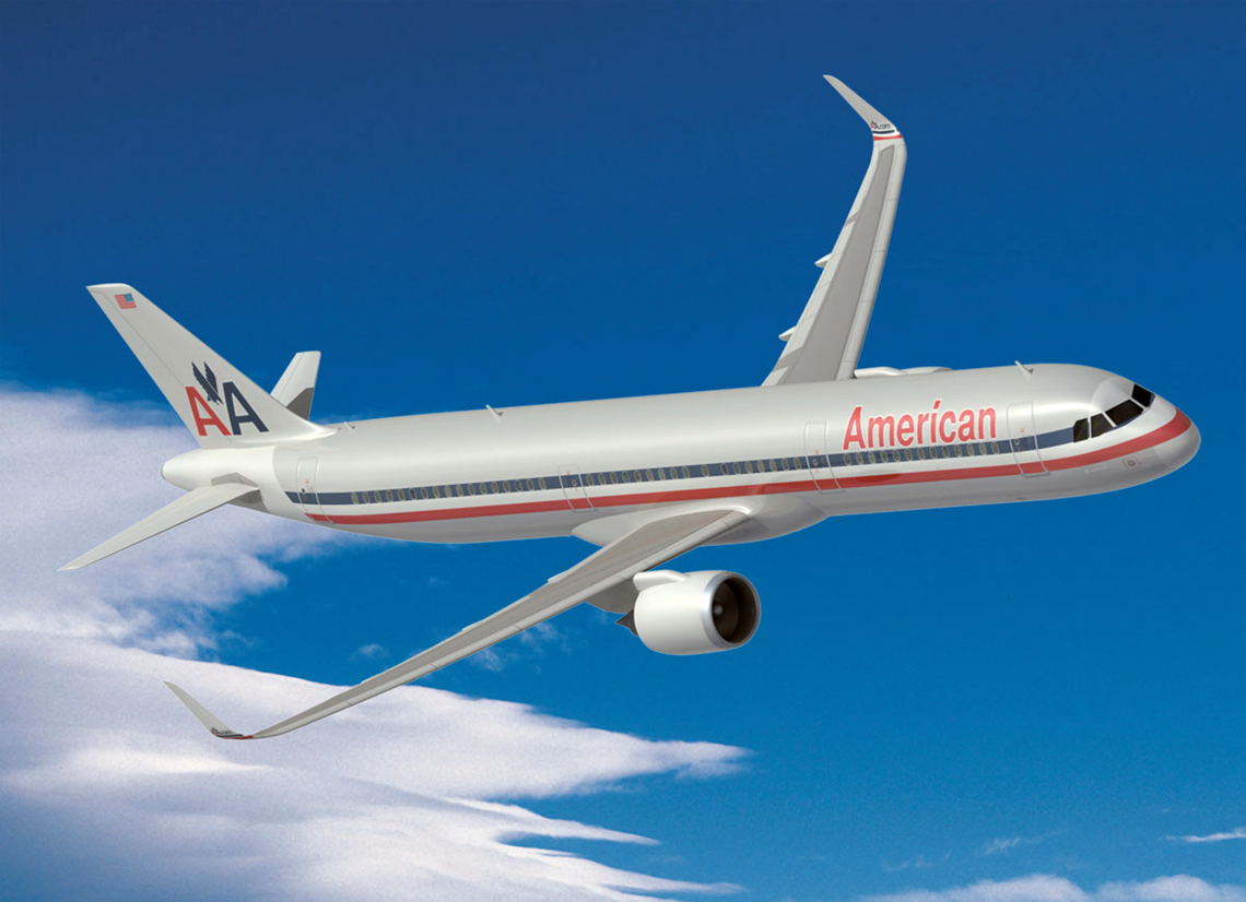
It so happens, 40 years later, in 2007, the well-viewed movie ‘Helvetica’ debuted, an entertaining history of the typeface interspersed with candid interviews with leading graphic and type designers, which consequently revisits the AA brand’s as a brand built around Helvetica. The movie also reveals a rift between modernists and postmodernists, with the latter expressing and explaining their criticisms of the famous typeface. A refrain by many of the designers in the movie — they wouldn’t know how to change or improve the Helvetica design. It’s fair to say, the design, the design elements, contributed to the longevity of American’s brand. It’s also fair to say time, i.e., technology, worked against it.
With some brands the passing of time works in your favor. For example if your business is dark ale or fine chocolate, where tradition and recipes go unchanged for generations, as time passes these industries become more revered. But not in the aerospace business. Boeing’s Dreamliner woes highlight the demands technology and processes aircraft design undergoes. Considering all the changes the airplane is going through I’m a bit surprised at the degree of vitriol directed at the redesign, when we consider the upcoming new planes. I don’t have issue with disappointment over aspects of the new messaging. I do have with an opinion that the long-standing identity, admittedly a classic icon, didn’t need tweaking. A new logo and paint job is more than a cosmetic makeover.
It’s a question that American and their brand consultant Futurebrand pondered for over two years as American was ordering 550 new planes, many with composite bodies that can’t have polished mirror-like finishes. During this time design elements and the name itself were scrutinized. We’re told the creative brief sought the proper blend of USA pride with a focus on flight, worldwide, technology, entertainment and progress. We’re told the abstracted symbol of the American flag will only appear on the tail of the aircraft. The new icon, formally an eagle loses the talons appears both to be a symbol of a bird and wings, the reminder of flight. We’re told American polled their employees and their customers and the message was the old identity felt tired. I believe all of that transpired. Whatever. My recent two-weekend experience wanted me flying at 35,000 feet in a new Panamera and not a 1967 Jaguar 420G — the mid-80s 767 felt older. The brand too either reassures or shakens the experience.
One more thought and it’s about presentation, not just the logotype and symbol but also the ‘packaging’ of the brands. By packaging in this case I mean how the logo is presented over a period of time. Let’s look at American founded 1934 and Coca-Cola in 1886.

Coca-Cola is a brand where time can work on their side. Coca-Cola introduced the powerful ‘stripe’ in the 60s which coincides with American’s previous brand debut. During this time, while the core Coca-Cola logotype underwent very mild tweaks the presentation of the logo varied greatly while retaining the stripe with its classic product. Noticeable change in the packaging while slight refinement with the logotype was enough to keep Coke fresh.

American’s packaging of the airplane on the other hand lasted a surprising long time with little discernable change, a tribute to the original design surely. But now comes the rub when considering the new planes, the new interiors. There are some out there who would be more than happy with the seats in business and first-class being Cassina LC2’s and LC4’s.
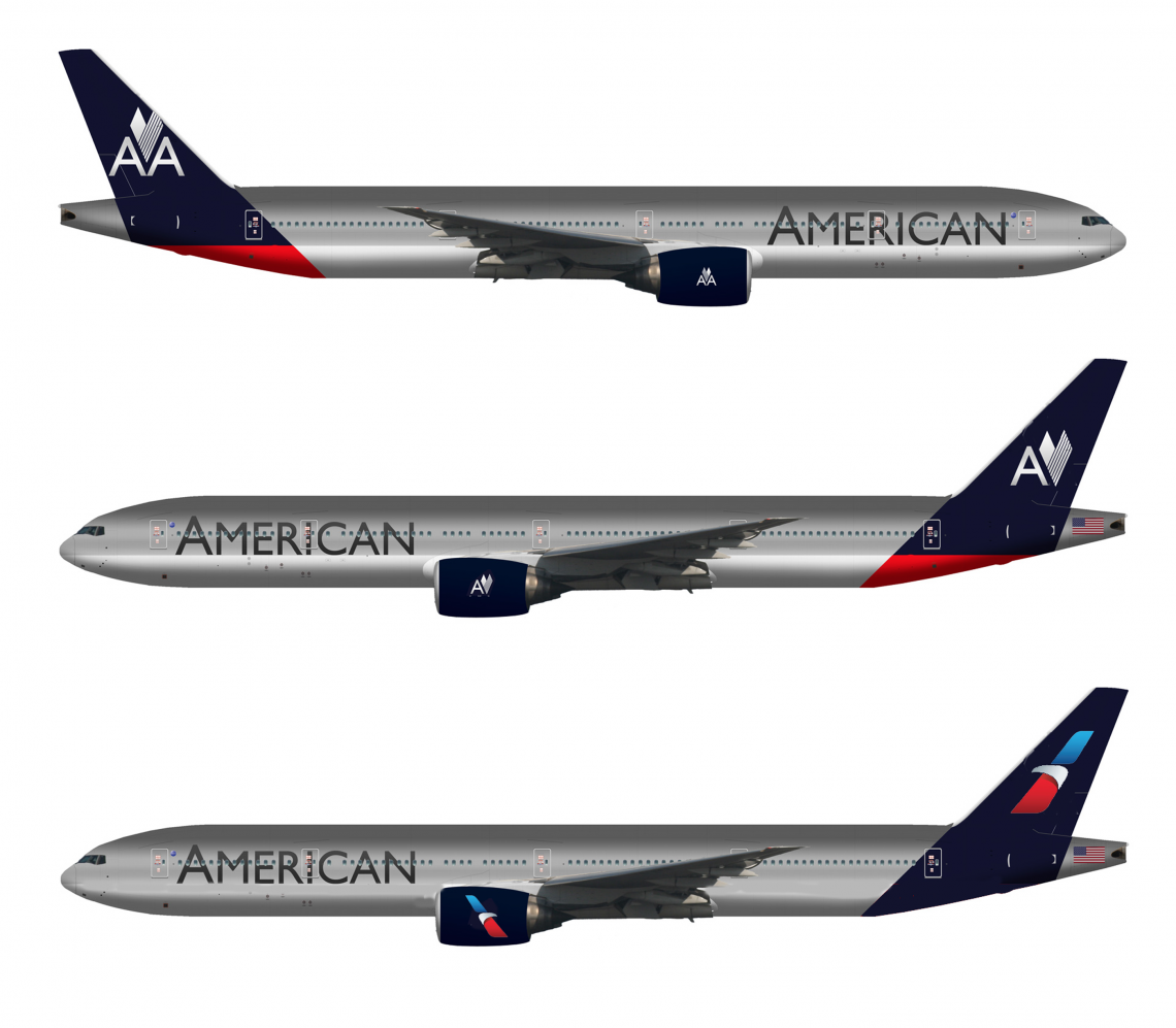
In order to write an opinion I needed to process a bit, the 1967 iteration fixed in my mind for so long. I searched and found the above concept designed by Anthony Harding. Harding created a thoughtful series in May 2012 when he heard American was buying more new planes. The comments on his post were interesting especially to see a pilot give his opinion. Harding’s layout is the top example and I did a quick cut-and-paste on 2nd and 3rd. Anthony, hope you don’t mind. This exercise examined losing the AA and putting a larger symbol on the tail. Massimo’s iconic eagle still makes an appropriate flight and USA statement and is more proprietary than the new abstract symbol though the new one works for me too. This study and the new identity does move it closer to what’s already in the marketplace. The messaging and vision statement play an important role.
The old logotype could lose the outlines. Maybe something close to Helvetica worth a look. But wait, we’re feeding a dead horse. The new identity is public, the old one laid to rest and I don’t think it will come back like Coca-Cola Classic. This dialog is a way of personal closure for me, for an identity that had a nice long run. If American was a women, she was a dame. And it’s ok to revisit those things that may not seem broken.
[ american airlines ] [ starbucks packaging ] [ massimo vignelli ] [ anthony harding ]
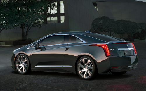 click > enlarge
2014 Cadillac ELR the luxury sibling of the Chevrolet Volt electric car was the upset winner of the best production car design at the Detroit auto show, besting the Corvette.
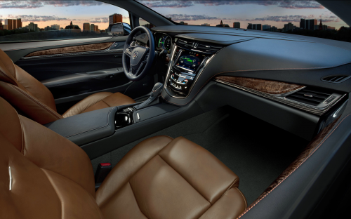
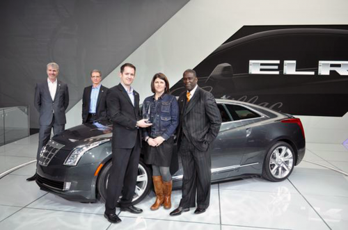 design team
<a href=" about phil patton
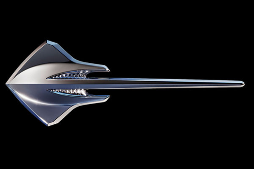
image courtesy of GM | click > enlarge
The sting ray logo for the new C7 Corvette Stingray model introduced at the Detroit auto show is carefully devised for licensing on shirts and caps and pins and—one designer said—a possible electric guitar. The aquatic stingray was a literal inspiration for 1963 Corvettes, which first bore the name, then spelled Sting Ray.
london’s tube turned 150 on 9 january 2013. abraham lincoln had just published the emancipation proclamation. via globalpost [RK]
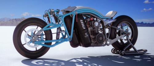 saline airstream | designed for les triplettes de bonneville | click >enlarge
The latest 007 movie “Skyfall” inspired this post. The movie did not lack much in action except it didn’t go unnoticed that there was no motorcycle statement. After looking at 30 bikes we have culled it down to bikes that look capable of hitting the streets soon and those bikes that make an artful power statement.
 kickboxer | designer ian mcelroy | subaru powered
We also looked at bikes that introduced sustainable and innovative features.
 bmw ghost | designer marko petrovic
 saline bird | designed for les triplettes de bonneville
1> 2012 LZH | Igor Chak
2> Speed Demon Powered by Biofuel | Imran Othman |Modenas
3> Shavit Electric | Eyal Melnick
4> Peugeot 515 | Madella Simone
5> Lamborbiker | Flavio Adriani |Lamborghini
6>
7>
8>
9>
All content ©2007 > 2024 DesignApplause