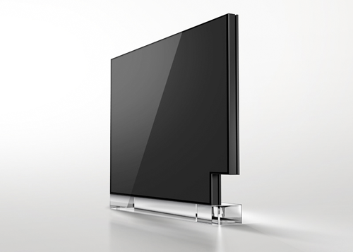
Neocon 2013 in its entirety represented an incremental slightly better statement overall than previous iterations. Nothing breakthrough, though not of no consequence as there were several trends worth mentioning.
[ trends ]
1> Less playful, more formal….but not too formal. Patricia Urquiola‘s couch – conference seating with high backs for semi-privacy. The lines, and surfaces are shifting towards the more organic, while colors remain subdued with lots of white.
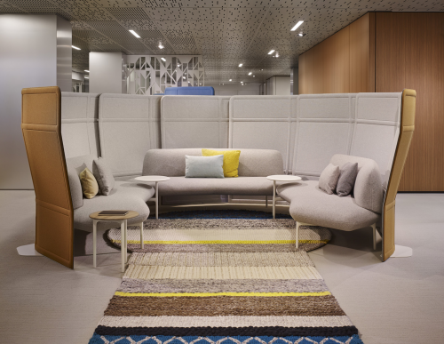 patricia urquiola | haworth | 2014
2> Fusion of office and home. Some showrooms used the word ‘crossover’ future but I like ‘indie’ as in “independence’ where the worker has a great deal more freedom to choose their working environment. Toan Nguyen‘s Lagunitas Lounge system looks like a living room sofa when in a home environment. Is the contract business model aiming at the residential environment for growth? I think so…
 lagunitas lounge and table | toan nguyen | coalesse | 2013
3> More personal space. Ties in with “indie” where at Steelcase there were pod-like rooms which could be customized by each visitor, or private phone and video conference space, chairs with extra high backs and sides, some even enclosed.
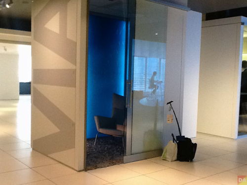 mood pod provides personal ambiance control | steelcase | 2013
[ brands ]
Coalesse > working with established ‘design’ designers on the way to become the “Moroso” of the contract business. note: more details via interviews with Massaud and Nguyen coming soon.
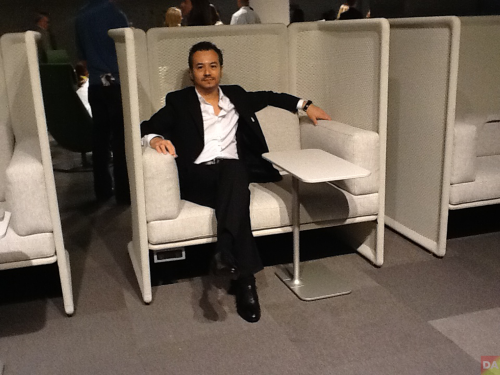 toan nguyen in his lagunitas lounge chair with table | coalesse
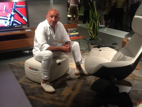 jean-marie massaud on ottoman of massaud collection work lounge | coalesse
Designtex > creative repurposing of materials. Loop to Loop is the first (and greenest at this moment) upholstery made from recycling already recycled textile waste. note: more details via interview with ceo Susan Lyons coming soon.
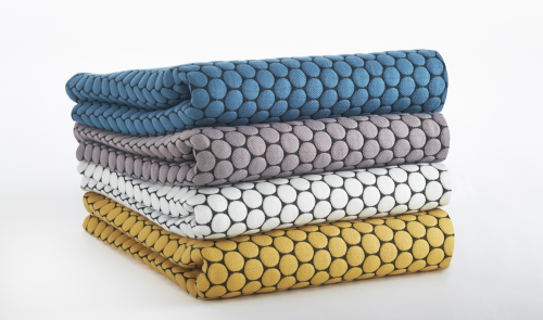 loop to loop | designtex | 2013
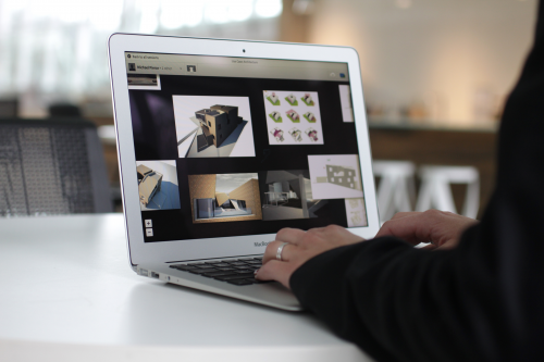
Haworth > The new break-thru BlueScape communication concept offering 1,000 sq/ft of screen real estate, in real-time, worldwide.
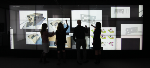 bluescape | haworth & obscura digital | 2013
Knoll > A focus on the big boys with Rem Koolhaas “piece de resistance” (04 counter) that may be the first DesignART piece of the contract market
Steelcase > Their focus on technology vs furniture. The v.i.a. (vertical intelligent architecture) is extremely technical and analytical.
Technion > Offered most clean and minimal solutions. Such as the Interpret System
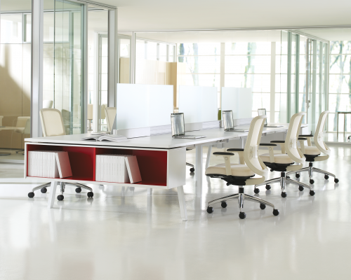 interpret | technion | 2013
Vitra > Very clever ‘indie’ desk and seating solutions by the Bouroullec’s.
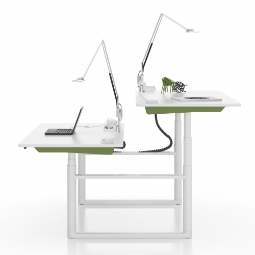 tyde | erwan and ronan bouroullec| vitra | 2013
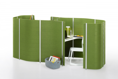 workbay | erwan and ronan bouroullec| vitra | 2013

about nicolae halmaghi
 click > enlarge
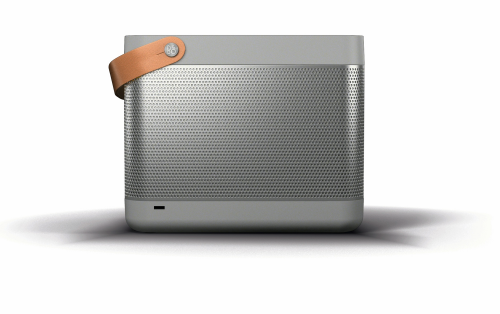
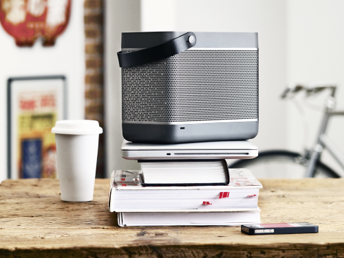
The boom box is back—again. Portable sound in the age of the IPad and Iphone has taken the form of an electronic picnic basket—the Beolit 12. The Beolit 12 features Apple’s AirPlay technology. Place a device in its tray top and it charges and plays. That link is simpler and surer than the Bluetooth used in such devices as Yves Behar’s brick like Jambox for Jawbone.
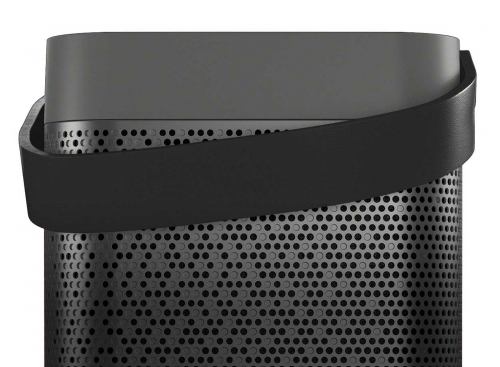
The basket, in graphite or blond colors, was designed by a 40-year-old Danish designer Cecilie Manz. She said, “I wanted Beolit 12 to have a clear expression showing its functionality and at the same time blending in naturally in people’s home. The natural leather handle invites you to move Beolit around—it makes it more approachable somehow.”

The look is new for B&O known for its Scandinavian modern space age electronics in the 1960s and 1970s. The work of Jens Jensen and his British born heir David Lewis, B&O was at its height in 1978, when the Museum of Modern Art gave the company’s work a show and has included some 20 of its pieces in the collection: the Beogram phonograph with its sliding tone arm, the CD player that magically opens when a hand approaches.
But B&O audio was never taken very seriously by audiophiles of whom there were many in the 1970s, before the focus of cool tech switched to computers. B&O stuff was for well off guys who wanted to impress women; in films of the 1980s it signaled the cad or villain.
The bright aluminum and glass of that look is absent in the Beolit 12, which just won the Red Dot design award in Europe, also echoes portable tube radios from the 1950s. Manz has designed several hand blown glass products, as well as lighting fixtures and furniture. On her web site is a wicker basket rendered in composites, foreshadowing the Beolit.

The company’s long time design consultant, David Lewis, died in November of last year. One of B&O fans of course was Steve Jobs, who happily adapted the wheel style controls of the first iPod from B&O phones. In January the company announced a new sub brand, supposed to be more accessible. But the Beolit 12 lists at $770. [ b&o ] [ cecile manz ]
<a href=" about phil patton
 click > enlarge
When Yamaha was developing a new amplifier, they realized that most amps available to musicians are best suited for live performances, not for personal use and most definitely not conveniently transportable. Not that you can’t get a good, small-sized amp with a handle, but the new THR Amp is about the size of a shoe box so you can comfortably carry it with you. It boasts a range of effects and superior sound quality, but as a non-musician I’m not going to deny that I like it for its homage to vintage sound equipment design.
It has “the tone and response of a tube amplifier, hi-fi stereo output for playing along with a backing track and a range of effects to modify the tone,” like Modern, British Hi Gain, Lead, Crunch and Clean. It also has four dual effector circuits: Chorus, Flanger, Phaser and Tremolo. Watch the instructional lab video to see and hear a demonstration of the range of sounds.


There are few different models in the THR line up. See the specs and enter to win one of your own.

about perrin drumm


the form series, form really does meet function.
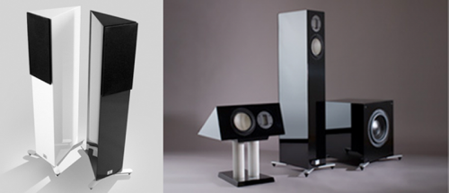
The Form series is not a typical entry-level series speaker system. Made by high-end Marten in Sweden form remains true to the open, airy and detailed signature sound of Marten and fits into the interior of any contemporary home.
the formfloor, a genuinely high-end 2-way floor speaker.
the formcentre shares the same tweeter as the formfloor, making the two speakers a perfect match, and allowing you to expand your system to 3.1 or 5.1.
the mighty formsub can be added to, and combined with, any of the speakers in the form and heritage series.
producer: marten
 click > enlarge
there are ear phones and then there are ear phones, as in ear buds that are sculpted to fit the minute specifications of your ear, providing unparalleled fit, comfort and sound quality.
That’s what Ultimate Ears has specialized in since 1995, when their products were available only to professional musicians who swore by their UE ear phones for live performances. They not only protect the musician’s hearing onstage, but the customized micro-speakers fitted specially for their ears ensures crystal clear feedback. Five years ago UE developed a series of consumer models for all us who aren’t in touring rock bands. The universal fit ranges from $20-$400, but a customized pair – the ultimate Ultimate Ear experience – will cost you upwards of $999. Buy one for someone who’s been extra nice this year, or buy a pair for yourself and receive a free Portable iPod Dock ($100) for your friend.
producer: ultimate ears

about perrin drumm
 time to start your gift list.
here’s a gift suggestion for under $25.00 US. the creator-director, gary hustwit hopes Objectified will get non-designers curious about why objects take a particular shape. it’s an informative and educational movie shot in documentary style. also the kind that gets played over and over again if you have a jones for product design / designers. google it—many reviews out there.
Running time: 75 minutes. Extra footage: 60 minutes.
more objectified information here
Artist: gary hustwit
Producer: swiss dots

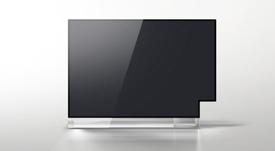
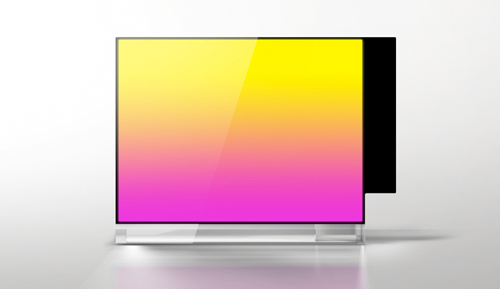
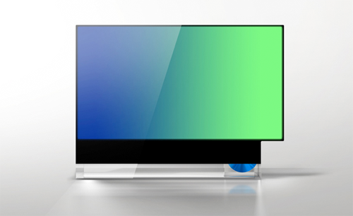
Here’s a clever concept to the mis-match aspect ratios for cinema ( 16/9 ) and television ( 4/3 ).


Not sure how its done but I don’t mind showing this piece of furniture. Being familiar with these dimensions it was easy to remember the model name: 16943. Never liked the 4/3 configure.
Designer: Studio Frst
[via josh spears]


Less about breaking news and more about affirmation: The Zeppelin iPod dock from Bowers and Wilkins not only looks good from across the room and CU, but the music is consistent with the manufacturer’s reputable sound.
First seen almost a year ago but did not mess with it until killing time in an Apple store last week. If you like modern, minimal, music, and have an iPod, this is worth a peek. It will set you back $600 USA but you get design, music, and art.
What’s HD radio? (more…)


Eton makes serious radios. Sound 140 Concerto (top) is a loaded clock radio with amazing audio that was specially crafted for your iPod. Martha Stewart would say put one in each room, being cheaper than wiring the mansion for sound. FR1000-VoiceLink (bottom) belongs in your survivor kit. AM-FM, emergency-band, cell-phone charger, walkie-talkie, with a nearly infinite power source crank. They don’t call it VoiceLink for nothing. (more…)

 patricia urquiola | haworth | 2014
 lagunitas lounge and table | toan nguyen | coalesse | 2013
 mood pod provides personal ambiance control | steelcase | 2013
 toan nguyen in his lagunitas lounge chair with table | coalesse
 jean-marie massaud on ottoman of massaud collection work lounge | coalesse
 loop to loop | designtex | 2013
 bluescape | haworth & obscura digital | 2013
 interpret | technion | 2013
 tyde | erwan and ronan bouroullec| vitra | 2013
 workbay | erwan and ronan bouroullec| vitra | 2013


