Ghost furniture by vaulot & dyevre.
 click > enlarge
I’m not encouraging lazy housekeeping, but Fantôme, Edition Cinna by Paris-based design studio Vaulot & Dyevre provides a perfect excuse to put off reshelving those stacks of books or cleaning up your kid’s toys. The meuble fantôme, or ghost furniture, cloaks your messy piles in an elegant white bell jar. Made from lacquered satin aluminum, fantôme elegantly hides your personal items. It’s so refined no one will suspect that you’re really using it to keep your dirty secrets under wraps.
Vaulot & Dyevre gives Fantôme a bit of personality in their description: “Let him proceed in your living room to conceal your personal effects. Simple and enigmatic, he’s harmless.” Their other designs reflect this sense of humor, like BoraBora, a pill that shines like a lightbulb to remedy your “moodiness, flaccid skin, and tendency to depression. You are obviously in lack of sunshine. Our range of supplements Kelvin Lumen restores the vitality you need. Sunset Laboratories offers a wide range of solar radiation, Borabora, the Maldives, Haiti and the Bahamas, ask your pharmacist. Read the instructions carefully. Do not exceed the recommended daily dose. This additional Solar should not totally replace natural exposure. Avoid abusive use.”


NeoCover, the magnetic key saver.
 click > enlarge
File it under brilliant, Jake Frey’s NeoCover is a magnetized light switch cover that makes it more convenient than ever to hang up your keys the moment you walk through your front door. You don’t even have to go as far as tossing them into your key bowl or dish or whatever you’re currently using, just place them against the light switch the moment you flip them on.
You may have seen Frey’s first version of the Magnetic Light Switch Cover, which came out last year, but he’s just released a new “enhanced” model and dubbed it NeoCover. This heavy duty upgrade can hold up to 27 keys and any other metal object, like bottle openers, lighters, a dog leash, even a hammer. It comes in standard white but you can request a custom color job or 2-, 3- and 4-switch models. Who would have thought a light switch cover could ever be so useful?


Swell, by earnest studio. Milan 2012
 click > enlarge
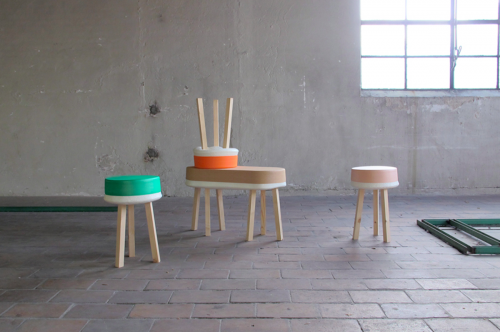
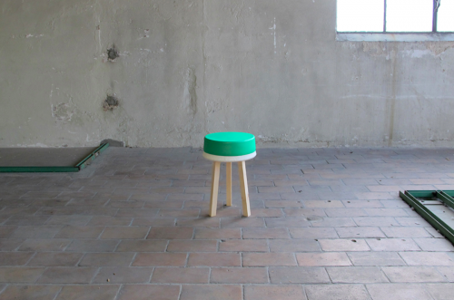
Even after Salone Del Mobile is over, I’m still thinking about The Front Room’s presentation at Ca’Laghetto, Via Laghetto, which featured a number of remarkable designers, including the Rotterdam-based Earnest Studio headed by Rachel Griffin. For Milan this year she presented Swell, a series of stools and benches that put an emphasis on the production process by cutting costs at every stage.
“Upholstered furniture typically uses foam created in massive block molds and cuts it into smaller pieces that are added to a separate frame. Swell integrates these production elements by using the frame and fabric as the mold for the foam. This also allows the foam to acts as a binding agent, eliminating costly handwork.”
Griffin goes on to explain that Swell simplifies the production process. Instead of molding massive blocks of foam, cutting them down to size, gluing them to a wooden frame and then sewing the fabric on top, “Swell uses the fabric and frame as the original mold for the foam.” The result cuts down on production time and materials and, because the foam fills the fabric, “no material is wasted as cut-offs.” Furthermore, the foam acts as a binding agent between the fabric and frame so there’s no glue, extra adhesive or sewing necessary. And since the foam expands in the fabric in a slightly different way each time, every piece is unique.
Swell Stool and Bench are available from The Front Room’s online shop for $393 and $542, respectively.
MIA by jean nouvel. Milan 2012.
 click > enlarge
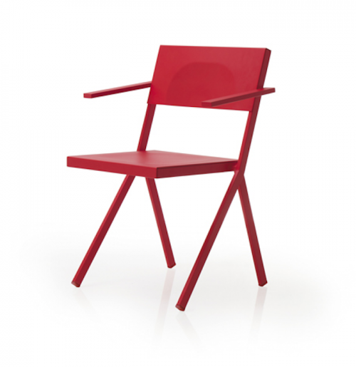
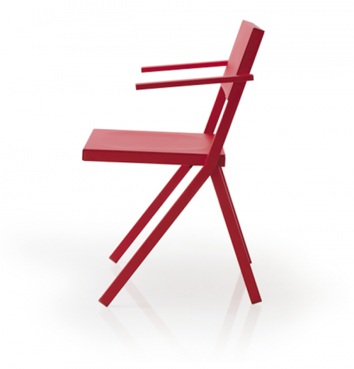
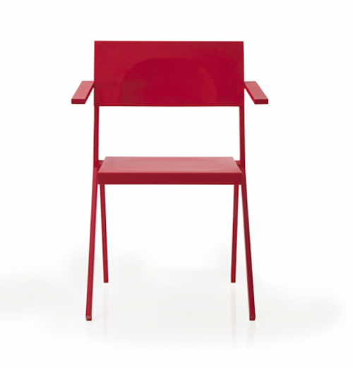
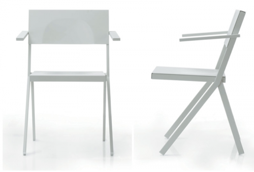
You probably know Jean Nouvel first and foremost as an architect. His work has won him some of the top prizes in his field, including the Aga Khan Award for Architecture, the Pritzker Prize and the Wolf Prize in Arts. But if you were in Milan for Salone Del Mobile you might have seen that his latest endeavor is MIA, a stacking chair he designed for the RBC Design Centre’s restaurant, also named MIA. The backrest, arms and legs are made of flat metal bars of varying widths. The chairs, which come in white, red, black and grey, are weighted so that they can be hooked over the edge of the dining tables to clean the floors. Usually chairs have to be lifted and flipped over the edge of a table, but Nouvel designed MIA so that all that’s required is a simple lift.
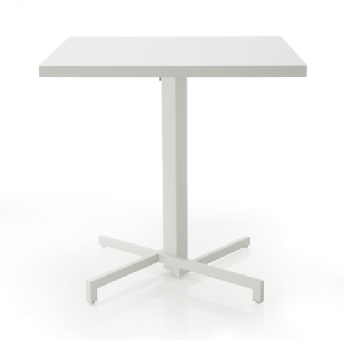
The MIA series also includes stacking armchairs, benches, tables and high stools. The line is being produced by EMU, the Italian furniture company, who notes that the collection “is a crystal-clear example of the spirit EMU brings to placing technological development at the top of its priority list, in an atmosphere buzzing with productive creativity. The whole concept stems from the RBC Design Centre in Montpellier, where three important elements were brought together: design, production and distribution.”
Hummingbird rocking chair. Milan 2012.
After conducting an ergonomic study of office seating, designers Agata Karolina and Dana Cannam collaborated on the Hummingbird rocking chair, which was included in The Front Room‘s stellar presentation at Ca’Laghetto, Via Laghetto, Milan, during the Salone Del Mobile 2012. We usually associate a rocking chair with slow evenings on the porch, but Karolina and Cannam designed the Hummingbird to act as a meeting place between work and relaxation. When you’re seated upright at your desk it acts as a normal desk chair, but with just a slight tilt and shifting of weight “the chair creates an embracing sensation, producing the feeling of calm.” It’s perfect for an afternoon work break, just tilt back and away from your desk, relax, and then shift your weight forward when you’re ready to get back to your busy day.
I love the use of color and materials (I’m a sucker for anything with felt) and how it comes with a blanket that rolls up like a rucksack during the work day and unrolls when you want to take a break – and maybe a nap, too. From Karolina and Cannam:
“The hummingbird is a contemporary take on a classic rocking chair. The name reflects the calm state of suspension between being engaged and deep relaxation…The objects that surround us must adapt to a richer mix of uses, housing types, living and work situations. The Hummingbird accentuates this dynamic lifestyle without sacrificing the value of history and simplicity.”
Hummingbird is available from The Front Room’s online shop for $4,204.


Chandlo dressing table by doshi levien. Milan 2012.
 click > enlarge
Nipa Doshi and Jonathan Levien established Doshi Levien, their London-based design office, in 2000. For the past thirteen years the partners have focused on work that “celebrates the hybrid and explores the coming together of cultures, technology, storytelling, industrial design and fine craftsmanship.” In an interview Doshi said, “The language that interests me is that of the hybrid. The visual language that cannot be placed or defined. The language that talks about plurality of global culture and ideas.”
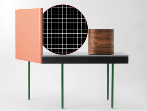
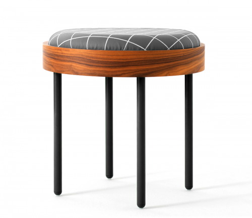
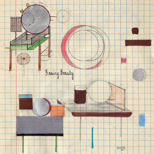
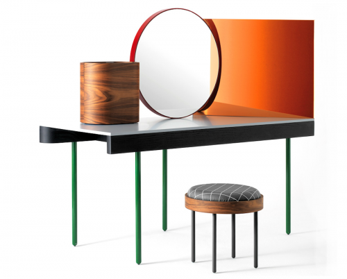
One of their recent projects, a vanity called Chandlo, is a perfect example of Doshi Levien’s ethos. The design for Chandlo draws inspiration from Bauhaus and, apparently, from the bindi worn by Indian women on their forehead. The elements from Bauhaus and De Stijl are obvious in the skinny, linear legs, the gridded pattern on the stool cushion and the strong, mirrored geometric shapes on the tabletop. The reference to the bindi is a little more conceptual and is rooted more in the general idea of the ritual of grooming.
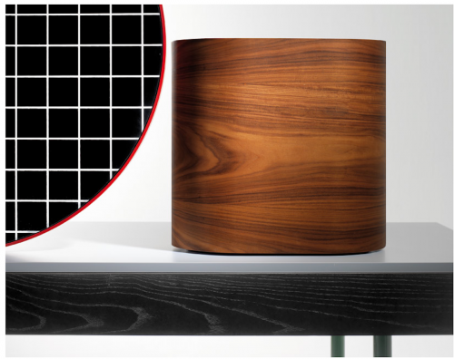
Chandlo is composed of “a central, front faced mirror with a red steel frame, a side mirror with a rose colored filter and a plywood jewelry box with rosewood veneer, all structured on a solid ash surface.” From Doshi Levien’s website:
“Chandlo was designed as a special prototype made by BD Barcelona for Das Haus 2012. This was an installation by Doshi Levien for IMM Cologne that explored their vision of a perfect home. Das Haus consisted of interconnected spaces opening up to a central courtyard. The different areas of the home depended mainly on objects and furniture to define space.”
Epilogue-prologue by design soil.
“Design Soil is a design project by teaching staff and students, from the product design department at Kobe Design University, who are design lovers. As a design university, we have attempted to create a space which let young designers to think and create things one by one slowly yet steadily like plants grow in soil.”
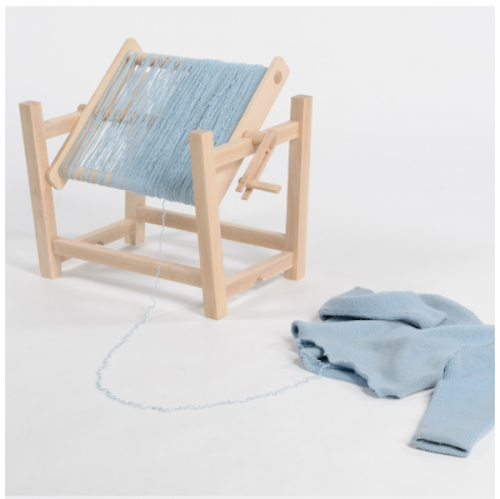
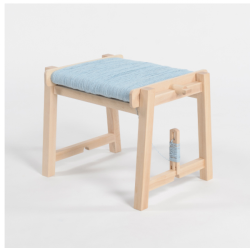
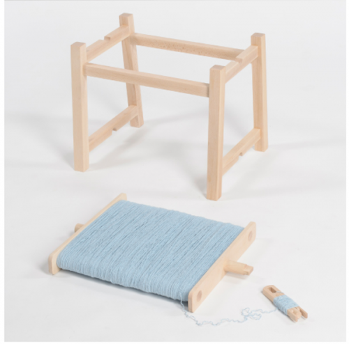
Design Soil’s latest project is Epilogue-Prologue, a collection of pieces intended to “walk along together for a long period of time” – from the epilogue to the prologue, get it? Rollin’ Rollin’ stool is a basic beech-wood frame with a spindle attached to the base, allowing you to make use leftover yarn or the remnants of a old sweater. You create the cushion yourself (you might need two sweaters if you like it extra soft) and when it’s worn out simply take a jumper out your Goodwill donation bag and make yourself another.
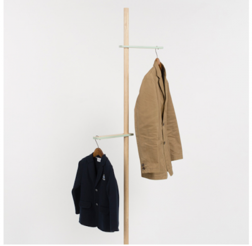
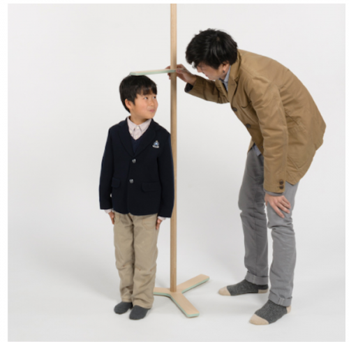
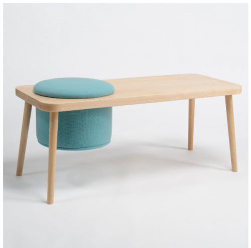
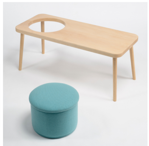
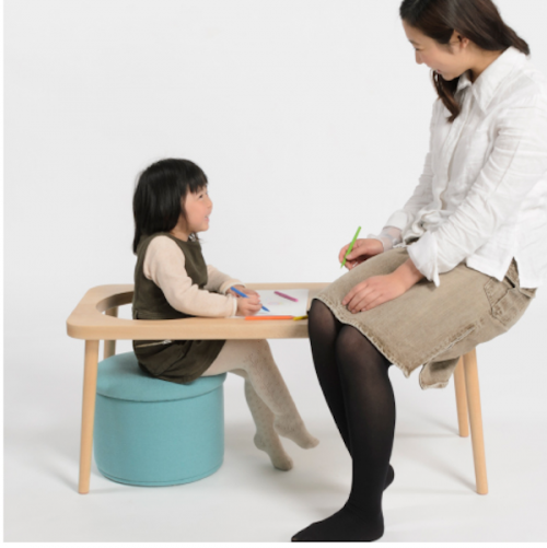
Growth is a coat rack that’s almost too cute for words. Each movable hanger is assigned to a member of your family, so you can track the growth of your kids along the rack instead of marking up a perfectly nice doorway. My favorite, though, is Steps, a bench with a removable cushion. I love the simplicity of the bench but also the functionality of the cushion, shown here in classic robin’s egg blue. You can use in a couple of ways: as a bench with a tufted seat and room to the side for your papers or coffee. You can take the cushion out and use it somewhere else in the room or you can lift it out of its hole and let you child use it as a desk.
Stijl by alexander seifried.
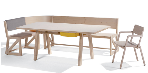
German designer Alexander Seifried named his latest furniture collection Stijl after De Stijl, the Dutch art and design movement that advocated “pure abstraction and universality by a reduction to the essentials of form and color.” Traditionally De Stijl-ers focused on vertical and horizontal lines and used only primary colors in addition to black and white. That’s a bit limiting, and though I appreciate the rigors of De Stijl, black, blue, red and yellow furniture doesn’t exactly assimilate very well into too many homes nowadays.
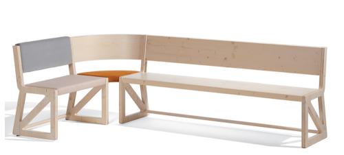
Fortunately, Seifried didn’t think so either. His Stijl collection updates white to include raw birch wood and black to include shades of gray. Added bonus? It’s something of a BIY (build-it-yourself) unit. The main component is a desk with a bright yellow drawer. When you add any combination of the chair, seat, bench and corner bench piece, it becomes a dining table. If you buy two of each seating elements you get a full circle of seats. What’s Dutch for wunderbar? (Okay, I couldn’t help looking it up: prachtig!)


about perrin drumm
Authentic icons. Cassina in Milan 2012.
![]() click > enlarge
click > enlarge
the overall quality of creativity and presentations in milan was astounding. for example, there weren’t many companies we visited that did not create a classic icon. cassina interestingly built their 2012 theme around — “authentic by design.” in cassina’s words:
The gesture of the designer, their hand, a sketch, an idea. The authenticity of a project is an ever innovative process of thought, insight and research, which Cassina identifies and values starting from the original creative heart, combining its qualitative excellence with its consolidated workmanship experience.
Cassina deliberately seeks authenticity in every project. This perspective is the starting point for the 2012 collection: a series of projects that express a way of thinking and living authentic design, where each element is always substantive and consistent.

crated icons were in the windows and and key locations on the floor.

close to the showroom entrance the icons are displayed on a planked area.

each inspiring icon holds an inspiring story. if you’re wondering, i didn’t know three of the 11 icons. see how you do, the answers are below.
[ the authentic icons ] [ cassina ]
1) red and blue | gerrit thomas rietveld | 1973
2) maralunga | vico magistrati | 1973
3) LC4 | le corbusier & jeanneret perriand | 1965
4) hillhouse | charles rennie mackintosh | 1973
5) luisa | franco albini | 2008
6) petalo | charlotte periand | 2009
7) barrel | frank lloyd wright | 1986
8] LC2 | le corbusier & jeanneret perriand | 1965/2006
9) feltri | gaetano pesce | 1987
10) superleggera | gio ponti | 1957
11) wink – toshiyuki kita | 1980
Interview with designer cecilie manz at milan 2012. Preview.
 click > enlarge
we meet danish designer cecilie manz at the friz hansen open house. this occasion is the introduction of ceclie’s new furniture series “minuscule” which she describes as a chair that could be used as a formal chair for informal meetings. a display deconstructs her concept and highlights the elements that comprise minuscule.


cecilie tells us that three stones she found on the beach inspired her concept. “i am fascinated by the variations that you can find in nature. the stones, all three are grey and seemingly identical. but they are all completely different shades of grey.”

cecilie’s interview and more examples of her work will soon be appearing in DesignApplause. [ cecilie manz ] [ fritz hansen ]


