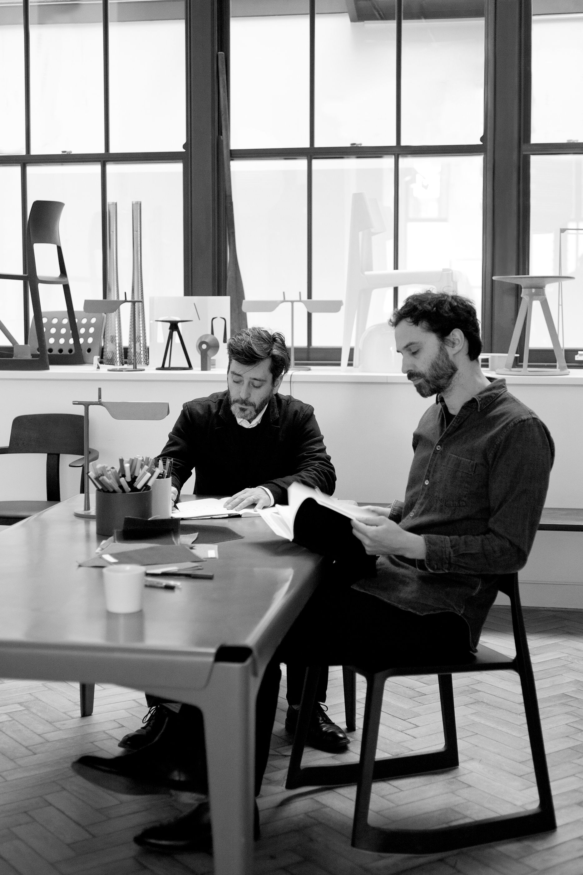
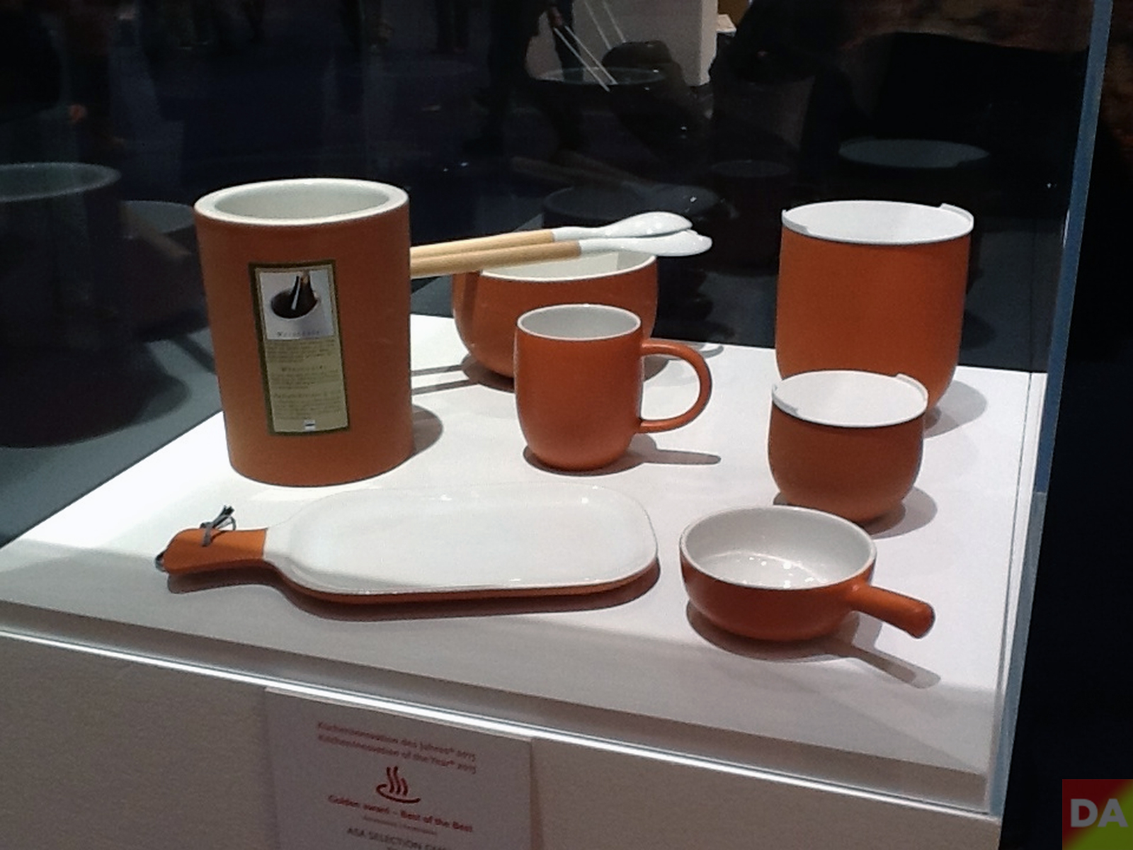
British designers Edward Barber and Jay Osgerby have designed Olio, a disparate tableware collection for Royal Doulton designed to be mixed and matched with existing homeware. We caught up with them in their London studio during <a href="http://www.clerkenwelldesignweek.com/" target="_blank"Clerkenwell Design Week to find out more.
[DesignApplause] What was the collection inspired by?
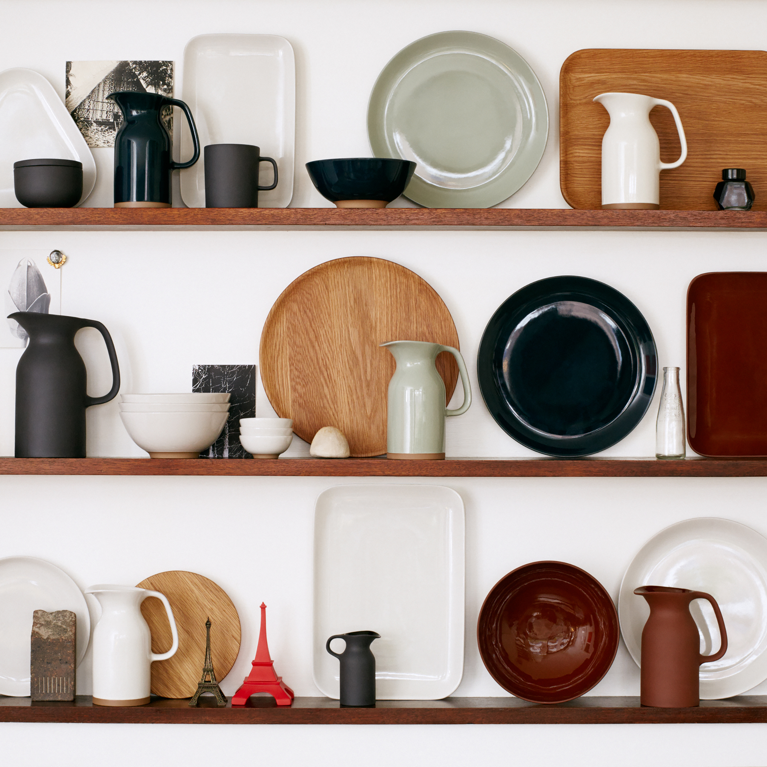
[ Edward Barber] We wanted to design a complete range that didn’t look like a complete range. There’s a definite diversity to it. The idea is that you could buy the whole thing but it wouldn’t look like you’d gone out and bought a range – you’d kind of had a bit more of an eclectic feel, or each piece stands alone, so you just buy the wooden platter or the teapot and it would fit with what you already owned. People we know don’t go out and buy a full 12-piece dinner set anymore – you tend to think, ‘That’s a really beautiful bowl’ or ‘That’s a great serving plate’ and you tend to buy cutlery from one place, maybe a teapot from another and a jug from here, so we thought if that’s the way people are, let’s try and design a range in that way.
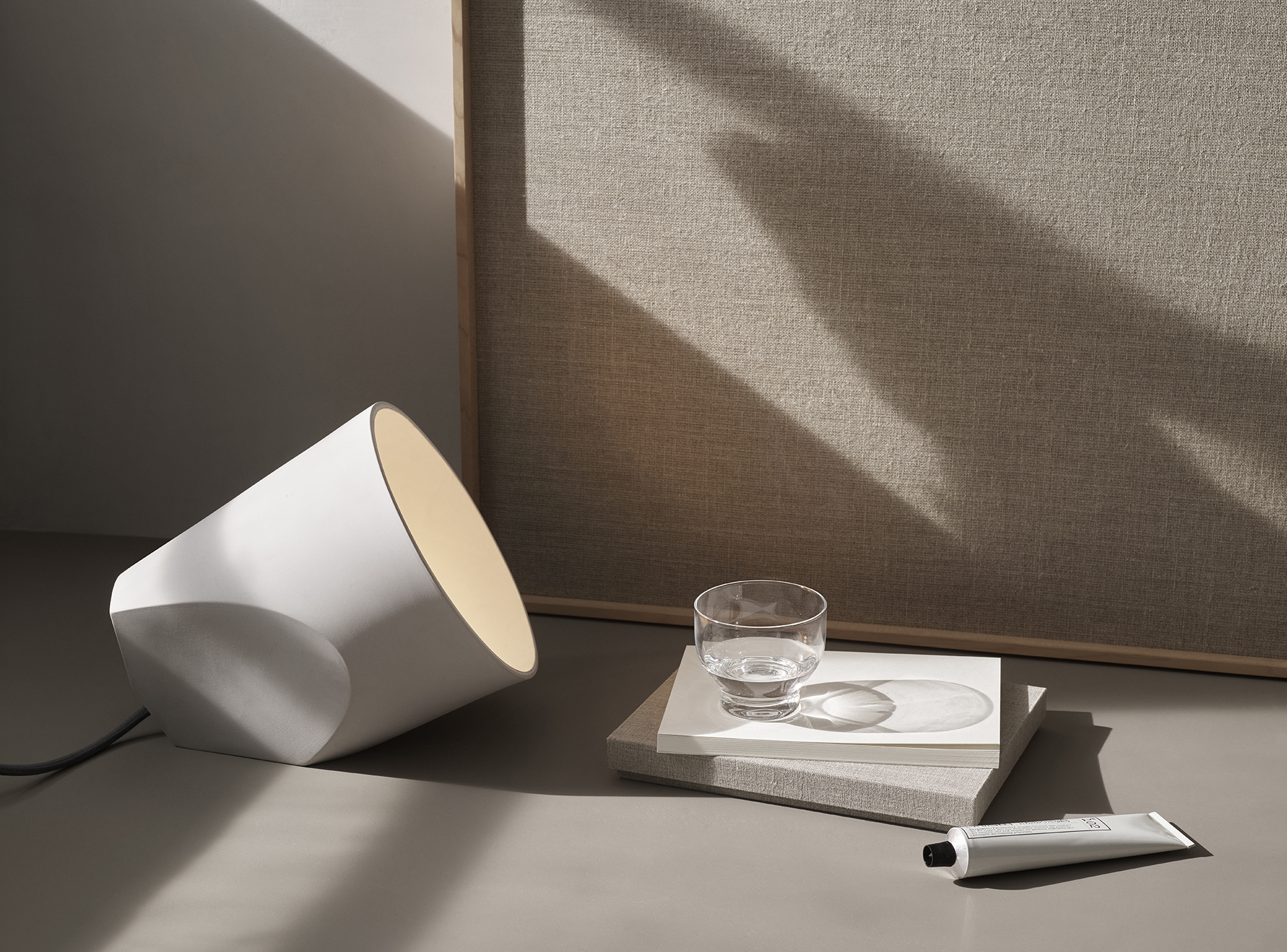
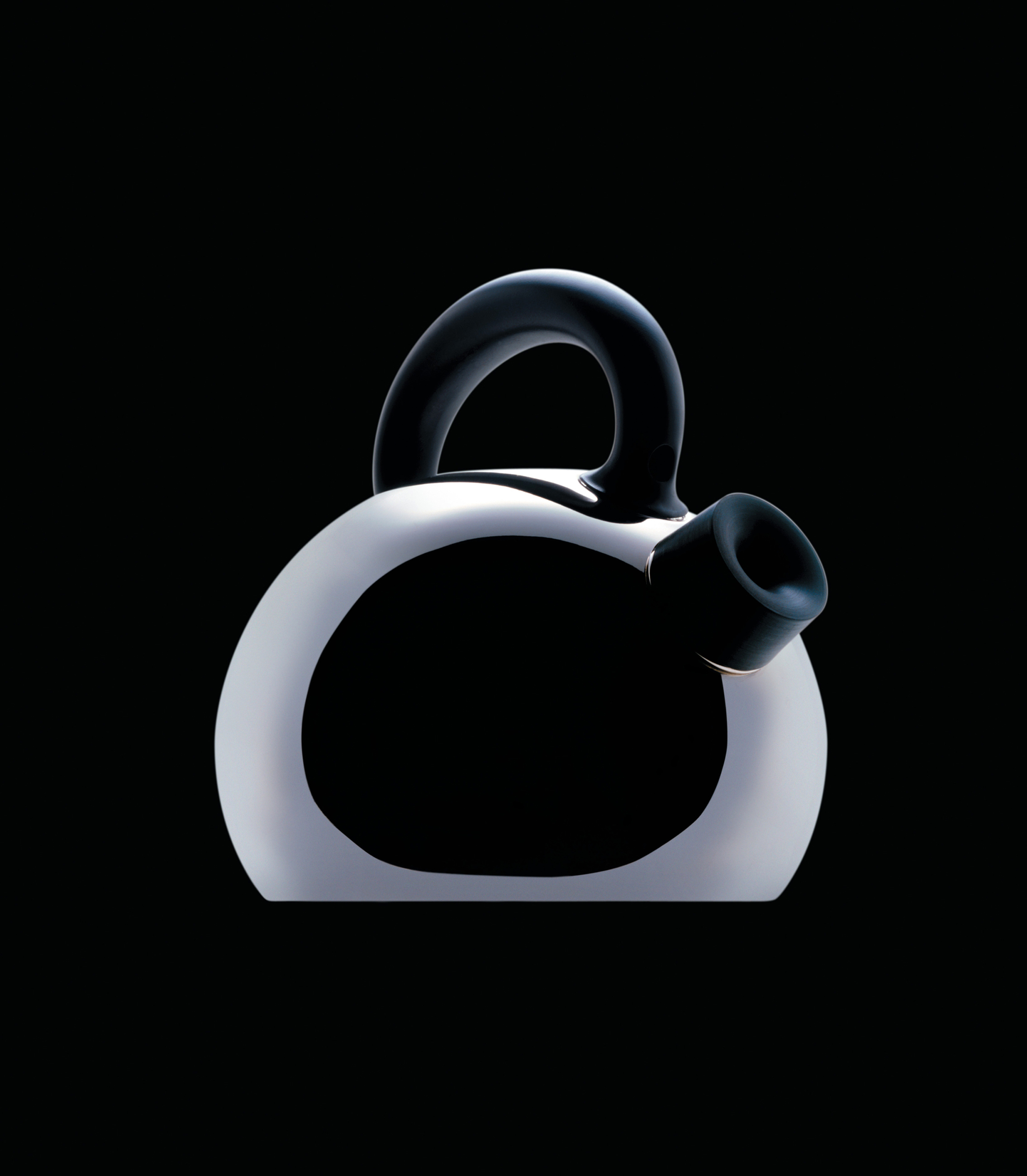
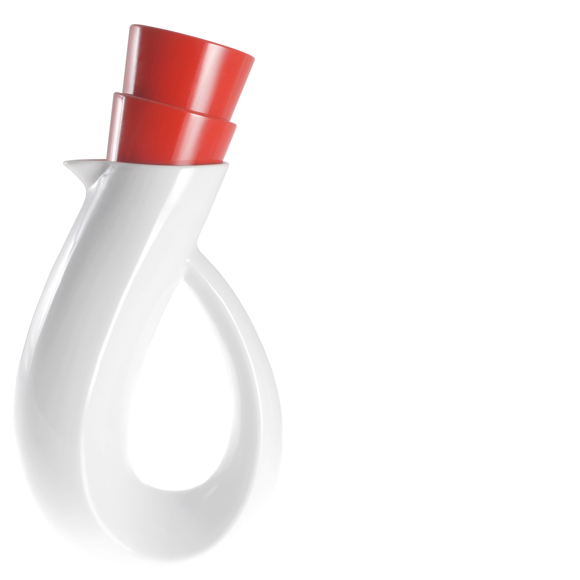
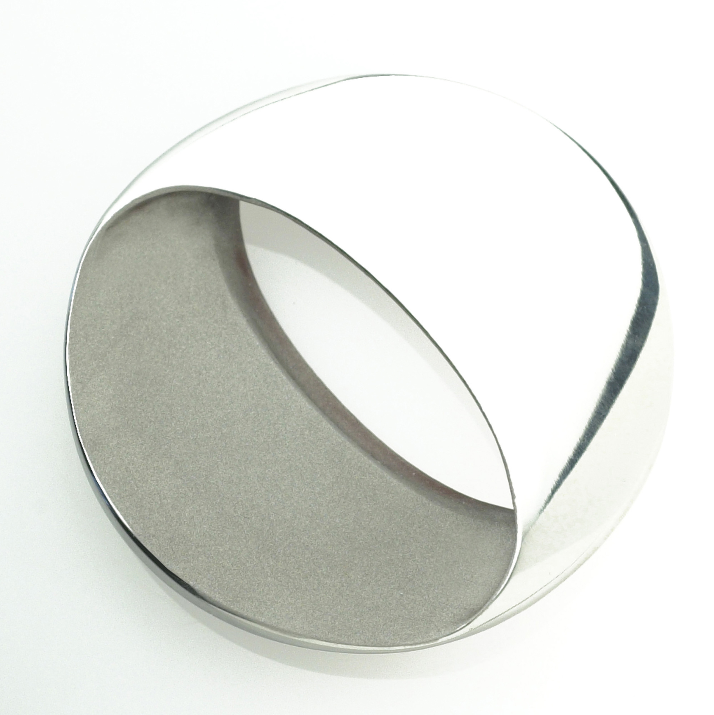
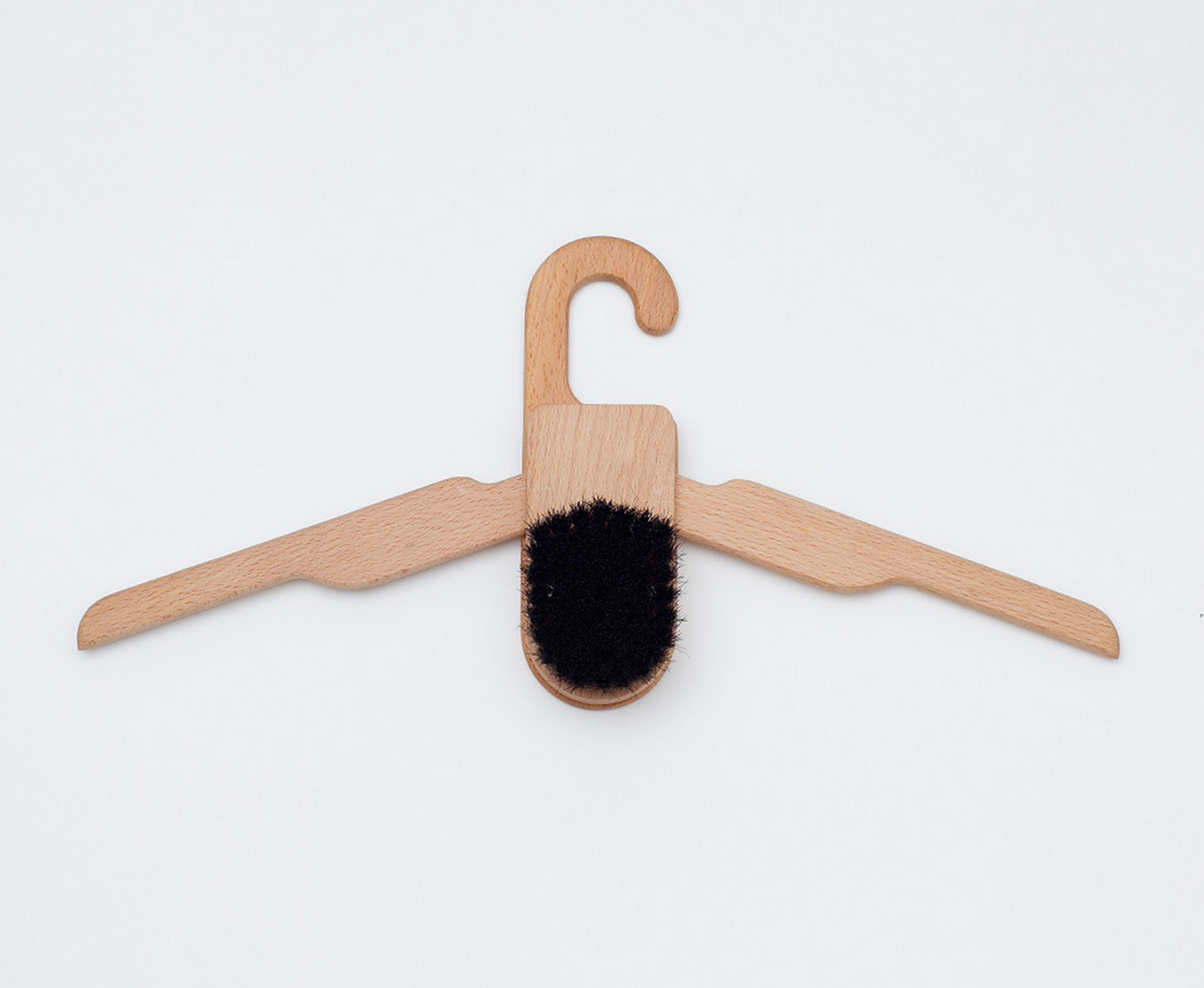
 courtesy barber & osgerby / ©amber rowlands
[DA] What informed some of the shapes?
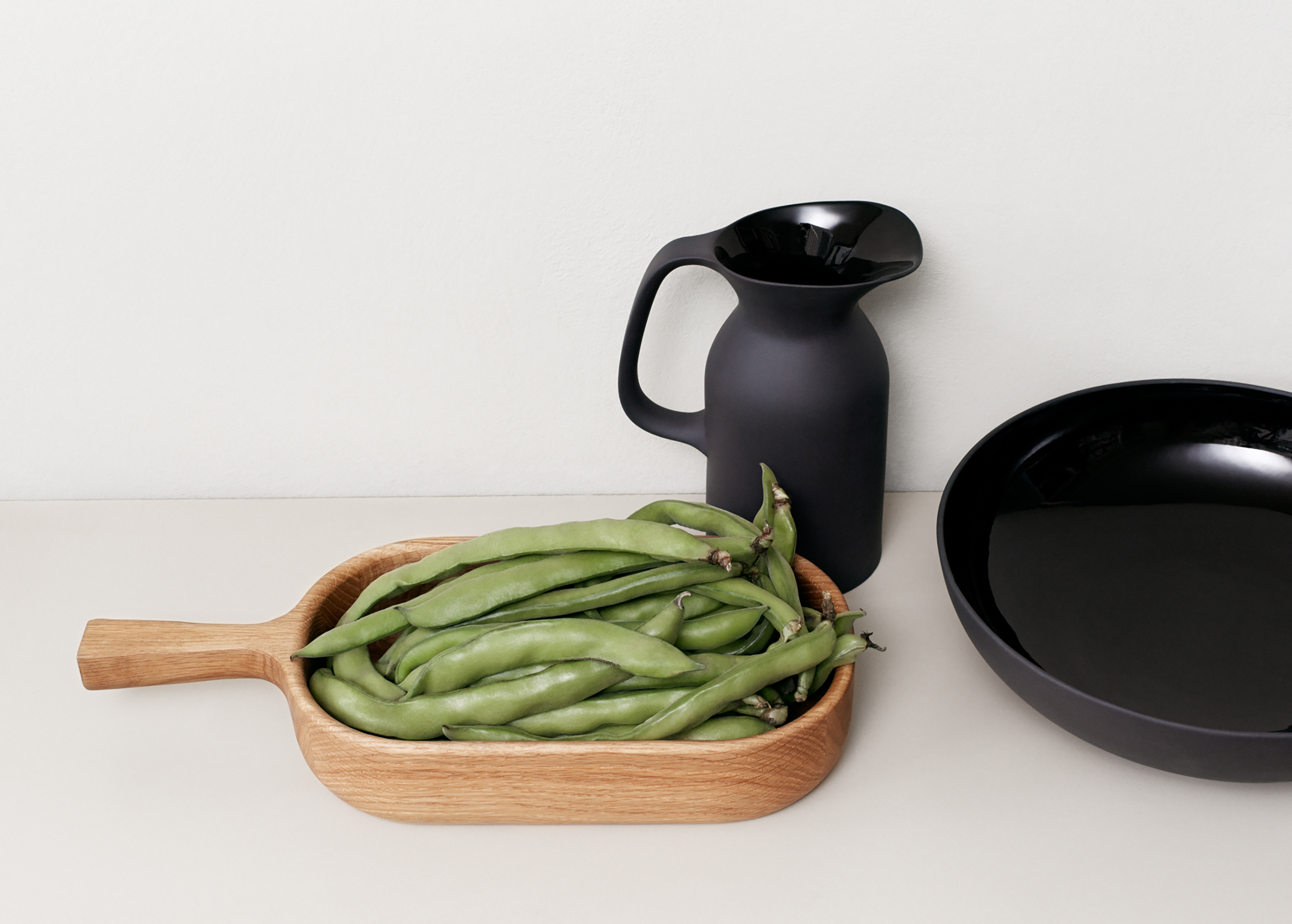
[EB] It is all about the tactility. These are all objects that you either hold in your hand or you eat your food from, so they’re things that are being touched on a daily basis. That’s why you’ve got that really nice edge on the wooden pieces, and a slightly more coarse finish with the glaze. It’s quite nice that you’ve got these slightly ambiguous objects, for example the wooden serving platter is great with a roast chicken on, but it can also be used as chopping board.
[Jay Osgerby] In terms of the forms, there wasn’t an outstanding influence to any one piece I don’t think – just a life-long collection of visual references from using and living with objects.
[EB] People have to engage with an object – that’s the most important thing for us when we design something. Of all the things that we’ve done, this is one thing where people feel very drawn to it and like to pick it up and play with it and feel it.
[DA] You were talking about people slotting pieces in with their existing collection, and it has got a homely sense of warmth about it…
[JO] Some designers would shoot you for saying that but I actually like that. Generosity is important and it’s not used very much in design. This needed to feel like a collection of miscellaneous objects, which cohere, but don’t really reference one another particularly with the exception of the finish.
[DA] You were talking about the kind of things that you pick up from markets and vintage sales, what catches your eye and why?
[EB] Mostly just interesting objects. I’m always buying wooden things. I’ve bought tons of wooden bowls over the years, some of them Scandinavian, some of them from Africa, I’ve got a couple from Samoa and New Zealand and I use those on a daily basis. But I also like the weird objects that you find in flea markets, sometimes you don’t even know what something is, it’s probably just a part of something else, but it looks great.
[JO] I think you can tell a lot about society from what you find in a flea market – different cultures have interpreted the same problems and found different solutions.
[DA] What’s the most important thing to know about you?
[EB] I think the most surprising fact is that we’ve been working together for 23 years…
[JO] … and we’re not a couple!
[DA] What’s the secret of your success as a duo?
[JO] Lack of options, like any marriage! No, I’m just kidding. We just get on really well – we’re friends. We both grow up with brothers, which teaches you to get along with people I think.
[DA] Talk me through your design process – how do you work together?
[JO] When Royal Doulton came to see us, there was not really much of a brief – it was more of a requirement for a range, they wanted an expansive range with lots of pieces in it and they more or less left it at that.
[DA] When a client leaves something that open, is that exciting or slightly terrifying?
[EB] I think if a furniture company had been as open with a brief for a chair, it would have been impossible, because we’ve designed a lot of chairs and we already know what we’re not going to do. But because we had never done tableware before, you always have faster, clearer ideas. We tend to think about what would we actually use at home, that’s always our starting point.
[JO] We weren’t interested in making a seamless collection. Eating is no longer a formal activity, it’s a social thing and that means there’s an informality about everything else that comes with it, the room you eat in, the way you cook and socialize at the same time, it’s all changed.
 courtesy barber & osgerby / ©amber rowlands
[EB] And as kids, we both had a lot of studio ceramics around our houses – our cereal bowls were hand thrown, so there was a feeling when we started out, to try to create that earthy textural quality. We soon realized that that was really impossible when you’re doing true mass production, which this is. It had to be dishwasher safe and pass all kinds of strength tests. But it certainly has that visual feel with the glaze on the inside and not the outside for example – it’s a very traditional thing, old English Toby jugs quite often had an exposed exterior body and a glaze on the inside.
[JO] The idea of leaving the body like that and not glazing it came from seeing the Jasperware at Wedgewood they’d make for 250 years, so when we visited the factory they were there making those sort of bright blue Jasperware things with a full pigmented body where they dye the stoneware that color and then leave it raw and we just thought it was really beautiful so this is more or less the same as Jasperware, the black Jasperware.
[DA] How does your design process work, how do you capture all of this, do you sketch or do you talk?
[JO] We do all of those things, but in fact in this project we used rapid prototyping a lot…
[EB] …for most projects it is just sketching and physical models. But for this project, we did tons and tons and tons and tons of prototypes until we get the detail right. To make a teapot out of foam just doesn’t work. It’s weird because it’s about the most crafty looking project we’ve ever done, yet it was mostly done on the computer which is not a usual thing for us. We could just send objects off to print and get back 3D printed prototypes really quickly. We also went up to Stoke-on-Trent and worked with a potter in his shed and he actually made jugs, like the teapot and the jug for us before they committed to making moulds.
[DA] What was the biggest challenge of the whole process?
[EB] We’ve actually designed the range to be much bigger than this, so I think one of the challenges for us was working with Royal Doulton to establish what we should launch first. It was really hard to edit the collection down.
[JO] Also because they’re being made in different places, getting the samples back was a very complex process – we never seem to have all the samples together in one place, so we didn’t really get to see everything together until quite late in the day. It was a challenge, but in the end it worked.
[DA] What was the most fun bit?
[EB] It was all pretty enjoyable, Royal Doulton are a really nice bunch to work with – really enthusiastic. Working in something for the first time is always great – we’ve never done a project in ceramics and we’ve never done cutlery before so there was a lot of firsts and a big learning curve. And we’re already prototyping the next wave to be released.
[DA] What are you most proud of?
[JO] Tricky, each project’s so different. Generally it’s the thing that you’ve just done or that you’re currently working on. The Tip Ton chair is probably one of the things we’re most proud of. This seems crazy, but we’ve really honestly actually had letters from all over the world, from the mums and dads of kids with back problems.
[EB] We had one recently: a little girl who was born with a spinal deformation and had to have special chair that kept her away from the table at dinner time. The Tip Ton chair performs the same function for her, so the whole family bought them so that she didn’t feel like the odd one out.
[DA] What advice would you give to a young designer starting out in their career?
[EB] Be original as much as possible.
[DA] What’s your favorite color?
[EB] I like colors where you don’t really know whether it’s one color or another so some people would see it as grey and other people would see it as brown.
[JO] For me it would have to be some ranges of blues that go between beautiful blue sky on a beautiful day or the se. It’s definitely in the blue spectrum, which is vast. One of the projects we did fairly recently was for the tile company Mutina and one of the ranges is called ink and it’s made up of some eight different tones of blue which are all really quite different but when you put them together they sort of work, they have this sort of strange undulating feeling as none of them are the same, they’re all subtly different so, blues.