Kulula airline rebranding.
 ha! not sure rebranding will inspire confidence with passengers.
but designers would have fun with these guys as a client. Kulula Air
via swissmiss / psfk
 ha! not sure rebranding will inspire confidence with passengers.
but designers would have fun with these guys as a client. Kulula Air
via swissmiss / psfk
 “wall of knowledge” for the stockholm library are renderings by a team of students at the architecture school of paris la seine.


a neat recap on how the design was generated at CG Society.
thinking of this as a concept though you can actually purchase this product. the caveat, what about three-prong plugs? don’t stop re-designing this thing.
Producer: metaphys
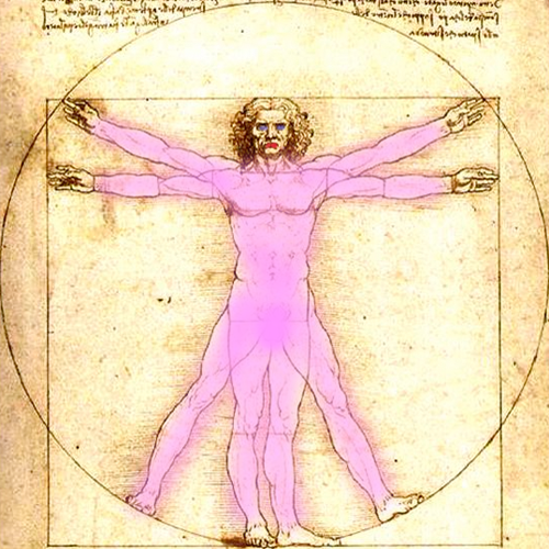 the beginning of the end for unisex objects?
Truth be said there are clear-cut benefits for me when the designer takes the female gender into account. The product generally weighs less. The technical products are simple, more intuitive. I like both neutral and wildly fun colors. However, my issues usually involve color and endorse gender-neutral color schemes.
The following principles belong to The Femme Den:
1. emphasize benefits over features: Rather than touting feature sets and specs (how fast or big or slick something is), make the product’s benefits clear. Who can it connect her to? How does it make her life easier? How will it save her time?
2. learn her body: Women have different bone and muscle structure: Simply shrinking products leads to injury and frustration.
3. craft a cohesive story: Women consider more than just the product itself. Design the whole experience with them in mind, from advertising and packaging to the retail environment and customer service.
4. identify a spot on the spectrum: For some tasks, women want to feel girly; for others, not at all. Nix the hyperfeminized stereotype and consider where on the spectrum this product should land.
5. remember her life stages: Are you designing for a 25-year-old or a 65-year-old?
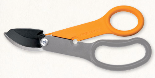
above: fiskars florist bypass pruner note: probably would fall in the unisex category but this tool is lithe and nimble.

above: k2 lotta luv women’s ski
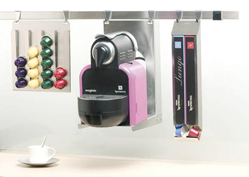
above: nespresso essenza d90

above: oralb pulsoni — quieter and smaller than other brands
resources:
stuff we love
fast company
gourmet get-away

good design is as little design as possible
Dieter Rams (born May 20, 1932 in Wiesbaden) is a German industrial designer closely associated with the consumer products company Braun and the Functionalist school of industrial design.
In 1993 I asked Dieter to speak to the Architecture & Design Society at the Art Institute of Chicago. The society recently had a name change: “design” had been added. We joked ( ahem ) at the time that the real estate economy was so bad that the Architecture Society needed new members. We needed a credible and passionate design icon to speak to this group. Dieter became the first designer to speak under the society’s new name.
What I remember that night and again recently while watching the Objectified movie was Dieter’s 10 design principles. Honestly, I can’t tell you for sure that these are the same principles. Hoping Dieter will set the story straight.
I think I like the earlier stuff better. Maybe it was the materials or maybe it was so different than the pack at the time. The first Braun product I remember making a design connect to me was an electric razor. Much of Dieter’s work has long seemed more connected to brutalism than minimalism. Let’s say beautifully, brutally, minimal.
* Good design is innovative
* Good design makes a product useful
* Good design is aesthetic
* Good design helps us to understand a product
* Good design is unobtrusive
* Good design is honest
* Good design is durable
* Good design is consequent to the last detail
* Good design is concerned with the environment
* Good design is as little design as possible
resources:
vitsoe
designmuseum
gizmodo
victoria and albert museum
dieter rams flickr
braun flickr
37 signals
tendesignprinciples
new: a bit late
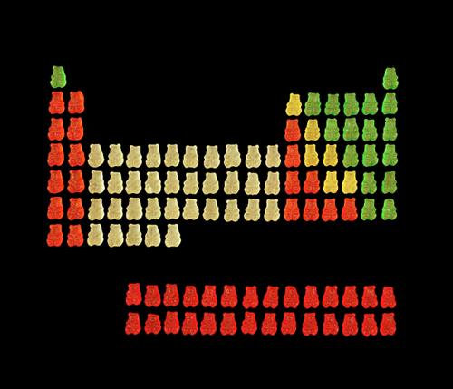 it’s halloween. it’s candy. it’s mad science.
above: gummy bear periodic table.
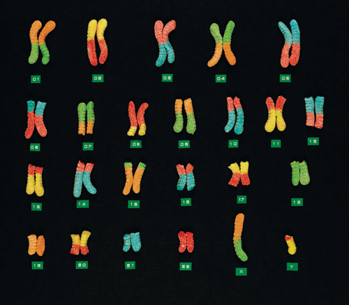
above: gummy worm chromosomes.
Artist: kevin van aelst
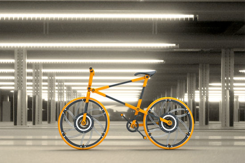
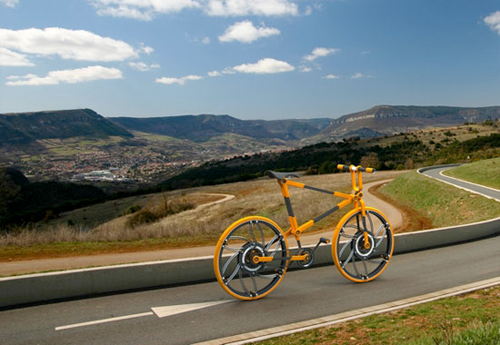
the eco 7 folding bicycle’s concept is to be as compact as possible, including collapsible wheels.
the design is intended for urban use and folds up to save space when not in use. while folding bikes are nothing new, aleman takes his design to a new level with folding bike wheels.
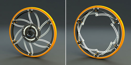
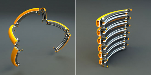
above: each wheels is composed of six pieces connected through double-pivot joints. the spokes of the wheel fold into the rim and fold out when opened up to provide structure to the wheel. the tire isn’t inflatable, allowing it to break into segments. the bike frame itself also shrinks down in size when taken apart, folding into itself and the core components.
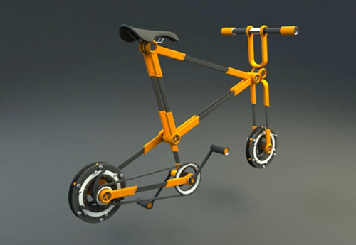
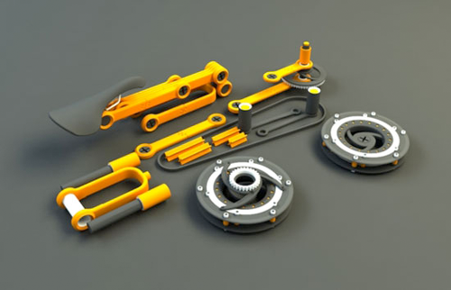
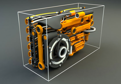
the design may take awhile to fold and unfold and not for everyone but the folding wheel concept is interesting. the pedals should go back to the drawing board or stay with the conventional, especially clips or cleats. maybe traditional tubes tires too.
Designer: victor aleman
 Andrew Sullivan posted this in a ‘metal health break’ post on his blog today.
“Music Painting” is a genre I hadn’t heard of!
via andrew sullivan
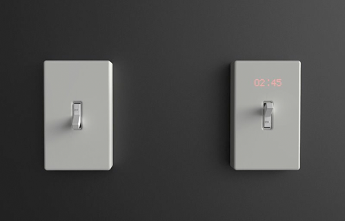 Though the designer’s intent is different, this concept works for me when the clock shows elapsed time the light is on: An eco – consciousness device.
Designer: ryan harc
via todaytommorrow
All content ©2007 > 2024 DesignApplause
Notifications