Blue forest's "eco-classrooms" and "sustainable tree houses."
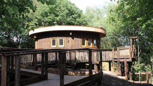
Blue Forest touts itself as a builder of “eco-classrooms and “sustainable luxury,” two words that are often mutually exclusive. I have to raise an eyebrow at any company that labels its products with names like ecoPerch without providing any information on what makes them so “eco” in the first place. The ecoPerch is a “four-bed retreat that offers guests an exclusive, sustainable self-catering experience…It’s natural, organized geometry maximizes the relationship between the inside space and the outdoor setting, ensuring the structure sits harmoniously within the landscape.”
That sounds like a lot of empty ad speak to me, and I was ready to write them off completely until I stumbled across an article about their “eco-classrooms” that actually makes their green-washed website seem more legitimate. The classrooms are constructed primarily from FSC- or PEFC-certified softwood timber and incorporate a sedum roof.
“The building operates without any main power or utility supply. It is serviced entirely by solar energy and even incorporates a methanol fuel cell as a backup should there be a prolonged period without sun. A rainwater-harvesting system collects water from the sedum roof for both the kitchen and composting toilets. The structure is believed to be the first building in the UK which processes harvested rainwater from a sedum roof into hot and cold drinking water using only solar power.”
No word on whether the same is true for their line of luxury tree houses, but why on earth don’t they include that on their site instead of a bunch sustainable mumbo-jumbo? Let’s chalk it up to the fact that this is a new company and whoever is handling their brand strategy clearly doesn’t realize that in addition to the luxury crowd, there’s a large market of folks who get seriously turned on by recycled rainwater and low impact construction.


LEED platinum prefab homes for under $200K.

With all the recent achievements in modular building, prefab is no longer a dirty word. The latest design to prove that prefab can bring affordability and good design together is the C6, a new prefabricated house by LivingHomes. The C6 boasts 3 bedrooms, 2 baths, an open floor plan “and lots of storage, light and warmth,” and it’ll set you back only $179,000.
“This is our first affordable LivingHome. It was designed by LivingHomes staff in collaboration with Make It Right, a nonprofit founded by Brad Pitt and architect William McDonough to build 150 affordable, sustainable homes in New Orleans’ Lower Ninth Ward, the neighborhood hardest hit by Hurricane Katrina. A portion of the proceeds from the sale of each C6 will help support the efforts of Make It Right.”
You can even configure your own dream home right on LivingHomes’ site. Choose an LEED level from Certified to Platinum, how many square feet of decking you want and customize the interior with flooring, cabinet and appliance options. If you need more rooms or bigger space, there are options for that, too. No one said prefab meant cookie-cutter. All you need to build you very own dream house is a piece of land – though a sense of design and maybe a construction team might help.


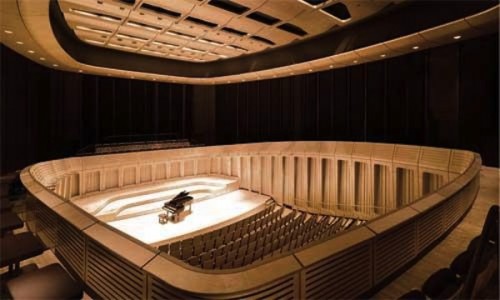
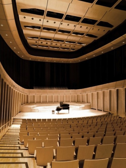
Impressive new acoustics at royal welsh college of music & drama in cardiff.
The competition to design the new Royal Welsh College of Music & Drama in Cardiff was held back in 2007, but it was completed just recently, opening its doors to students in late 2011. The $35 million project includes a 450 seat chamber recital hall (with acoustics that will apparently blow your mind), a 180 seat theatre, four rehearsal studios and an exhibition gallery (take a virtual tour of the grounds).
Jason Flanagan, the project director said the “approach was two-fold, to design the internal performance spaces from the ‘inside out’, looking at their acoustic and theatrical functionality as major drivers, whilst in parallel designing from the ‘outside in’, thinking about the civic presence of the building in its urban context.” That sounds like a load of vague ad wash to me, but who cares – the space looks incredible.
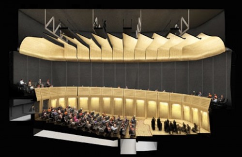
There are three new performance spaces housed within the original, though heavily renovated building. The most fascinating part is the roof. Each individual space is “united under a single, floating roof, its height determined by the theatre fly tower.” This not only means that the acoustics can be tweaked to the nth degree depending on the evening’s performance, but it gives each auditorium the look of a music box with the lid lifted off so that we might gaze in at the precious contents.
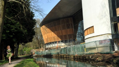
Breaking down the new london design museum.
 click > enlarge
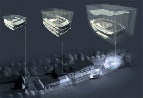
Earlier this week it was announced that the Design Museum, currently located in east London, would relocate in 2014 to a site at the Commonwealth Institute. Chances are you’ve caught a whiff of the buzz already. Here’s how the renovation adds up:
Number of years the site stood vacant: 12
Interior design: John Pawson
Why you should know him: Recently he’s done stage design for major ballets and operas as well as a temporary exhibition in the Geometric Staircase of St. Paul’s Cathedral. See all his work.
Number of floors: 5
Square-meters: 10,000 (about 33 square-feet)
Height of peaked roof: 16 meters (about 55 feet)
Estimated annual visitors: 500,000 (double the previous amount)
Estimated cost: £80 million (about $126 million)
“It’s a true icon and example of post war modernism,” Pawson said. “The challenge was working inside the skin of an existing building. For me it’s about retuning the existing architecture so it still feels fresh. The palette we’ll use is quite quiet and simple…and will retain and enhance the extraordinary special qualities of the building.”
Building on the edge: the timmelsjoch experience pass museum.

Architects must be up for a challenge nowadays; Here’s the second precarious-looking structure I’ve seen go up in the Alps in the last month. The Timmelsjoch Experience Pass Museum, designed by South Tyrolean architect Werner Tscholl, is definitely a stunner, but it was built for one of the most arbitrary reasons I think I’ve ever heard: to celebrate the 50th anniversary of the road it teeters over.
Granted, this is no ordinary road. The Timmelsjoch Pass cuts through the Alps along the Austrian/Italian border. Rising to 10,000 feet, building anything up there is a feat; Can you imagine trucking construction materials back and forth along those sharp switchbacks? As you might imagine, this isn’t a museum with rotating exhibitions. Its sole purpose is to pay homage to the pass itself. There’s a model of the pass in a single glass display case planted in the center of the one-room museum. There’s also some information behind the faceted glass walls, designed to echo the structure of the one of several icy caves nearby.
Tscholl was a natural pick for this project given his origins as well as his propensity for designing buildings that often jut out precariously over steep edges. Many of his projects are situated in remote locations, which means he’s used probably used to low turnouts sat his unveilings. This is a good thing because I’ve got a feeling The Timmelsjoch Experience Pass Museum is going to hit a new low on the list of annual visitors.


CZWG's inverted pyramid library in London
 click > enlarge
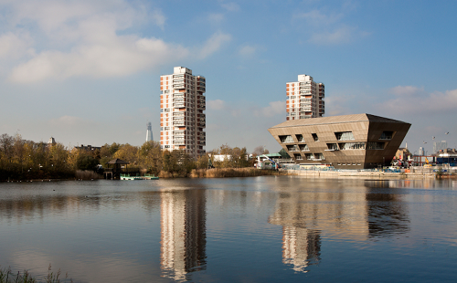
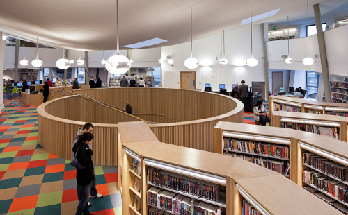
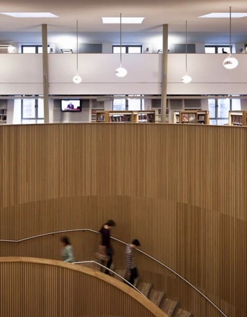
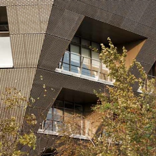
CZWG‘s new Canada Water library in Southwark, London, takes the shape of a hexagonal, inverted pyramid, with immediate services on the main floor (cafe, Internet, current books) that expand as the floors themselves do. There’s a 150 seat performance space on the ground floor, too, and the top two widest levels are devoted to the main library. The exterior is covered with perforated, anodised aluminum sheets, and they’ve allowed for a fifth level – the rooftop – to be utilized as an additional floor as well as a green area.
The goal of making popular books available on the ground floor alongside a cafe is to encourage passersby to pop in, have a coffee and check out a new book – something people might be less likely to do if they knew they had to hike up to the top floor to browse through new releases. Or you could stay all day, “…learning in the morning, listening to a poetry performance at lunchtime, studying in the afternoon, watching first class theatre at night, and then relaxing in the cafe after that,” says Councilor Veronica Ward.
The inverted pyramid shape isn’t just a lark; Rather, it’s an incredibly creative way of meeting a design challenge. Based on their client’s needs, CZWG knew they would need to build a larger space than the site allowed for. They also couldn’t just build straight up because it would cut off the interaction between user groups on a given floor and it would have required the library to staff those additional stories – so they designed outward. Instead of going higher, they went wider and the result is a library that’s both stunning and completely unique. Piers Gough, a partner at CZWG, calls it “a futuristic Pandora’s box of possibilities.”
CZWG is producing some of the most exciting new work in architecture right now. I profiled their other recent project, a cancer treatment center in Nottingham, but readers might be more familiar with some of their higher profile work with the Smithsonian and in New York City.
As a side note, if you think this library is a stunner, check out the “20 More Beautiful College Libraries From Around the World.” Books never had it so good.
Photos by Tim Crocker
Cleveland clinic lou ruvo center for brain health. Frank gehry.
 click > enlarge
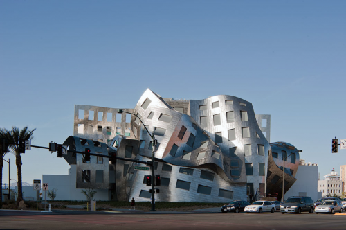
In architecture I love minimal, efficient, and white cubes that let outside light generously pour in and its structure does not get in the way of its function. I also love modern sculpture and modern roller coasters. Architect, product designer, Frank Gehry for sure gets my divided attention. Here’s his latest structure, the Cleveland Clinic Lou Ruvo Center for Brain Health in Las Vegas, Nevada. Groundbreaking in 2007, open for patient care in 2009 and completed in 2010.
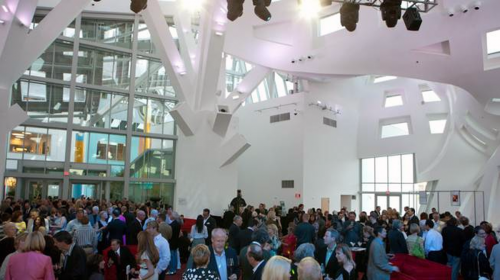
Gehry agreed to design the building only after discovering he shared a bond with its founder, Larry Ruvo. Both men suffered personal losses to degenerative brain diseases. Ruvo lost his father to Alzheimer’s disease and Gehry’s analyst’s wife succumbed to Huntington’s disease. The $100 million complex comprises two wings connected by an open courtyard: a dedicated research center, located at the northern end of the building, and a ‘for-hire’ event space, dubbed the Life Activity Center, located at the southern end. Architecturally, the two spaces are dramatically different and yet together they form a cohesive whole. A four-story clinic, houses medical offices, patient rooms and research space, is rational, conventional, and rectilinear in geometry. By contrast, the Life Activity Center ( above photo ) is a soaring sculptural volume tucked beneath a signature Gehry stainless steel roof. Designed as an event space, proceeds fund the center’s research.
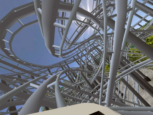
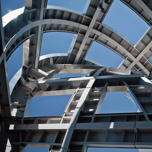
above: air coaster XL roller coaster simulator app made with a multitouch 3D interface, so un-CAD. below: building super-structure.
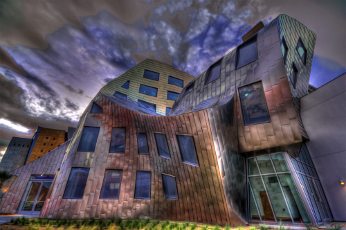
The Center operates as an outpatient treatment and research facility and includes 13 examination rooms, offices for health care practitioners and researchers, a “Museum of the Mind,” and a community auditorium. The Center also serves as the headquarters for Keep Memory Alive Foundation (owner of the building), the Las Vegas Alzheimer’s Association and the Las Vegas Parkinson’s Disease Association.
[ frank gehry ]
Frank Gehry grew up in Canada. In his free time as a child, he would make small versions of buildings out of pieces of wood. In 1947 his family moved to the United States. That is where Frank Gehry began his university studies in architecture. He believes that architecture is art. He has said that, in some ways, he has been more influenced by artists and sculptors than by architects. This may be why his buildings often look like energetic sculptures made from bold geometric forms.
Gehry’s body of work favors the style of Deconstructivism, which is often referred to as post-structuralist for its ability to go beyond the modalities of structural definition. Its architectural application tends to depart from modernism in its absence of cultural givens such as societal goals and functional necessity. Deconstructivist structures are not required to reflect specific social or universal ideas, such as speed or universality of form, nor a belief that form follows function per early modernist structures. Gehry’s own Santa Monica residence, which he applied his conceptual studies into a reality, is a commonly cited example of deconstructivist architecture, as it was so drastically divorced from its original context, it cloaks its original spatial intention.
Gehry’s style sometimes feels unfinished using inexpensive found objects and non-traditional media such as clay and has been called “the apostle of chain-link fencing and corrugated metal siding”.
There are critics. Art historian Hal Foster reads Gehry’s architecture as, primarily, in the service of corporate branding. Other complains include complaints that the buildings waste structural resources by creating functionless forms, do not seem to belong in their surroundings and are apparently designed without accounting for the local climate.
Famous examples of Frank Gehry’s work include the “Dancing House” in Prague, the capital of the Czech Republic. This playful building, finished in 1996, looks like two dancers. His most famous building is the Guggenheim Museum in Bilbao, Spain. It was completed in 1997. Most of the curving building is covered in titanium. It looks like a dancing metal wave sitting on the edge of a river. The curved surfaces of this building and others by Frank Gehry are so complex to build that they require computer programs.
Frank Gehry’s buildings are so popular that some people say they create a “Gehry effect.” This term is used for a building that attracts visitors because of the architect who designed it.
To Gehry’s credit he has an ability to conceive and execute his surreal sculptural architecture. As there are critics of flying to the moon or jupiter, Gehry’s architecture is akin to space exploration. His work does inspire and someone will figure out how to apply concepts that will be less costly and more sustainable to build. [ gehry partners ]
[ project credits ]
Project Cleveland Clinic Lou Ruvo Center for Brain Health, Las Vegas
Client Keep Memory Alive
Architect Gehry Partners, Los Angeles—Frank Gehry, FAIA (design partner); Terry Bell (project partner); Brian Zamora (project designer); Kristin Ragins, Ronald A. Rosell, David Rodriguez, Michael Sedlacek (project architects); Andrew Galambos, Eun Sung Chang, AIA, Izaburo Kibayashi, Michael O’Boyle, Mok Wai Wan, Natalie Magarian, Natalie Milberg, Nora Wolin, Sameer Kashyap, Sarah David, Yvon Romeus (project team)
Structural Engineer WSP Cantor Seinuk
M/E/P/FP, Security, Telecommunications Engineer Cosentini Associates
Lighting Design L’Observatoire International
Acoustical Engineers McKay Conant Hoover; Nagata Acoustics
Building Transportation Edgett Williams Consulting Group
Life-Safety Engineers Aon Fire Protection Engineering Corp.
Climate Engineer Transsolar
Door Hardware Finish Hardware Technology
Landscape Architect Deneen Powell Atelier
Civil Engineer G.C. Wallace
Building Maintenance Lerch Bates
A/V Engineer Spurgeon Design and Development
General Contractor Whiting-Turner Contracting Co.
Size 85,180 square feet (site area), 60,000 (total building area)
Alpine pod offers high elevation refuge .

Prefabricated architecture makes its way to the top of the Italian alps with the Alpine Pod, located on the Freboudze glacier on the Mont Blanc range. Commissioned by the Italian pine club, CAI Torino, the pod offers climbers refuge from the terrain’s severe conditions.
Designed and built by LEAPfactory, “an Italian firm specializing in modular structures with low environmental impact,” the Alpine Pod uses nautical and aeronautical fabrication techniques to create a self-sufficient structure capable of withstanding extreme weather, like 124 mph winds and 26 feet of snow.
Nothing like this has ever been attempted before, and as such it looks nothing like typical alpine structures. Luca Olivari, the project’s structural engineer, used glass-fiber reinforced plastic (GFRP), which he said is “an ideal material for extreme conditions because the fiber’s weight and orientation can be precisely defined in every area of the structure to support high-concentrated loads.”
As for the pod’s features, it’s 250 square-feet and has a kitchen as well as dining and living areas, twelve bunks, storage for gear and a weather monitoring station. Photovoltaic panels produce 2.5 Kwh of solar energy; It weighs almost 3 tons and cost about $327,000 to construct. And because it’s based on a modular structure, with “individual modules designed for specific functions like eating or sleeping,” the pod itself can actually be rearranged and expanded, should demand require it.
It’s an amazing feat of specialized building under extreme conditions. I’m anxious to follow this project to see how the pod functions after months of wear. But even if the cute sweater design gets rubbed out by wind and sleet, it’s still an oasis in a frozen, forbidding landscape for adventurers heading into the alps on foot.


paul smith and czwg collaborate on nottingham cancer center.
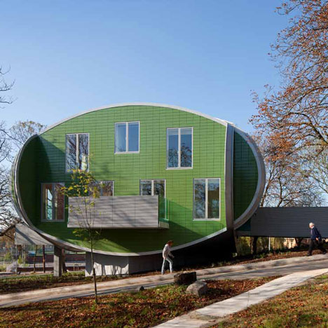
The opening of a new cancer treatment center in Nottingham isn’t the sort of thing that usually makes headlines, but when it’s designed by Piers Gough, founding partner of London-based CZWG Architects, with interiors by fashion designer and Nottingham native, Sir Paul Smith – then it does. This will be the ninth Maggie’s Centre to open in the UK, and after looking at some of the other locations, it’s clear that good design is an essential part of their treatment.
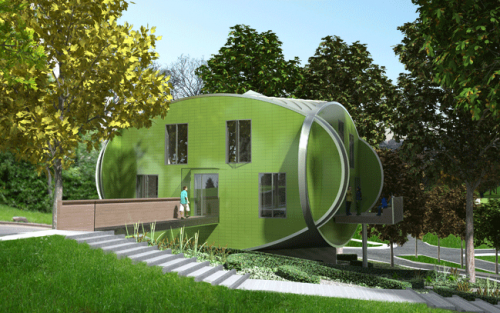
Frank Gehry designed the Dundee location (with a wavy roof line and all) and Zaha Hadid is responsible for a surprisingly angular Centre in Fife. I’ve never been a fan of her work – or bulbous, cartoony design in general – but her Fife location is amongst my favorite of the various and impressive Centres. I definitely like it better than the new Nottingham facility – with its interjecting green ovals, oddly punctuated by a rectangular balcony and windows, the entire building looks more like one of those wooden, children’s shape-matching games. At least the inside looks bright and cozy!
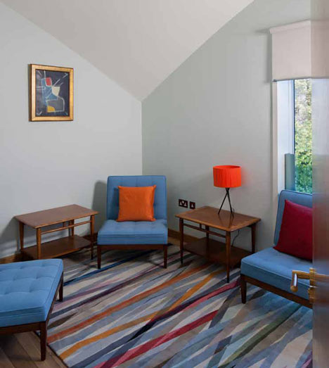
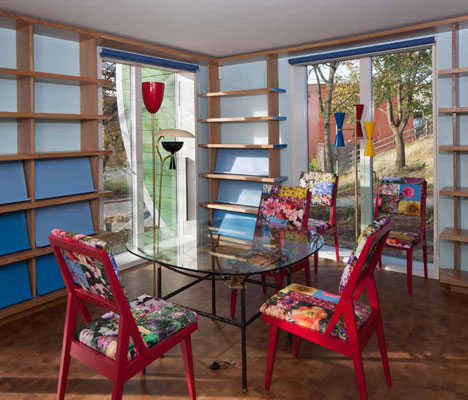
designer(s): CZWG Architects | paul smith


