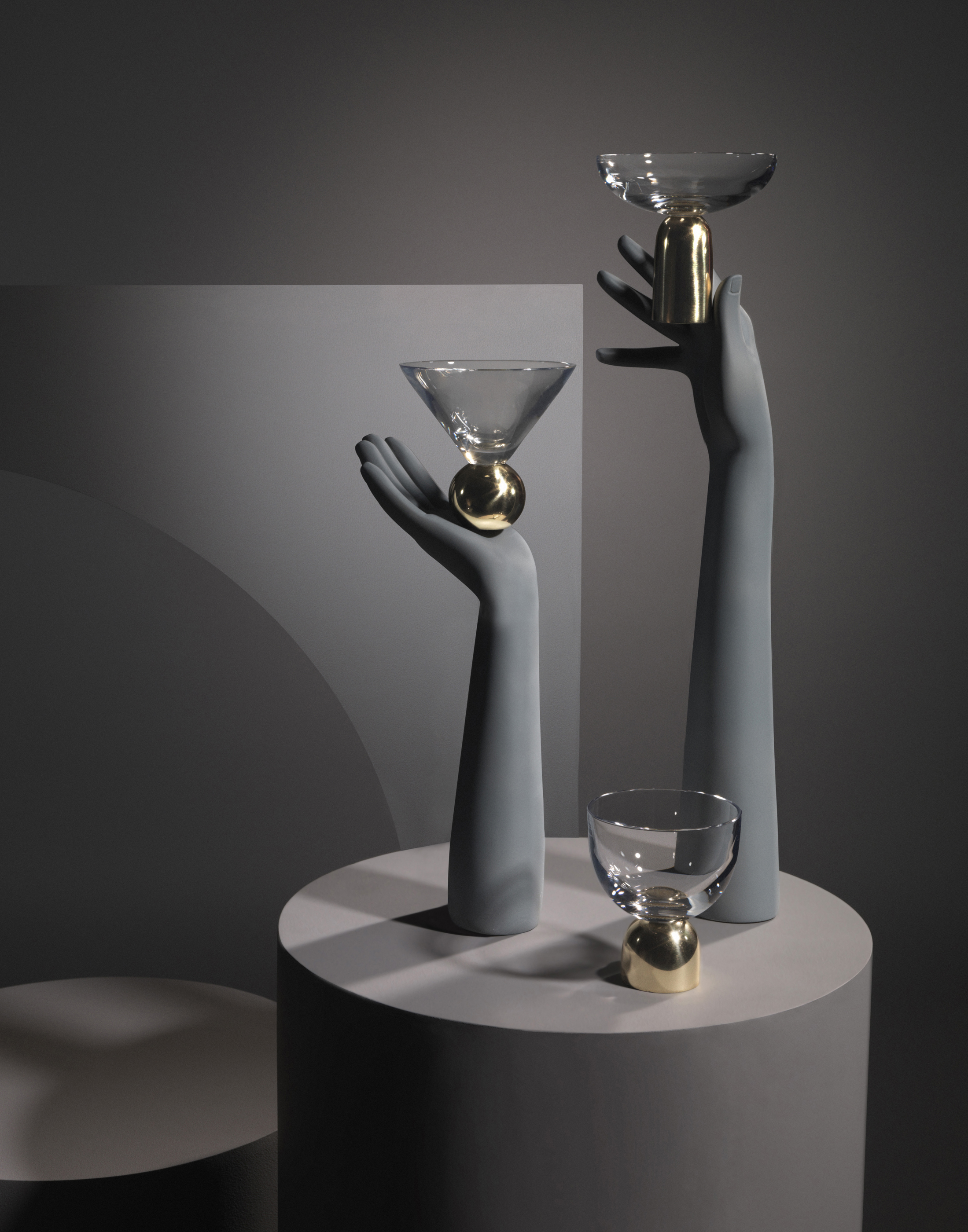


spazio rossana orlandi. milan design week 2016.
the doyenne of design gathers talent new and established in her eponymous spazio rossana orlandi.
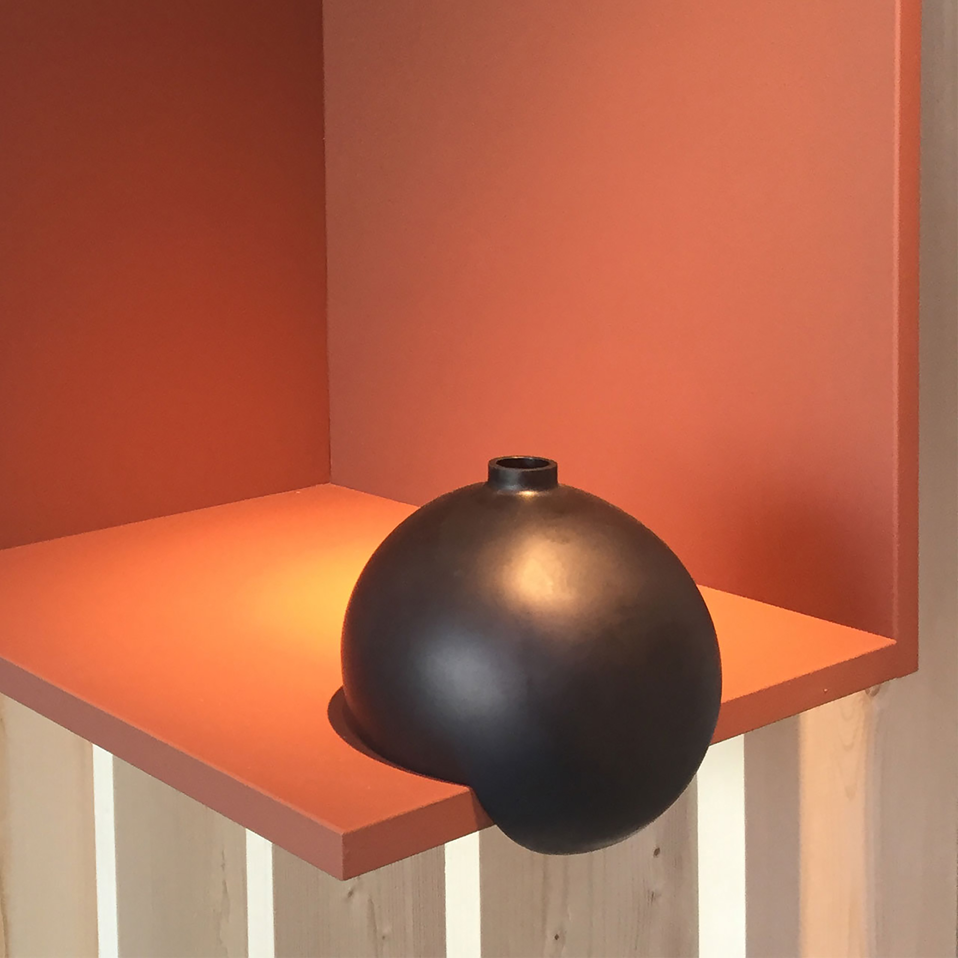
spazio rossana orlandi, a former tie factory on via matteo bandello in the magenta neighborhood of milan, is part design-shop, part gallery, part sun-dappled courtyard café, curated by the eponymous doyenne of design. orlandi is known, not only for her trademark specs (pictured above and now available to buy in the shop), but for her ability to spot the stars of the future at the very beginning of their careers. every year for milan design week, the space is filled with a combination of new talent and the big names she’s supported from day one, making it a must-see destination.
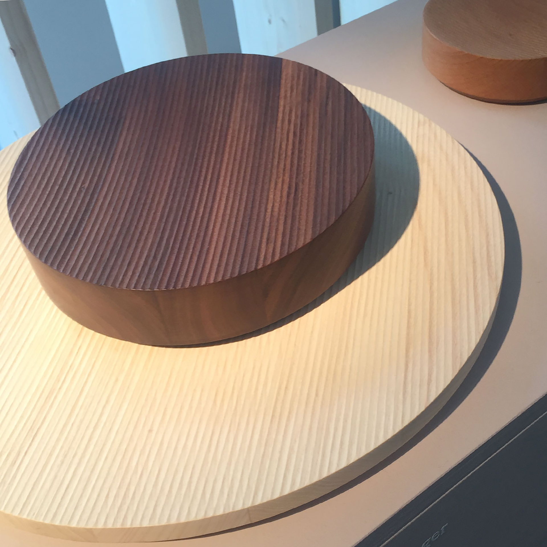
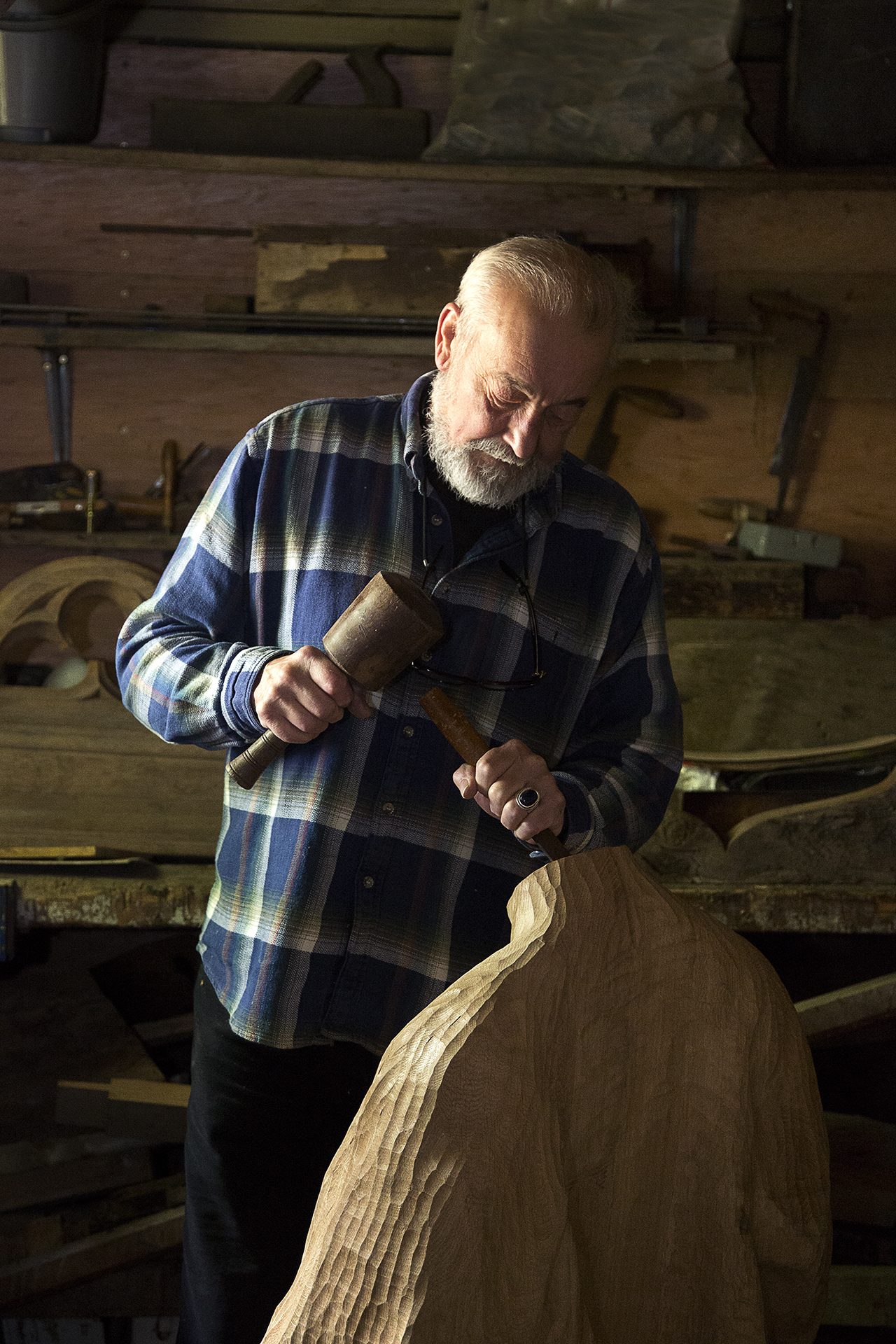
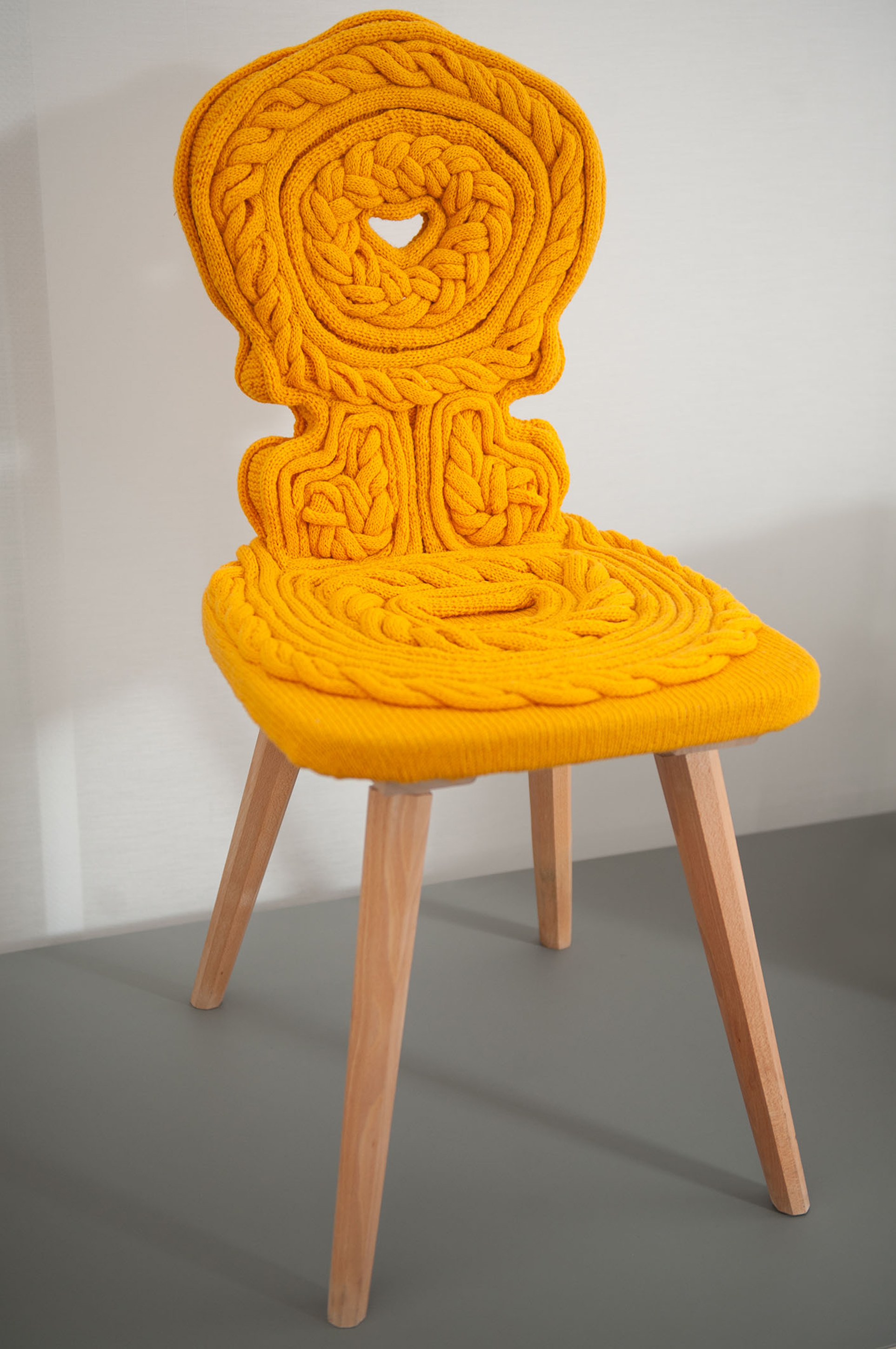
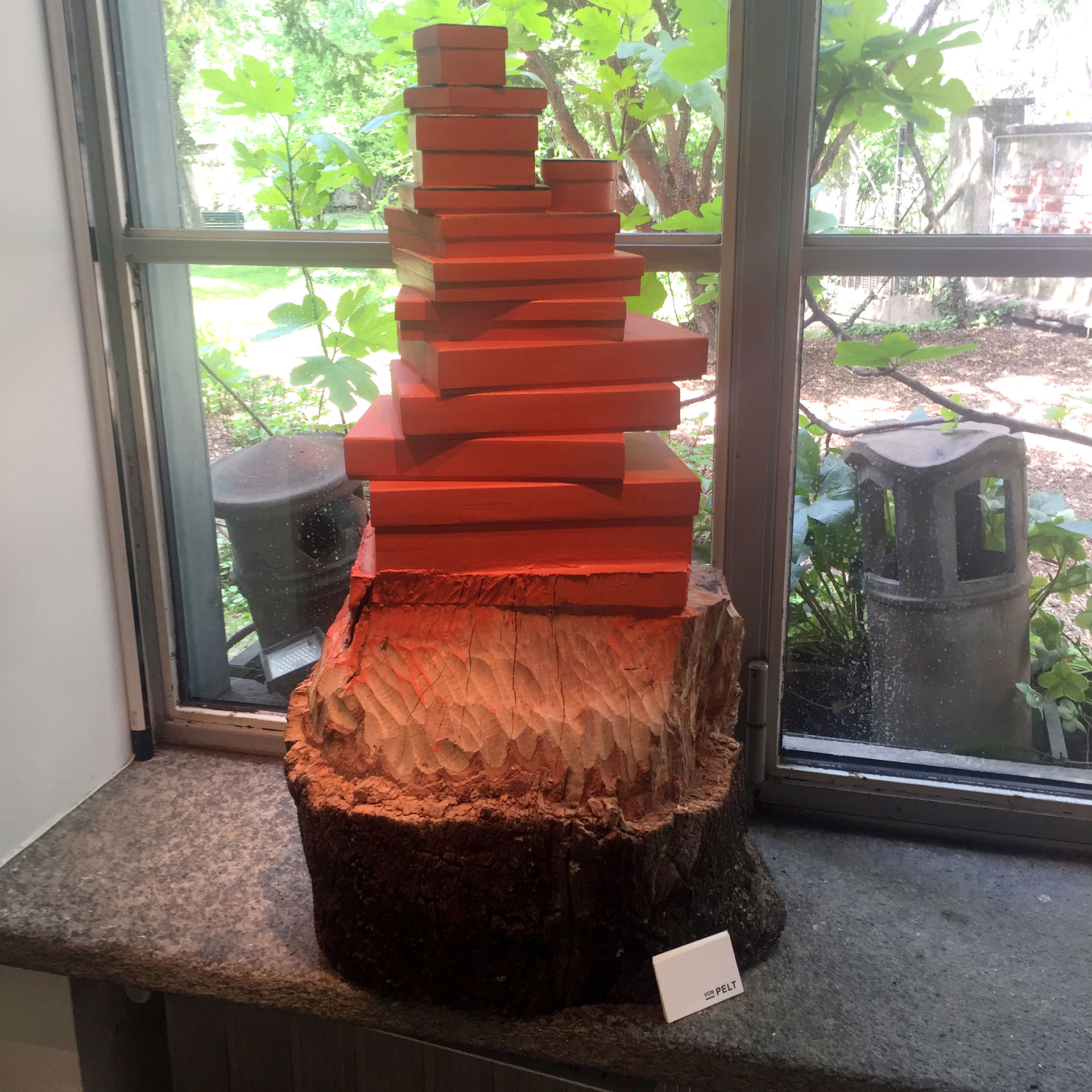
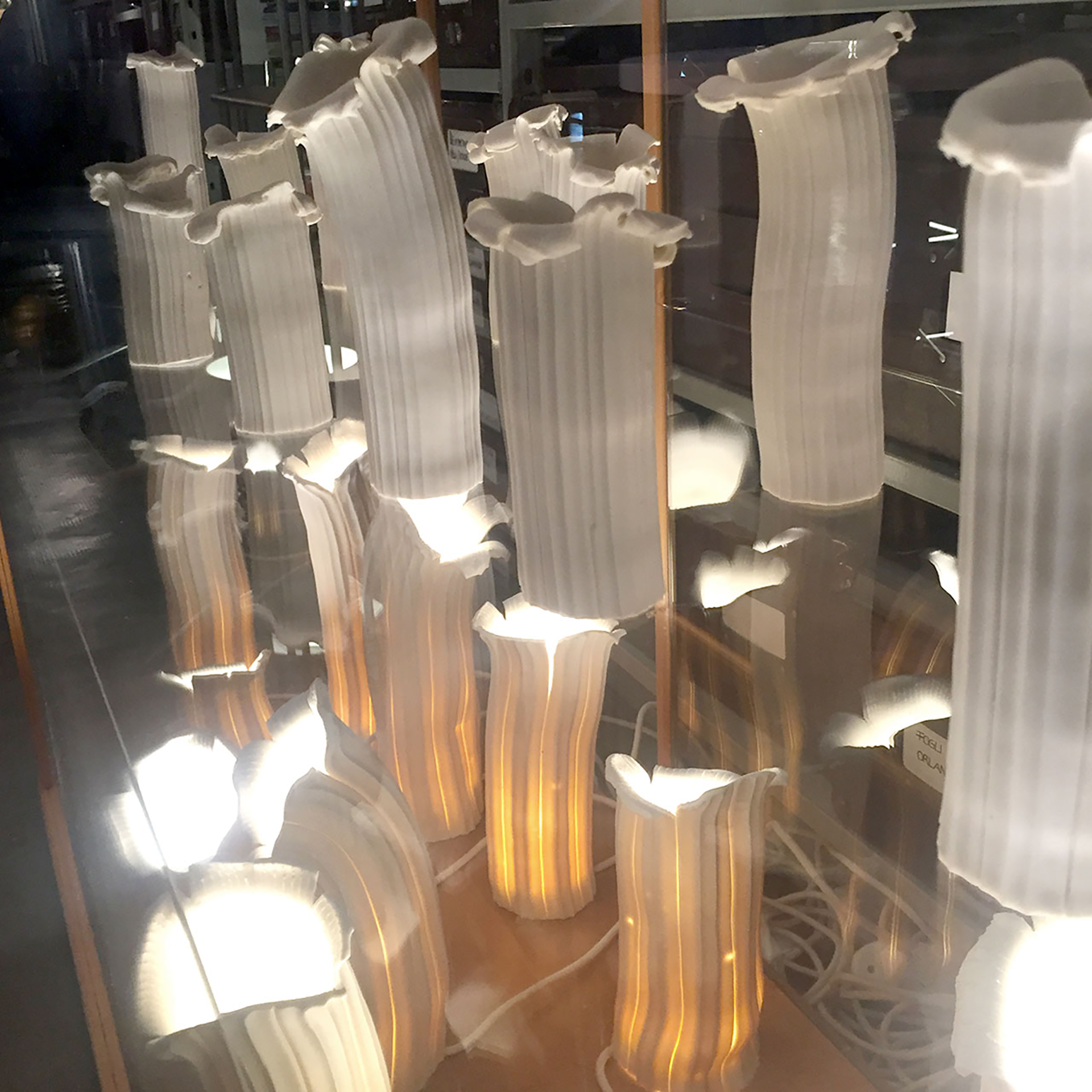
below> this sculptural piece showing the transition from tree to wooden designed object is by desiree mejer, part of design collective von pelt. the collective celebrates its members’ varied talents and provenance, saying, “most are self taught or come from a different discipline and location, such as graphic design and poetry from london and spain, artist sculptors from berlin, and italian textile researchers and craftsmen.” mejer was born in spain, now lives in london and is a fashion designer by trade, having launched fake london in 1997.
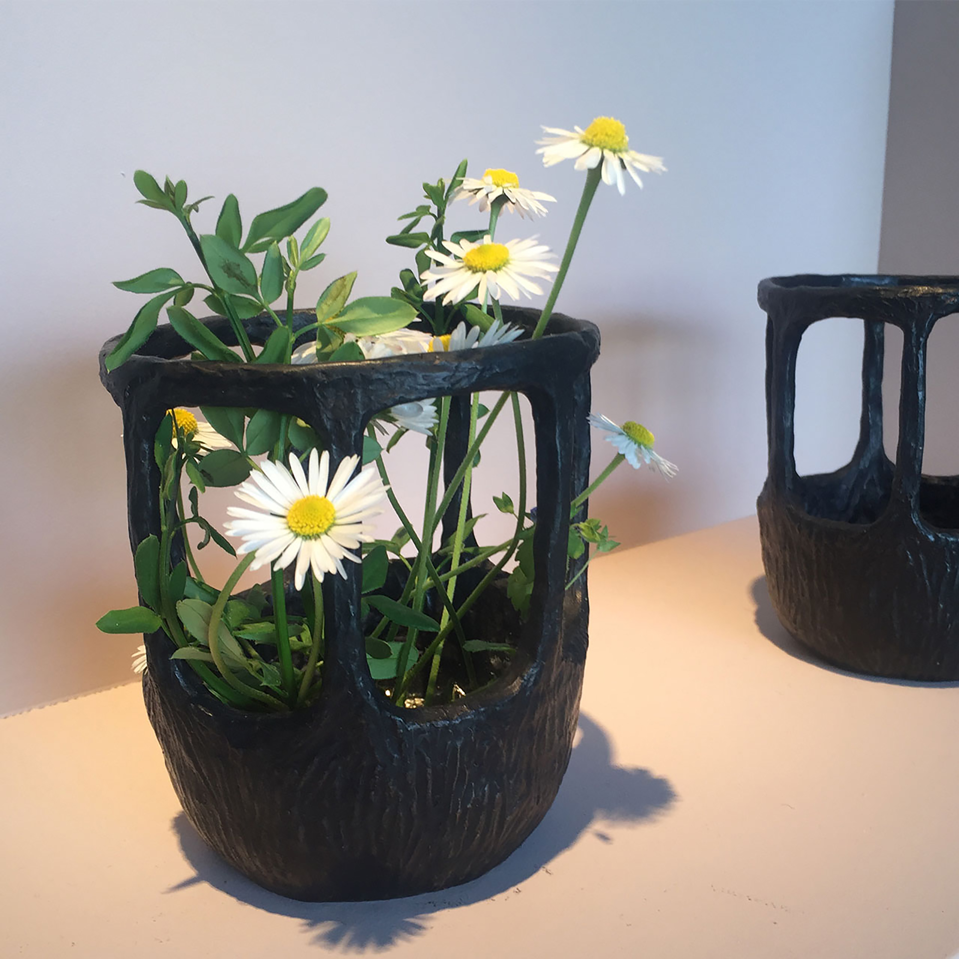
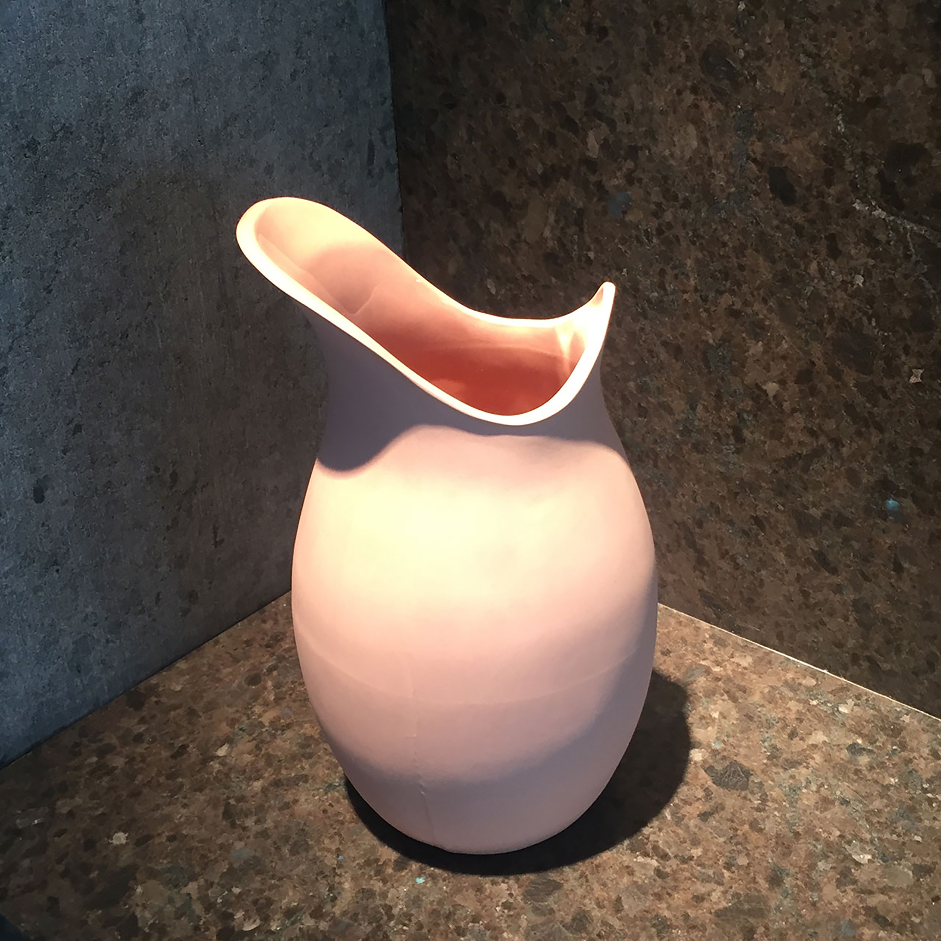
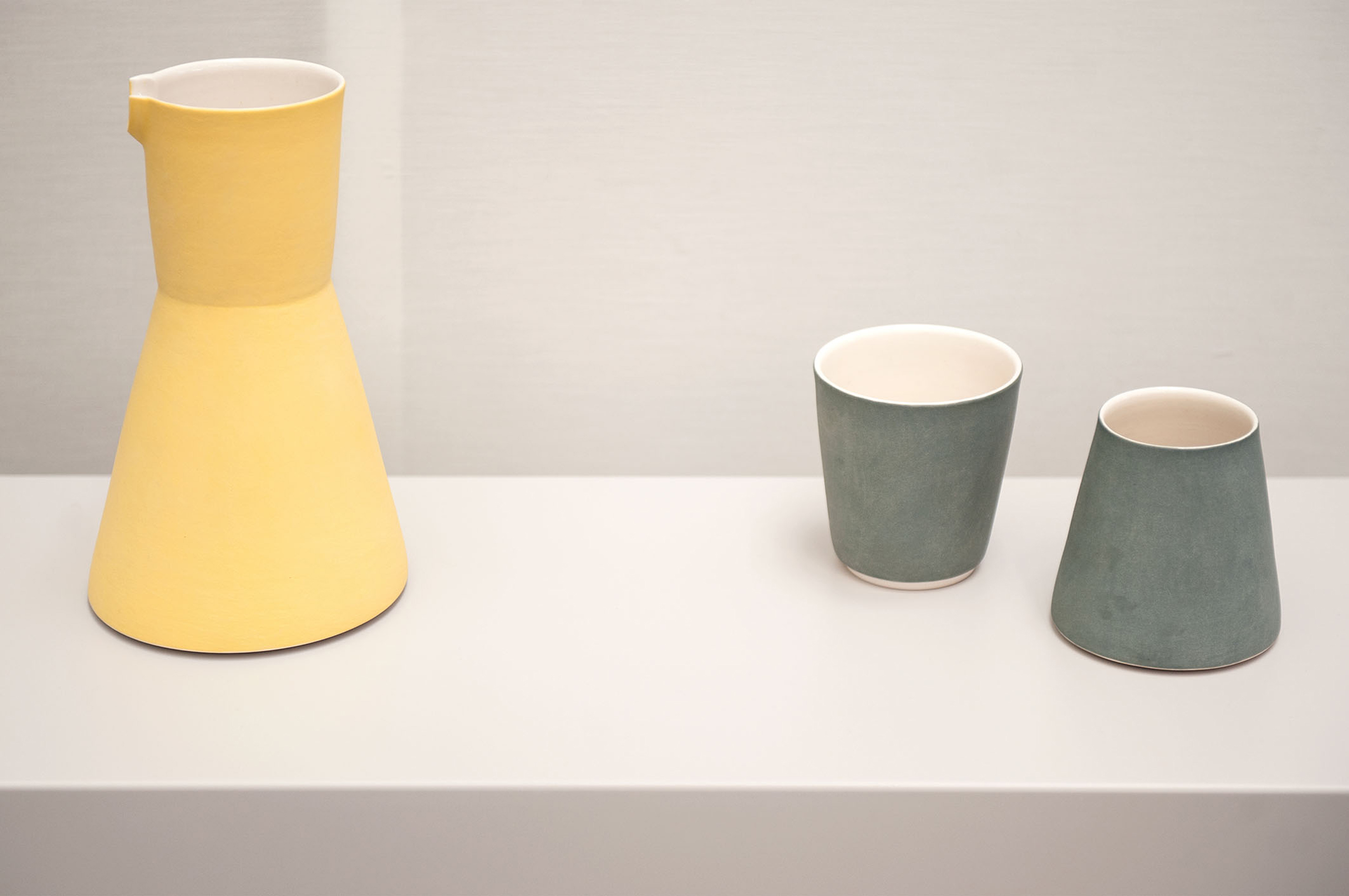
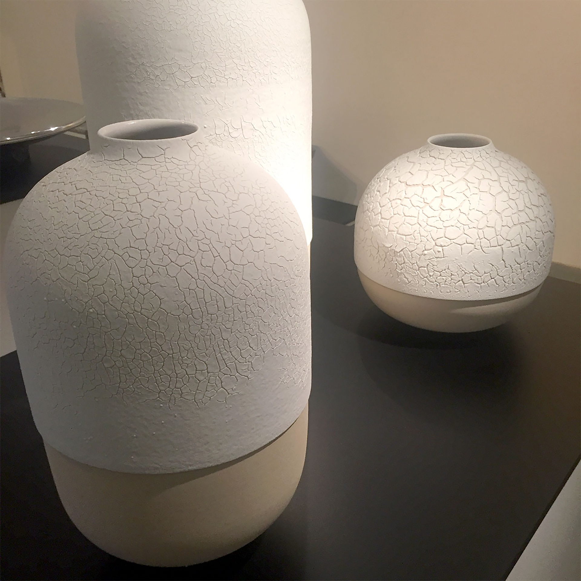
below> dutch designer floris wubben has been turning ceramic techniques on their heads since his extrusion machine made ceramic vases by forcing clay through templates like play-doh. his latest collection involves removing layers of glaze with a blowtorch between firings.
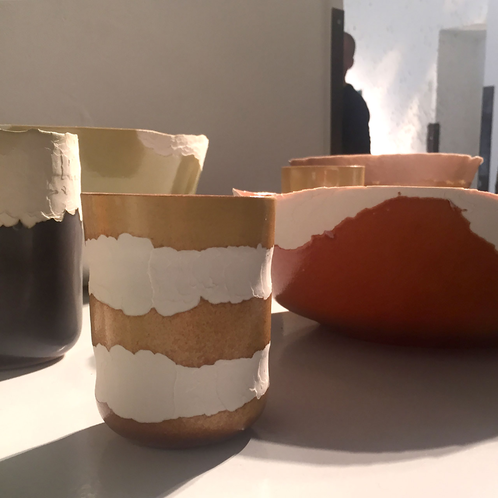
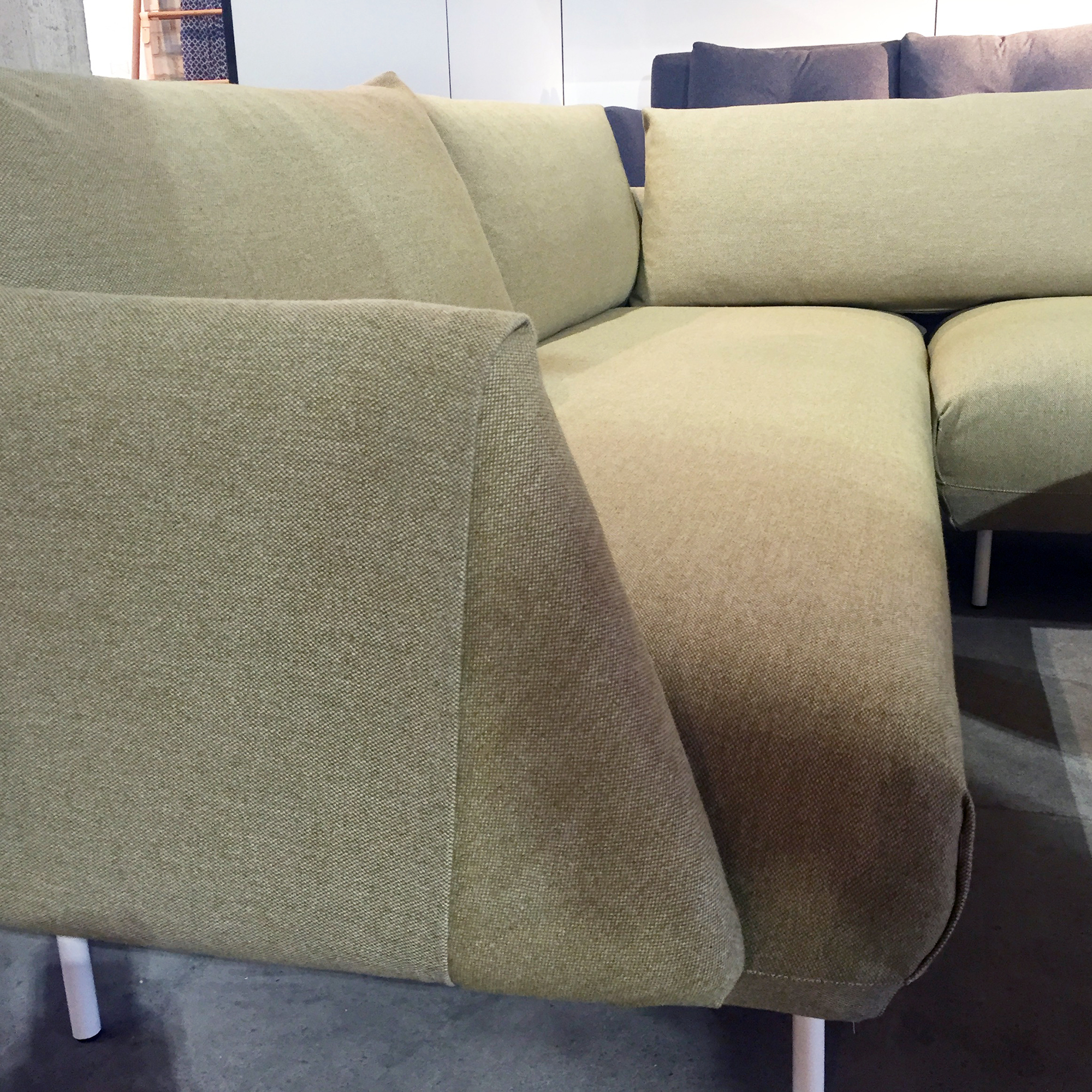
some of his experimental extruded pots have now made it into production and are available for sale in the rossana orlandi shop.
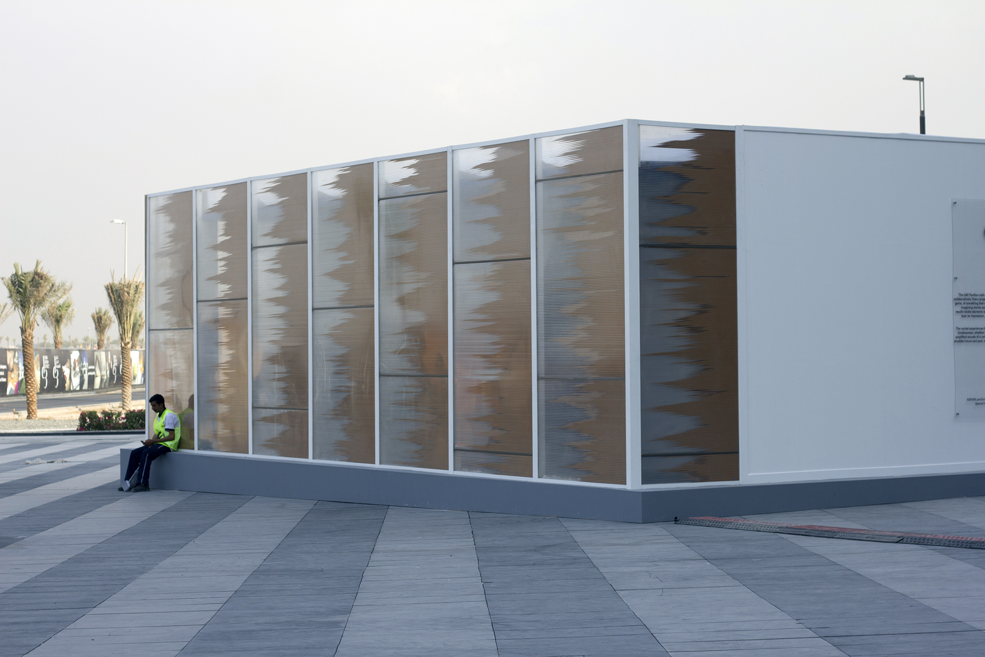
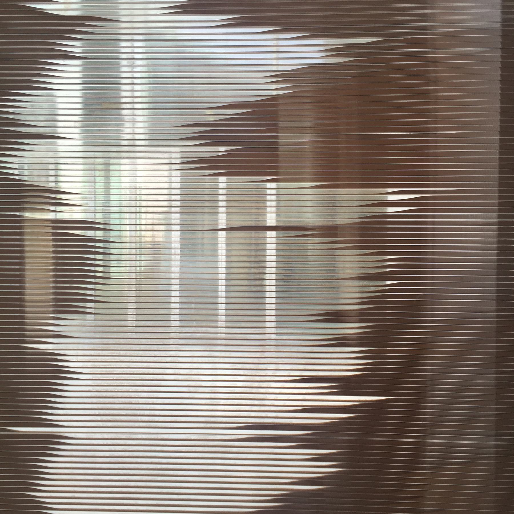
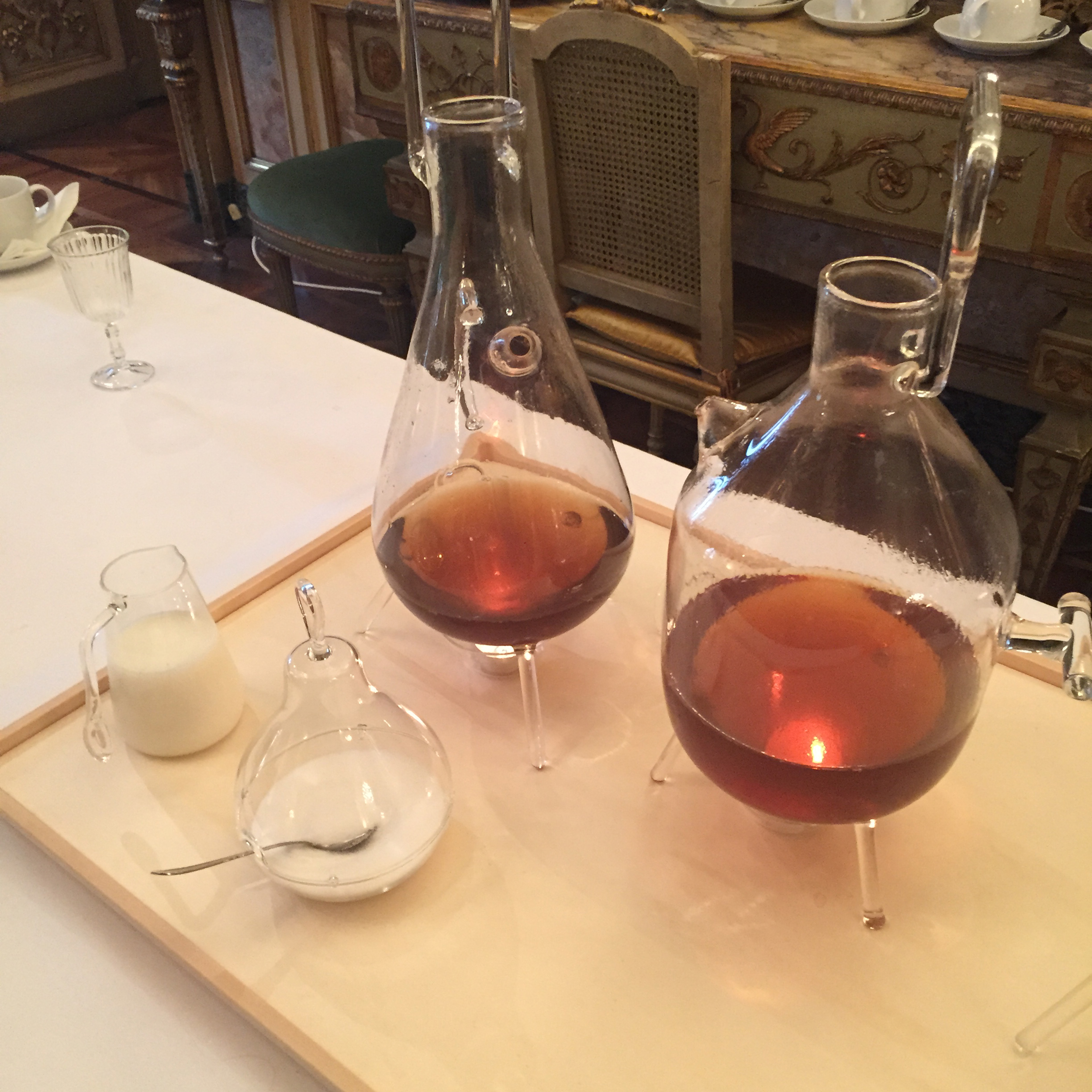
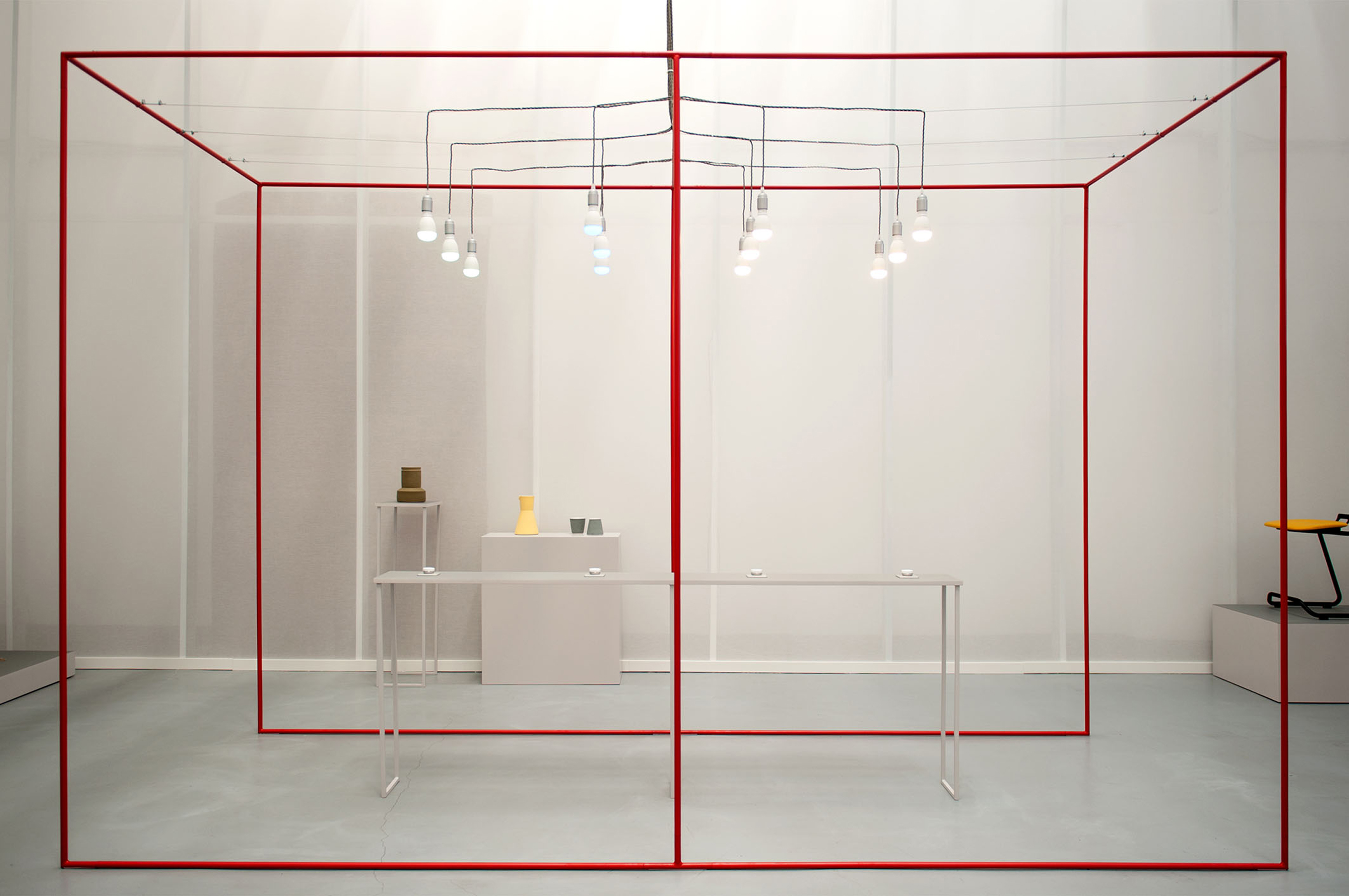
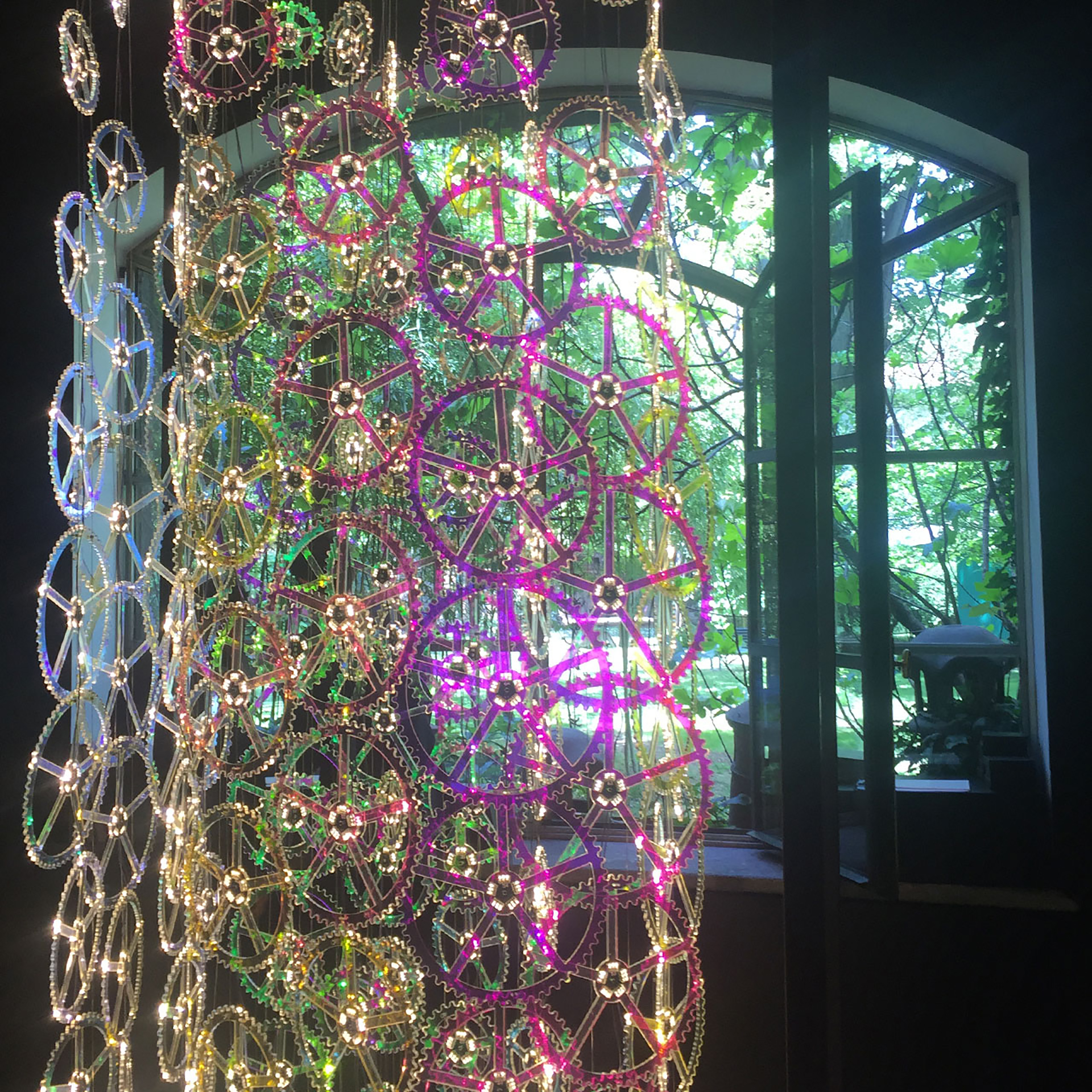
below> light in time was a stunning installation by moritz waldemeyer for sports watchmaker panera. “the creation of the artist comes to life through an interplay of light and material,” said a statement from the brand, and the sun-lit location proved them right. the iridescent petrol-lie color turned out to be one of the key color trends in milan.
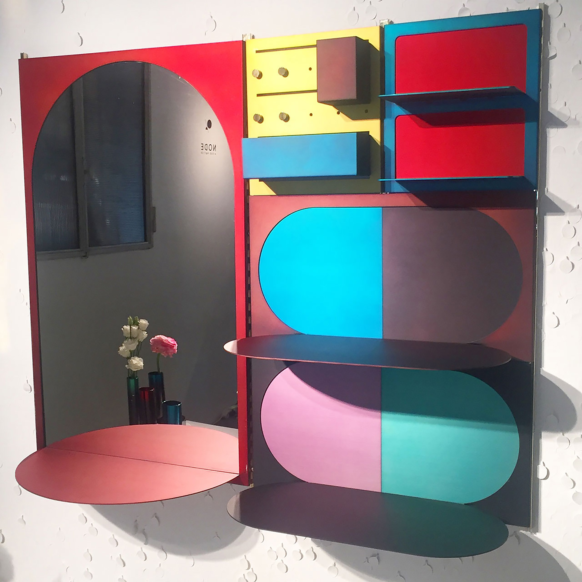
umzikim and kyuhyung cho designed the robbot shelf in response to their concerns about the future – limited natural resources and the impact of artificial intelligence. “however, no matter what comes our way, we’ll never give up on creating breathtaking moments, because our aesthetic capabilities and imaginations are what make us human,” they say. the robbot shelf enables users to create their own combination of modular components to make something that meets their needs and reflects their personalities.
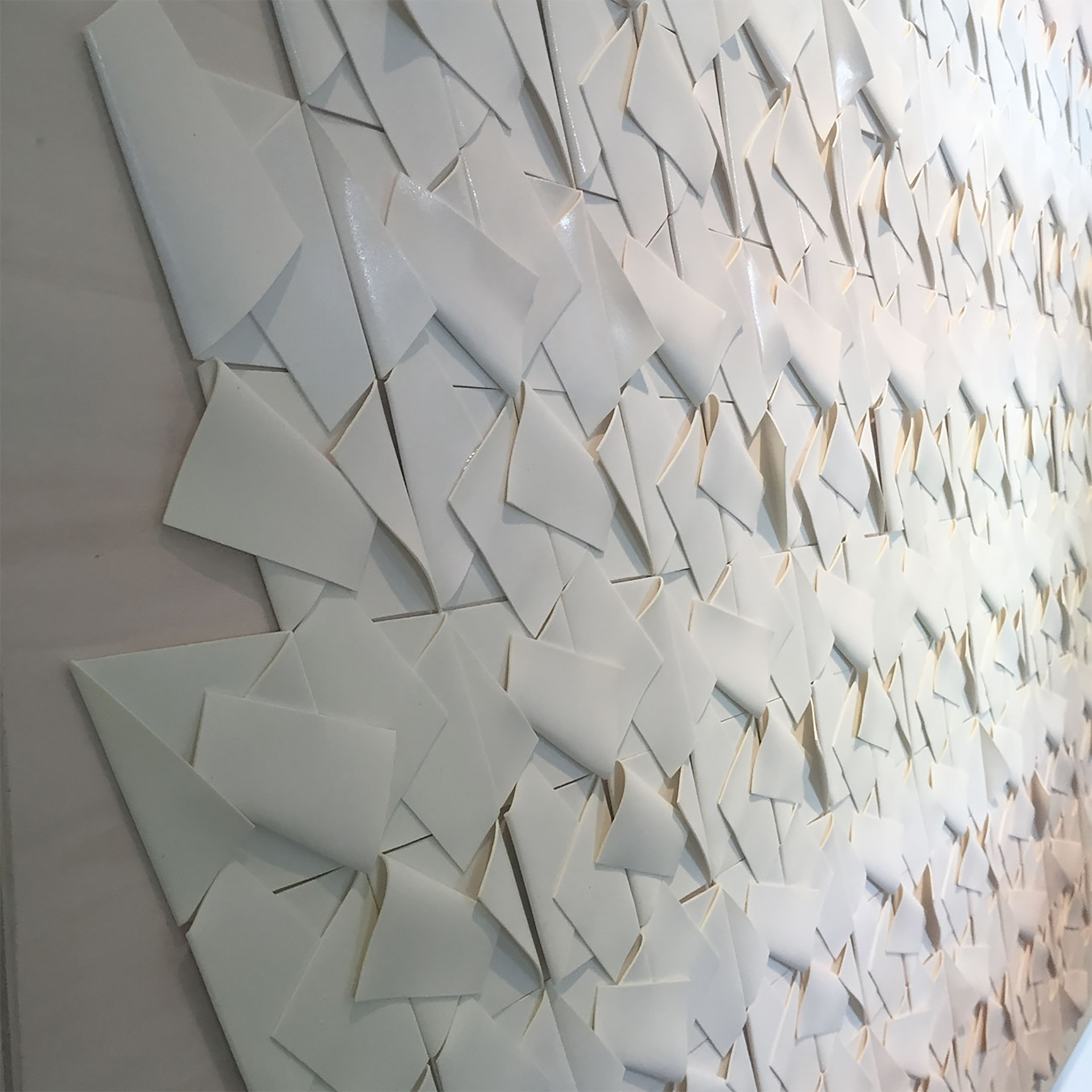
below> the handmade atacama vase by josefina munoz and peter fink was part of an exhibition entitled i dream of luxury curated by nov gallery after an open call to emerging swiss designers to interpret the concept of luxury for the future. munoz and fink encapsulated their collection in the phrase: “i dream of perfect flaws.”
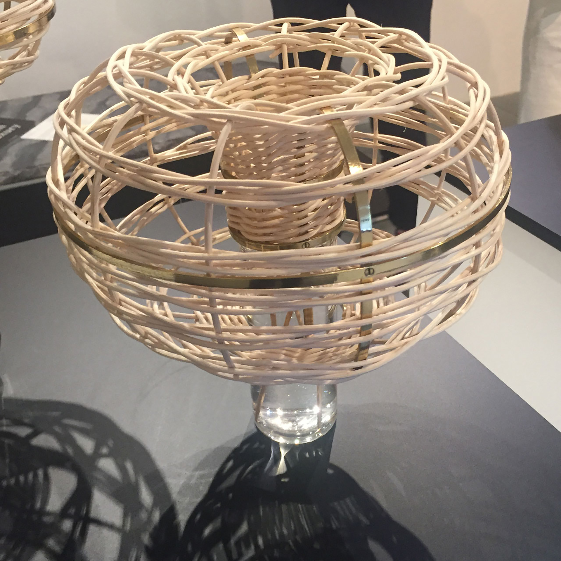
another piece in the same exhibition was volutes, a fragrance dispenser made of ratten, brass and glass by anouk eva-meyer. “i dream of scent as a memory” was the phrase given by the designer to explain her work. ratten and brass were also two key materials seen right across milan design week this year.
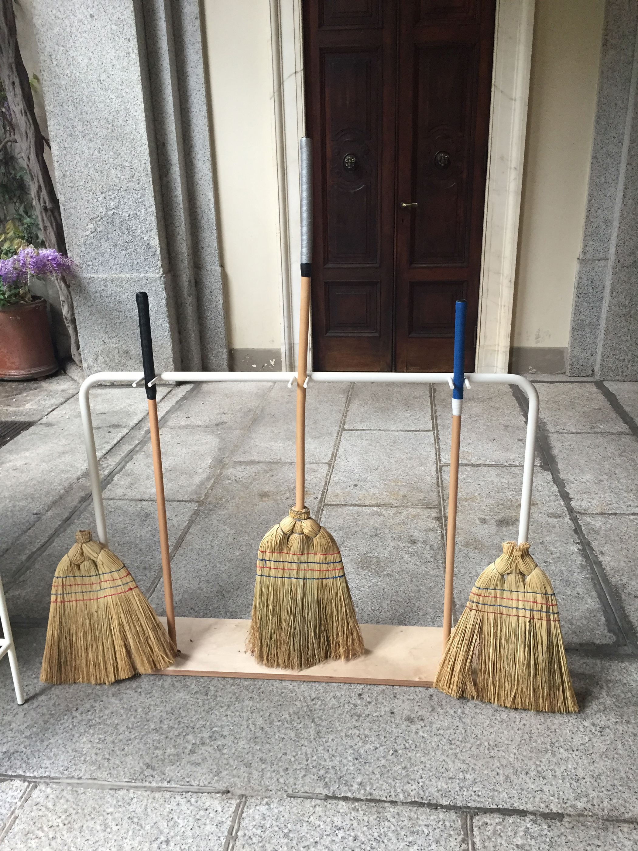
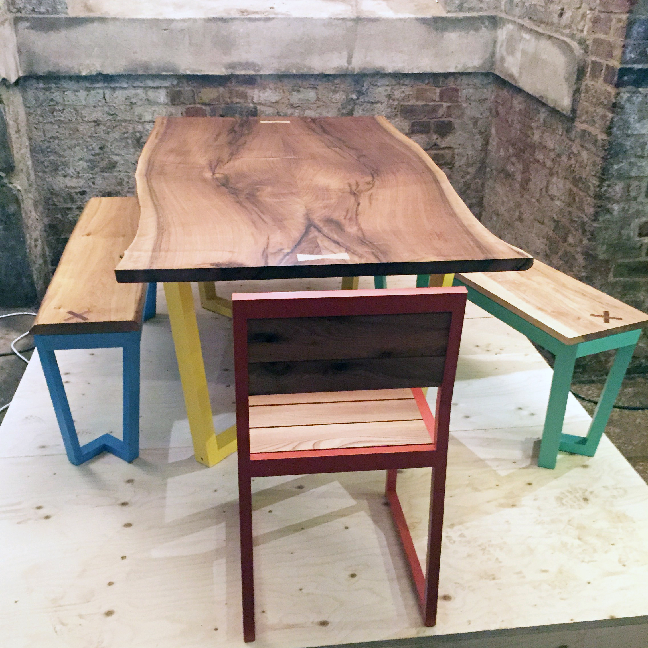
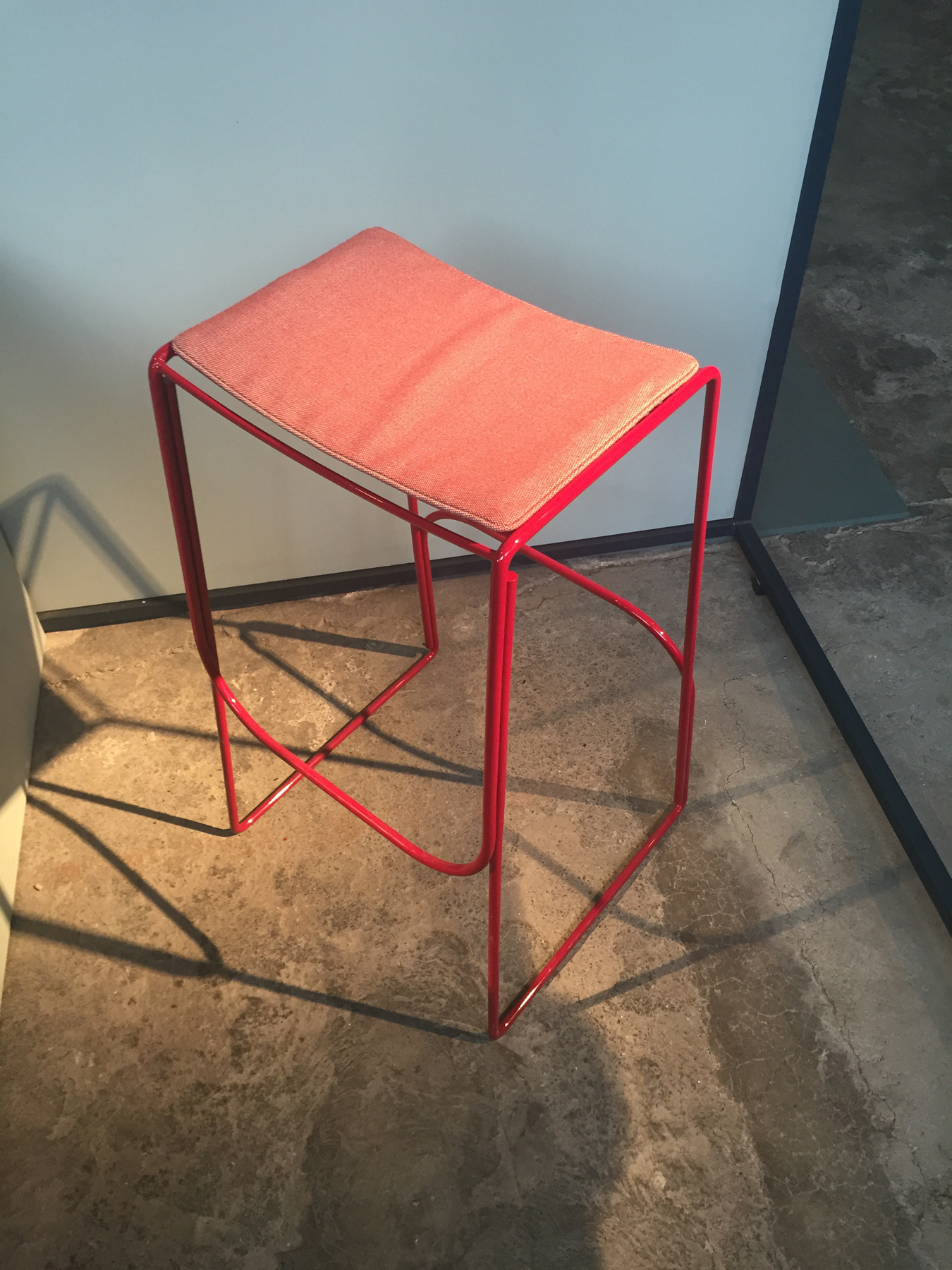
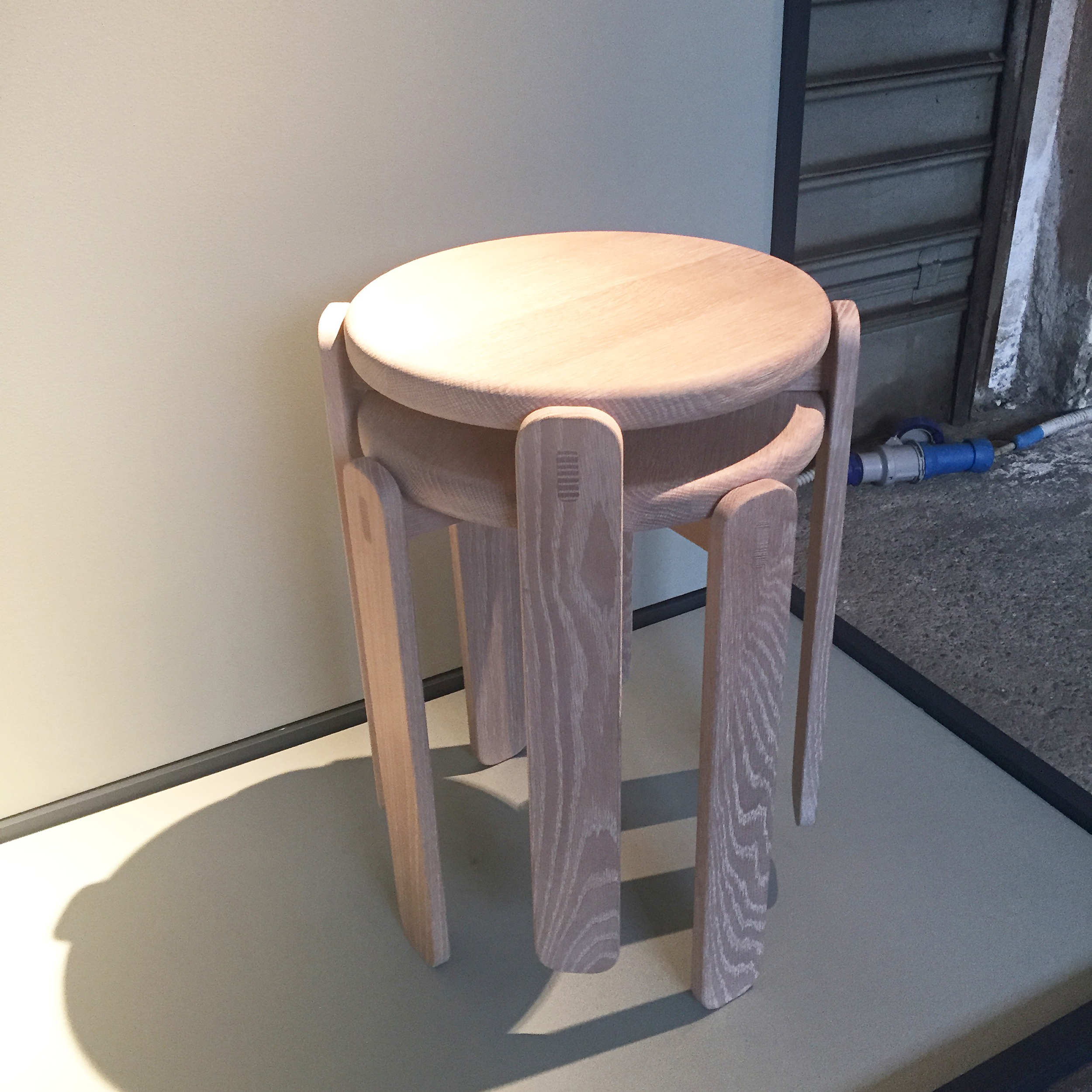
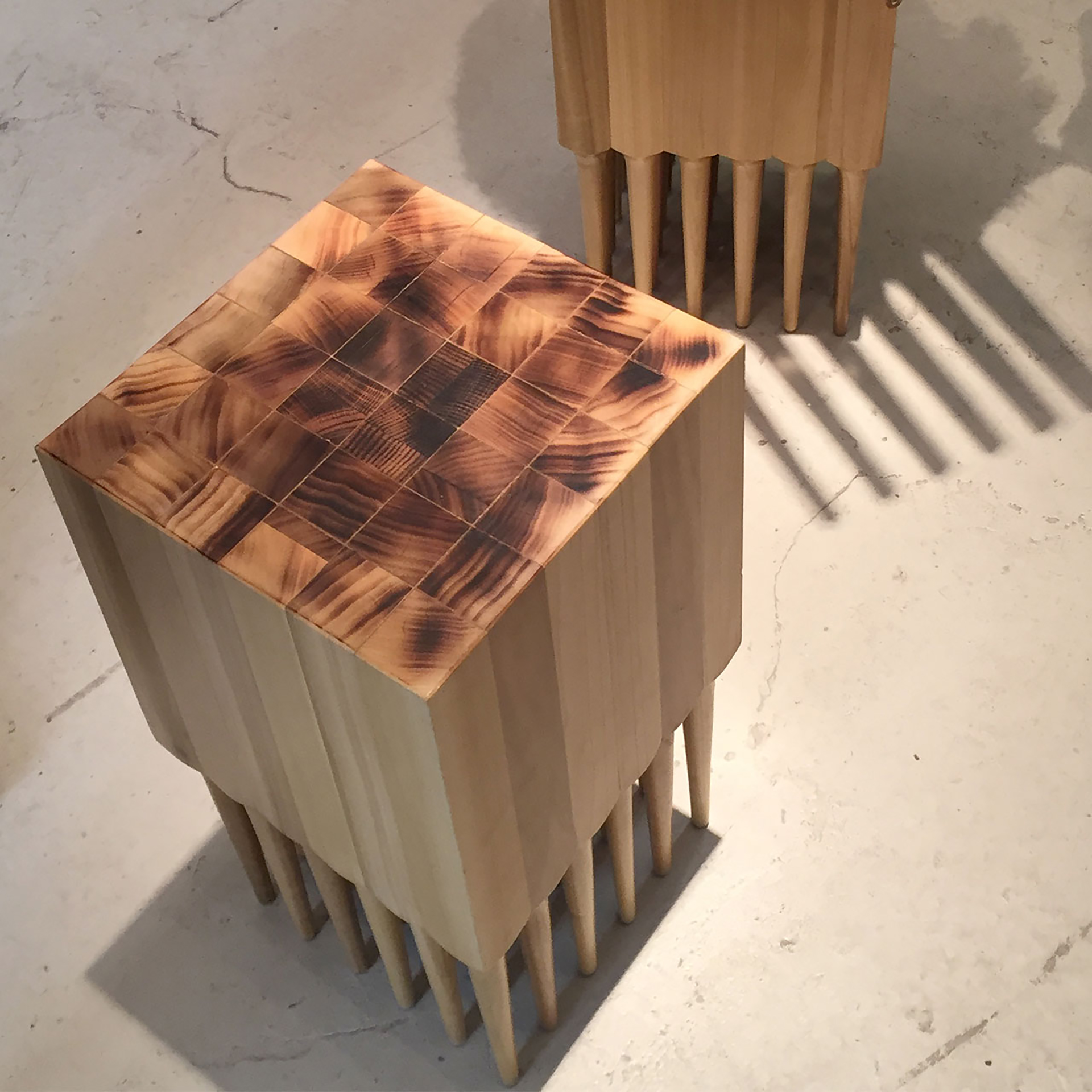
below> jacks-up by sungjun kim is a stool made entirely of turned poplar wood legs, inspired by the collective effort it took to raise the briggs hotel in downtown chicago in 1866. that year was the starting point for all the pieces in an exhibition by the school of the art institute of chicago (saic)’s whatnot studio, to celebrate the school’s 150th anniversary.
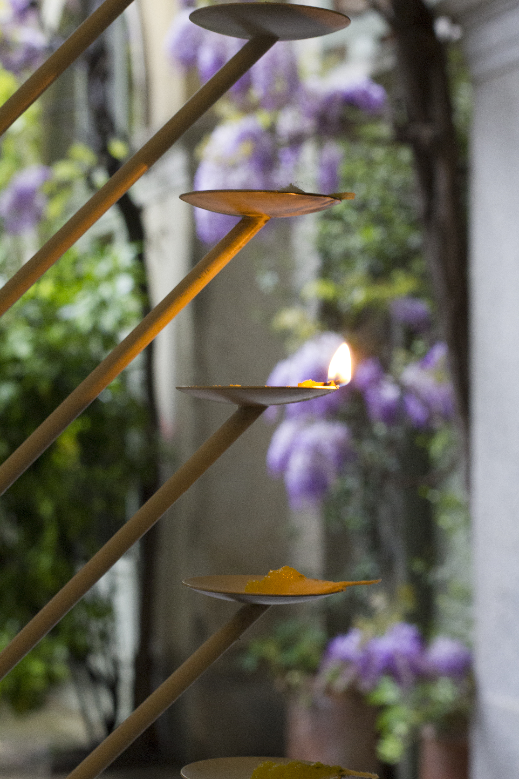
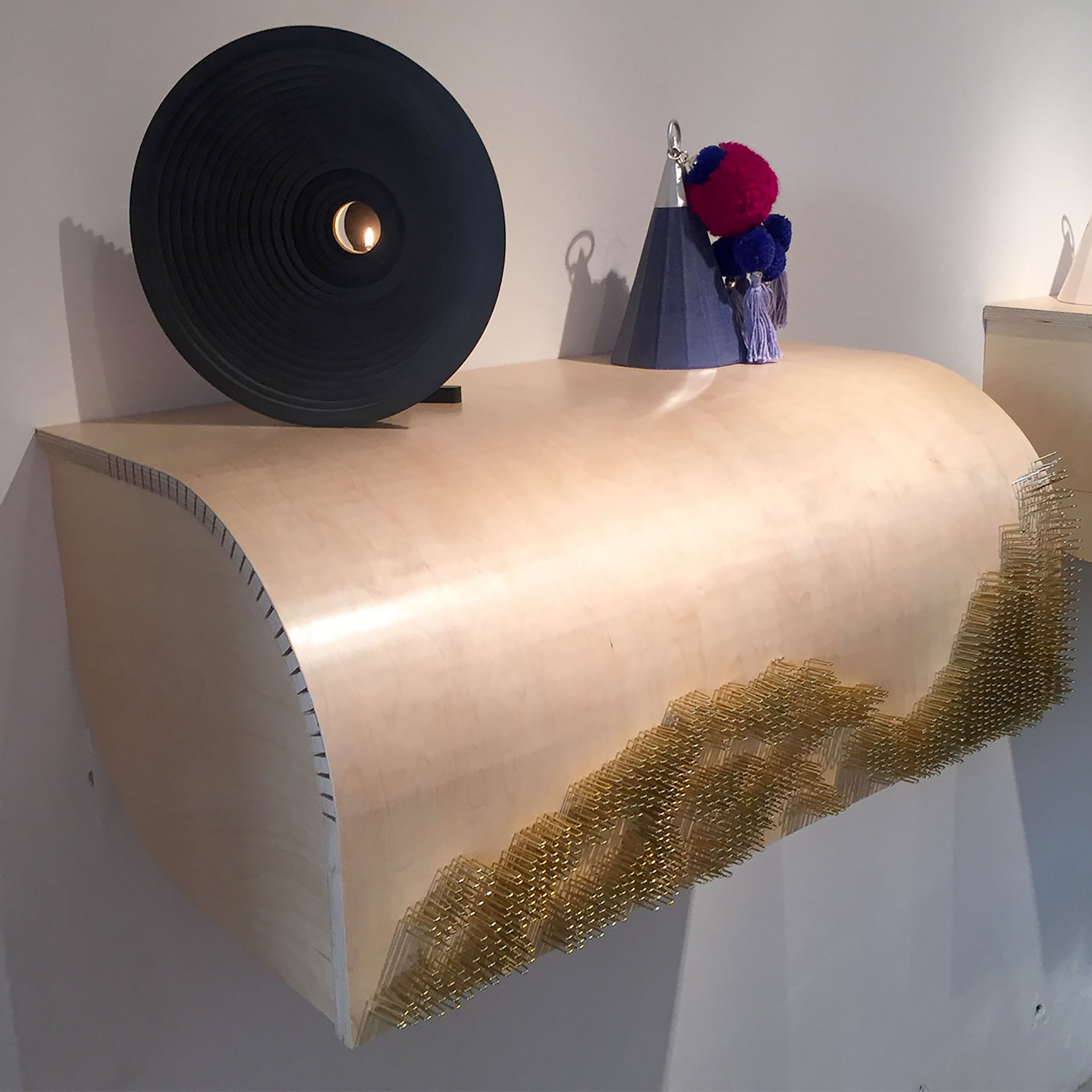
below> other pieces in the exhibition included the oil lamp with light diffuser by ali keshmiri – an oil lamp designed to focus attention on the flame; and allele by shau heng li – a stapled plywood table (staples and plywood were both commercialized in 1866), inspired by mendel’s law in which functional elements mutate into decorative abnormalities.
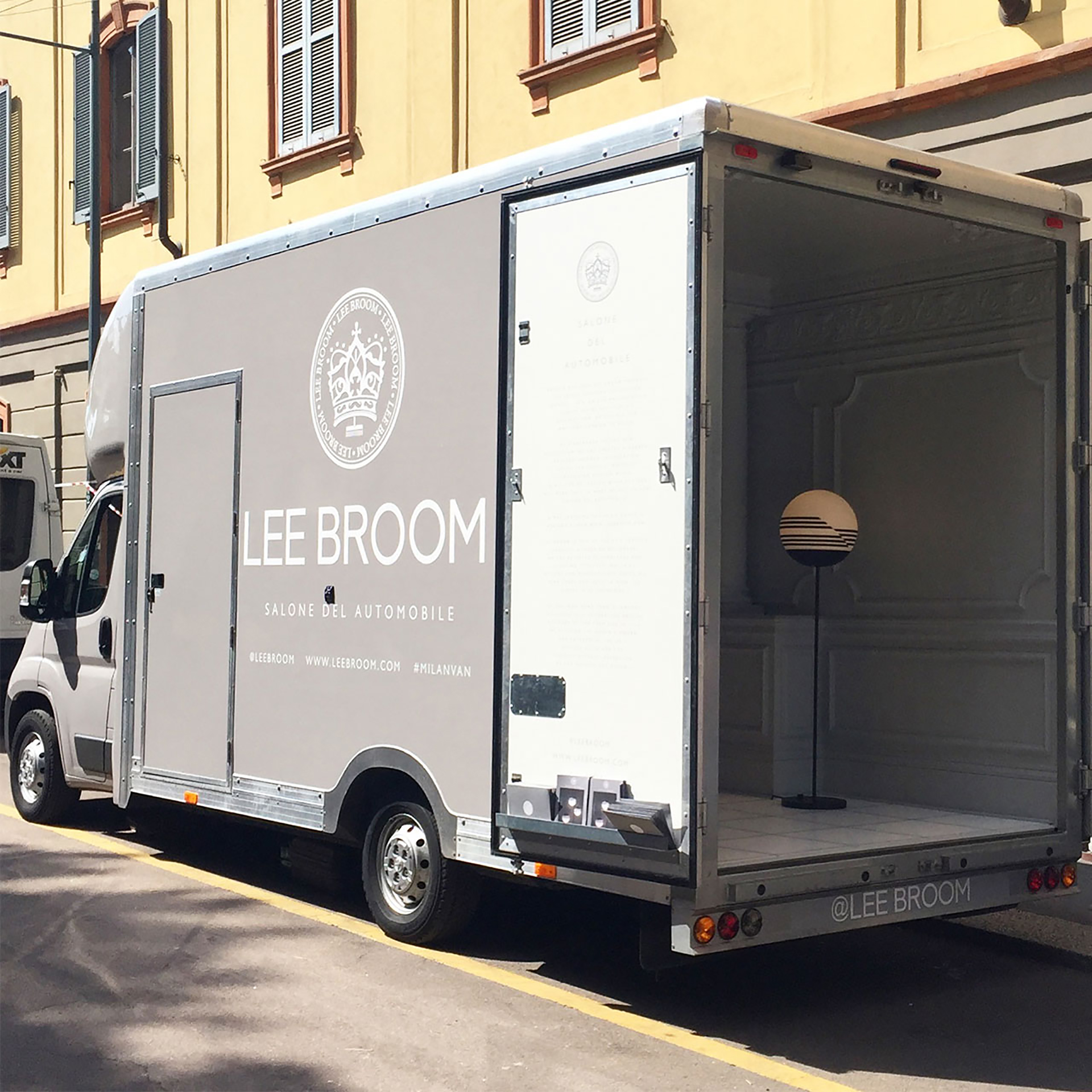
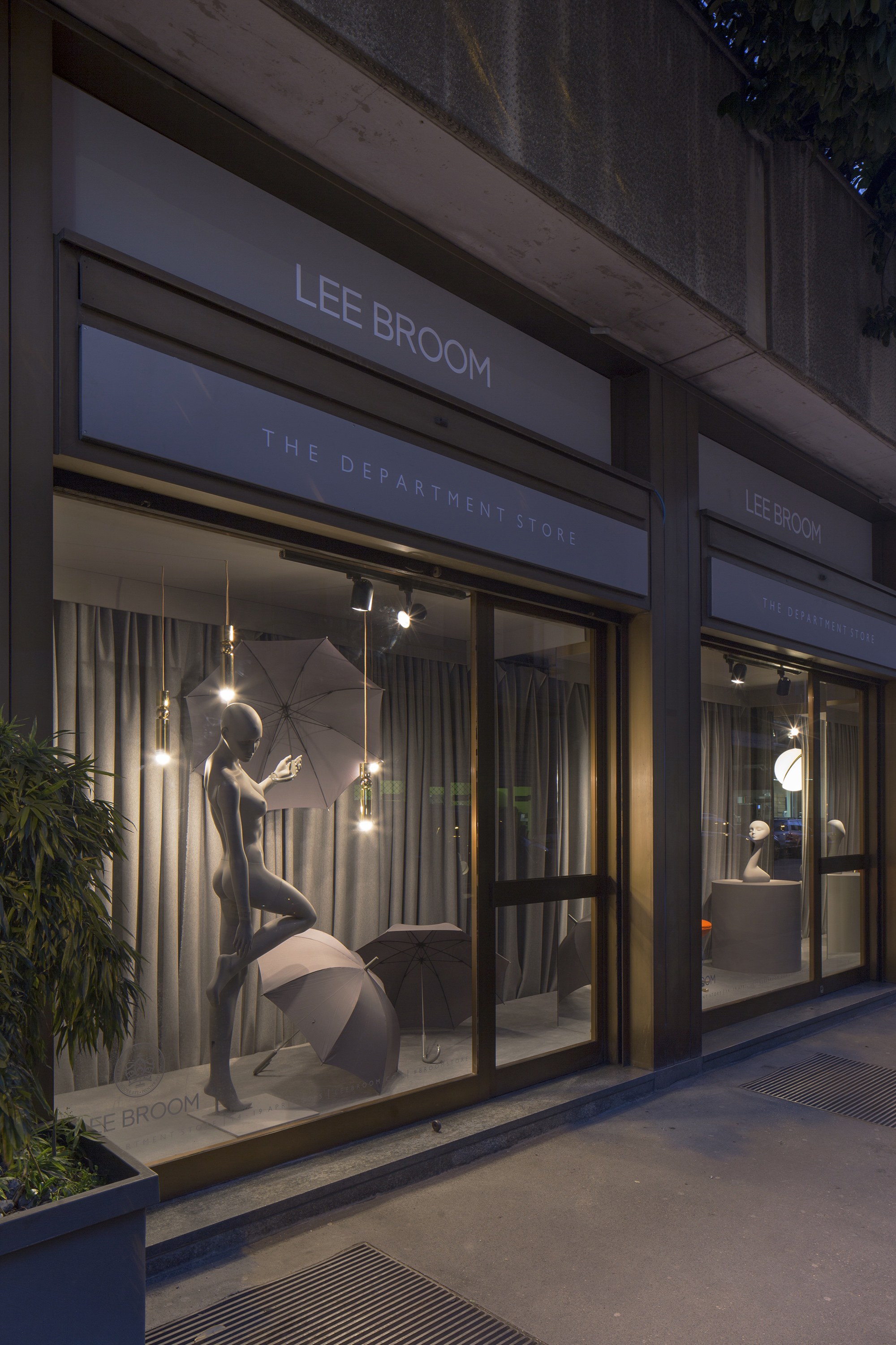
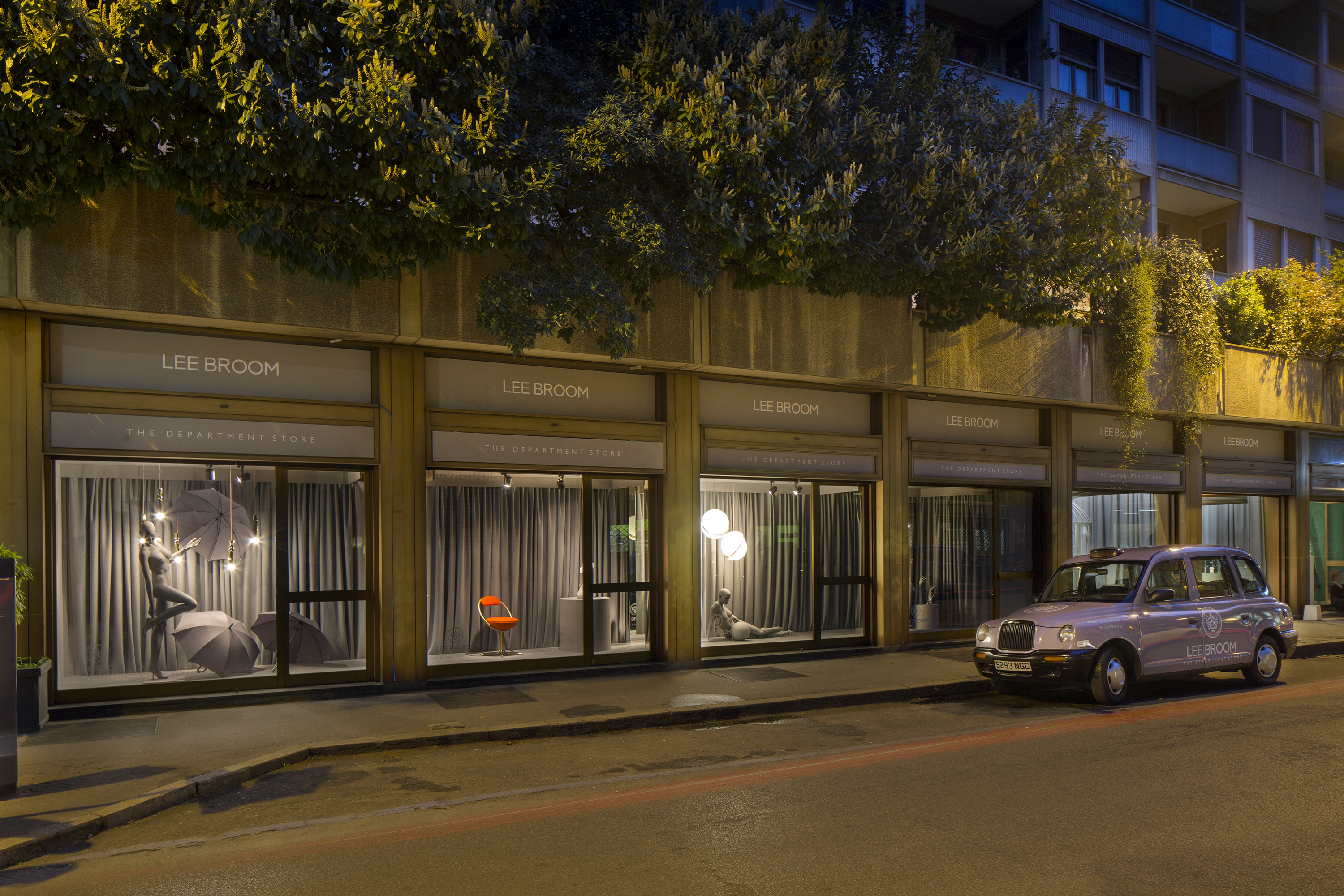
finally, we spotted lee broom’s salone del automobile parked up outside – a stroke of genius by the british designer, the van moved from location to location throughout milan design week bringing design to the people.