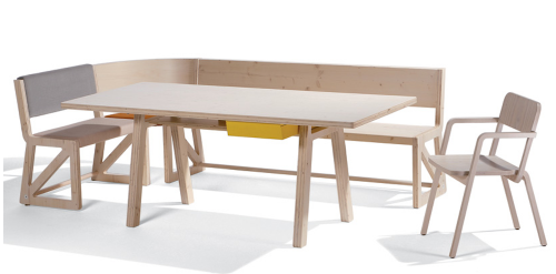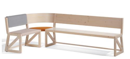
German designer Alexander Seifried named his latest furniture collection Stijl after De Stijl, the Dutch art and design movement that advocated “pure abstraction and universality by a reduction to the essentials of form and color.” Traditionally De Stijl-ers focused on vertical and horizontal lines and used only primary colors in addition to black and white. That’s a bit limiting, and though I appreciate the rigors of De Stijl, black, blue, red and yellow furniture doesn’t exactly assimilate very well into too many homes nowadays.
Fortunately, Seifried didn’t think so either. His Stijl collection updates white to include raw birch wood and black to include shades of gray. Added bonus? It’s something of a BIY (build-it-yourself) unit. The main component is a desk with a bright yellow drawer. When you add any combination of the chair, seat, bench and corner bench piece, it becomes a dining table. If you buy two of each seating elements you get a full circle of seats. What’s Dutch for wunderbar? (Okay, I couldn’t help looking it up: prachtig!)


about perrin drumm

Much of Berlin-based furniture designer Johanna Dehio‘s work is inspired by make shift structures. Wandwinkel, or Wall-Angles, is a two-legged side table that “requires only the correct inclination and support of a wall.” Similarly, Kleiderstiele, or Clothing-Sticks, is a coat rack that’s really more like experimental furniture; Hangers are attached to long rods that lean up against the wall, pinning your jacket there until you need it again.
One piece that doesn’t require ample wall space is Dehio’s clever Hockberbank, or Stool-Bench. It does, however, require a little user participation. The system consists of several wooden planks with circular cut-outs that fit over stools. If you only need seating for two, simply take the two-seater plank and stack the other stools. If you need four, or want two three-seater benches, just make the combinations and store the rest of the system. The planks are so lovely you don’t even need to tuck them away in your closet. If Dehio’s other designs are any indication, I’d suggest leaning them against the wall.


with its 3-in-1 construction that allows a chair to fold out into a table and back down again into a diminutive, space-saving side table, “grand central” earns its name.
Designed by Sanna Lindstrom and Sigrid Stromgren, “Grand Central” is yet another inspired piece of furniture to come out of the recent slew of design shows happening all over the world. Lindstrom and Stromgren’s work is currently on display in the “Ung 8” exhibition of 22 young Swedish designers at the Stockholm Furniture Fair. Much of their previous work isn’t as strong conceptually as “Grand Central,” but that’s not a negative thing to say. It’s exciting to watch new designers on the brink of finding their own niche in the great big world of design. With “Grand Central,” Lindstrom and Stromgren are finally there.
designer: sanna lindstrom and sigrid stromgren

about perrin drumm
 put a spin
on the overworked woodsy trend with jason phillips’ log stools ($322).
Cast from original tree stumps, the stools are available in gold or silver leaf. They add the perfect amount of pizzaz to a room without going over the top.

But maybe bling isn’t your style. You might like Jasper Morrison’s stools for Vitra instead ($405). Made of 100% cork, they’re not only sustainable (the cork used is limited to 9 year harvest cycles so that the same tree can be harvested for generations) but their simple lines, muted color palette and attention to materials gives a perfect nod to our Danish modern forefathers.
log stools:
cork stools:
designer: jason phillips
designer: jasper morrison

about perrin drumm


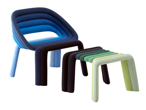
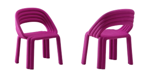
Milan 2009: Casmania and designer Luca Nichetto collaborate.
Nuance is a new concept of the padded seat, in two sizes: one for use around a table and a “lounger” that’s lower and larger with an ottoman combination. Nuance combines a strong visual and ergonomic concept of “hand made” which gives added value to the object while the focus is on reducing waste.
