• CALENDAR
    • Add Your Event
  • architecture
    • art & literature
    • awards
    • buildings
    • sustainable
    • prefabricated
    • public space
    • residences
    • urban planning
  • design
    • art & literature
    • awards
    • collectables
    • concept
    • fashion
    • sustainable
    • home
    • lifestyle
    • safety & special needs
    • transportation
    • workplace
  • editor’s pick
    • featured
    • gift ideas.
    • interviews
    • opinion
  • events
    • auctions
    • competitions
    • conference & Exhibitions
    • fairs
  • news
    • latest news
    • elsewhere
    • lifestyle
    • people
    • producer
    • retailer
DesignApplauseDesignApplauseyour daily design dose
  • CALENDAR
    • Add Your Event
  • architecture
    • art & literature
    • awards
    • buildings
    • sustainable
    • prefabricated
    • public space
    • residences
    • urban planning
  • design
    • art & literature
    • awards
    • collectables
    • concept
    • fashion
    • sustainable
    • home
    • lifestyle
    • safety & special needs
    • transportation
    • workplace
  • editor’s pick
    • featured
    • gift ideas.
    • interviews
    • opinion
  • events
    • auctions
    • competitions
    • conference & Exhibitions
    • fairs
  • news
    • latest news
    • elsewhere
    • lifestyle
    • people
    • producer
    • retailer

som

Home Tag som

2021 chicago architecture biennial collateral projects.

Oct 6, 2021

the 2021 chicago architecture biennial announced more than 100 city-wide cultural partners that will present programming in coordination with this year’s chicago architecture biennial, the available city, which will take place from 17 september 18-december 2021 at locations across the city. the 2021 edition will present ideas and possibilities for vacant urban spaces, activated with and for local community groups in collaboration with designers

above > courtesy som

designed and fabricated by som and the university of michigan taubman college of architecture and urban planning, the pavilion is an open-air learning lab and gathering space for a school in chicago’s south shore. led by professors tsz yan ng and wes mcgee, the splam [spatial laminated timber] pavilion showcases the potential for prefabricated timber.designed and fabricated by som and the university of michigan taubman college of architecture and urban planning, the pavilion is an open-air learning lab and gathering space for a school in chicago’s south shore. the product of a multi-year creative collaboration between skidmore, owings & merrill (som) and university of michigan taubman college, led by professors tsz yan ng and wes mcgee, the splam [spatial laminated timber] pavilion showcases the potential for prefabricated timber. “automated manufacturing technologies enable us to precisely and efficiently prefabricate a kit of parts which can be delivered to the construction site on demand, leveraging skilled labor where it is most effective in the process,” ng and mcgee said in a statement.

neighborhood: south shore
address: epic academy / 8255 south houston avenue, 60617

/////

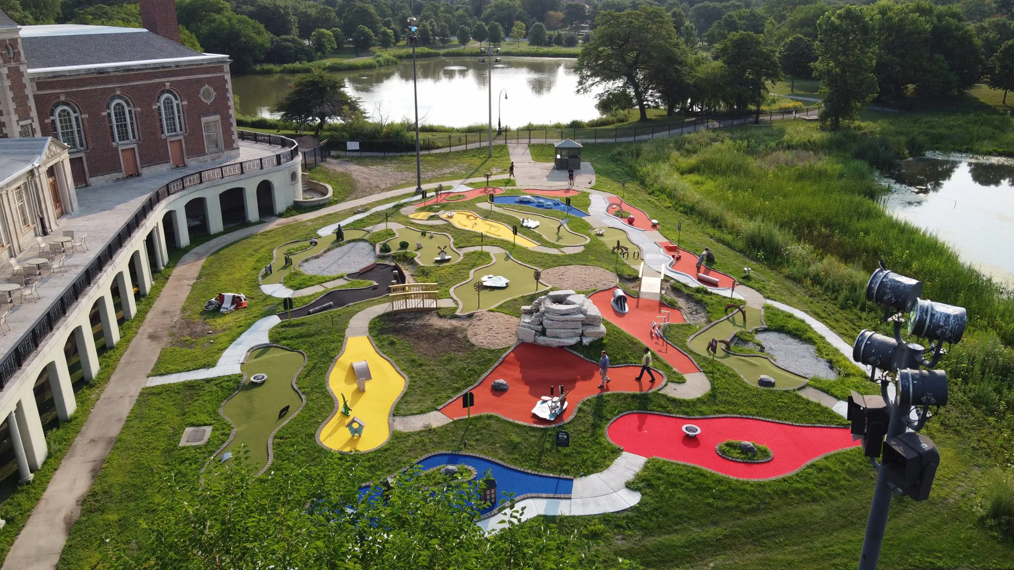
the douglass 18 miniature golf course redesigned with a theme of bird conservation opens in north lawndale, a project by the lincoln park zoo and community partners with the support of the chicago park district.

above > courtesy nathan loevy

/////

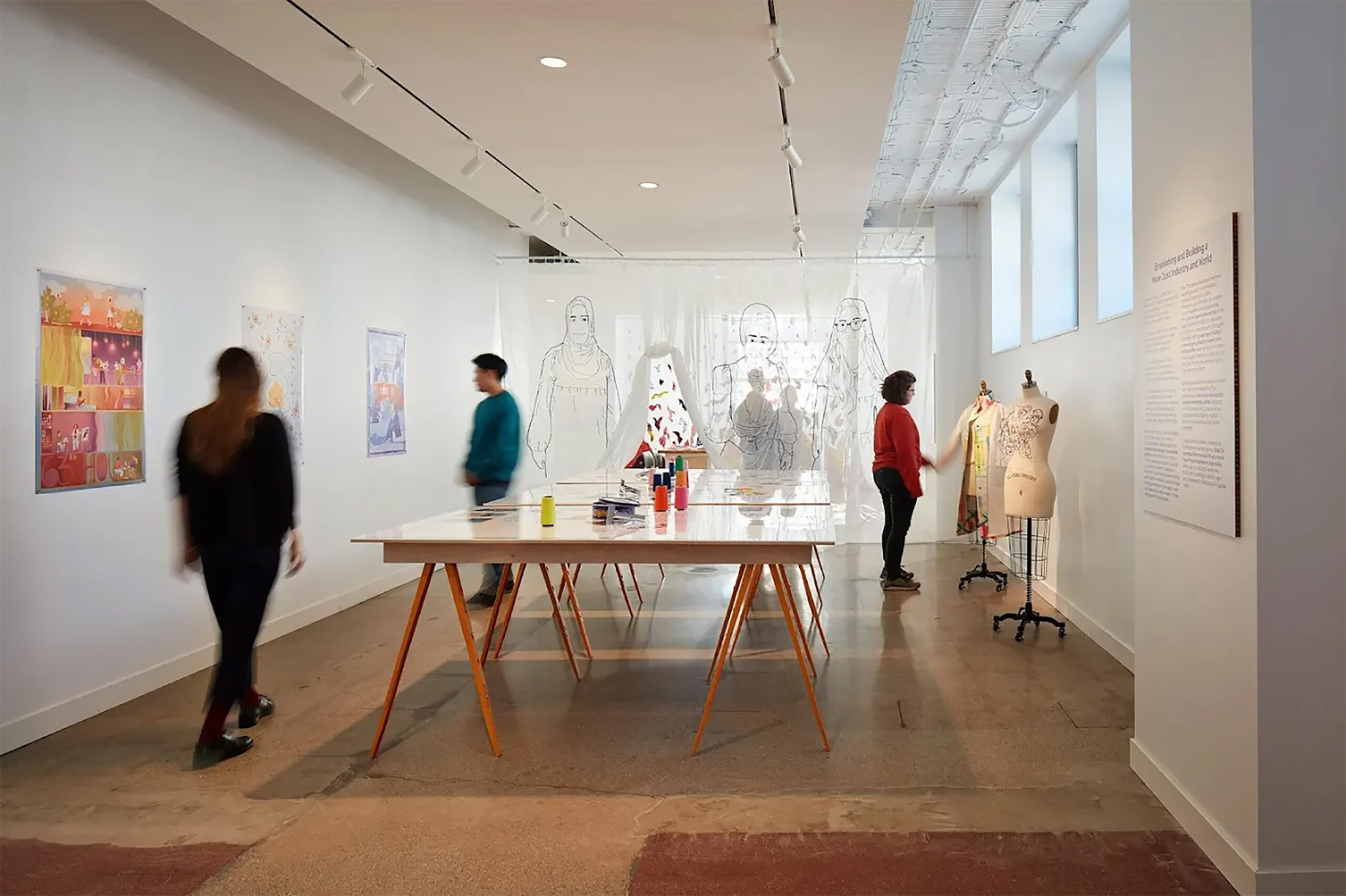
above> courtesy studio gang

a collaboration with blue tin production and studio gang creates two inaugural happenings: an exhibition — a different future in the making: building garment worker power & a broader abolitionist movement; and blue tin production’s corporate office — 63rd house. a third element includes the opening of studio gang’s new gallery space in wicker park where this exhibition debuts. that’s quite an announcement!

the opening of the gallery coincided with the opening of the 2021 chicago architecture biennial (cab), where studio gang was a partner.

[ the exhibition ]

a different future in the making shows how these questions are being explored by blue tin production, the first apparel manufacturing worker co-operative in the us run by immigrant, refugee, and working-class women of color. materializing blue tin’s radical model and vision using the tools and techniques of garment work, this exhibition also reveals how the co-operative is seeding greater change through their newest project: 63rd house, a community space and manufacturing studio in chicago lawn designed by studio gang.

what can bottom-up, systemic change look like in the garment industry—and beyond—when exploitation and violence are replaced by community and care? and what role might architecture and design play in this transformation?

on view
20 november 2021 > 11 february 2022
studio gang gallery
neighborhood: wicker park
address: 1520 west division street chicago
[ details ]

[ 2021 chicago architecture biennial overview ]

the shortlist announced for ohare international airport renovation.

the shortlist announced for ohare international airport renovation.

Nov 15, 2018

above > the foster epstein moreno jv proposal

the city of chicago recently announced a $8.5 billion renovation of o’hare international airport including a new terminal that will be the centerpiece of the largest expansion in o’hare’s history.

to jump-start this vision, twelve global architectural firms were asked to submit proposals including danish architect bjarke ingels, studio fuksas of italy, chicago firms, gensler, hok, perkins + will, and chicago architect helmut jahn, who designed the stunning terminal 1 which opened in 1986.

a shortlist of five firms are highlighted below. two design contracts will be awarded: the winning team will design the global terminal and concourse. the second-place finisher is expected to design the satellite concourses. the eight-year project, made possible by the end of a 35-year lease with the airlines, would be paid for with future airline fees, and therefore would not require taxpayer dollars.

[ design objectives ]
> expand terminal and gate space
> replace aged infrastructure with state-of-the art systems
> introduce new technology and security innovations
> integrate domestic and international to create a seamless passenger experience
> enhance the passenger experience
> incorporate sustainability and enhanced accessibility features
> reflect the legacy of chicago’s innovation, architecture, and it’s diversity

[ scope of work ]
> increasing the airport’s overall footprint from 5.5 to 8.9 million sq ft.
> tearing down 55-year-old terminal 2 and creating a new global terminal
> adding 25% gate capacity at existing gates to accommodate larger aircraft
> increasing gate count from 185 to 235
> adding two new remote satellite concourses
> adding a tunnel to a new parking facility foreshadowing a future new terminal
> renovating terminals 1,3, and 5

while affirming the 14 project design objectives and scope of work expectations DesignApplause considers the heart of this project is replacing a 55-year-old terminal with a cutting-edge architectural solution that’s categorically a part of every world’s-best discussion.

[ uniquely different ] two concepts stand out: studio ord features ample neighborhoods and greenspace not seen elsewhere in terminals. foster epstein moreno jv boasts a world-first column-less concept under an extraordinary shell with a span of 550 feet.

[ wow factor ] one concept dominates: foster epstein moreno jv a space that pushes the limits of technology and truly lifts the spirits.

[ pro vs con ] what stands out…only one concept with zero con: foster epstein moreno jv.

[ shortlisted firms ]

above > the fentress-exp-brook-garza joint venture’s globally-minded terminal design for chicago provides an elegant, spacious, and sustainable gateway to connect chicagoans and the world with speed and efficiency. soaring spaces sparkle with sunlight and lift the human spirit. daylight and spatial composition guide passengers intuitively and purposefully. the latest technological advances shape a smart, seamless, comfortable, and unencumbered experience. from arrival to departure, every element of the new terminal is crafted to elevate the passenger, making their journey inspiring, engaging, stirring, and fun. our vision is to return the romance of air travel to all who pass through chicago’s o’hare.

above > foster epstein moreno jv / a joint venture led by foster + partners and chicago-based firms epstein and moreno. our design is based upon a sequence of memorable and distinctive spaces that create a gateway to chicago with architecture that is open, transparent, inclusive, welcoming and functional, in turn resolving the sophisticated security, airport and airline requirements in a way that meets the needs of both employees and passengers. three arches frame the landside of the building, merging into a grand single arch on the airside, thus dissolving the barrier between inside and out and allowing the spectacle of the airfield to be visible to all who pass through the gateway, and recapturing the romance associated with air travel.

above > studio ord / chicago is a city defined by motion; confluence – of our river, of trail networks, of railroads – has shaped our most vibrant civic spaces. studio ord’s elegant and efficient design for the o’hare global terminal and global concourse unifies the airport’s campus by converging seamless lines of motion across three terminals around a spectacular central oculus. this confluence becomes orchard field – a vibrant neighborhood that combines abundant green spaces with distinctive landmarks, bespoke retail pavilions, and diverse activity zones. richly layered and easily navigable, it captures the unique character of chicago and redefines o’hare as a 21st century international destination.

above > som / we have delivered global excellence in this great city, shaping chicago’s skyline, neighborhoods and public realm for more than 80 years. it’s said that our chicago buildings turn “pragmatism into poetry.”

our elegantly undulating o’hare global terminal aims to be the world’s best, through optimal functional planning, great design, and keen practicality – all quintessential chicago qualities.

we infuse the muscular heritage of chicago architecture and engineering with many lessons from the natural environment, to increase human comfort, save energy and define a distinctive sense of place. this can be chicago’s next great building and our new gateway to the world.

above > santiago calatrava, llc / o’hare’s global terminal by santiago calatrava is a masterwork of modern terminal architecture. with a glass façade and dramatic shell-like roof soaring over the approach road, the building unifies the terminal complex while establishing itself as its centerpiece.

inside, vaulted, light-filled spaces celebrate both the grandeur and simplicity of bygone travel as customers move easily to and from gate areas enlivened by chicago-focused concessions in an airy, park-like setting.

convenient links to adjacent terminals, satellite concourses, and public transit support a future vision plan that transforms the area opposite the terminal into a vibrant hotel, retail and business complex.

somewhat unusual is the jury is not being disclosed, not even to the architects. please stay tuned.

celebrating 20 years of the guggenheim bilbao museum

celebrating 20 years of the guggenheim bilbao museum

Nov 1, 2017

above> 3d drawing of the guggenheim museum

please join mas context and skidmore, owings & merrill (som) on wednesday, 1 november, to celebrate the 20th anniversary of the guggenheim museum in bilbao. this event will be a unique opportunity to learn first hand about the making of one of the most important buildings of the end of the twentieth century. the event is part of mas context’s 2017 fall talks series and it will take place at the offices of som in chicago.

designed by frank o. gehry & associates, the guggenheim museum was a feat of design and construction. the use of digital modeling, including the now famous catia, and other innovations opened the door to a new generation of architecture that defined in the beginnings of the twenty-first century. the chicago office of skidmore, owings & merrill (som) served as the structural engineer for the building with bilbao-based idom as the local engineer. it was a unique collaboration that proved to be a major success.

to commemorate the 20th anniversary of its opening, john zils, associate partner emeritus at som, will discuss the work of som in the project while bill baker, structural and civil engineering partner at som, will discuss the guggenheim museum in relationship to the engineering work that has been developed in the office in the last two decades.

iker gil, editor in chief of mas context, will kick off the event by providing an overview of the transformation of the city of bilbao, from the challenges it was facing to the situation 20 years after the opening of the museum.

the transformation of bilbao was documented in the issue 30-31 of mas context. among the contributions, the issue features an interview with john zils. you can read the issue here

the exhibition som: engineering x [art + architecture], currently on display in chicago and presented with mana contemporary chicago in partnership with the chicago architecture biennial, reveals the concepts and forms that stem from som’s integrated practice of engineering, art, and architecture. details

mas context is supported by a grant by the graham foundation for advanced studies in the fine arts and by private donations. for information about how to support mas context details

mana contemporary announces som exhibition for 2017 chicago architecture biennial.

mana contemporary announces som exhibition for 2017 chicago architecture biennial.

Sep 10, 2017

mana contemporary chicago has announced that a new pop-up exhibition, titled som: engineering x [art + architecture] presented in partnership with the chicago architecture biennial and ace hotel chicago as a partner for special programming, the exhibition will run through january 7th, 2018.

for more than eight decades, som has explored the poetics of structure through continual examination and experimentation. the exhibition reveals the concepts and forms that stem from som’s integrated practice of engineering, art, and architecture. through hand-drawn sketches, interactive sculpture, immersive video, and a lineup of more than 30 structural models at 1:500 scale. the exhibition gives insight into som’s practice, past and present, as it seeks to address physical and environmental challenges with concise and honestly expressed solutions.

the exhibition surveys som’s long tradition of collaboration with visual artists and showcases models, drawings, and ephemera from projects created by pablo picasso, james turrell, jaume plensa, james carpenter, janet echelman, and iñigo manglano-ovalle. som: engineering x [art + architecture] explores the idea that engineers, architects, and artists alike practice a poetry of inquiry, experimentation, and ingenuity.

the exhibition is sponsored by sterling bay and terry dowd, inc.

trump tower chicago’s new provocative signage is now national news unfortunately.

trump tower chicago’s new provocative signage is now national news unfortunately.

Jun 24, 2014

above> alex garcia tribune photo

Donald Trump is a lightning rod. Now Trump has made Adrian Smith‘s, architect at Chicago’s SOM, emblematic Trump Tower Chicago a lighting rod. The issue went public three weeks ago when Chicago Tribune architecture critic, Blair Kamin, architecture critic of the Chicago Tribune, jumped all over evidence of new signage in-the-making. Trump responds and it went back and forth prompting mayor, Rahm Emanuel to weigh in, “a tastelss sign”. Trump finds a need to say, ‘I love chicago…and my sign ‘. These happenings now national news, Jon Stewart can’t contain his get-real sentiment either.

trump-sign-early1

above> about the time kamin went public

Let me weigh in from my own experience with this building and two others regarding signage. In 2002, when Trump was looking for marketing proposals I was asked to create a concept for @Properties. The concept: Create two books, a graphic coffee table piece and one with strategies and numbers. @Properties was wildly successful though a very new company. A humongous building in their portfolio would not be a bad thing. The thrust of the concept was jumping into the future, as if @Properties had already won the Trump Tower job. @Properties deftly pitched it but didn’t get the job. Solace was achieved by Trump’s marketing team loving the creativity and boldness of the pitch, it was one of the best. We walked feeling we won and thinking Trump hired a great architect and they would not mess up.

Trump_Tower-from-riverwalk1

above> trump tower from river walk | image courtesy som / click to enlarge all images on this post

An uh oh moment occurred at the time Santiago Calatrava‘s brilliant and ambitious Spire was looking like it might happen. Under construction at this time, Trump’s building was looking good too. Also at this time, The Spire began placing beautiful marketing signs along both north and south Michigan Avenue. Really understated, as elegant as the building. But then, more signs popped up, freshly mounted in the sidewalks. 10 large bullet-points… Trump Tower is coming.

Trump_Tower-SW-&-NW-Elevations1

above> trump tower sw/nw elevations | image courtesy som

trump_tower-ground-plan1

above> trump tower ground plan | image courtesy som

Trump_Tower-abstract-render1

above> trump tower abstract rendering | image courtesy som

Trump Tower’s new signage comes as no surprise, though very disappointing that someone, didn’t feel the collaboration between Trump and Smith created a magnum opus capable of saying all the right things on its own. The building’s design calls out for more than all cap fatso letters that seem slapped on the facade. Recently faced with the dilemma of marketing their new State Street store and respect Louis Sullivan‘s building Target figured it out by placing all messaging inside the structure and not on it.

Not many know this story about the John Hancock Center. In 1969, three years prior to my arrival as a designer at The Design Partnership‘s signage partner Mabrey/Kaiser, Bud Mabrey with the help of SOM’s Bruce Graham, the designer of JHC, persuaded John Hancock Insurance to eschew any signage, that a brightly lit observation deck would be all the identity that this building needed. [ interesting jhc tidbits ]

trump-hancock1

above> bruce graham’s john hancock center | 1969

trump-cna2

In 1973, again Bud Mabrey and again with the help of the architect, Graham Anderson Probst and White, enticed CNA Financial Corporation to paint their building red. The concept, the red design was used to depict the sun setting over the ocean as illustrated by the red imagery to the west of Lake Michigan. And again, no building identification signage except on the plaza. A sign was eventually added more than 20 years later.

Now the CNA building really has no business being in this conversation, too short, a non-existent brand image, but it does belong with the Hancock Center in the big concept arena. Big concepts don’t mean success and huge concepts go so unnoticed because they may be very open to interpretation. It may take someone next to you to set you straight. But you gotta love their conception, the pitch and execution. I would have praised Trump if he had topped the building with a ‘big concept’ oversized toupée instead.

trump-timessquare1

above> developer’s proposal for 300 north michigan avenue

Times Square. The above image surfaced late last year for 300 north Michigan avenue, which is SOUTH of the river and not the Mag Mile. This stretch is becoming known as the Millennium Mile. Yes, a Times Square style will make its way to Chicago. Only if it’s very profitable for the city though. Guessing State Street not Mag Mile suits this format best. Mag Mile is our Madison Avenue. Confident Rahm Emanuel will support the right thing [ Chicago places ads on really public spaces ]

Michael Bierut, Pentagram partner and DesignObserver co-founder said this, “What’s interesting about Times Square is that there are special signage regulations that ensure that every new building has to have big signs on it. They were put in place in the late 80s when there were proposals to replace the older buildings with new (and boring) corporate buildings. Now there are a lot of new skyscrapers there but they are covered with flashing signs. Trivia point: Tibor Kalman helped develop the standards, working with architect Robert A.M. Stern.”

527-ronscope200about ron kovach

Contact Us

We're currently offline. Send us an email and we'll get back to you, asap.

Send Message
DesignApplause

your daily design dose

Follow Us


about us
contact/help
privacy policy

ADVERTISEMENT

LATEST NEWS

  • lissoni new york introduces lissoni architecture.
  • ford switches gears re most dramatic auto business model switch in your lifetime.
  • expo chicago 2023 discovers artists that embrace architecture and design.
  • a man for all reasons brit architect/designer david chipperfield wins 2023 pritzker architecture prize.
  • the beginning is the most important part of the work. hello 2023.

All content ©2007 > 2022 DesignApplause