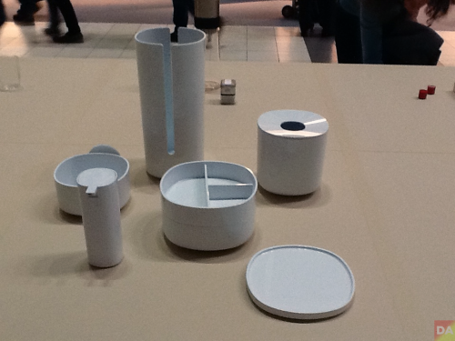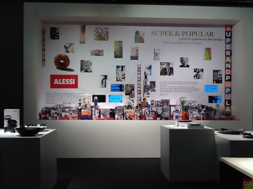

wrap #1 quite simply is a collection of products seen at ambiente and also at the international home+housewares show. the common denominator is all received design recognition at ambiente. we are expecting these products to also be recognized at Discover Design and the innovative products display. above > birillo | pierro lissoni | alessi //// winning but not pictured is cutlery set ‘mu’ | toyo ito | alessi below > super & popular | package design mario trimarchi //// a tribute to alessi’s most acclaimed small household objects many of which won design awards.


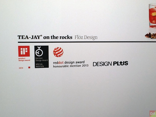
above & below > tea-jay on the rocks | flöz design | blomus //// offering possibly the most enjoyable tea-making you’ve experienced.

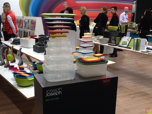
above > nest storage | joseph joseph //// solving the problem of storing the storage when not in use below > wash&drain //// video covers it.

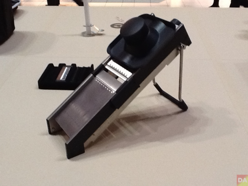
above > michel bras mandoline //// offering form power and safety | kai below > gg flip & fold | oxo / smart design //// video covers it.
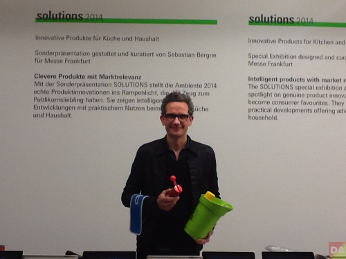
below > london designer sabastian bergne holding a red ‘rachet grinder //// winning but not pictured is rachet cheese grater both by kuhn rikon. the rachet concept is both innovative and functional.

[ alessi ] [ blomus ] [ joseph joseph ] [ kai ][ kuhn rikon ] [ oxo ] @ambiente #Ambiente13 @HousewaresShow #IHHS2014 #DiscoverDesign
 click > enlarge
Most everyone goes to the show to view the goods. We do too. But we conceived this post to showcase the presentation of brand and object. And we failed in execution, in part because we started our booth documentation at the end of our list of things to do. Next time, looking at presentation is going to be first item on our list. Though the booth and the object relies on one another in presentation, we separate the task of evaluating the object and evaluating the booth.
Here are several examples from this show. Most are from the exhibitors who were showcased in this year’s Discover Design competition. Most are small companies with few products and presentation is an easier task.
The criteria:
* how visible is the booth from afar
* how visible is the brand itself
* how special are the goods presented
* how well does the booth shield the viewer from visual distractions
* how creative is the booth concept
 medium-sized booth. we liked this booth last year too
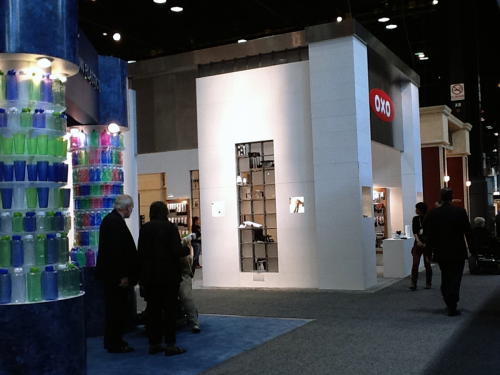
 large totally contained oxo booth
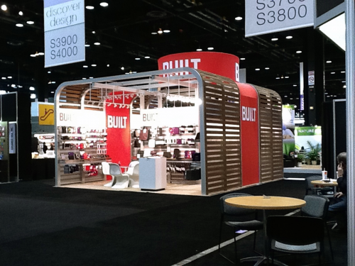
We do like white in most product presentations but Built makes it work with wood.
 wins iron-pansy award
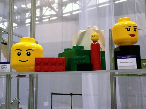
Room Copenhagen has visual knockouts Lego and Pantone, among others, and present these objects on boxes covered with brown carpeting. Shown here on the Discover Design display, not the booth. They do much better next year.
 rare example of objects presented with and without the packaging
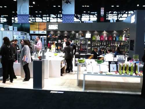
JosephJoseph a bit over zealous with quantity in this mid-size booth. But it’s well-organized and they present the object with and without the merchandising packaging. They also get best product award so there you go.
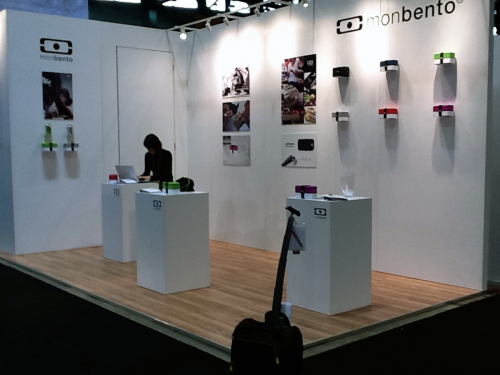
 guessing most minimal booth in mccormick place.
Monbento plays it cool. The glass vase on right is a best of show award. That’s our trolley in foreground junking up the image.
note: We intended to make mention of those booths that were not photographed but presented exceptionally well. But a photo is worth a thousand…next time. What’s it all mean? Well, a great product might not even come to this show and still be successful. The fact that the great presentations went hand-in-hand with the awards means little in this post. We were not being objective in this matter. And careful with the brown carpet.
 juicy salif | philippe starck | alessi | 1990 | click to enlarge
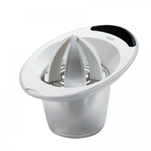
Two events prompted this post. Two weeks ago I went on a Bertrand Goldberg architectural tour. Two buildings in Chicago, four owners, all architects. Of interest, all four interiors might have been designed by one person, the furnishings were so similar, mid-century modern. Two of the four had the Salif on sparse kitchen counters. Our galley kitchen falls into the latter category. Anyone’s guess what kitchen tools were in their cupboards. The other event, we made grouper ceviche last weekend, an on-going experiment with different recipes so precise citrus measurements are required. We also have a juicer made for cooking, the OXO Citrus Juicer with a measuring cup as its recepticle. I purchased it directly from OXO when it won a design award in 2007.
 citrus juicer | oxo | 2007
Below are promising juicers selected with the following criteria: simple, manual or small electric that’s easily stored, lightweight output, and well-thought-out solutions with great aesthetics. Several in are in the collection of contemporary art museums. Several will have glitches, like the Salif, no problem for me but to Barbara it can behave like a sobriety test; the Orangin and Flash Lemonade Juicer can be a bit labor intensive to fill a quart IMO. Price range from $8 > $100.
[ links ]
bistro electric juicer | bodum
catcher | graeme davies | joseph joseph | 2009
citrange juicer | quentin de coster | 2010 ( seeds get stuck )
citrus juicer | oxo | 2008
citrus power juicer | metrokane
citrus squeezer | oxo | = http://www.oxo.com/p-463-citrus-squeezer.aspx
citromatic | braun = http://www.braun.com/global/household/juicers/multiquick-citrus-juicers.html
electric citrus squeezer | stefano giovannoni | alessi | 2003
flash chill lemonade maker | takeya
juicy salif | philippe starck alessi | 1990
mandarin citrus squeezer | stafano giovanninoni | alessi | 2001
my squeeze | alessi
orangin | jeren got | 2009
utilo lemon squeezer | blomus
vita juicer | innocenzo rifino / lorenzo ruggieri | bugatti

