 click > enlarge
Study after study shows that sitting all day long at a desk is bad for your health. It slows your metabolism, decreases your body’s ability to process sugars and fats, and even increases your chance of developing diabetes, blood clots or thrombosis. Men who sit for more than six hours a day have a 20% higher mortality rate, while women have a 40% higher rate – a factor, we might add, that can’t be counteracted by increasing your exercise. The only way to not die earlier, apparently, is simply not to sit down all day long anymore.
While newer offices are being designed for more flexible coworking environments that encourage movement, sometimes you just need to hunker down in one place and get a job done. The best solution designers are offering up so far is the standing desk. You can read more about how employees at companies like Mircrosoft, Google, the Mayo Clinic and the FBI are benefiting from a conversion to standing desks and walkstations (a slow moving treadmill-desk) in the Chicago Tribune‘s recent article.
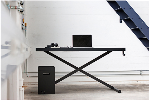
Before committing you can test it out by working at an ironing board or countertop, but once you’re convinced consider springing for the Xtable, an adjustable height desk designed by Danish studio KiBiSi for furniture manufacturer Holmris. You can manually raise and lower Xtable with a hand crank; the two crossing legs operate much like an ironing board. It comes with a floor organizer for your papers and pens, though it really ought to come with a matching, adjustable height chair.

about perrin drumm
 click > enlarge
Industrial designer Jordi Blasi specializes in minimal, practical and, most importantly, durable objects, like outdoor trash bins, large modular seating units and bottles for commercials products like beer, milk and tomato sauce. One of his most recent projects is Branca, a standing “simple and functional coat hanger” that you could use in your home, but its intended for more heavy duty repeated, daily use in an office.
The first thing you might notice when you look at all the components laid out (see image below) is that there’s not a lot there – only seven pieces: a painted steel body and base and hooks made of injected strengthened plastic. By eliminating excess components – even nuts, bolts and screws – Blasi not only simplifies the assembly process and minimizes the packaging, he makes it much more economical – a major factor for anyone outfitting an entire office building, for example. Plus, it’s not as if he sacrifices on design. I love how the hooks can be used as knobs or as loops for coat hangers.


about perrin drumm

Right on the heels of Apple’s announcement of its new office building in Cupertino, CA is Google’s new London HQ, designed by Penson. Is it just me, or does it look more like a really fancy dorm done up in futuristic 60s mod/pod style? I know Google treats their employees well (or so says my friend in San Francisco who gets a gym membership along with the job), but why is there so much lounge space in this office? If you scroll through the images you’ll see a room with padded, reclining benches and what I can only assume is an update on the bean bag chair – a dorm room staple. This is one of the offices many “informal meeting spots,” but whether it will facilitate a relaxing work environment or just a place to relax remains to be seen.
One of the many features is the ability to ‘draw on the walls,’ which sounds cool in theory, but how many designers sketch out their ideas on a white board in the hallway? I give it two weeks until those boards are covered with dirty jokes and amateur drawings of penises – just like a dorm.
Futhermore, I know there’s no accounting for taste, but how long are those all-white rooms (with smatterings of bright mod colors) going to stay so pristine looking? Scroll through some more pictures. What’s up the club scene decor? Royal blue walls with neon tubing for the meeting rooms? That might have worked in Tron (which they actually homage – see the last pic), but not every adult wants to feel like they’re working on the set of bad movie or in the 80s’ idea of what a space module of the future looks like.


design: Penson

about perrin drumm

Normally I do whatEVER it takes to nix lamps of all kinds in favor of recessed or trac.


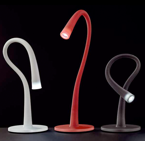
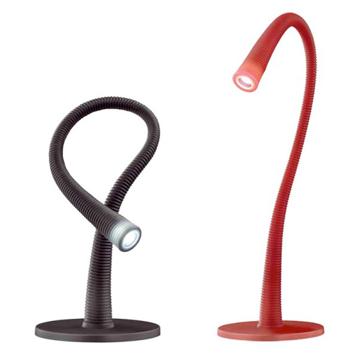
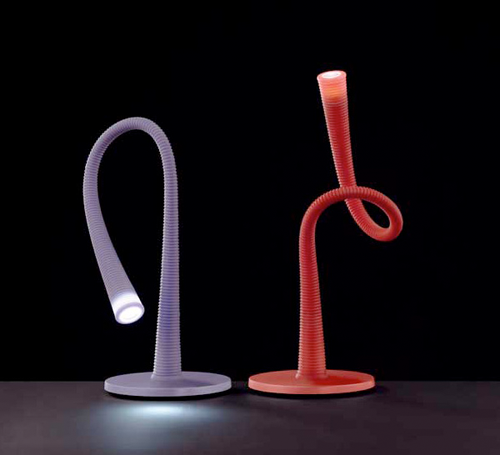
I-Lumex ultra-modern lamp comes with its own USB port. Made of soft, tactile silicone in red, lavender, graphite and white hues, these versatile, multifunctional and user-friendly lamps are fully flexible and adjustable, literally bending over backwards to meet your lighting needs. Love LED for it’s low-power consumption and high light output. Delivers 50,000 hours of illumination. Will take exception to this little cutie.
Designer: Denis Santachiara
Producer: Antonangeli Illuminazione
[via]

Index is home to a dazzling display of interior design, quality and style.
Featuring 1000’s of international brands, exclusive launches and an exciting mix of new ideas, if you’re fitting out an office, hotel, residential or public project or simply looking for eye-catching design, Index has everything you need, inside and out!

Phillipe Starck’s latest — a plastic chair — earned it’s name on the first sketch. Mr. Impossible. The designer said it couldn’t be made. The challenge being the weld. Using existing methods to weld the seat and the legs would create an unsightly seam. Kartell’s engineers had to go the blue water route. The key, a very big laser.
The Kartell store in New York recently exhibited Mr. Impossible, a series of chairs by Philippe Starck. While the design for Mr. Impossible was conceived years ago, the technology needed to weld two transparent shells together did not exist until recently. Also on display was Starck’s Misses Flower Power, a collection of large-scale prototype vases made from transparent polycarbonate. (more…)
 click > enlarge


