 click > enlarge
I was drawn to the Mine cup even before I learned that leading Swedish designer Anna Kraitz was inspired by Meret Oppenheim’s 1936 “Object,” better known as the fur-covered tea cup. Though Kraitz’s cup isn’t as experimental or surreal or hairy as Oppenheim’s, its subtler play with form also succeeds in turning a simple bone china cup into a statement, and perhaps even a sculptural object.

Unlike its furry counterpart, Mine is full functional as a vessel for hot liquids and will deliver tea or coffee to your mouth just fine. The simple delight here is in details like the bowl-like saucer, which is much deeper than a normal saucer. The handle is the more obvious difference. It extends beyond the point that a handle usually ends, dripping down the side on one end and dipping into the cup itself on the other. The handle, which Kraitz fits into each cup “with the utmost skill,” is available in white, hand painted gold or platinum.

about perrin drumm
 click > enlarge
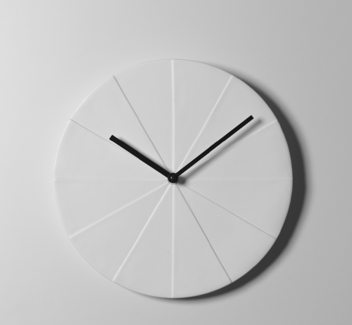
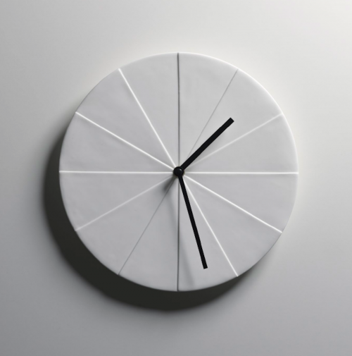
Jussi Takkinen, a furniture and lighting designer who splits his time between personal and freelance projects and design work for Harri Koskinen, needed a new clock. When faced with the decision of finding one to buy that met his standards or designing his own, he opted for the latter. The question now was what form the clock would take. Around that time, Takkinen noticed “a pile of newspapers on the floor which formed a series of steps.” According to him “the sunlight happened to fall onto the newspapers creating a striking series of shadows on the different steps that gave [him] the idea for Osio.”

Like am updated, geometric wall-hanging sundial, Osio (Finnish for sections or steps) bridges ancient methods or telling time with contemporary design. The white bone china clock face has no numbers. Instead, it’s divided into 12 sections of varying heights, one for each hour. When sunlight hits the clock the shadows fall across the sections to give the time. The hands are simply a back up methods for nighttime and cloudy days.

about perrin drumm
 click > enlarge
The stockholm-based design studio Form Us With Love contends that “lamps are like people; They are happiest in families.” The sentiment is certainly true for their eponymous pendant lights. The three forms that make up the happy Form family (Cone, Globe and Tube) are handblown in shapes inspired by bare light bulbs.


The affordable lights are sold individually as opposed to being sold in sets that you can choose what combination suits your space and taste best. A row of three or four of the Tube pendants works just as well as a 25-piece cluster of all three shapes combined. “With very modest means and simple forms, Form Pendants can make a big difference in an interior. There is almost an infinite number of possible combinations.” [ design house stockholm ]

about perrin drumm
 click > enlarge
Katrin Greiling came up with the concept for her faceless, clock-less watch, the No Time Bracelet, while she was working in Dubai. “In an environment where there are lots of status symbols to be worn o nthe wrist, my cheap, digital, plastic watch suddenly became an item for discussion. I designed a piece of jewelry in gold, based on my old wristwatch, that turned everything upside down. The simple item suddenly became expensive, but with a twist.”


As an avid watch collector, I regularly wear several kinds on both ends of the spectrum, from practical Swatches to the shiny gold kind. I’m also a believer in the watch as an ornamental piece, and like to wear several pretty but defunct ladylike vintage gold-toned watches as bangle bracelets. With that in my I feel like Greiling is really speaking my language with the No Time Bracelet. Since I like wearing a fancy watch with a t shirt and jeans, I love how she combines an everyday object like a digital watch with higher end materials like gold or white gold plate. [ design house stockholm ]

about perrin drumm

[ design house stockholm ] will celebrate its 20th anniversary at the fair this year. That’s 20 years of the design publishing house creating a network of very talented designers and a catalogue of Scandinavian-influenced products. Their entire tabletop, furniture, fashion and lighting collections on display. 2012 introductions include:
[ rock chair by fredrik färg ]
Rock Chair continues the traditional rocking chair’s comforting function but in a modern design. Rock Chair is a knock-down design sold in a flat pack. The five pieces are easy to fit together. There is a toy-like charm to its simplicity. As a model, Rock Chair is like a drawing that one can sit on, as beautiful as it is cleverly functional. Pricing: Rock Chair $595, Cushions (Rock Seat) $250

[ pendant lamps by form us with love ]
A triad of glass lamps that are stronger as a group. The idea is that we should find our own combinations of lamps at work, or at home above the dinner table. Functionally amusing and beautiful. Three lamps together or 25 of them in an illuminated sculptural mobile. $120 each

[ homebags by lena bergström ]
Bergström has expanded her Uman and Björk collection or rugs to incorporate 3 sizes of homebags. These homebags add style and color to a room while serving as a convenient storage piece. You can see the family resemblance in the leather accents and the surface texture. 3 sizes: diameter 14”, height 13.5” $200; diameter 17.5”, height 11.5” $225; diameter 21.5”, height 9.5” $275.

[ magazine table by axel bjurström ]
Magazine Table has two functions in one piece of furniture: it is a magazine rack and can be used as a side table. There is room for a pile of magazines 45 cm high and the angle of the rack prevents the magazines from falling off. The spines of the piled magazines create a sculpture that is in a constant state of flux. Available in white and grey. $295 | | | [ design house stockholm ] 19 > 22 august | nyc | booth #3734

[ black+blum ] will show the following products that will be newly available to consumers after the show:
[ thermo pot ]
black+blum keeps meals hot and protected with their new thermo pot. The stainless steel vacuum flood flask has a cork top and stainless steel spoon which magnetically attaches onto the side of the thermo pot. It will keep food and drinks hot for 6 hours. It is ideal for picnics, bringing lunch to work, saving leftovers for later and more. Comes with a 10-year guarantee. $42

[ eau good water bottle ]
The bottle uses a filter system with binchotan active charcoal, which has been used in Japan as a water purifier since the 17th century. It reduces chlorine, balances the pH and adds minerals to the water. Most importantly, it makes tap water taste clean and delicious. The organic binchotan active charcoal can be used for up to 6 months. black+blum will also sell binchotan active charcoal refills so that users don’t have to buy a new bottle each time. $20
[ black+blum ] 19 > 22 august | nyc | booth 3782
 Whimsical tabletop | brilliant beads | quirky gifts | 19 > 22 august 2012 | booth 2748 [ pmawholesale.org ]
 d’e-light by philippe starck | click > enlarge
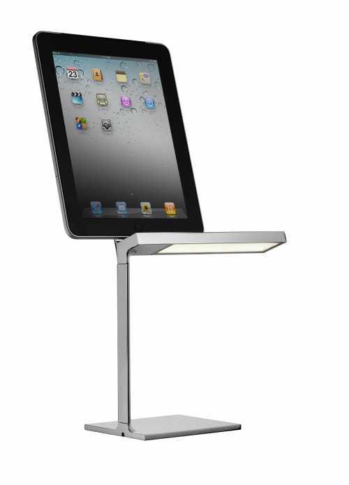
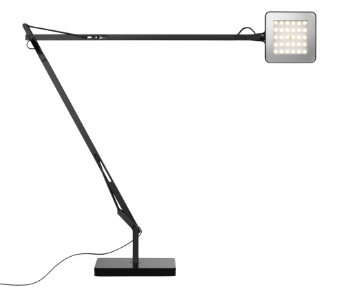
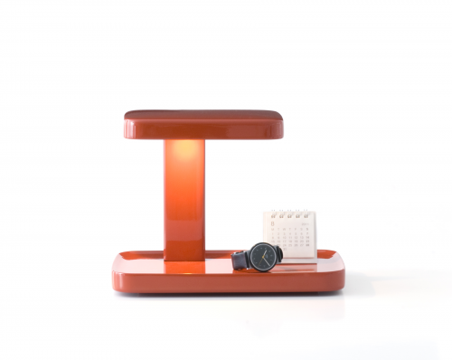
A somewhat startling surprise and wondering why now, but… the good news is, Italian lighting design company Flos is participating for first time in NYIGF. What to show ( many options ) at the gift show? Proudly presenting the “Gift Collection.” Duh. Comprised of twelve portable lighting options, the Gift Collection includes new designs such as the MiniKelvin by Antonio Citterio and the Piani designed by the Bouroullec Brothers, as well as mainstays in the Flos catalog such as the May Day by Konstantin Grcic and the Miss K and Miss K Soft designed by Philippe Starck. The collection as a whole will make its debut at booth #3931 | 19 > 22 August [ flos ] [ nyigf ]
 kelvin LED by antonio citterio

mini teca by ron gilad
 piani by the bouroullec brothers
 click > enlarge
Renown Acme Studio, provocateur and purveyor of fetish-like ballpoint pens and a multitude of creative accessories, is introducing a pen and card case penned “Metro.” Acme commissions iconic talents to do their thing with a pen and maybe an accessory too. Rod Dyer is known for designing for every record label in the country. His thing for Metro is typography. If you feel funny about Maui hanging with these cities, it’s Acme’s home base. It’s a cool set. Smart-looking, notwithstanding, you’ve got to own an Acme Studio pen to really appreciate, btw. [ acme studio ] Metro debuts at NYIGF 2012 | Booth 3908 | 19 > 22 august [ nyigf ]
 click > enlarge
We received the images and the press release. There’s little doubt the origin. The market category, the style, the materials, and the innovation and colors. The unique effort of twin brothers Richard and Antony Joseph. Here’s a sneak at 2012-13.
above> Tri-scale. When open, its three arms provide a stable platform on which to place bowls and other items for weighing. When closed, the unit folds down to an extremely compact size of 4.5 cm x 15 cm x 1.5 cm, enclosing and protecting the screen and controls, which makes it perfect for storing in a kitchen drawer. The scale weighs/measures in the following units: gms, lbs, ozs, fl.ozs and mls. Maximum capacity: 5kg/176.4 fl.oz/11lb/5000ml. Designed by [ Morph ].
below> A new product in the Elevate™ collection: carousel with knives. Dishwasher safe.

This isn’t a knock but an expectation: Kitchen and tabletop is not yet as green ( not the color ) as it could be. These award-winning guys are so consistently solid we expect them to lead the way with the innovative greener solutions in contemporary kitchenware. [ joseph joseph ] Booth 3502 | 19 > 22 august [ nyigf ]
 click > enlarge


