 click > enlarge
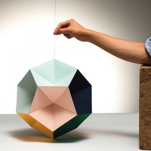
You’ve probably seen at least one of the first three editions of the colorful Themis Mobile collection that Stockholm-based graphic designer Clara von Zweigbergk created for Artecnica, but the company swears that Mono, the newest edition, is “vastly different than any other mobile of its kind.” First off, Mono has more sides than von Zweigbergk’s previous mobiles. D&D fans will know even without counting that this baby is a dodecahedron – that’s 12 sides – each in a different eye-popping color “painstakingly handpicked by Clara in her creative process, which she describes as ‘intuition and the way the colors work in contrast to one another.'”

Which brings me to my next point, which is somewhat tangential, but bear with me. As you might imagine, I read a lot of copy for product descriptions, and sometimes when designers, manufacturers or distributors aren’t content with a basic item description they go to great lengths to entice potential buyers with language so belabored and verbose it becomes comical. Nothing against Artecnica -they’re a truly wonderful company – but is this not just the long-winded way of saying that Mono is fun and colorful?
“The harmonious play of colors instill into the viewer a sense of visual pleasure and fulfillment further enhanced by the faceted nature of the geometry of Mono that allows each individual color to appear in four different shades.”
All critiquing aside, Mono works equally well above a crib and a dining room table, and there aren’t many design objects you can say that about.

about perrin drumm
 click > enlarge
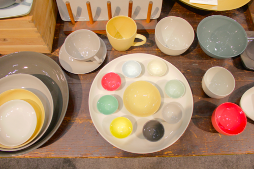
Mud Australia‘s line of handmade porcelain tableware easily caught my eye at the ever over-packed New York International Gift Fair this year. A rough wooden tabletop set off the collection’s picture perfect palette of soft greys, rich red, butter yellow and cheery robin’s egg blue. The exterior of all the plates, bowls and cups is left untreated, giving it a vitrified stone-like surface that’s balanced by the shining, glazed interiors. All the pieces are over, microwave and dishwasher safe, so they’re not only beautiful but practical, too.
Mud crafts their porcelain in their Sydney studio, where they also sell Chilewich’s place mats and table runners, Kobo soy candles and Vitsoe furniture. While their products are carried by a number of retailers in the United States, Mud has never had an American storefront of their very own until now. In just a few weeks they’ll be opening up shop in Soho on Crosby Street. Stay tuned for more news of the opening.
 about perrin drumm
 click > enlarge
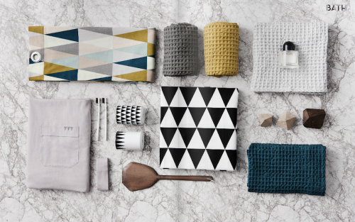
Ferm Living, a Danish interior design company, is riding high on the ever-surging trend towards Scandinavian sensibilities. They produce a line of well-crafted everyday objects with eye for color and pattern and a focus on highlighting natural materials. Retro, yes, but not kitsch. Their Autumn/Winter 2012 collection includes textiles with strong geometric prints in black and white and neon orange color combinations. The neon is something of an anomaly, however, as most of their products this year are more subdued – dark mustard, dusky mauve and rich, deep turquoise balanced by grey and wood tones. The images here are just a smattering of their hundred-page catalog. See all their products and continue on to their online shop or see if they’re stocked in your city.

about perrin drumm
 click > enlarge
It was abundantly clear that Destination Mexico’s big hot pink NYIGF booth full of bright, shiny things was meant to convey this message: We are here. We are fun. We are commercially viable. MoMA Design Store certainly agrees – their New International Design program is a partner. They currently sell a number of Mexican designers featured in the show, like Ariel Rojo, who’s Energy Saving Pig Lamp was prominently displayed. The ceramic lamp comes in black and white, with the curly-Q compact fluorescent bulb attached to the back like a tail.
My favorite Destination Mexico product is the Paper Strip Bowl by Yolanda Resendiz and Jesus Renteria. If MoMA’s goal with their Destination series is to highlight contemporary design that references regional traditions, the Paper Strip Bowl does a beautiful job of making the handcrafted tableware Mexico is known for into a durable consumer product. Discover more contemporary Mexican design at the MoMA store.

about perrin drumm
 click > enlarge
London-based designer Stephen Johnson scoured antique shops in England for the odds and ends that comprise Wonderland, his playful candleholders. Miniature hotdogs, barrels, birds and animal figurines are stacked off-kilter, one on top of the other to make up the candlestick portion, while a base made out of a horse, a rabbit, a lady-in-waiting or a hummingbird fluttering atop a tree branch anchors the whole menagerie.
Wonderland, as in Alice and Wonderland, is made from 100% recycled aluminum and is available in matte white as well as special editions of chrome and gold. At NYIGF this year Artecnica debuted the fantastical table topper in matte red. While I think all modern furniture lovers will agree that the rigors of austerity are key, no house is quite a home if you don’t let loose just a little, and Johnson’s candleholders are just the antidote to an otherwise stark and spare dining room.

about perrin drumm
 click > enlarge
Before Kip Kotzen started neo-utility, his Brooklyn-based design sales agency and distribution company, he worked with the Eames family in California as well as with Vitra and Areaware. Since 2009 he’s been applying his excellent taste to smaller goods for the home and office, like the To:ca Alarm Clock (which is, by now, a modern icon), the beautiful handmade wooden toys by Miller Goodman or the minimal, purpose-driven desk accessories by ANYTHING that make me want to spend my last paycheck on an office makeover.
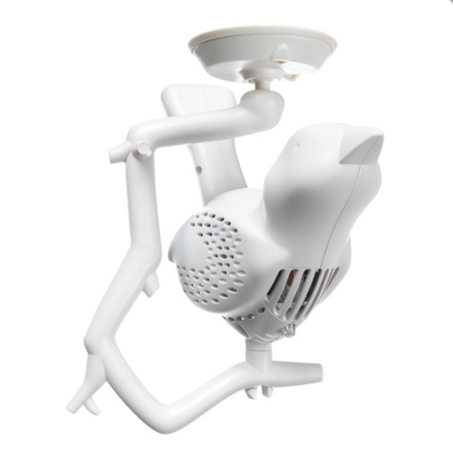
Among neo-utility’s 2012 product line up is the clever/cute Chick-a-Dee, a bird-shaped smoke detector and the Mini-ELEFAN, a small table top fan with an elephant trunk-like duct you can use to adjust the direction of the wind and control in three settings – strong, weak and rhythmical. Since the blades aren’t exposed its ideal for children, and it can be charged with a USB cable. The filter is washable, too, and it even comes with an optional aromatherapy attachment.
We also love the Recycled Sky Planter, by Boskke. Upside down planters make it possible for apartment dwellers to maximize their interior green space without cluttering up every available surface, and Boskke’s line of planters are, as their name suggests, made from recycled plastic. A float-stick indicates the water level so you know when to refill, and starting at $18, you can easily afford to cluster them in groups.
Visit neo-utility’s at NYIGF at the Javits Center, Booth #3748.

about perrin drumm

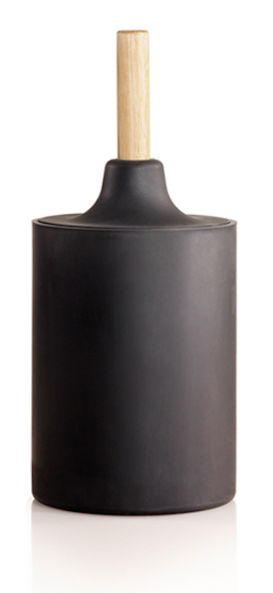
Finally, someone has taken their designer hands to the ugliest thing in my bathroom: the toilet plunger. You might have seen Josh Owen‘s new WC Line at Accent on Design at NYIGF last week as part of Kontextur, the go-to source for all those seeking a sleeker, more refined bathroom. Owen’s three-part WC series includes a waste bin, toilet brush and plunger. The former has a handy wooden dowel attached to lid to keep your used tissues from being an eyesore, and the plunger and brush are hidden from view in a clever little rubber container.
“These products exude clarity by blending utility, usability, materiality and engineering with careful attention to the concerns of space limitations often accompanying their context in the bath.”


about perrin drumm
 click > enlarge
An Accent on Design in NY Gift Fair, Pantone brings more colors to home. [ pantone ]
<a href=" about phil patton
