coca-cola debuts inaugural – true – global packaging.
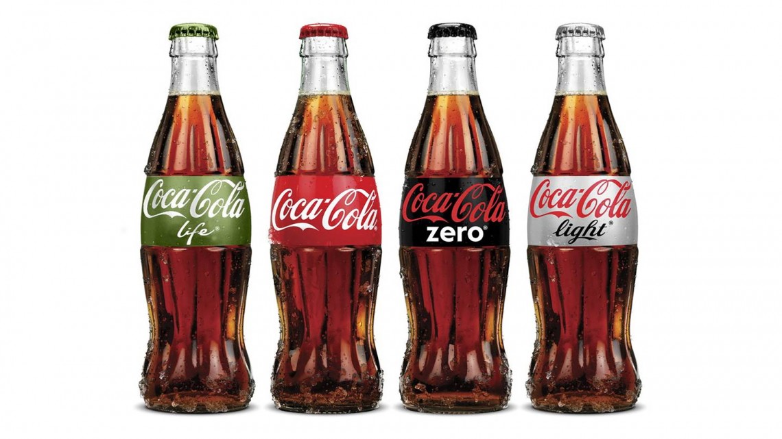
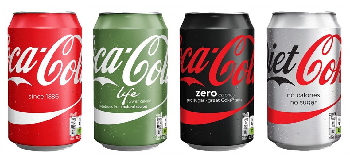
the new packaging for the entire coca-cola trademark will feature the brand’s signature red disc. the graphic visually unifies coke, diet coke, coke zero and coca-cola life. the new design will hit shelves in mexico the first week of may and then roll out globally throughout 2016 and 2017. packaging changes won’t come to the u.s. until at least next year.
coca-cola’s one brand strategy
a remarkable revelation by global icon after all these years, the changes, announced at an event on 18 april 2016, in mexico, represent an historic shift for the company. “the unification of the brands through design marks the first time in our 130-year history that the iconic coca-cola visual identity has been shared across products in such a prominent way,” said james sommerville, coca-cola’s vp-global design, in a statement.
“packaging is our most visible and valuable asset,” said marcos de quinto, chief marketing officer at coca-cola, in a statement. “the coca-cola red disc has become a signature element of the brand, synonymous with great taste, uplift and refreshment. by applying it to our packaging in such a bold way, we are taking the next step towards full adoption of the ‘one brand’ strategy, uniting the coca-cola family under one visual identity and making it even easier for consumers to choose their coca-cola with or without calories, with or without caffeine.”
two packaging designs
introduced a year ago (march 2015) –- participating markets will launch one of two packaging design approaches. the first, “monocolor” (pictured above), features single-colored packaging for each brand and a horizontal typography that visually connects packs when lined up side by side on the shelf or in a cooler. this design will be launched in 11 markets in the northwest europe and nordics region including: finland, iceland, great britain, ireland, france, denmark, norway, sweden, belgium, the netherlands and luxembourg.
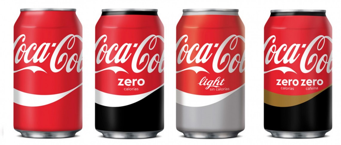
the “split” design (pictured below), which will launch in spain, sports a horizontally divided look, with coke red appearing above the horizontal ribbon on every pack, and the variant’s signature color appearing below.
what’s the history of the coca-cola red disc?
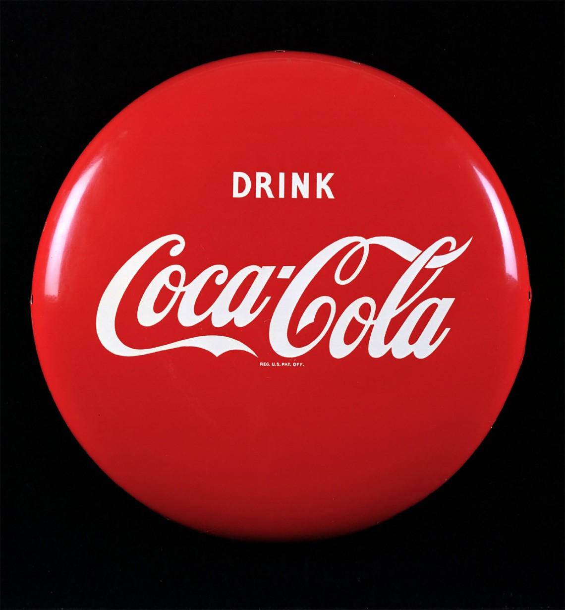
it was first introduced in the 1930s on hand-painted coca-cola advertising. over the years, it became synonymous with great taste, uplift and refreshment. in 1947, the creative director at d’arcy advertising, archie lee, purified and systemized the red disc used then for retail signage to signify that real coca-cola was sold there. the disc, therefore, became the inspiration for our approach to the “taste the feeling” campaign signature that we introduced in january, and now these new packaging designs also communicate that coca-cola, any coca-cola is the real thing.
what’s gonna happen to the coke stripe ?
the stripe gave design a good hook to draw upon. a favorite below by chinese designer jonathan mak is his [ sharing a coke ]
[ thinking behind the design ] [ one brand strategy ] messing with good design fraught with mixed emotion.
