NYC subway installing smart touchscreen wayfinding system.
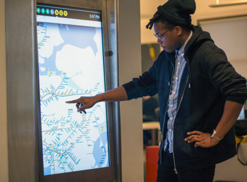 click > enlarge
Starting this year, 90 touch-screen kiosks are scheduled to be installed in the New York City subway system, a system that serves 2 million commuters and tourists a day. The 47-inch touchscreen displays will be encased in kiosks throughout the city. Tapping any subway station will immediately chart out the best route of getting there, and the kiosks — will count down to a train’s arrival and list any delays or outages commuters should be aware of. A digital content loop will also be displayed. The concept was announced in 2010 and trial kiosks have been operating well enough for a year in select locations.
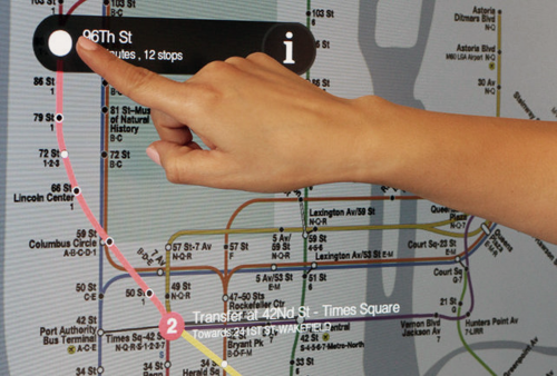
There’s also discussion that the maps could support MTA-approved third-party apps, and will include points of interest so travelers won’t need to know which station is nearest their destination. The backend is designed to be ‘smart’ keeping track of most frequented destinations to aid in way-finding and suggesting destination. The units will contain video cameras and microphones as well, tools that could be enabled in emergency situations for two-way chatter. There may also be real-time news when disruptions occur or are forecasted such as Sandy.
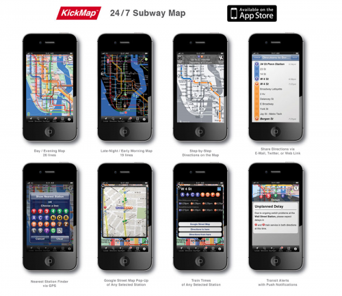
The touchscreen may seem outdated to some, wi-fi, comes to mind. But this is a public system and only 60% of MTA’s riders have smartphones. But there are third-party apps available on iTunes.
The photos in this post raise the question of data visualization design and are the maps shown the best graphic system? I travel a lot and find the KickMap model the best. Going to different cities with different way-finding models reinforce the concept of the adopting one nationwide system.
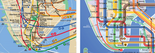 lower manhattan
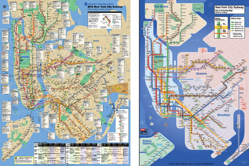
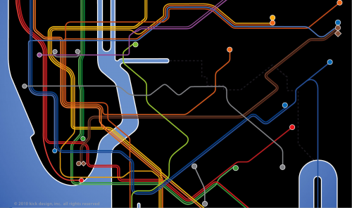 an 11p > 6a map
In the end no system will do everything for everyone. The real-time information is handy for the daily commuter. For the tourist in a city for the first time nothing can replace a little route planning before you get on the train platform. And carrying a current route map is recommended.
[ control group ] [ kickmap ] [ kickmap nyc design ]Fastcompany Update: In response to comments and tweets regarding sanitation issues, Control Group gave us the following statement: “One of the principles of our design was to minimize touch and gestures with one click navigation. Also, the DST display works with any object–finger, nail, pen, etc. And the screen is in waterproof enclosure to enable regular cleaning. And just like the thousands of Metrocard machines in the NYC subway system that feature a touchscreen, the MTA will maintain the new kiosks.” I might also add, our society shared payphones for decades, and those touched our hands and our faces.


