International Home & Housewares 2012. The booths deconstructed #1.
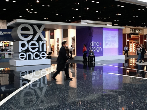 click > enlarge
Most everyone goes to the show to view the goods. We do too. But we conceived this post to showcase the presentation of brand and object. And we failed in execution, in part because we started our booth documentation at the end of our list of things to do. Next time, looking at presentation is going to be first item on our list. Though the booth and the object relies on one another in presentation, we separate the task of evaluating the object and evaluating the booth.
Here are several examples from this show. Most are from the exhibitors who were showcased in this year’s Discover Design competition. Most are small companies with few products and presentation is an easier task.
The criteria:
* how visible is the booth from afar
* how visible is the brand itself
* how special are the goods presented
* how well does the booth shield the viewer from visual distractions
* how creative is the booth concept
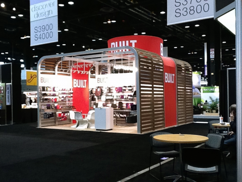 medium-sized booth. we liked this booth last year too
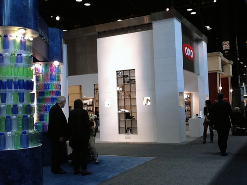 large totally contained oxo booth
We do like white in most product presentations but Built makes it work with wood.
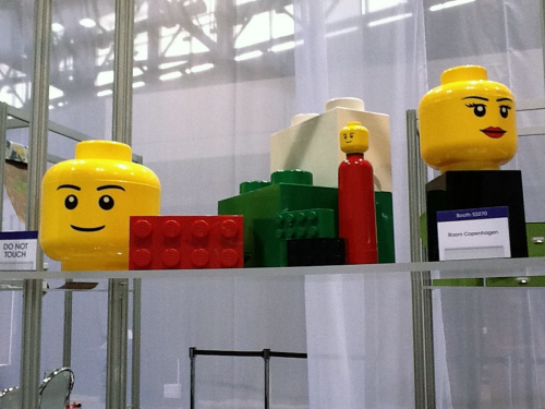 wins iron-pansy award
Room Copenhagen has visual knockouts Lego and Pantone, among others, and present these objects on boxes covered with brown carpeting. Shown here on the Discover Design display, not the booth. They do much better next year.
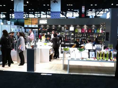 rare example of objects presented with and without the packaging
JosephJoseph a bit over zealous with quantity in this mid-size booth. But it’s well-organized and they present the object with and without the merchandising packaging. They also get best product award so there you go.
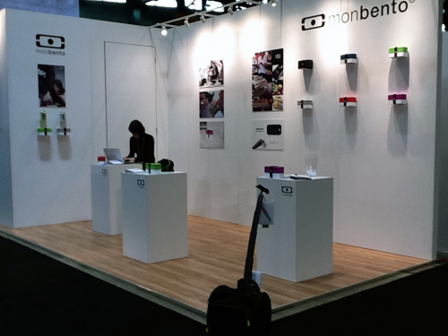 guessing most minimal booth in mccormick place.
Monbento plays it cool. The glass vase on right is a best of show award. That’s our trolley in foreground junking up the image.
