 click > enlarge
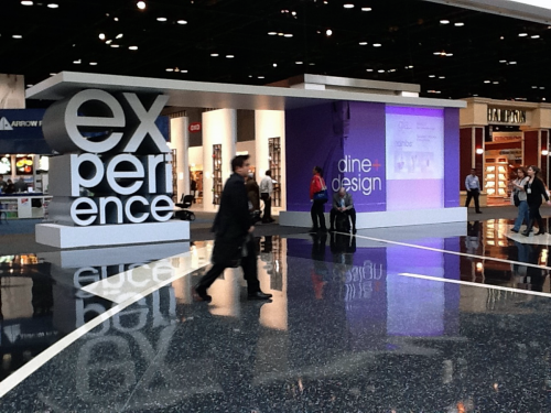
Most everyone goes to the show to view the goods. We do too. But we conceived this post to showcase the presentation of brand and object. And we failed in execution, in part because we started our booth documentation at the end of our list of things to do. Next time, looking at presentation is going to be first item on our list. Though the booth and the object relies on one another in presentation, we separate the task of evaluating the object and evaluating the booth.
Here are several examples from this show. Most are from the exhibitors who were showcased in this year’s Discover Design competition. Most are small companies with few products and presentation is an easier task.
The criteria:
* how visible is the booth from afar
* how visible is the brand itself
* how special are the goods presented
* how well does the booth shield the viewer from visual distractions
* how creative is the booth concept
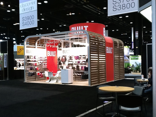 medium-sized booth. we liked this booth last year too
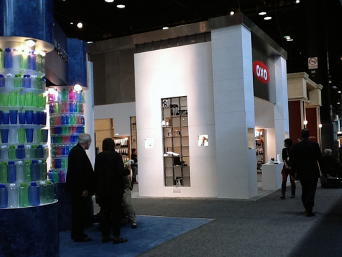 large totally contained oxo booth
We do like white in most product presentations but Built makes it work with wood.
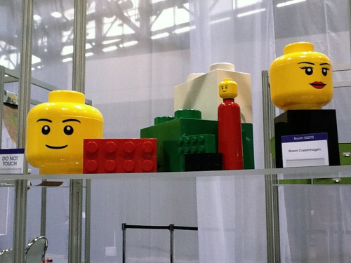 wins iron-pansy award
Room Copenhagen has visual knockouts Lego and Pantone, among others, and present these objects on boxes covered with brown carpeting. Shown here on the Discover Design display, not the booth. They do much better next year.
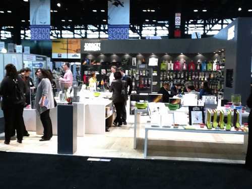 rare example of objects presented with and without the packaging
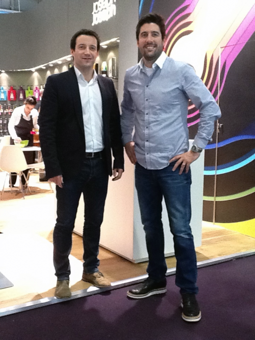
JosephJoseph a bit over zealous with quantity in this mid-size booth. But it’s well-organized and they present the object with and without the merchandising packaging. They also get best product award so there you go.
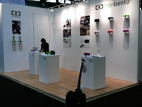 guessing most minimal booth in mccormick place.
Monbento plays it cool. The glass vase on right is a best of show award. That’s our trolley in foreground junking up the image.
note: We intended to make mention of those booths that were not photographed but presented exceptionally well. But a photo is worth a thousand…next time. What’s it all mean? Well, a great product might not even come to this show and still be successful. The fact that the great presentations went hand-in-hand with the awards means little in this post. We were not being objective in this matter. And careful with the brown carpet.
 jørgen bodum, ceo of bodum | click > enlarge
The following excerpts are previews of two interviews taken at Ambiente 2012, Frankfurt. We talk to the leaders of each company, Jørgen Bodum of Bodum and Antony & Richard Joseph of JosephJoseph :
[DA] Jørgen, tell us about Bodum’s tagline “Make taste not waste.”
[JB] The tagline is about five years old, about the time of the introduction the capsule coffee system. The capsule coffee system makes coffee 10 times more expensive, and secondly, if you take one of the big capsule companies, they produce 9 billion capsules a year, just one company; six-thousand tons of aluminum. There were many court cases against us when we made that statement. They were saying at the time they were 60% recycled and they’re not even 10% recycled. And so far we’ve won all the cases.
 l > r: richard & antony joseph, founders and head of josephjoseph
[DA] JosephJoseph is known for good looking and well-functioning products. Can you say your products are design-driven or is there another way to describe the concept-to-completion of your products?
[AJ] We’d say our products are function-driven. Every product has a functional story. A lot of people say “oh yeah, that’s the colorful kitchenware stuff. Yes, color is part of our identity though that might change as it could be black and white in two years time. But we feel the constant, the overall driver is function.
 click > enlarge
above: The new Bistro Pour Over Coffee Machine. Give Bodum a degree of credit for trying to make a better cup of coffee by tweaking their famously successful french press. [ details ]

<br clear="left"
above: JosephJoseph add a twist to the whisk. As a flat whisk, Twist™ is ideal for mixing sauces in low pans or for making gravy in roasting trays. Then, with a simple turn of the handle, Twist™ morphs into a balloon whisk, allowing egg whites to be whipped into peaks of perfection. [ details ]
Keep your eyes peeled for the full interviews and more images right here on DesignApplause. [ ambiente 2012 ] [ bodum ] [ josephjoseph ]
 click > enlarge
 medium-sized booth. we liked this booth last year too
 large totally contained oxo booth
 wins iron-pansy award
 rare example of objects presented with and without the packaging
 guessing most minimal booth in mccormick place.