magis, the italian design company, presents a temporary ‘pop-in’ exhibition at herman miller’s new york flagship (251 park avenue south). the magis way at herman miller is an experiential demonstration of the brand spirit – the most robust ever presented in north america – and is designed by swedish firm note design studio, encompassing nearly the entire second floor of the herman miller showroom.
“it is important to us that architects, designers and design lovers can see, touch and feel our products, says alberto perazza, ceo of magis. “for us, design is in our dna and we love sharing it with the public and international design community.”
the brand’s spirit and success are based on the desire to provide a wide array of users with access to highly functional, quality products manufactured with advanced technologies. to achieve this, collaborating with major international designers is essential –they have a vision of the resulting products that is ethical and poetic as well as aesthetic.
for the magis way exhibit at herman miller, note design studio has developed a pursuit of visuals and volumes through fascinating architectural arrangements within the renaissance-revival building (designed by neville & bagge in 1909) that herman miller calls home. the stockholm-based studio began working with magis in 2018, dreaming up their exhibition spaces for salone del mobile, stockholm furniture fair and more.
a welcoming setting, this space is an invitation to discover the new and iconic designs presented within it, including plato designed by jasper morrison, the officina collection by ronan and erwan bouroullec, bureaurama by conceptual artist jerszy seymour, chair_one by konstantin grcic, the famous spun chair by architect thomas heatherwick and many more. linking the products and vignettes are new rugs from the volentieri collection designed by inga sempé, featuring different types of yarns and weaves to balance color, texture, even light reflection through a mix of neutral and luminous materials. this is a new category for magis and the first time they will be on display in north america.
magis, founded in 1976, is proud of its “made in italy” quality and tradition and speaks an international language by combining craftsmanship with technical advances in manufacturing. the magis way exhibit at herman miller expresses the breadth of their portfolio in a meaningful demonstration.
“we want visitors to feel that they’ve just discovered magis, whether they already knew the brand before they visited the exhibit or this is their first exposure to it,” says tim straker, chief marketing officer, herman miller. “this is a chance to envision magis in one’s own space, whether it’s home or at work.”
among the values shared by magis and herman miller is a commitment to creating responsible design and a strong belief in design authorship. through this relationship and the pop-in exhibition, the two companies have woven a story of creativity and applicable authored designs for north america in a real and credible way.
architects, interior designers and design lovers can visit the magis way at herman miller by contacting (212) 753-3022 to schedule an appointment, or enter through the herman miller store, taking the stairs in the back to the second floor monday through friday 11:00am – 5:00pm.

 >click > enlarge
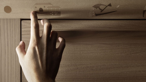
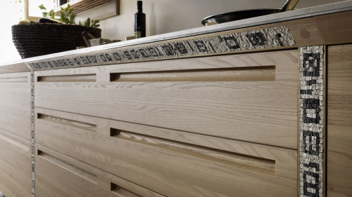
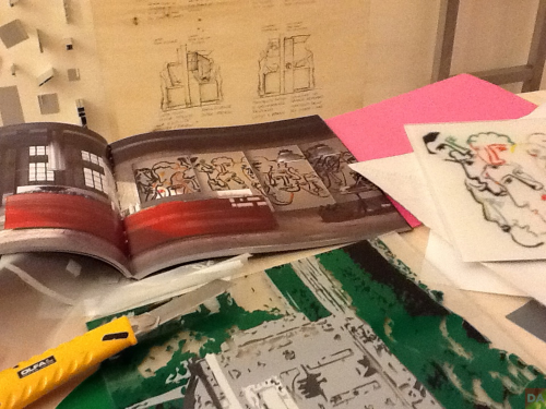
The artisan appears in 1993 when the ‘Fabula‘ model was launched, the first kitchen with colored wood and doors inlaid with pictograms. For the designer Gabriele Centazzo, it represented the Mediterranean dream. In 2009 Valcucine presented ‘Invitrum‘, the first 100% recyclable base unit in glass and aluminum. In 2013, both art and tech reappear together as Valcucine’s Milan showroom creatively presents their master craftsmen who set up real workshops showing how they create inlays, mosaics and carvings. We also see the reappearance of Centazzo designing SineTempore (without time), a kitchen conceived to express the values of tradition through the recovery of various ancient handicraft techniques.

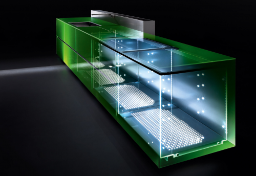
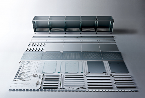
With Invitrum, the production process of recycled aluminium has the advantage of consuming only one-twentieth of the energy needed to obtain primary aluminium. Traditional kitchens usually supply base units that are installed side-by-side which means that the chipboard side panel is doubled; Valcucine’s structure has simply a single carcass side in glass. The new glass system is designed to be easily disassembled using only mechanical joints instead of glues.

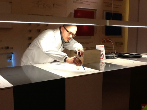
In the showroom product technicians shared the tests, here Diego Skerlic, a quality official, uses an eyedropper of various stain producing ingredients such as coffee and red wine, as he helps develop fully resistant long-lasting materials.


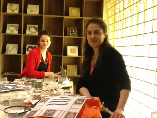
Laura Carraro and Lisa Battistutta were introduced to Valcucine as mosaic art students and the two continue to collaborate and create for them.

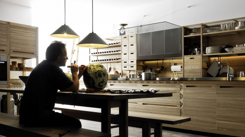
above and below, kitchen program SineTemporare | 2013

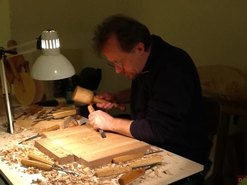
Wood sculpture Padovan Giovanni carves away.


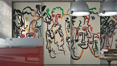
Most recently, after three years of research, Valcucine has developed a technique to make inlaid art on glass. The highly technological process is rooted in handmade craft and makes it possible to personalize a kitchen with ideas offered by artists, architects and designer or even by the home owner.
 artematica vitrum arte programme
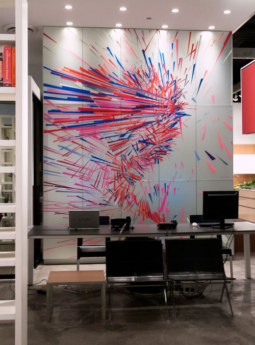
And even more recently Chicago graphic designer Rick Valicenti and John Pobojewski of (thirst) alerts us to the very same process used for the Valcucine Chicago showroom for NeoCon 2013. The installation of The Elizabeth Project (formally named E) consist of ribbons of colored vinyl cut by hand and infused in glass. ‘Elizabeth’ is the daughter of Chicago architect Gordon Gill: the collaboration done in 2009 when Elizabeth was nine. thirst used motion capture technology and custom software to sample Elizabeth’s energy as she danced in place. [ details ]
 e | thirst | 2009
[ valcucine ]

“Living Architectures” is a series of films that seeks to develop a way of looking at architecture which turns away from the current trend of idealizing the representation of our architectural heritage.
Through these films, Ila Bêka and Louise Lemoine put into question the fascination with the picture, which covers up the buildings with preconceived ideas of perfection, virtuosity and infallibility, in order to demonstrate the vitality, fragility and vulnerable beauty of architecture as recounted and witnessed by people who actually live in, use or maintain the spaces they have selected. Thus, their intention is to talk about architecture, or rather to let architecture talk to us, from an «inner» point of view, both personal and subjective. Unlike most movies about architecture, these films focus less on explaining the building, its structure and its technical details than on letting the viewer enter into the invisible bubble of the daily intimacy of some icons of contemporary architecture.
Through a series of moments and fragments of life, an unusually spontaneous portrait of the building would emerge. This experiment presents a new way of looking at architecture which broadens the field of its representation.
The volumes and the complete series of films will be first presented to the Italian public in a tour entitled Living Architectures Marathon which, between 27 June and 20 September 2013, will visit some of the main exhibition institutions in Italy: the MAXXI in Rome, the Triennale in Milan, the Pecci Centre in Prato, the Mart in Rovereto, and Casa Cavazzini in Udine. Each presentation will be based on a free screening of the series of films and will offer the public an opportunity to meet the filmmakers along with several other special guests. [ details ]
 This year’s Venice Architecture Biennale hosts Design Onscreen – The Initiative for Architecture and Design on Film, a first-ever presentation of 16 films.
The Biennale itself is a spectacular affair showcasing the latest in architecture and design from around the world through exhibitions and events presented by 55 countries. 27 > 29 August 2012 | Venice, Italy [ details ]
The films will screen at the Teatro Piccolo at the Arsenale – “action-central” for the many diverse offerings at the Venice Biennale. All screenings are free and open to the public and most will be followed by dynamic in-person discussions and audience Q&As, featuring top architects and design experts from around the globe, including Lord Norman Foster, Peter Eisenman, Rick Joy, Steven Holl, Vittorio Garatti, Deyan Sudjic (Director, Design Museum London), Barry Bergdoll (Chief Curator of Architecture and Design at the Museum of Modern Art); Moshen Mostafavi (Dean, Harvard Graduate School of Design), Mark Wigley (Dean, Columbia Univ. School of Architecture), and David Chipperfield (Curator and Director of the 13th Annual International Architecture Exhibition, Venice Biennale).
[ films include ]
43 Colonne in Scena a Bilbao (43 Columns on Scene in Bilbao)
Antwerp Central
The Architecture of Carlo Scarpa
Coast Modern
DAVID CHIPPERFIELD: Form Matters
Diller Scofidio + Renfro: Reimagining Lincoln Center and the High Line
EAMES: The Architect and the Painter [ interview with Jason Cohn, writer/director ]
The Gruen Effect: Victor Gruen and the Shopping Mall
How Much Does Your Building Weigh, Mr. Foster?
Mission Statements: The Architecture of Dutch Diplomacy
Modern Tide: Midcentury Architecture on Long Island
Peter Eisenman: The University of Phoenix Stadium
Rick Joy: Interludes
Steven Holl: The Nelson-Atkins Museum of Art, Bloch Building
Unfinished Italy
Unfinished Spaces
 click > enlarge
Pininfarina is best known as the designer of bodies for Ferrari and Maserati and other car brands. Its famous red 1947 Cisitalia sports car enjoys a place of pride in the design collection at MOMA in New York. But it is from another side of its work that Pininfarina has drawn most of the 400 pieces of its work set for display at the Italian Cultural Institute in Belgrave Square in London beginning June 22. Four lovely cedar scale models represent highlights of the auto design history and present—the 1947 Cisitalia 202 Berlinetta , the 1967 Ferrari Dino 206 Gt , the Birdcage 75th concept and the recent Cambiano concept, an extended range plug in electric debuted at this years Geneva Motor show.

But the focus of this show is Pininfarina Extra, which specializes in product design and more recently interiors. It was set up in 1986 and directed by Paolo Pininfarina and has its studios in Cambiano near Turin. Its products include ski boots and motorcycle helmets. Credits include the Coca-Cola Freestyle drinks machine, the Snaidero Ola 20 kitchen, and the Primatist B62’ yacht. Among its most recent projects in architecture are the Keating Hotel in San Diego, the interiors of the Juventus Stadium, and a residential tower, the Millecento in Miami.
Older items include the Riva rocking horse and the Guerlain Homme perfume bottle. The most recent, seen in London, are a new Lavazza espresso maker and, being unveiled for the first time, a sort of monorail or so-called personal rapid transportation system developed with Vectus, a Korean company, shown in model form at the gallery. Along with the show the firm is sponsoring a design contest for Royal College of Art students; winners will be announced June 21. [ details ]
date> 22 june > 15 july 2012 | london
venue> italian cultural institute
organized by: italian cultural institute in collaboration with: Pino Pietrolucci and Pininfarina
<a href=" about phil patton
 moka alessi | alfonso mendini | click > enlarge
Only a glimpse of the Spring/Summer 2012 line and our focus ( not Alessi’s ) will be the theme of duality. Let’s start with “old and new” via the “Moka Alessi” by architect Alessandro Mendini’s homage to Alberto Alessi’s maternal grandfather, Alfonso Bialetti, creator of the indispensable Bialetti Moka Express that is a mainstay in many Italian kitchens. [ bialetti moka express ]
 all-time | guido venturini
‘All-time’ represents both “formal and casual” with minimal flowing smooth classic lines but designed for daily use and includes all the basic elements of flatware, bone china, and glasses. A re-design of the “Pluto” collection designed by Guido Venturini.”I immediately knew I didn’t want to do anything too different. I’ve got a strong bond with the formal style – for me, it’s a real necessity. The language of shapes has its own priorities, and it draws me into it in a way that I can only control up to a certain point.”
 is01 | inga sempé 2012
This spoon serves up both “Italy and France” and designed for a competition organized with the magazine “Domus” to celebrate the anniversary of the “Cucchiaio d’Argento” (in English “Silver Spoon”) – the historic recipe book with its 12,000 recipes and as a star of Italian kitchens for the past 50 years. For this special occasion five international designers were asked to come up with a new serving spoon. The winner, Inga Sempé, for her ability to design a very simple, rigorous and yet highly expressive tool which, thanks to its precise details, well fulfills the practical need to gather up and serve risotto. France? The designer is of course French.
Be alert for other examples of duality in the Alessi Spring/Summer 2012 line.
 “compas” chair | click > enlarge
First previewed at Silvera-Université, the prototype of the Compas chair shows the continuing collaboration and affinity between Patrick Norguet and Kristalia which began in 2011 with the “Poule” occasional table and the “Degree” stool/storage henceforth available to the public. The definitive version of Compas will be presented at the Milan Fair in April.
[ “compas” chair ]
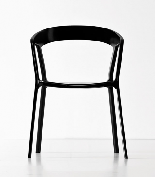
“Compas” is a timeless tribute to contemporary furniture conceived in the forties on the principle of fluidity and comfort. Here Patrick Norguet uses current technical possibilities to the full to refine the lines in order to achieve a chair which is both welcoming and stackable, for use inside and out. The seat and the back are polypropylene and the feet are epoxy lacquer die cast aluminum.
 poule occasional table
[ poule occasional table ]
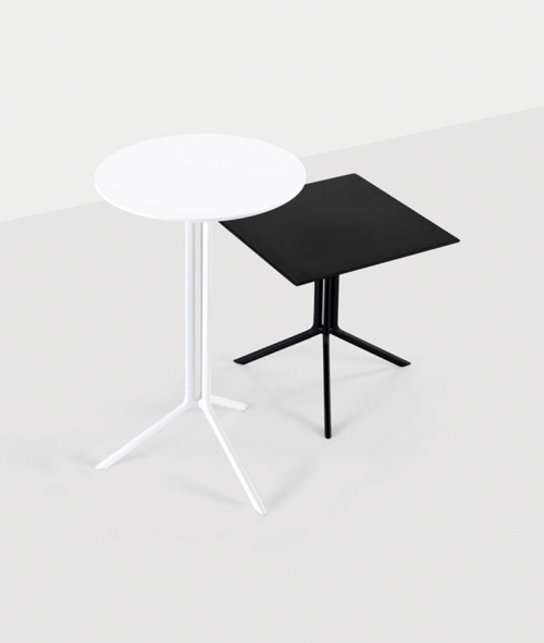
The Poule table has a light and cheeky soul, first of all because of its name, a veiled reference to chicken legs of which the base recalls the shape, but it is above all functional: produced with drawn wire aluminum and die cast aluminum elements with its constant and recyclable qualities.
It folds and is available in two heights, with a black or white epoxy lacquer, for outside use, and its laminated top is offered in two versions: round or square. Poule will be available from the end of April 2012.
 degree stool/storage
[ degree stool/storage ]
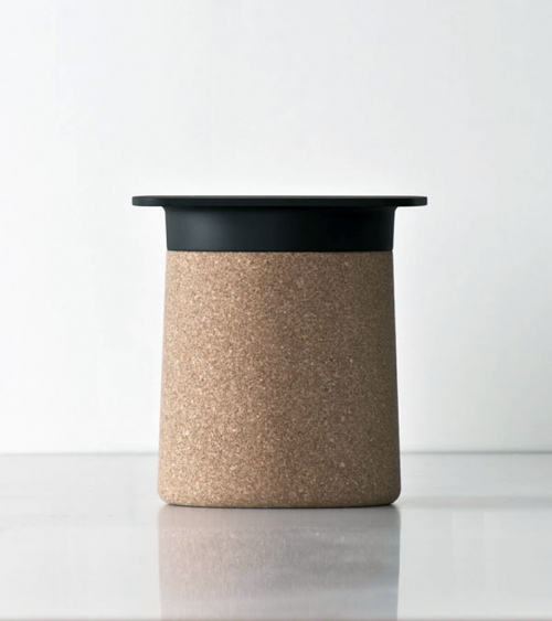
Is it a pop sculpture, a scenographic element or an enormous cork? No, it’s Degree a veiled reference to the British qualification and its unique hat. Presented last year as a prototype at the “Salone del Mobile” in Milan, it is currently available in two versions: in either black or white polypropylene, with or without cork cladding. Versatile and amusing, it is a coffee table which also acts as a small piece of furniture for storage. Degree is available from mid-March 2012.
[ patrick norguet ] [ saloni 2012 ] [ kristlia ]
</strong.


