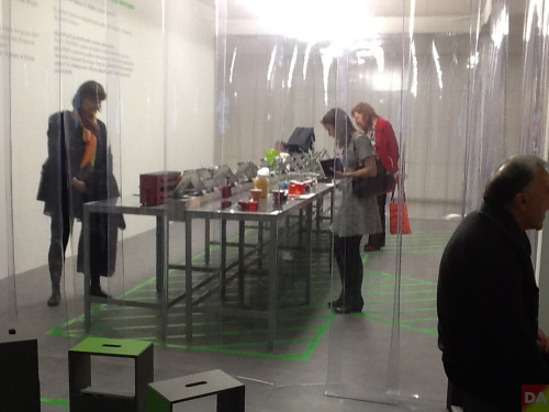
the annual beazley designs of the year exhibition showcases the most innovative designs across fashion, architecture, digital, transport, product and graphic design from the past 12 months, as nominated by the public and design experts from around the world. discover all the new installations throughout the design museum created to celebrate this year’s london design festival.
‘the wacky and the wonderful, life-saving or just mind-changing… these are the people designing our future.’ channel 4 news
sponsor > as a specialist insurer, beazley is well placed to understand the value of good design. it sees first-hand the consequences when things go wrong and its products and services are expertly designed to help people and businesses when they most need help.
224-238 kensington high street
w8 6ag
14-22 september 2019
everyday 10am-6pm
tube > holland park | west kensington
#ldf19 #beazleydesignsoftheyear

above> bergne with ‘mr. gripper’, ‘ratchet grinder’ and ‘olimax’
The third ‘Solutions’ special exhibition at Ambiente 2014 continues to focus on well-thought out functionality. This exhibit was conceived by London designer Sebastian Bergne and in 2014, he and co-curators Marcel Stut (essen & trinken magazine) and Claus Tormöhlen (galeria kaufhof department store), select 23 products out of a growing number of submissions. ‘Not all of these products are beautiful in form but they’re beautiful in functionality and use of innovative technology and materials, and that makes the products something to reckon with,’ Bergne says. DesignApplause notices 2014 includes more bigger players than 2013. Though no awards are given, this collection in some ways is as important as a design competition. Three entries in ‘solutions’ were also winners in ‘design plus‘

[ products 2014 ]
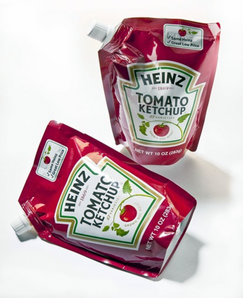
 heinz new 10-ounce pouch | click > enlarge
Heads up, this pouch post will take statements from an article and serve them up “out of context.” Probably because one statement caused me to take pause.
“The trend is being driven by savings on packaging and shipping costs as well as aesthetics — an upscale pouch sporting elaborate graphics offers a modern look and premium appeal, marketers say.” ~ Emily Bryson York, Chicago Tribune reporter
“Manufacturers can cut packaging costs 10 to 15 percent by going to the pouch.” ~ John Kalkowski, editorial director of Packaging Digest
“It’s a different approach for us, but we’re going to listen to consumers, we’re going to develop the products that they want, but then they need to buy them.” ~ Denise Morrison, CEO Campbell Soup Co
“They see the pouch as a very contemporary packaging alternative and they relate that packaging to a better quality experience coming from the food that’s in (it).” ~ Charles Villa, vice president of the consumer and customer insights department for Campbell’s USA
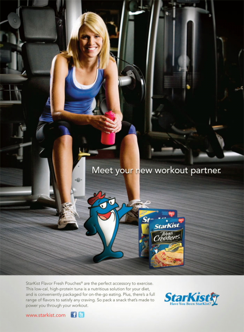
 starkist introduced tuna in a pouch in 1999
“The pouch business took about five or six years to be self-sustaining and said seeing more products in pouches now is ‘exciting’.” ~ Jennifer Albert, director of marketing at StarKist
“The latest wave of pouch conversions appears to be about ‘providing creative consumer solutions,’ as opposed to simply introducing a new package because technology was available.” ~ Lynn Dornblaser, director of consumer packaged goods insights at Mintel
“The typical shopper in a developed market like the U.S., said Heinz CEO William R. Johnson, is ‘now intensely focused on value,’ adding that buying decisions are based more on price ‘and less about product design.'”
[
full story ] editor: an aside, worried that the current shelf with rigid containers neatly arranged and all labels front and center will evolve in a sock drawer aesthetic.
 click > enlarge
An Accent on Design in NY Gift Fair, Pantone brings more colors to home. [ pantone ]
<a href=" about phil patton
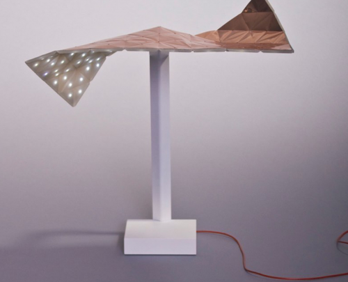
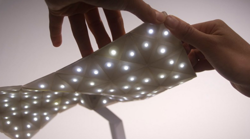
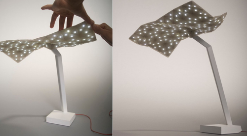
 omri barzeev’s ‘starlight’ lamp is a perfect example of an interesting new material applied in an unattractive, nonsensical way.


Kudos to Barzeev for designing a mutable sheet of LED lights that look like stars in the dark, but as for sticking a rectangle of it on a base, that gets a big thumbs down. As it is now, the Starlight lamp looks more like a model for a large-scale application of the LED sheet than a finished product. How cool would this be if it was huge, if it lined the ceiling in a large space, or was mounted against an entire wall? It has a lot of potential that ought not to be restricted to a dinky lamp that looks as if it’s about to totter over. Omri, you’re halfway there, now back to the drawing board!
designer: omri barzeev

about perrin drumm
 jim dyson promotes innovation to cure economic woes.
Jim Dyson, legendary design engineer, in a piece for The Daily Beast, that whatever deficit fixes Washington comes up with near term, only expanding exports will grow the economy and keep deficits manageable in the long-run. Dyson encourages Congress to adopt Obama’s deficit-reduction commission’s recommendation to permanently extend the current temporary R&D tax credit. Dyson notes that China already surpasses the US in high tech exports but concludes that US companies are well-positioned to develop – with incentives that match their risk – the innovative technologies and new products of the future. more via daily beast
We offer high quality custom college papers at an affordable price that are always delivered on time for any deadline. Our skilled and educated writing team is comprised of only expert researchers and academic paper writers to ensure that our customers are guaranteed a quality paper. Whether you need a standard essay, a comprehensive dissertation, or any other college papers, we can provide you with a 100% original paper that will help you succeed.
producer: dyson

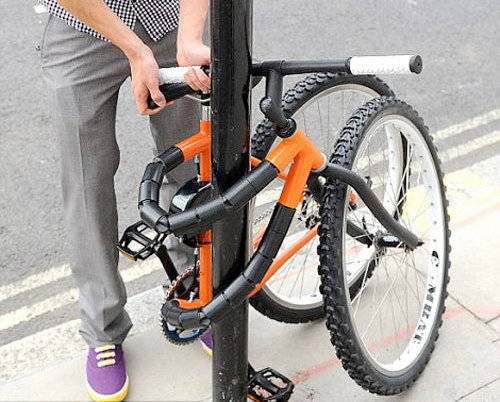
new bike design reduces theft by locking itself around a pole.
With more than 300,000 bikes stolen in the US every year and over 1,200 stolen in the UK every day, perhaps simply locking your bike to a pole isn’t enough anymore. And with more and more people using their bikes to commute to work, bike theft is more than just a bummer, it’s a major setback. Desperate times call for desperate measures, and in this case desperate measures call for good design. 21-year-old British designer Kevin Scott answered that call with the bendable bike. The bike’s frame is built using a ratchet system that can be tightened to ride and then loosened enough to wrap around a pole. Both wheels can then be locked together, securing your ride into a two-wheel pretzel confounding enough to stump your average bike thief.
Scott’s design nabbed the runner-up spot for the New Designer of the Year Award at the UK’s Business Design Centre. He’s already putting the prize money into further developing the design, but is still looking for backers so he can continue to improve it and get it into production.
Designer: kevin scott

about perrin drumm
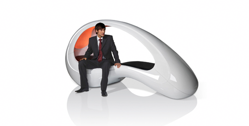
 we were alerted that there are energypods on google’s campus. good for them.
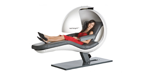
above: the energypod. below: a description from the producer’s web site:
Fatigue control for the workplace! Looking like something out of science fiction, the MetroNaps EnergyPod actually harnesses science and NASA technology to create a space within a space.
Occupying the same amount of room as a sofa, the EnergyPod creates a cocoon from outside noise and distractions. Occupants are reclined into the optimal napping position to promote blood circulation and reduce pressure on the lower back and ambient sounds help nappers drift into light sleep. At the timer’s expiration, the occupant is gently woken with a combination of lighting and vibration.
Key Features & Benefits
* Room within a room
* Inbuilt Bose sound system
* Contemporary design
* Zero gravity technology


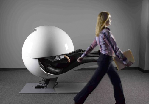
above: another fatigue management product from metronap is the lightweight and easily transportable “napshell.”
note: however, if you’re working for a less evolved company or not putting in 16 hour days…

above: fits easily in your desk drawer. put glasses on, crack your office door ever so slightly, prop large document on copyholder device in front of you.
Producer: metronaps ( energypod )

