• CALENDAR
    • Add Your Event
  • architecture
    • art & literature
    • awards
    • buildings
    • sustainable
    • prefabricated
    • public space
    • residences
    • urban planning
  • design
    • art & literature
    • awards
    • collectables
    • concept
    • fashion
    • sustainable
    • home
    • lifestyle
    • safety & special needs
    • transportation
    • workplace
  • editor’s pick
    • featured
    • gift ideas.
    • interviews
    • opinion
  • events
    • auctions
    • competitions
    • conference & Exhibitions
    • fairs
  • news
    • latest news
    • elsewhere
    • lifestyle
    • people
    • producer
    • retailer
DesignApplauseDesignApplauseyour daily design dose
  • CALENDAR
    • Add Your Event
  • architecture
    • art & literature
    • awards
    • buildings
    • sustainable
    • prefabricated
    • public space
    • residences
    • urban planning
  • design
    • art & literature
    • awards
    • collectables
    • concept
    • fashion
    • sustainable
    • home
    • lifestyle
    • safety & special needs
    • transportation
    • workplace
  • editor’s pick
    • featured
    • gift ideas.
    • interviews
    • opinion
  • events
    • auctions
    • competitions
    • conference & Exhibitions
    • fairs
  • news
    • latest news
    • elsewhere
    • lifestyle
    • people
    • producer
    • retailer

infographic

Home Tag infographic

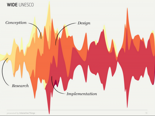
Infographics. The variables within design process.

Nov 12, 2012

click > enlarge

Benjamin Wiederkehr, editor of Editor at Datavisualization.ch, shares his presentation given at the Visualized Conference on 8 November at the Times Center in New York City. We focus on the variables within the design process depicted from different problem/solutions as well as a glance at creating the infographic.


An article on this presentation will be announced on @visualized [ full presentation ]

Food deserts. Interactive infographic.

Sep 3, 2011

map of places in usa furthest from supermarket. via good [RK]
Where your water comes from. Infographic.

May 6, 2011

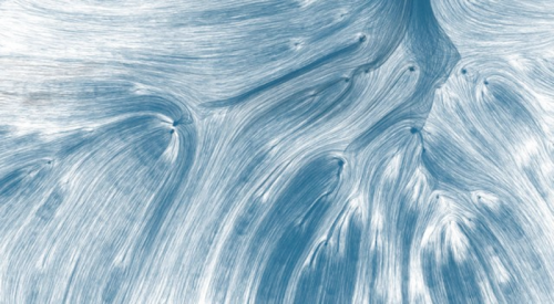
left: Drawing Water by David Wicks is a constructed landscape created by the relationship between rainfall and water consumption in the United States.

The infographic uses water consumption data and builds images to expose the reality that water is channeled, pumped, and siphoned to locations far from where it falls. Although the paths are imagined, the project is based on real data and it attempts to reveal truth about water resources and use.

Drawing Water plays a bit upon the 19th-century theory that “rain follows the plow.” At the time of its inception, that theory promoted Westward expansion, under the belief that plowing fields encouraged cloud formation and rainfall. As long as people plowed fields, they believed, water would come to them. Although we recognize climatological reality isn’t influenced by our farming (in the manner hoped), Americans still live with an illusion of resource availability following need.

David will be showing the prints and interactive at UCLA as part of the D|MA thesis show May 12. [ creative applications ]

How to measure twitter influence.

Mar 24, 2011


Clever graphic depicting a person’s impact on twitter. Illustration by la Tigre. [ full story ]

Contact Us

We're currently offline. Send us an email and we'll get back to you, asap.

Send Message
DesignApplause

your daily design dose

Follow Us


about us
contact/help
privacy policy

ADVERTISEMENT

LATEST NEWS

  • the beginning is the most important part of the work. hello 2023.
  • 40m zero-emission domus redefines trimaran concept.
  • this glass is for the birds migratory birds that is.
  • 2023 all-electrifying timeless instant recognition porsche taycan.
  • unrivaled residences found in repurposed chicago tribune tower.

All content ©2007 > 2022 DesignApplause