 click > enlarge
Before Icelandic designer Katrin Olina established her own studio in Reykjavik, she worked for Philippe Starck in Paris and Ross Lovegrove in London. Though she studied industrial design at ESDI in Paris, Olina’s work runs the gamut from illustration, graphic design, fashion, interiors, print and animation. She’s collaborated with companies like Dupont Corian and 3M, porcelain manufacturer Rosenthal and the furniture manufacturer Swedese. Meanwhile, she creates smaller scale narrative driven work like Eulespiegel, an animation “featuring otherworldly landscapes and imaginary creatures.”
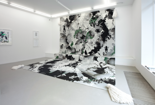
Lately her efforts have been focused on furniture. She has a brand new collection of tubular bent steel pieces called Friends of Steel. Unlike Mies Van Der Rohe’s thin, silver-colored steel chairs, Olina’s Puffastool, Black Lady table, Mirror and Black Box cabinet are based on frames made from thick black bent steel. Apparently, the inspiration for the collection came from Miklimeir The Magician, Olina’s large, digitally printed rug that depicts a narrative – her take on the tradition of using rugs or carpets to tell stories. The collection is so new, in fact, that there aren’t even any images of it available to publish online (Wallpaper ran a small picture in their July 2012 Design Directory), but you can get a sense of her high-tech-meets-handmade aesthetic by browsing the online shop, where you can buy Miklimeir or one of her more affordable silkscreened prints.


about perrin drumm
 click > enlarge
Some of our favorite designers are represented by De La Espada, which is why we were excited to get a little taste of what they’ll be showing during the London Design Festival this September. This year they’ll return to The Tramshed event at designjunction, where they’ll be showing special exhibitions from Autoban, Matthew Hilton and Søren Rose Studio.
“A celebration of authenticity, creativity and innovation, The Tramshed is a carefully curated event with a diverse selection of both established and emerging companies. designjunction, this year in central London’s disused Sorting Office, is a stimulating place for design, culture and entertainment.”

Autoban will exhibition their second of four site specific installations schedule for 2012. Spread over 1,000 square feet in The Sorting Office, environment has an ethereal depth created by multiple layers of sheet material and the passage of light. The spatial organization highlights the interplay between the product, the space and the visitor. New products launching at the event include Cloud Table, an oversized wood dining table inspired by the organic forms of clouds; and Master Chair, an upholstered dining chair with a slender wood frame. Each will be available in a choice of four hardwoods: oak, walnut, chestnut and ash. The new products will be displayed next to classics from the range.”

Matthew Hilton will use the festival to launch Mary’s Chair and Mary’s Side Table, two new pieces of furniture inspired by a trip to the Cathedral of St. Mary of the Assumption in San Francisco. Apparently, Hilton was moved by “the contrast of the oppressive weight of the concrete structure and the release of the swooping, expansive space within. Mary’s chair and side table are inspired by this experience. Crafted in solid hardwood, American white oak and American black walnut, the side table with a marble top, the forms are substantial yet delicate, sculptural yet highly functional. Also launching are Misty sofa, a cool and brooding design with an exposed timber frame and a cast iron leg; Misty coffee table in the same materials and design language as the sofa; Pole Light, a functional timber reading lamp with brass detailing; and a new version of the existing Horizon Coffee Table, with larger overall proportions.”
>
Søren Rose Studio (top of post) will also release new products from their Park Avenue collection, including P.A. Bed, a solid wood bed with a light expression; P.A. Bookcase, a timeless, expansive storage unit with drawers a seamless part of each shelf; P.A. Rectangular Table, a functional table with lightness and purity of form; P.A. Ottoman Tray, which transforms the P.A. Ottoman into a coffee table; and Church Chair, a stackable timber chair suitable for use as a dining or conference chair.

about perrin drumm
 click > enlarge
I like that Stefano Pugliese calls his latest furniture collection a ‘family.’ According to Pugliese, the Furniture Family is from Chitaly, or Italy and Chile, the two countries where the pieces were made. The simple, plywood forms are already childlike and playful, and by calling the whole set a family it evokes images of afternoon playtime or sitting down to breakfast with your children.
But there’s also a formal elegance at work here. Pugliese lets you see – in fact wants you to see – the joinery between the seat or the table top and the legs, and because this normally concealed aspect of furniture making is exposed, he takes full advantage of it by joining the stools together with fun and whimsical shapes. There’s an exclamation point, an X or a plus sign and a single line with two dots that become a round face.
Pugliese said the design was born from “a formal exercise that explores the mechanical and aesthetic value of plywood paired with black Raystone, which is a 100% organic petrol-free bio composite board produced from the waste of sugar production. Through digital controlled cutting technology and simple finishing work, the project seeks to deliver different solutions starting from a single type of joint. Like all members of a family, all pieces are slightly different but similar.”


about perrin drumm
 click > enlarge
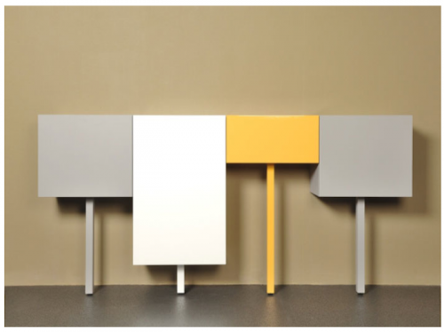
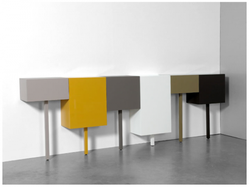
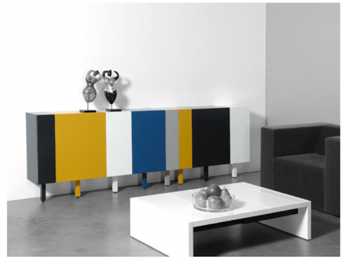
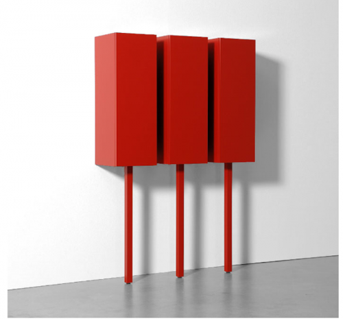
Sticks aren’t a brand new design, but since I’ve never seen a cabinet system quite like it I think deserves some attention anyway. Made in 2011 by Gerard de Hoop, a product and interior designer based in the Netherlands, Sticks come in four different heights and widths and a variety of colors, so you can customize them to fit the needs of your space. They can be used a lowboard, sideboard, small wardrobe or as a single loose cube that can serve as a nightstand or side table.
Which brings me to their best design feature (if it wasn’t obvious already): they stand on one leg, making them the pirates of the cabinet world. Really, their one-legged-ness comes from de Hoop’s devotion to minimalism, so minimal, in this case, that he did away with 75% of the product’s base. Still, they’re just as stable and function just as well as their quadraped counterparts.


about perrin drumm
 click > enlarge
“Design Soil is a design project by teaching staff and students, from the product design department at Kobe Design University, who are design lovers. As a design university, we have attempted to create a space which let young designers to think and create things one by one slowly yet steadily like plants grow in soil.”
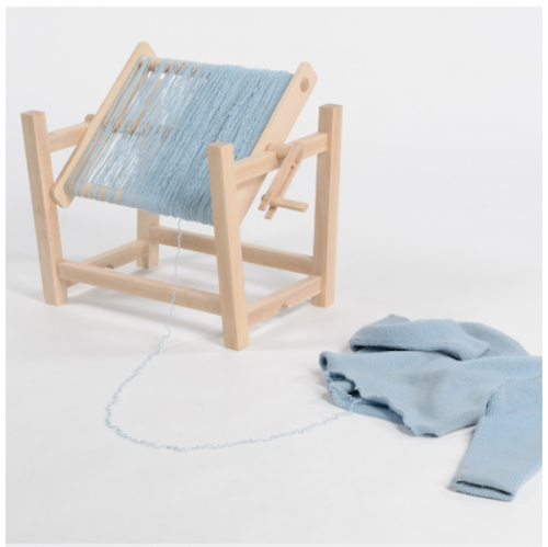
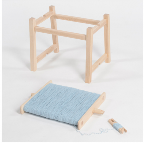
Design Soil’s latest project is Epilogue-Prologue, a collection of pieces intended to “walk along together for a long period of time” – from the epilogue to the prologue, get it? Rollin’ Rollin’ stool is a basic beech-wood frame with a spindle attached to the base, allowing you to make use leftover yarn or the remnants of a old sweater. You create the cushion yourself (you might need two sweaters if you like it extra soft) and when it’s worn out simply take a jumper out your Goodwill donation bag and make yourself another.
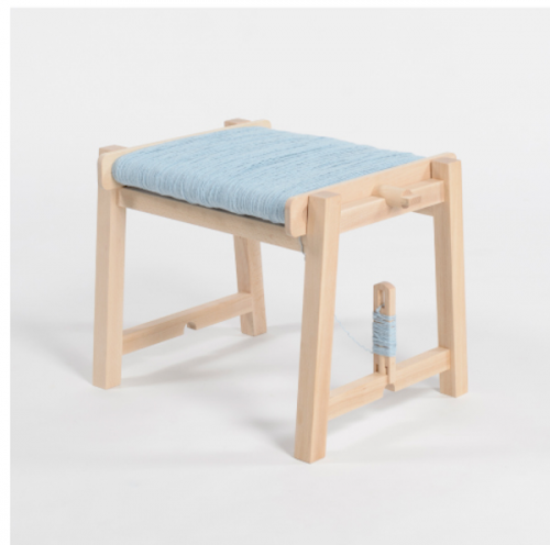
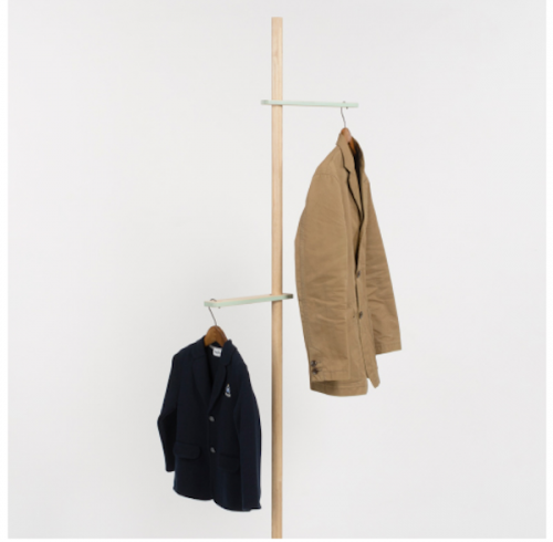
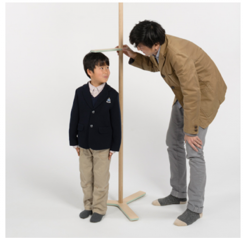
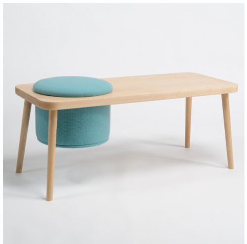
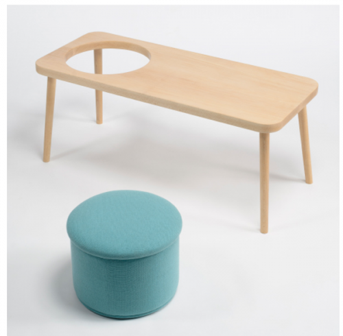
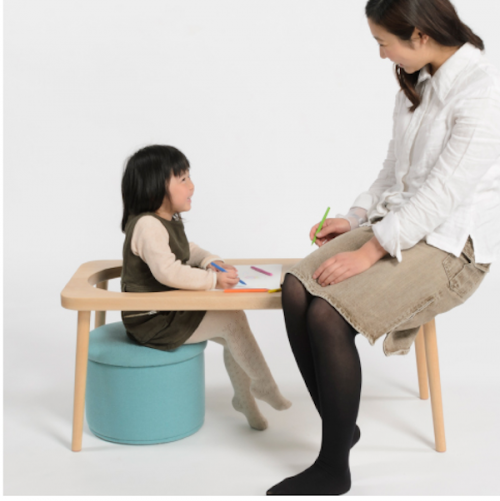
Growth is a coat rack that’s almost too cute for words. Each movable hanger is assigned to a member of your family, so you can track the growth of your kids along the rack instead of marking up a perfectly nice doorway. My favorite, though, is Steps, a bench with a removable cushion. I love the simplicity of the bench but also the functionality of the cushion, shown here in classic robin’s egg blue. You can use in a couple of ways: as a bench with a tufted seat and room to the side for your papers or coffee. You can take the cushion out and use it somewhere else in the room or you can lift it out of its hole and let you child use it as a desk.


about perrin drumm
 click > enlarge
Designers Ronan and Erwan Bouroullec hit the ground running early on in their career, snagging commissions from Cappellini, Issey Miyake, Vitra and later Magis, for whom they’ve designed two furniture collections including the Pila chair and Pilo table which debuted in Milan this week. It’s almost impossible to say that it resembles their other projects because with a portfolio that includes store design and iPad apps along with furniture, lighting and housewares their work is so diverse it defies categorization. The common link would be craftsmanship and intention of design, which the designs speak to:
“With Pila, our intention was to design a chair that would be brought down to its minimum, using the least quantity of material and assembling items. The plywood seat and back parts of the chair are supported by four very thin sticks in solid wood which are maintained together by a structure in injected aluminum that is almost invisible. The back of the chair, like the blade of a knife, subtly comes into the main frame while guaranteeing high support resistance. We wanted this chair to be as light as possible, to almost float in the space as if it would stay on its feet by magic.
“Pilo answers the same quest for lightness and additionally proposes an open system that allows to compose a table that goes with one’s needs and wishes. Pilo is a table reduced to its minimum: solid wood feet that support a wooden top thanks to discreet and strong aluminum connections.”

>
“>

>


about perrin drumm
 click > enlarge
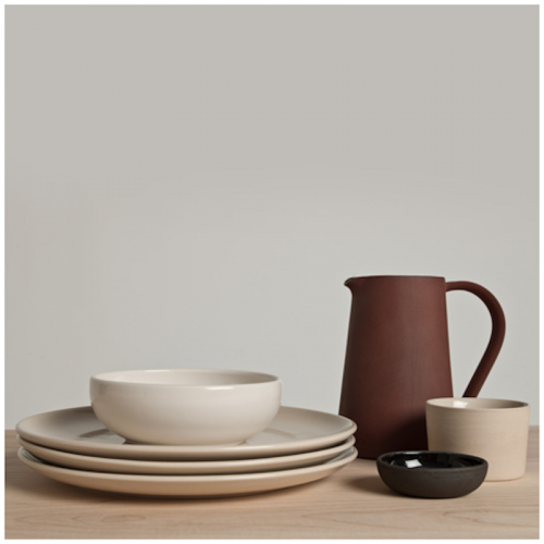
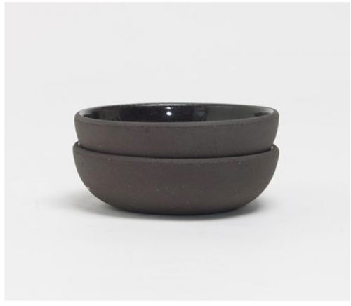
I’ve long been a fan of Another Country’s contemporary craft furniture, especially their Series Two dining set, but they’re also a great example of how a furniture company can increase their brand visibility by selling other home products made by designers and craftsmen who share a similar aesthetic – like Ian McIntyre, for instance. Another Country debuted his tableware collection, Another Pottery Series, during London Design Week last year.
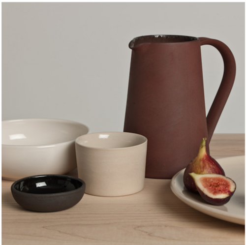
The hand-crafted collection includes a jug, plate, bowl, cup and something called a pinch pot, which gets its name from the original process, which didn’t involve a potter’s wheel, but consisted of simply pinching the wet clay together to form a small dish. All the pieces are made using a Jigger/Jolly process wherein “a piece of clay is placed into a spinning female mould and a male profile is introduced, squeezing the clay between the two surfaces. Mould and profile come together and any excess clay squeezed out by the process is trimmed off. This project,” McIntyre goes on to say, “explores the aesthetics created when the clay does not fully fill the moulds.”
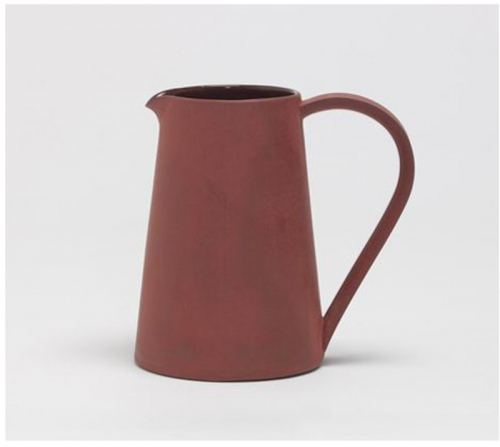
More specifically, “the jug is slip cast and made of Terracotta which has been fired to an unconventionally high temperature that vitrifies the body of the clay giving it the strength of stoneware and achieving the scorched colour. The pinch pot is black stoneware, the bowl, cup and plate are sandy stonewares. The clay shapes are pressed on these machines and then fettled, dipped in glaze, fired and polished.”
Right now only the pitcher ($79) and pinch pot ($21.50) are available for sale online to US markets.


about perrin drumm
 click > enlarge
Sofia Lagerkvist, Charlotte von der Lancken and Anna Lindgren of the Swedish design studio Front recently created the Collage chair for artisan furniture manufacturer Gemla. Front combed through Gemla’s archives for inspiration and came up with a collage, so to speak, of the company’s history of products.
Once you look you can see many different chair designs at work here. The legs and rounded back bar remind me of classic midcentury cane chairs, but the shortened backrest recalls a lounge or side chair, while the webbing is reminiscent of vinyl pool furniture. Clearly, the Collage chair, with its supple, dyed leather and handcrafted wooden base is a far cry from patio seating. And unlike other furniture manufactures, Gemla has an in-house team of woodworkers and craftsmen that make their pieces. Collage is not for sale directly from the site. Rather, it’s made to order to enable the client to choose their own colors and materials


about perrin drumm

Before Harry Bertoia made his eponymous furniture collection for Knoll in the early 50s, he was an artist and jewelry maker. He even made the wedding bands for Charles and Ray Eames. But once his gridded metal collection became a hit at Knoll he’s been known first and foremost as a furniture designer.
The most famous of the five pieces he made is, of course, the Diamond chair, a chair that’s more sculpture than traditional seating. In fact, Bertoia noted that “If you look at these chairs, they are mainly made of air, like sculptures. Space passes right through them.” As one of the most important pieces of furniture designed in the 20th century, it’s the Cooper-Hewitt’s Object of the Month for April.
Made from welded steel in polished or satin chrome or bonded rilsan, it’s scratch, chip and chemical resistant. Some of the pieces in the collection include cushions, which are affixed with snaps or feature stretched fabric, pulled taut across the entire front. I wish I could sit in one all month long, but until I upgrade my simple wooden Adirondack deck chairs to something of the midcentury variety, I will continue to gaze longingly at Bertoia’s masterpiece from afar. [ harrybertoia.org ]


about perrin drumm

