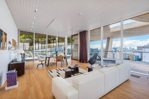
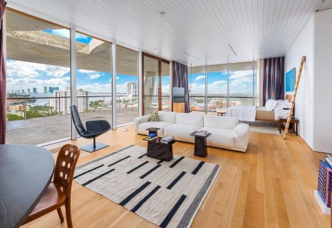
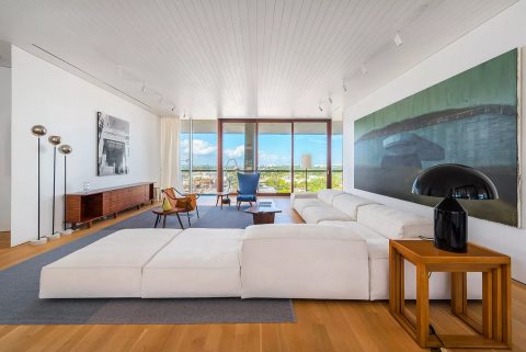
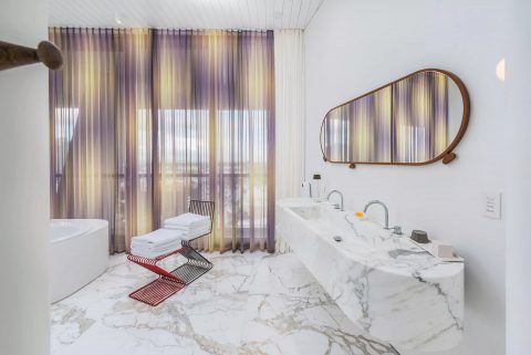
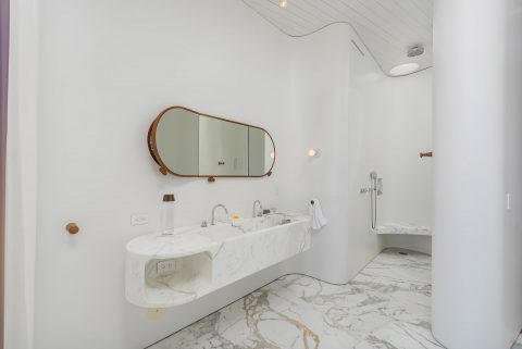
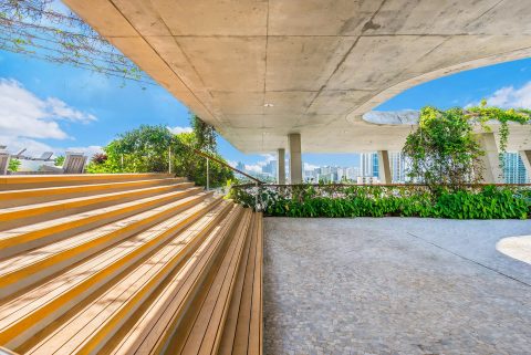
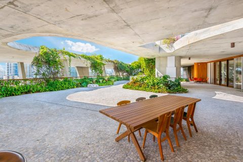
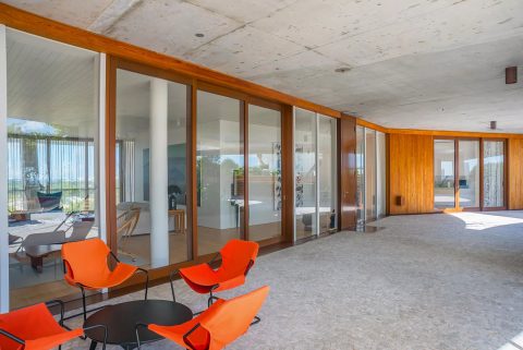
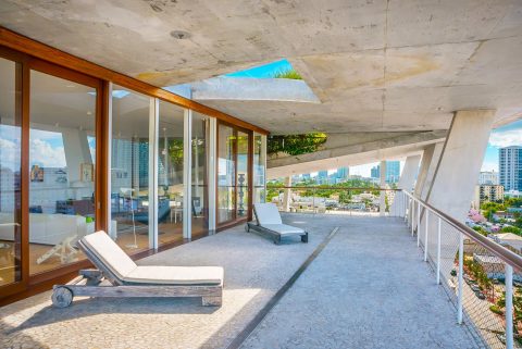
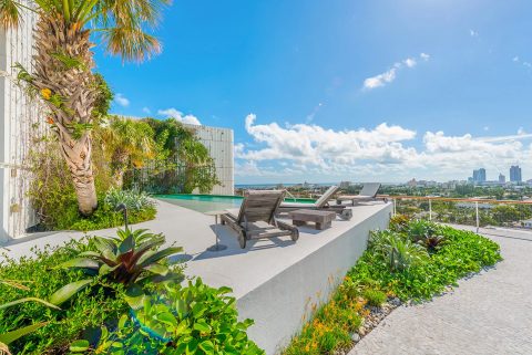
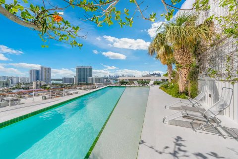
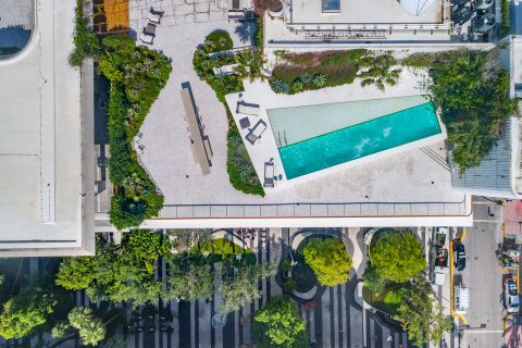
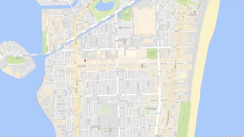
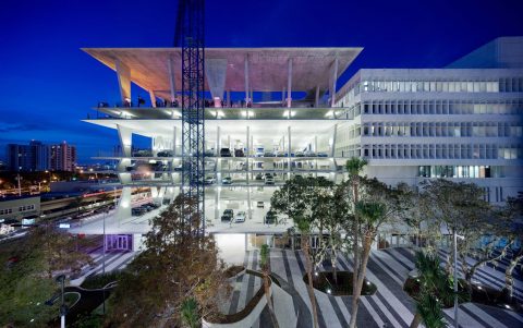
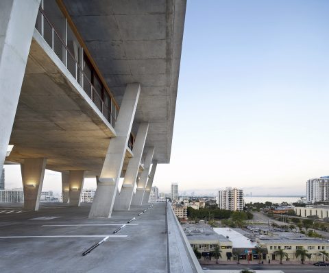
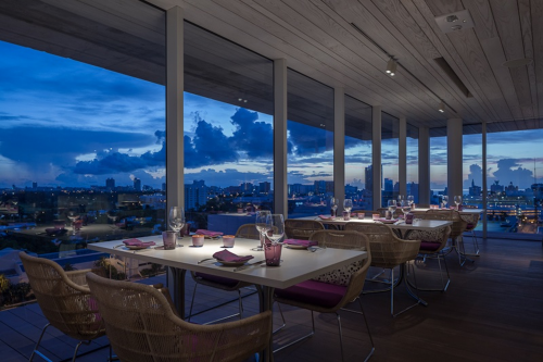
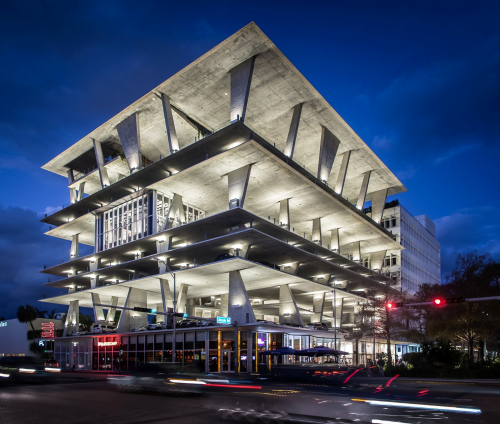
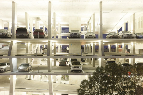
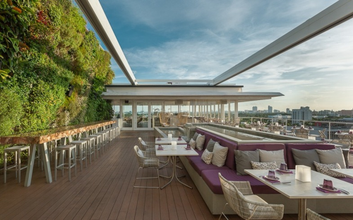
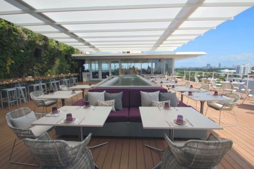
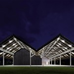
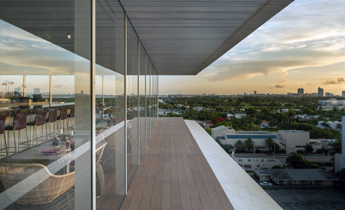
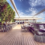
One of many highlights for the Herzog & de Meuron Building* during Design Miami was to visit Juvia, a recently designed pentouse eatery atop the building. Designed by Venezuelan architect and interior designer Alejandro Barrios-Carrero the restaurant straddles the 1111 Lincoln Road office building and a Herzog & de Meuron parking garage. The 10,000 square foot indoor/outdoor restaurant features an innovative trackless, retractable roof, and a 22-foot high vertical plant wall.
[DesignApplause] Alejandro, this project is being billed as Miami’s first restaurant where architecture and design collaborate to play a leading role. What was your vision for the restaurant and how did you achieve it?
[Alejandro Barrios-Carrero] Let me talk about the vision. I think that Juvia is Miami. For me I would describe it that way. Then we can ask, “What is Miami?” For me Miami is much more than its famous Art Deco. For me Miami is about nature, architecture, the sky, the plants.

With Juvia we had the opportunity to do many things, from converting an office space into a restaurant, to juxtaposing a high-end restaurant with a parking facility and taking advantage of the penthouse/terrace floorplan.
It was big challenge because usually restaurants are on top of office buildings or tourist attractions. The parking facility is indeed a wonderful architectural statement but it is still a parking garage. The idea and concept is you walk into a private entrance at street level and take a private elevator. The visitor is transported into this oasis that nobody expects and they experience the bringing of the outside inside and the inside outside.
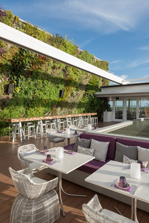
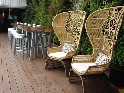
Our philosophy is derived from a good balance of architecture, interior design and landscape. Our office, ABC, put together a good team. For the vertical garden we used acclaimed French botanist Patrick Blanc. The Amazonian-inspired plant wall is a soil-less garden wall, overflowing with greenery native to South Florida. This is his first project in Miami and he’s now doing the Miami Art Museum.
We brought in Thomas Patterson, an Australian designer, for the lighting. There’s a soft orange-amber built-in LED fixture in the ceiling. The kitchen was a collaboration with Russell Stillwell of Next Step Design, from New York.
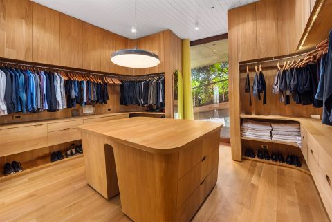
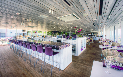
We used a very limited materials and color palette. We used wood which is very homey and cosy. The wood is on the floor, walls, even the ceiling. The ceiling and some walls are whitewashed white oak. A special detail is in the extended mullions of both floor and ceiling. The illusion created brings the outside inside.

extended mullions of both floor and ceiling bring the outside to the inside
The color palette consists mostly of white with some light grey and purple. We chose purple, a color that shouts with great energy. Purple appears in the amethyst stone topped liquor bar.
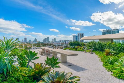
For furniture we use a B&B Italia collection by designer Patricia Urquiola. This collection consists of eight elements and all elements are here in the restaurant. The chairs are rope-woven using string for inside and plastic for outside. Inside there are white oak topped dining tables with bases designed by Piero Lissoni. Outside there’s the 8.5 meter communal table with a petrified wood tabletop and a water fountain. On the terrace you have the small tables, also a banquette that surrounds the water feature. The water feature has a visual relationship with the structural columns: The silhouette and texture of the water feature and the structural columns are similar. Tabletops outside are limestone. A nice balance of stone and organics.
Another design element is wanting to have many Juvia’s in one. What does that mean? We created a restaurant where you can come to the same place four times and you can feel very different experiences. It’s very different experience to dine on the outside terrace versus eating inside.
Inside you have the experience of dining at the liquor bar. Another venue is a banquette table, another the central tables, and yet another tables next to the windows. Each location offers a very different experience. Also, there’s not one chair that doesn’t have a beautiful view.
Juvia is sexy, understated luxury, it’s relaxed, it’s what Miami exudes. Juvia brings identity to the city, personality, and much more the Art Deco heritage I love and respect. We bring something to the city that it didn’t have before.

[DA] You inherited a great space, a great vision, a great structure, and you’ve melded your vision together with the structure and enhanced this space. Totally seamless.
[ABC] Thank you. Exactly, the seamless connection with the old building and the new restaurant. I think it’s about understanding this space, the overriding energy we have talked about. It’s about our vision respecting the existing structure, the magnificent parking facility, the understanding of the architecture here as this is a very architonic restaurant. Now you can have a dialog about what is interior design, what is architecture.
[DA] When you came in, did you need to talk to Herzog?
[ABC] No. They sent us the drawings, they recommended Patrick Blanc. Patrick was very excited because it was his first time that he does a restaurant where he’s called in at the beginning of the project rather than at the end. We collaborated with the plant selection: There are over 200 varieties in this space. Juvia by the way is named after the indigenous Brazilian nut tree.

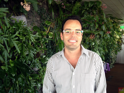
alejandro barrios-carrera
[DA] Not part of dialog but a comment: One of the things that’s so special about this project is Alejandro understands where it is. He understands that it’s part of Miami and it’s part of the Herzog de Meuron parking garage. And he takes as some of his inspiration some of Herzog’s lines. You can see it in the fountain, the angles and the silhouette of the structure, the concrete to engage in a relationship with the Herzog building.
There’s also a relationship with the 1970s building. For example the wood planks in the ceiling are similar to the concrete planks in the older building. You can notice that the planks widths are different and that’s similar to the detail landscape architect Raymond Jungles installs at street level in front of 1111. Alejandro cleverly and subtly captures the essence of the creation.
(*) formerly the SunTrust Bank building, purchased by developer Robert Wennett in 2005 who hired the Swiss firm, and effectively shored up the west end of Lincoln Road at Alton Road. [ juvia ] [ herzog &de meuron ]

