
join hbf & hbf textiles for a prosecco toast at neocon 2019.
please join hbf & hbf textiles for a prosecco toast in their showroom (387) during neocon from 3-5pm on monday, june 10th!
showroom #387

please join hbf & hbf textiles for a prosecco toast in their showroom (387) during neocon from 3-5pm on monday, june 10th!
showroom #387

hbf + hbf textiles will debut their 2018 launches at neocon 50, highlighting their dedication to humanistic workplace solutions and dynamic design. in showroom 387, hbf’s latest + greatest will be on display—ranging from an elegant, collaborative seating line mod by the award-winning henrik schulz to an imaginative, high-performance textile collection curious crowd from the colorful ghislaine viñas.
this year are hbf’s impressive team of product designers including henrik schulz, todd bracher, ghislaine viñas, and scott wilson.
june 11-12 from 9-5pm, june 13 from 9-3pm
prosecco toast || june 11th from 3-5pm, hbf + hbf textiles: showroom 387

above> transcend by suzanne tick for skyline design
a neocon 2017 runs from 12 to 14 june at the mart in chicago. at-a-glance preview…
3form / 10 – 142
a collaboration between 3form and brooklyn-based designer louis lim of makingworks has resulted in the creation of mobius, exclusively on view at wanted design in new york city in may 2017. now check out the latest at neocon.
andreu world / 10 – 132
invites you to discover our new collections at neocon 2017. we look forward to welcoming you.
save the date: please join us for the andreu world fiesta. this year’s event will feature traditional spanish tapas and wine along with a very special live music performance.

arper / 339
arper presents their 2017 collections at neocon. stop by for a coffee and explore the new products at their chicago showroom.

buzzispace / 10 – 111
at neocon 2017 on both the first and the 10th floor of the merchandise mart, buzzispace will realize its comprehensive approach to design for happy, healthy living, incorporating a range of furniture options, and serious acoustic solutions.
carnegie / 10 – 112
life is colorful with the roy g biv collection! the energetic collection spans the full spectrum with high performance upholstery and digitally printed wide width sheers that celebrate color at its very best.
designtex / 1032A
in business, collaboration is everything—but creating the right balance between openness and privacy is a challenge. casper™ cloaking technology by designtex is an architectural film for glass walls that obscures digital screens to outside view. it acts as a smart shield to ensure data privacy, while providing the peace of mind to collaborate freely in any working environment. this is a breakthrough that will unleash space design in the networked modern world. casper is the only cloaking technology of its kind anywhere. you have to see it to believe it.

hbf / 387
thomas lykke/oeo has collaborated with hbf to create the studio table series.
haworth / 312
come see bluescape and global commercial furnishings leader haworth an innovative new collaboration space at neocon 2017.
humanscale / 351
humanscale and the living product challenge. talking about sustainability is easy. what’s more challenging is creating a net positive impact. especially when it’s being audited and validated by the international living future institute.
herman miller / 321
when bill stumpf and don chadwick designed the original aeron, they combined a deep knowledge of human-centered design with innovative, never-before-seen technology to deliver a chair unlike any other. just as iconic films and albums are updated for new mediums, standards, and audiences, aeron has now been remastered to meet the needs of today’s work, workers, and work environments. by coupling co-designer don chadwick’s vision with herman miller’s latest research around the science of sitting, the new aeron works better than ever before—so you can too.
ki / 1181
join the ruckus at neocon 2017! get a first-hand look at how ki‘s ruckus collection is disrupting the design paradigm. in addition, we’ll be showcasing innovative product solutions developed using the principles of human-centered design.
keilhauer / 373
luno is for reflecting. a visually striking lounge chair that allows you to move, sit and communicate in your own style. design by eoos.

maharam / 1188
maharam design studio decided to develop a substrate: apt introduces a new polymer that combines a silicone face with a polyurethane-and-silicone mid-layer to maharam’s offering of nonwoven upholstery textiles. using a proprietary formulation. apt is the result of five years of research and development.
mohawk / 377
go behind-the-scenes with mohawk group for a sneak preview of the bold and stylish floorcoverings they’ll be showcasing this year. take a peek at our entire lineup.

okamura / 11 – 124
alt piazza is an office furniture of the future that turns office shared space into a place where you can work comfortably.

skyline design / 1060
transcend by suzanne tick
steelcase / 300
steelcase workplace advisor empowers organizations to measure the effectiveness of the workplace, and improve it based on easy-to-understand, actionable data accessible through an online dashboard.
teknion / 10 -48
around is fully featured, yet clever new new task chair. hidden innovations facilitate a simple chair design with a light, minimalist form. designed by justus kolberg, around is remarkably comfortable, versatile and easy to use.
vitra / 1192
vitra has been developing and producing office chairs for over 40 years. its first model, the vitramat, set new industry standards, and many of its successors have continued to revolutionize workplace seating. to accompany the market launch of the pacific chair, am chair and id chair update, we are introducing the task chair campaign: a new digital tool that provides existing and prospective customers with an inspiring presentation of these chairs.
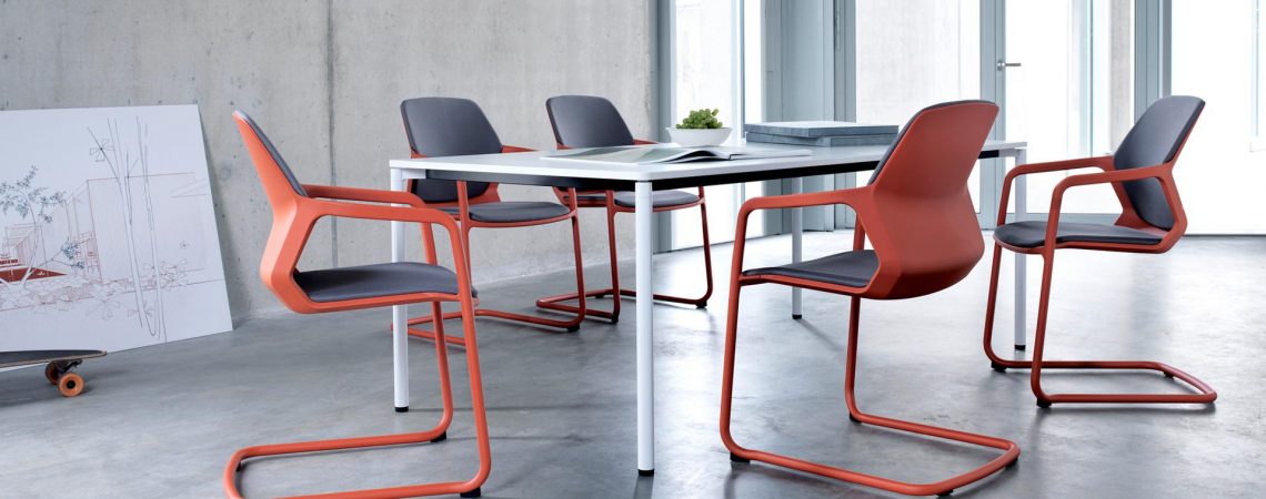
wilkhahn / 7 – 7072
wilkhahn’s new metrik cantilever chair stands apart for its sculptural shape and contours which bring modern automotive design to mind. polygonal shapes and rounded edges are part of a distinctive body which is defined by form-fit assembly of the tubular steel frame and seat component. design by whiteID.

this year’s neocon attendees will be the first to experience the first major renovation at the mart in 40 years. the cost: $40 million. a new name too: themart.
this transformation centers around the grand stair, a communal space connecting themart’s first and second floors, and includes a large multi-purpose space atop the grand stair on the second floor, a modernized, urban food hall and an expanded riverfront park with alfresco seating. attendees at the upcoming neocon 2016 event (june 13-15, 2016) will be the first to experience the new 1st and 2nd floor layout and amenities, including a specially curated lounge furnished with product from themart showrooms.
dynamic elements of the renovation include:
• the grand stair: a monumental new portal of themart, the 50-ft wide majestic staircase creates a connection between the first two floors, and also serves as a meeting or workspace with stadium seating, a large projection wall and free wi-fi.
• the lounge: a multi-purpose space with views of the chicago river and skyline, located atop the grand stair, will feature food-service and provide various areas to meet, work and socialize. during neocon, the lounge will offer food service provided by lettuce entertain you restaurants and be a convenient meeting place for all participants. comfortable seating and complimentary wifi will offer a welcome respite from the busy showroom and exhibit hall floors. lounge furnishings include casual and dining furniture by allermuir, bernhardt design, davis, hbf, herman miller and stylex, and floor coverings by masland carpets.
• the food hall: a reconfigured, reinvigorated and dramatically designed seating area with more natural light will engage visitors beyond dining and offer additional space for lounging, socializing and working.
• river drive park: a 5,000 square-foot outdoor green space along the riverfront connects tenants, visitors and pedestrians to themart’s main entry, and includes seating and shaded areas with dramatic views of the river and chicago skyline.
• reception/information desk: a new greeting point for the building located at the base of the grand stair.
vornado realty trust, the property’s owner, engaged innovative new york-based architecture, strategy and design firm a+i to lead the design process throughout the three-year capital improvements renovation project.
“rather than creating a port of entrance and exit, the architectural features of themart’s new lobby allow for a new kind of engagement by slowing down the pace of passage,” states brad zizmor, principal and co-founder of a+i. “the grand stair and reception area create a spectacular architectural landscape conducive to reflection, thinking and socializing. in keeping with a+i’s reinvention of the lobby as a programmatic space to dwell in, as opposed to pass through, we designed a colossal stair with a physical structure that is 80% meant to be lingered on as opposed to being walked on.”
other building upgrades neocon participants will find include:
• enhanced wifi service on the first and second floors
• A NEW BANK OF AUTOMATED ELEVATORS ON THE FAR WEST SIDE OF THE BUILDING SERVING ALL FLOORS
• a completely renovated seventh floor exhibit hall featuring new floor coverings, wall system, lighting, wayfinding, and enhanced wifi service
about themart: one of the largest commercial buildings in the world, the 4.2 million sf merchandise mart (themart) is located in chicago, il along the chicago river. completed in 1930, the building continues to meet the changing needs of the office and showroom businesses it serves. as a gold-eb oem leed certified building, themart is committed to creating and maintaining sustainable environments.
can you feel the love?

above> introducing montara650 collection by the coalesse design group and lievore altherr molina
coalesse® engages a&d as participants at neocon 2016 / #1032 – a&d community invited to take part in the design process
coalesse, recognized for forward-looking, design-driven products that foster social connection, creative collaboration, and focus and rejuvenation, is inviting the a&d community to participate in the design process through a range of new products and custom capabilities at neocon 2016.
its showroom #1032, will feature expressions of custom capabilities that can be applied through the newly launched potrero415™ tables, massaud conference seating, and the montara650™ collection, among other products, giving a&d professionals the opportunity to discover new ways of personalizing through color and pattern, materials and features, and shape and size to make it their own and enhance emotional engagement at the workplace.
showroom visitors are also invited to participate in the design process through coalesse’s new customizer web app, which demonstrates ways of applying custom color and pattern to the groundbreaking lessthanfive™ chair. the web app and degree of product offerings make customization highly-attainable, empowering clients to be curators of a more meaningful design experience.
below> vitra & artek / #1192 // north american introductions / vitra customized applications
at neocon, vitra will present a series of projects that demonstrate how it has optimized collaboration with client project teams. this provides clients a direct dialogue and unprecedented access to vitra’s top design talent, allowing for the custom-development of new product applications for large scale projects.
above> the vitra color and material library by hella jongerius – ten years ago, the dutch designer hella jongerius began a research project for vitra to study the properties and possibilities of colors, textures, finishes and materials. this long-term project has resulted in the vitra color & material library, devoted to the establishment and further development of an intelligent system of colors, materials and textiles. this concept facilitates a higher degree of specificity in interior design. in her book “i don’t have a favourite colour”, which was launched at vitra’s 2016 milan presentation, hella jongerius describes her method of research and the application of its results to the vitra product portfolio. courtesy © vitra photography labadie/van tour
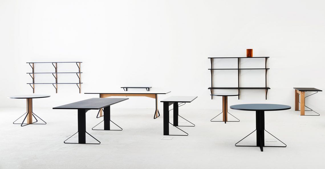
below. the kaari collection by ronan and erwan bouroullec for artek courtesy © artek
below> mohawk group / #377 & 3-121
elevate contemporary spaces to inspired floorscapes through mohawk’s latest production collections. inspired by nature and designed to merge fashion with function.
below> mohawk group / moving floors collection / diagonal relief, fade relief, plane high, plane low, 656 green 24by24
designed to be dynamically moving base on the user’s point of view, moving floors was inspired by the multi-layered beauty of our cultural landscape. empowers designers to create kinetic floorscapes through limitless combinations.

below> haberdasher textiles / by laura guido-clark for herman miller / 3-321
haberdasher is an array of palettes and patterns, inspired by traditional sewing materials—and tailored for projects of various sizes and budgets. giving solids and patterns license to commingle or stand alone, haberdasher gives you license to play. mix. match. curate. collaborate. differentiate. and indulge.
above> there are 5 families each with their own identity.
pins and needles: a simple pattern of pins strewn about a canvas becomes iconic in a highly graphic way. / string plaid: the crosshatch pattern creates a colorful, dynamic, and graphic twist on traditional plaid. / well suited: allows vibrant and deep colors to collaborate in a small scale, two-color nailhead pattern. / fish net: the quilted hand offers dimension and explores a large line of intense, warm, and cool colors. / tailored: the tightly woven grid texture creates a subtle surface that reflects light and contours form.
below> hbf & hbf textiles / 387
hbf has returned to its roots, teaming with esteemed designer and longtime partner michael vanderbyl to create introduce conexus, a work/lounge chair designed to function across any contract setting — offices, lobbies, hospitality environments…
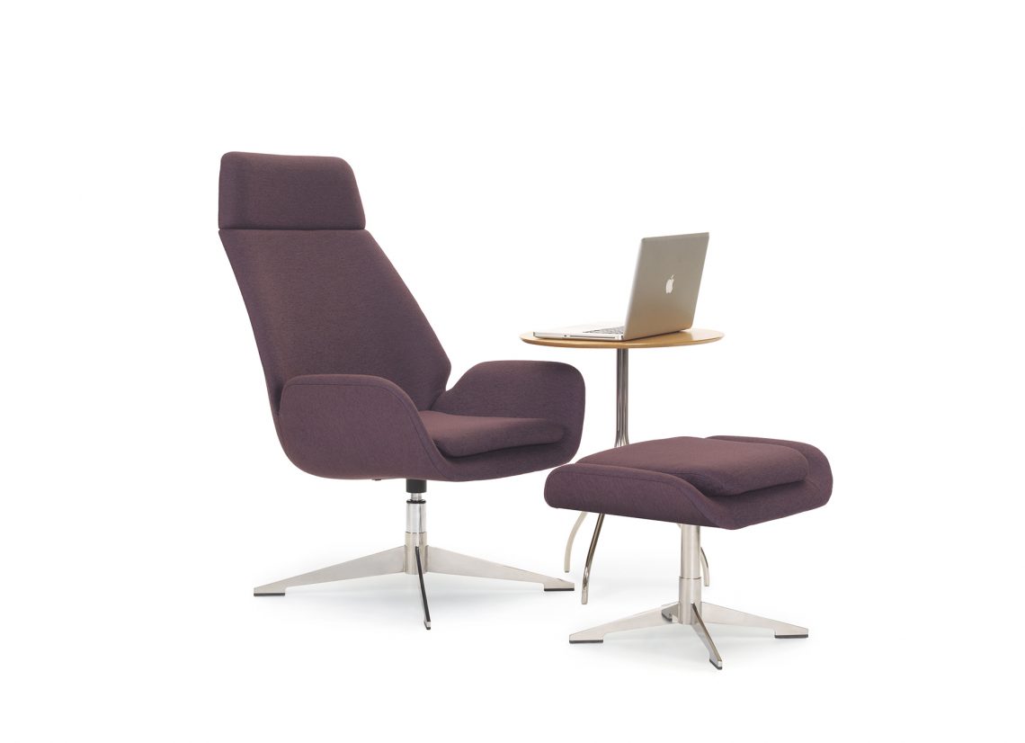
designer michael vanderbyl notes, “i strive for timelessness. conexus plays with the shape of a classic lounge chair and transforms it into a more organic form that showcases the exceptional craftsmanship in the woodwork and the upholstery. the wood merges with the upholstery in such a seamless way that the piece takes on a sculptural quality, an engineering feat that hbf executed masterfully.”
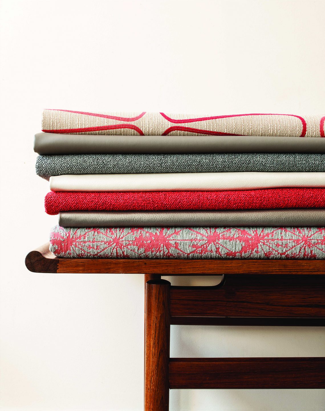
below> hbf textiles highlights color, texture, yarn, and hue in spring 2016 collection
known for their artful and authentic approach to design, hbf textiles is going back to the classics for its spring 2016 collection. hbf textiles vice president of design mary jo miller started with le corbusier’s infamous lc palette of colors from the 1920s, and used these fresh shades as a catalyst for the collection.
below> tek pier / teknion / 1048
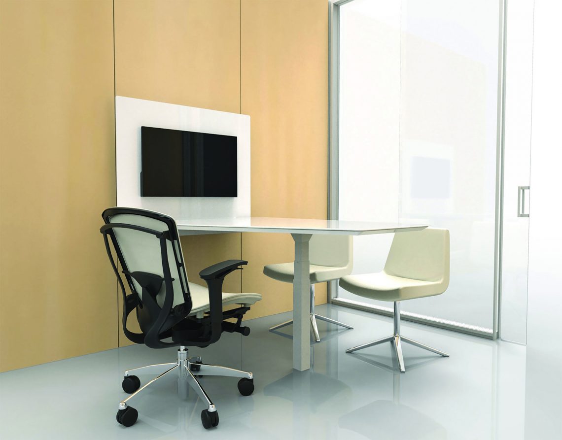
tek pier “is the first product of its kind to successfully merge wall-mounted monitors with height-adjustable worksurfaces,” said paul kruger, teknion’s director of design, architectural products. tek pier takes advantage of teknion’s altos demountable wall cable routing, structure and acoustic performance. the innovative origami mount allows for fluid positioning to share a large format monitor, maintain viewing privacy, or engage in touchscreen applications.
below> designtex / moquette / 1032a
moquette is a textile mash-up that blends a classic velvet weaving technique with the creative possibilities offered by digital printing technology. the woven structure employs a “moquette” construction produced on a modern wire loom, allowing some areas to be woven as flat bands while elsewhere selected yarns are lifted and then cut to create a short, dense pile. beginning with a simple pattern of alternating horizontal stripes of varying widths, the moquette technique adds complexity by introducing a sense of dimensionality, which is enhanced by the luxurious combination of lustrous and matte yarns. finally, the raised, plush surfaces of the woven fabric are printed digitally with a non-repeating and random color pattern.
the result is an intricate layering of textures and colors that evokes natural landscapes, reflecting biologist e.o. wilson’s concept of biophilia—the theory that human beings are instinctively drawn to the natural world, and thus that design following this principle provides a heightened sensation of comfort and repose.
below> parentesit freestanding / by lievore altherr molina for arper / 339
arper extends the functionality of parentesit to include freestanding models for increased privacy and comfort. architectural in scale, these modules carve out a three-dimensional space for concentration or quiet conversation in shared workspaces or collaborative environments.
parentesit was created with a dual inspiration of minimalist art and classic japanese interiors. to shift this approach to an architectural scale, the screen is capable of dividing a room in half, or partitioning off a space for quiet, independent thought.
below> wolf-gordon / & 10 – 161
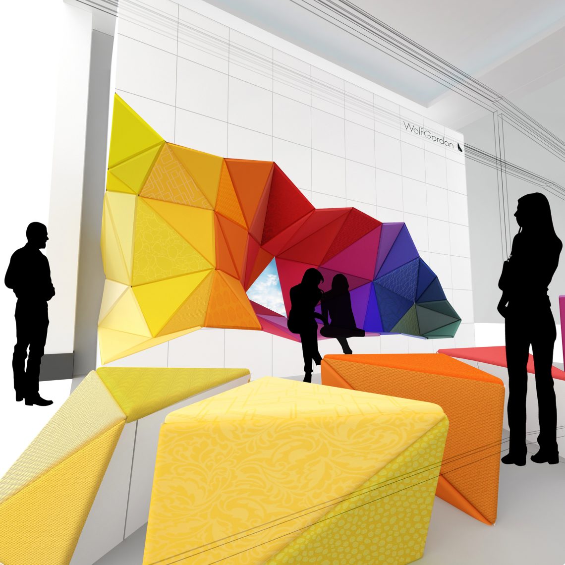
following dazzling installations of sculptures and interactive digital displays in past years of neocon, wolf-gordon has again transformed the market space in a new way. office_excavate re-envisions the cubicle-enclosed office by creating a colorful, open seating space that can be easily rearranged for meetings, coffee breaks, and recharging of phones and humans alike. the furniture, which can be used alternately as seating, desks, tables, or stools, will be upholstered in over 100 different wolf-gordon textiles. office_excavate is a collaboration of karlssonwilker inc., new motor, graham kelman and wolf-gordon creative direction.
below> humanscale / 351
they’re not only previewing a brand new line of diffrient occasional chairs they’re unveiling never-before-seen niels diffrient designs. take a journey through human-centered design innovation and chat with founder and ceo bob king, visionary designer todd bracher and the rest of the humanscale team.
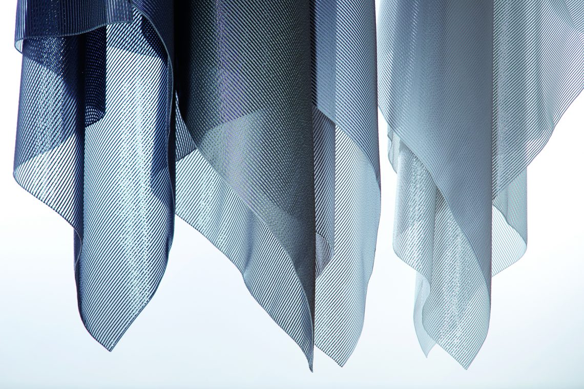
reflectacoustic is a groundbreaking design that controls sound and delivers heat and glare reduction through yarn, weaving and metalized backing technology. the textile absorbs and reflects back a great deal of light; all validated through 3rd party testing.
below node with sharesurface / sharesurface was designed by steelcase design studio / steelcase / 300
steelcase health research reveals exam rooms not designed for the modern healthcare experience . findings uncover five ways exam space is failing physicians, patients and family members; informs new design framework and product, node® with sharesurface
node with sharesurface features a rotating sharesurface that provides dynamic access to information, a central part of the exam experience. physicians using mobile technology are able to chart while maintaining eye contact, pivot the surface to share their screen with the patient and family for education and shared decision making, all while having mobility in the room. the chair’s back and arms allow doctors to have more conversational postures during consultation and the rotating surface arm moves out of the way for examination activities.
below> northern parallel / cf stinson / 10-1150
[ collection summary ]
• 7 new textiles, 72 colorways.
• a collection of coordinating textiles that explores the connections between michigan (where stinson is headquartered) and maine (where stinson houses their design studio).
• shared michigan/maine discoveries:
• similar geographic latitudes
• rigorous climate with diverse seasons
• inhabitants with an appreciation for nature and willingness to embrace the seasons
• michigan/maine ideals include work hard, build with integrity and if you are going to be unique – be honest. shared mindset explored through textiles that are hard working, unique, honest and full of integrity.
• made in america, small carbon footprint.
below> the doni collection / designed by giancarlo piretti for ki / 1181
if you can dream it, doni can express it. create with a fresh palette of energizing brights and sophisticated neutrals. imagine the possibilities with two-tone colors and unlimited custom color possibilities. the collection offers guest, task, tandem and stackable configurations.
below> introducing rockwell unscripted™ / knoll / 1111
rooted in david rockwell’s innovative approach to hospitality environments and public space, and inspired by his award-winning design for theater and entertainment, rockwell unscripted is a comprehensive collection of furniture elements that adapt to the spontaneous choreography of the work day.
“our interest is in getting people to look at their work environments as a stage on which movable furniture can be arranged in endless configurations. you can craft the scene around what it is you’re doing that day,” said rockwell group founder and president david rockwell.
below> lievore altherr molina’s arcel for bernhardt design / 399
below> glass gradients by scholten & baijings / skyline design / 1060
glass gradients by scholten & baijings add dimensionality to a space by establishing a dialogue between the simplicity of the patterns with their signature color palette.
below> suri pouf / designed by sezgin aksu and silvia suardi for kolekiyon / 11 – 113a
inspired by headgear from the ottoman empire
below> elemental wall systems / 3form / 10 – 142
time + weather = beauty
inspired by the rustic look—created from clean materials
below> repiroue perching stool / okamura / 11 – 124
the perfect combination of sitting and standing – a new style of work posture
it is no secret that changing our posture throughout the day is essential to our well-being in the office. what’s more, adapting a posture that is appropriate for the task at hand helps relieve stress placed upon the body. okamura recommends five postures for increased office productivity and efficiency. among them is the perching posture, a perfect combination of standing and sitting.
below> chilewich contract launches speckle / 7 – 6030
speckle is a durable and easy to maintain textile ideal for any environment.
speckle comes in four color ways and in each the warp yarn subtly contrasts with the soft pearlescent silver speckles in the weft direction.
chilewich has experimented laying speckle tiles quarter turned and found that the natural color shift between warp and weft adds a richness and level of interest to this quiet weave. speckle is ideal for spaces in which the floor is a foundation for bolder interior design elements. a sustainable solution of bold and neutral patterns.
below> wilkhahn / 7-3082c
wilkhahn’s dynamic office seating utilizes patented 3d technology to encourage health, creativity, and productivity in the workplace.
by special request of the a&d community, will show for the first time at neocon, a white, through-dyed seat shell and backrest frame.
below> arborite high pressure laminates / 7-1018
recognizing the increasingly blurred aesthetic line between contract and residential design, arborite has curated a selection of residential products with crossover appeal to create commercial stones.
above left > cityscape loft’s modern, wet cement look is ideal for urbanites in search of a low-maintenance, industrial-inspired surface. right> industrial loft evokes the glazed look of oxidized metal, combining light and dark shades with a matte texture for a chic, modern effect.
below> amble / by stephan copeland for lightcorp / 7-8062
why is amble different? amble is a light with no moving joints or articulation – in fact, the only moving part is a gravity-powered “eye.” minimalist design meets elite performance in a battery operated dimmagle led task light. created by renowned lighting designer stephan copeland, amble is highly adjustable yet has no moving joints or articulation. amble’s lean, single-form construction enables excellent adjustability and mobility through the intelligence of its shape.
below> nima / by giancarlo piretti for american seating / 10-148
aimed for the higher education market and various contract environments, nima is an inspiring multipurpose collection of chairs, providing exceptional comfort through a sophisticated minimalist aesthetic.
below> stir kinetic desk m1 / 1067a
the new m1 is a height-adjustable desk driven by software that senses your presence, learns your preferences, enables you to set goals and actively reminds you to change positions throughout the day.
DesignApplause will continue to add to this post as well as social shout it during neocon.

we created a color palette for emeco 111 navy chair made from 111 recycled coke bottles and collaborated with their internal team to drive the aesthetic towards a singular and “velvet” finish.
In anticipation of Cusp Conference 2011, we are telephone chatting with guest speaker Laura Guido-Clark.
[DesignApplause] What do you call yourself professionally?
[Laura-Guido-Clark] I think you started with probably the toughest question. But I think we kind of landed on “experience consultants” because we’re trying to shape the human experience. How color, material, finish, and pattern, the skin of surfaces, affects the human experience.
[DA] What’s your background? How did you evolve into an experience consultant?
[LGC] I’ve always loved science and loved design so while in college I didn’t know if I wanted to be a doctor or a designer and found out the processes were really similar. And of course I wound up being a designer and my degree is in interior design. But I went back and studied textile design. A bit later when with my former partner, we were getting many surface design projects. BTW, my partner retired and I’ve since been on my own nine years. But I discovered how much I loved working with surfaces, what they could do, and how you would engage whether you put your hand on a fabric, held a cell phone, sat in a car, all of these experiences became important to me and as well as how it made people feel.
[DA] What’s your office environment like?
[LGC] It’s colorful. It’s a combination of old and new in terms of furniture. Of course the surfaces are quite tactile and engaging. The walls and work tables are white because we have to view color. It’s a warm environment, a lot of natural light. And it’s homey.
[DA] You mention natural light. Is that the best light to test color?
[LGC] Natural light is great, it’s an ideal light. But we have to test in all lighting environments. We are very mindful of the context of things and how they’re used. If your product resides in fluorescent lighting, then we test with that light.
[DA] What’s the non-natural ambient light in your office?
[LGC] Our ambient light is warm light rather than cool. So no fluorescent unless in our test areas.
[DA] I’m in the middle of writing an article about buying LED lighting in 2012 aware that the incandescent has been congress mandated to cease and desist. What’s your opinion on LED’s?
[LGC] We’re aware of LED development but I need to learn more about it before I can comment. But lighting is indeed going through a revolution and we’re getting closer to where we can really control our lighting environment experience. It’s how we feel and respond in lighting environments, it’s an active vs a passive experience and that’s exciting to me.
[DA} The new LED’s coming down the pike are very high-tech, some almost artforms. I’m all for the government, in this case, forcing the lighting manufacturers to create a more energy efficient and aesthetic light source. Do you get involved in shape?
[LGC] What’s nice, our team is getting involved very early on and we’ve been able to educate our client that color is not a band-aid and we in fact do get involved with shape that addresses humanistic qualities and materialities. So, while we’re not industrial designers we are asked to weigh in on many aspects, in particular the humanistic aspects of our products which can range from a car to a toothbrush.
[DA] What disciplines make up your team?
[LGC] We are cross-disciplined with graphic and industrial designers, and marketing strategists. And we are global.
[DA] A tempting phrase the following question, “are your solutions only skin-deep?” How deep do you go?
[LGC] We do go really deep. What we realize and honor is intuition in design but we also have to honor process, and observation, and science. We’ve trademarked this process “Climatology™” and this process was in response to a company that had to change a large production line. And the company has to trust your opinion. It’s not enough to say that you have this feeling that pink is the new color. Climatology looks at things in a much bigger way. We try to access the temperature, reading the social, political, economic, and emotional climate, and what we’re really looking for are the human values it impacts. The values and desires will translate into color, materials, and pattern. And we can substantiate these attributes and give a brand a DNA. So yes, we go really deep.
[DA] How old is the Climatology process?
[LGC] It was trademarked six or seven years ago.
[DA] How early to you become involved and what’s the typical time frame?
[LGC] Our research is generally three to six months. We take a lot of time to research what a brand is, what it stands for. Our due diligence seeks to make something come alive through our mapping process in Climatology.
[DA] You were quoted in this month’s “United States of design” issue of Fast Company, regarding the state of design in the USA. You say “sometimes we prefer the quick fix over the long haul. Our culture isn’t’ necessarily disciplined or long suffering.” It’s not unusual for designers with global experience to say European business may be more emotion driven, while the US may be more a marketed-to culture business mindset, less about the heart and more to where it’s going, an implication of a long-haul objective. What are you referring to?
[LGC] Maybe I’m looking at it from a different standpoint. If we talk about Japan I’m thinking in terms of patience more than process. I think in our culture there is a lot of due diligence and in the projects I’ve been involved in, Japan for example, there’s also a sameness in due diligence. I’m talking about the patience in results. And I’m thinking how quickly we cycle things. There is something to be said about, let’s think about kids and their expectation of what technology has brought, even on a global level, that things are happening very quickly. When I think about Sony for example, how they had the patience to penetrate this market and they have shown they are pointed to be in it for the long-haul. I do believe that there are cultures that are more disposable, that we’re really looking at it on a different basis of sustainability. I do believe the US is also research driven and looking at sustainability but I wouldn’t say that patience is number one in our culture.
[DA] Agree with the patience thing. May we quote you again? Two years ago, in the Fast Company blog, you made a little opine on focus groups and how they don’t work when used to determine a creative solution. The comments on that post were very insightful and well articulated as well. Did you have any fallout from that article?
[LGC] I got more of a positive response than a negative response. Steve Jobs has even spoken against focus groups. You can’t be asking for that sense of validation if you do. When you’re talking about your due diligence, if you really feel that you’ve brought in best, and have done your homework you should stick with that. People will always have their opinions and it’s about who you listen to and who you’re trying to please, and I often feel that in a focus group you’re trying to please everyone. And your product begins to look like that and you wind up not making a statement on who you really are.
[DA] Yes, many times a focus group is used as validation within your own company, to sell those who are remotely involved in the creative process.
[LGC] Right, in those situations you want guarantees. I don’t know of any design process where risk isn’t involved. When you want guarantees you move towards safety. And with safety and many times you get compromise and you start to lose your point of view. Even Malcohm Gladwell in his book Blink, he talks about how companies would have missed out on some of their best introductions if they would have listened to focus groups. Herman Miller is a good example. No one wanted the chair in the focus groups.
[DA] You’re talking about the Aeron chair. The focus groups hated that chair.
[LGC] Herman Miller did six years of research and the chair becomes number one in the market. Yes, and that’s the risk part. And now you have to give Apple credit. they’re not asking for permission, they’re doing what they believe in.
[DA] Personally, I think folks hire us because of what we like. I like the classics, and as a result I get to work on a lot of projects I like that have classic overtones. How do you take yourself out of the equation when your recommending this or that?
[LGC] I think it’s very important to start each project with a blank canvas and always ask the “what if” as well as truly understanding your client’s point of view. They’re hiring you for your expertise but it’s not about imposing your sensibility, but by the same token you are trying to make things exciting for them. It goes back to you also having that deep understanding of who they are and where they want to go. So I try to become really empathic and try to be a very good listener.
[DA] How do you present your surface and color solutions to your client?
[LGC] The first thing we do is talk about the “why” behind it. So there’s always this feeling that it’s substantiated and something deeper. And if it’s a deep dive its Climatelogy can be a very in-depth report about what’s going on and what’s the humanistic values and how we’re going to move towards that. The presentation always involves visuals that show how we got to where we got to. Because everything we do is tactile it involves the actual color, material, and finish because that’s what really is going to move them. That’s the end result. That’s the visual response we need because that’s exactly what’s going to happen in the marketplace.
[DA] When you wish to match color on different materials, say the interior of a car, the dashboard, the seats, the carpeting. How do you go about it?
[LGC] We work with different lighting sources but many times it has to be about reflectivity and absorption and sometimes we don’t want it to match exactly. Sometimes we want it to be a rich experience. Many times it’s letting the material be its optimal self. If it’s a wood you want to be aware of the grain. If it’s leather you probably don’t want it to be perfect like vinyl. If materials can be themselves then they can work together.
[DA] Yes, totally agree. Graphic designer Jim Sebastian championed a color matching system called the “Colorcurve System” that addressed the tendency of some colors to appear different on a variety of surfaces, materials, and in different lighting conditions. This system was based on light reflectance curves and not on pigment formulations. It made it possible to match color that would remain closely matched even as the light source varied. The company, Colorcurve System Inc., is nowhere to be found but this scientific color matching system was so good and precise it must exist somewhere under another name. That’s what instigated this question in the first place. I used it several times when an exact match was required for printed brochures, packaging, product and tradeshow exhibits.
[LGC] I own the system and used to work with it many years ago. It was an intuitive, precise system to use. Sorry it isn’t still around!
[DA] editor’s note: Jim Sabastian responded, the Colorcurve System is discontinued. He’s aware of a European system called “Natural Color System” and suggests looking into it.
[DA] I’m going to ask you a question I think I know the answer to. Are you digital or sketchbook?
[LGC] I am very much about imagery and collage which puts me half in each world but I am not amazingly well versed on the computer. I’m a much more hands on person.
[DA] I’m somewhat surprised, my research leading up to our chat placed you as a techie. So you are a traditional creative embracing the technology.
[LGC] Ha! I embrace technology but my team is well versed. I use technology a bit differently. I’m really a hands on person and that’s why I’ve always loved color, materials, and finishes. It’s a 3-D world. The imagery on a screen is beautiful but I love the 3-D world.
[DA] I do to. And it’s a gift to be able to visualize and see the 3-D, not everyone has the gift.
[LGC] Aren’t you excited about the new 3-D technology and how they can build up layers to create models. Incredibly exciting.
[DA] I’m not as well-versed in 3-D as maybe I should be. But I’m aware that many new capabilities are being announced almost daily. Are there any schools that specialize in color or surface design?
[LGC] I have taught color at CCA (California College of Art) but I haven’t found any teaching color or color theory. What I find most is different disciplines when it comes to applying color, like industrial designers or even interior designers who are a little more comfortable, but they’re not as comfortable with the medium because there is not a lot of exposure to color. The thing I find most important in teaching color is to eliminate the fear for rich experimentation. That’s where wonderful things happen. It’s really about experiment.
[DA] What drives your projects? Are you given products that present new materials you are not familiar with?
[LGC] What drives the projects is your curiosity and asking “what if” and looking at the materials as if you’ve never seen them before even though you’ve seen them a million times. And you work with others who really understand materiality and really research the new materials and think about how those properties might be used as an asset to the industrial designer to create something that is more revolutionary. And it really depends on what the industrial designer is trying to say. If they’re trying to do something classic we research differently than if they’re trying to something that is say, more experimental, driving towards technology. Those are things we have to understand before we start.
[DA] Designers who get into research like you do might all say the most exciting projects are the ones they know zero about. It forces the issue of starting from scratch.
[LGC] Yes! It’s exciting, exhilarating when you start with that blank empty piece of paper. It’s very satisfying when you are asking yourself questions. It’s unfolding all the different layers which is such a great part of the process.
[DA] What inspires you?
{LGC] Nature is an amazing inspiration, like watching what true beauty is and how things change. From a color standpoint no one does it better than nature. There’s also that whole sense of humanity, this sense that we’re so much more connected than we sometimes acknowledge. And I think that the human heart, this ability to be open, this ability to reach out, and be vulnerable, it also inspiring. And that we can ask the question “why” and we can be continuously curious. That gives a reason everyday to get up because you get to learn something new if you choose to.
[DA] I’m pretty opinionated (maybe to a fault ) about color and textures, there are ones that I love and hate. Just look into my closet and those colors and fabrics are there and have been for long time. What about you?
[LGC] I can’t say that I dislike any one color? For me color is about context and relationships. So while something might not feel right to me, maybe isolated or in a pair, i can add a third color, i can love the whole, all the colors together. To me it’s about playing and understanding the relationship they have to one another. One of the exercises we actually did in school was to take a color that they liked and one they hated and then find a color in the middle that married them. And most of the time they actually didn’t hate that color anymore.
[DA] How do your “surface” yourself and your living environment?
[LGC] I like to layer things. In terms of clothes I like things simple, I love the whole unexpected idea that something might be a salvaged edge or show me that there was a human hand involved. I love this whole idea of juxtaposing different types of materiality. In terms of what I surround myself with and be inspired, I love color and I love different materials and have different materials mirror one another like a linen sofa, a glass table, a velvet cushion. I like the way materials talk to one another. I drive a little red Mini Cooper which makes me happy. She’s something like a cartoon. I just love her.
[DA] What’s her name?
[LGC] Her name is Beatrice. I like to have fun and I like to explore. I like to be out and about, I like to observe things. I love to people-watch. I think that’s incredibly telling. I guess that’s kind of a reflection of how I approach my work.
[DA] How does your own work represent your own philosophy on the state of design?
[LGC] My work is humanistic. It often solves problems but it also allows you to discover things in your life that perhaps you didn’t even know that you needed and it engages you in a way that is much deeper than just the surface. It’s not just a pretty thing. It’s something that you want around for a long long time. That’s a big goal. You know, the primary tenet of eco-consciousness, you have to want it, you have to create desire. Because, even if it’s made of an eco material and you don’t want it around, it’s no longer eco-conscious.

[DA] Laura, what’s your life like now?
[LGC] Last year I kind of had an epiphany, I realized I spent a great deal of time trying to discover what a client’s DNA was and encouraging them more of who they were in the world but then sometimes I wasn’t doing that for my own company. And that epiphany allowed a shift into looking at life beyond work and I’m in the process of forming a non-profit, hoping that it makes people smile and makes people feel like they’re respected and valued, mainly through color. I’m really excited about that. I really can’t wait to interface with more kids and make changes that maybe can make the world just a little bit better.
[DA] That sounds absolutely wonderful and great.
[LGC] Yay!
[DA] What’s next?
[LGC] I’m speaking at Cusp Conference next week as you know. And we’re going to introduce the non-profit at Cusp which is exciting. And other things on the horizon: cameras, textiles and furniture finishes.
[DA] Do you have a question?
[LGC] Tell me about DesignApplause.
[DA] Another story! Laura, we now have a better understanding of what an experience consultant is. See you at Cusp.
[LGC] See you at [ Cusp ]
[ guido-clark background ]
Laura Guido-Clark is a designer whose passion is to make the human response to products more meaningful through color, material, finish and pattern. Through her trademarked process, Climatology(tm), she researches and tracks relevant changes on the social, political, economic and emotional fronts. She distills these collective traces of the consumer consciousness into a thesis about their needs and unfulfilled desires – figuring out what people really want and why, often before they even know it themselves.
Her multiple disciplinary design studio collaborates with companies like Kodak, HP, LG and Toyota – as well as start-ups across industries such as automotive, consumer electronics, and home furnishings. Her textile and pattern design include work for HBF, Pallas, FLOR and Uncommon. As a result of her expertise, Laura has been invited to speak both nationally and internationally on design, and is an expert design blogger for Fast Company magazine. [ l-gc studio ]
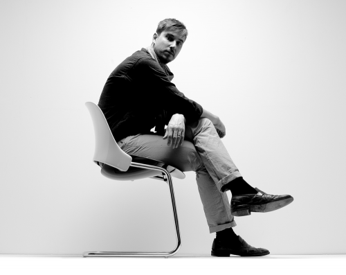 todd bracher sitting on humanscale’s “trea” [click on photo to enlarge]
It’s Tuesday, 14 June, Flag Day. We’re talking to Todd Bracher in the Chicago showroom of Humanscale.
[DesignApplause] Todd, give us a little idea of what your work environment is like.
[Todd Bracher] I’d say my work environment is quite neutral. I’m based in the Brooklyn Navy Yard, which is sort of a barren part of New York City, which is quite a contrast in its own right. It’s almost like working on a sailboat. You have views onto the harbor and to the East River. It’s wonderful. But what I love about it is the large, open, industrial-like space, really neutral, no outside influences around me. In other words, I look out the window and I see the water and the sky and for me it’s just a white slate. It’s a wonderful place to think and not be influenced by anything.
All content ©2007 > 2024 DesignApplause